Paper Tiger's tips on developer handoff
Onboarding Developers

A year ago, we started using Figma as our main design tool at Paper Tiger. It changed our workflow with developers dramatically, so we thought we’d compile a 101 guide for others making the switch. Here’s everything you need to know for dev handoff in Figma, whether you’re the designer passing off assets or the engineer building them.
Before Figma, I would have sent a long list of elements to developers including: Source files stored in Dropbox, a couple InVision projects, design specs created via plugins or tools, fonts, images, SVGs and some notes.
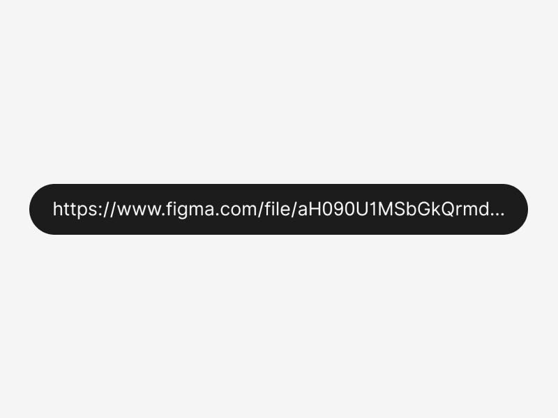
After a year in Figma our production workflow is a lot leaner. Now we just share one link to the developers involved on the project. That little URL acts as a single-source-of-truth for everybody in and outside the team.

Selective Sharing and Viewers
Our hand-off process in Figma starts with developers being added as Viewers through the Share Panel on a per-project basis — which comes in handy if you work with multiple freelancer developers.
Alternatively, you can add a developer as a Team Member from the Team Dashboard (with View Only permissions) and give them access to all projects. The flexibility here is noticeable — you can just share final deliverables with freelance contractors while having the in-house team able to see all projects.
Furthermore, Viewers don’t require a billing account and can be added for free.
They get access to a real-time version of your project files from the desktop app, browsers and even mobile devices. Being a multi-platform tool, developers can also access and work from Windows or Mac OS X.
An overview of Figma for developers
Even with view-only permission, developers can navigate the file’s pages and frames, launch a presentation of the prototype (if any) and of course, get access to all the exportable resources like images and styles. Bear in mind, there’s no way for them to tweak or apply edits on the design.
Code Inspection and Layout Measurements
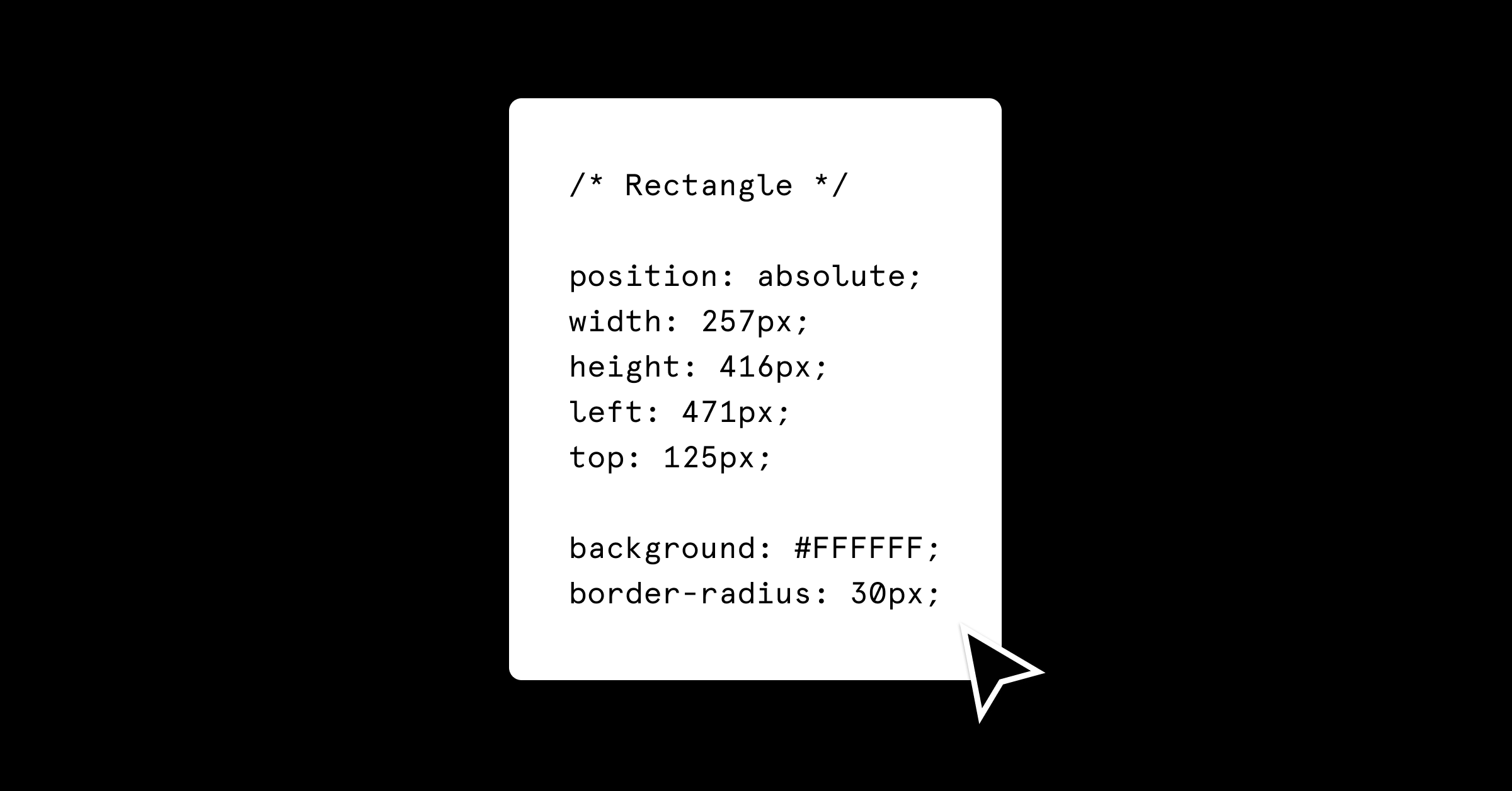
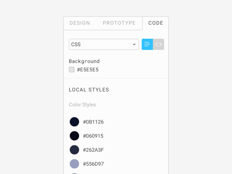
In Figma, the Code panel offers an easy way to extract code information from a specific page element. The code will be displayed by clicking on a layer.
Currently, Figma supports CSS, Swift, and XML, but notice that most of the code available involves only visual properties and spacing. No Javascript or other logic is exported.
The right hand panel provides code data for color values, typography, position and sizes. Additionally, designers have the option to add a text description to styles and components, which will be available in the same place.
Finally, the panel supports two formatting styles for all three syntaxes: Table and Code. You can toggle them from a tab selector. The Code formatting style is very useful for quick copy and paste. Since the output code is structured in groups, you can extract only the ones you need. Groups split the code by position, text or colors.
Measuring and Spacing
While the Code Panel is selected, Figma draws visual guides around the selected element for spacing and sizes, highlighting its spatial relations with the surrounding elements.
It’s a simple process: Click on the element you’d like to measure, then hover the pointer onto another layer. Here’s a few other suggestions:
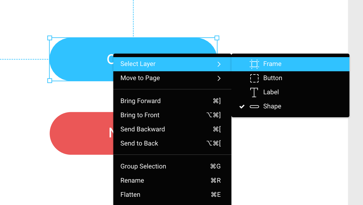
Pro tip 1 — Ctrl/Cmd + click to show guides and code for elements nested in groups:
Pro tip 2 — Right-click a layer to access a list of its nested children:

Spacing values are displayed in absolute pixels, so you may have to take it into account if coding a design made in density ratios higher than 1x.
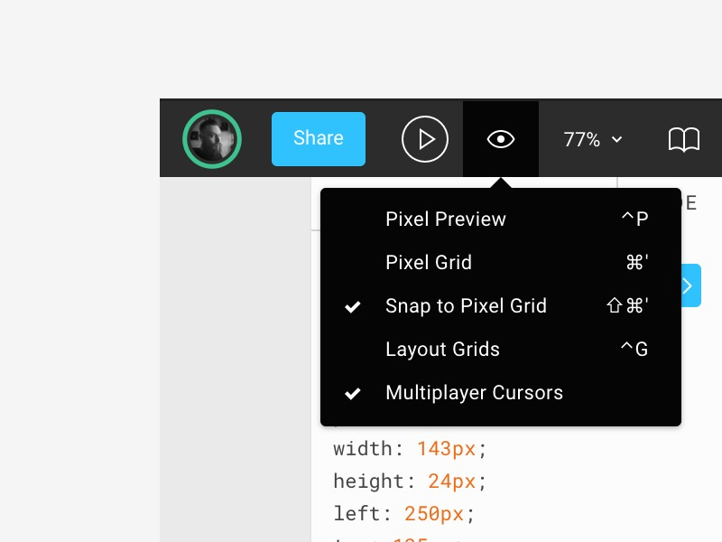
Guides and Grids
You can toggle the visibility of the layout by clicking Layout Grids from the Eye Icon on the toolbar. In order to show Rules and Guides, hit ctrl/cmd+ r instead.

Alt+hover onto an element will now consider and show the spacing values relative to the closest grid’s module or guide.
Working with Shared Styles
Projects often use a specific set of colors and text styles in order to ensure consistency across the user interface. In Figma, designers can create shared Styles for color, text, grids and effects and structure them in groups.
A Styles list is easily accessible by clicking on the project canvas or clearing the actual selection (Esc key).

That’s the best place to start in order to set up the global design variables in code and minimize the efforts if a change is required.
Together, designers and developers could define naming conventions for Styles early in the process, building a unified shared design language across the team. Or afterward, by uniforming similar Styles, cross-checking color contrast or reviewing the product over a quick Slack call.
If a process involves limitations in the context of design variables (limited palette, text Styles, or anything technology or brand related), discussing the Styles at early stages could be beneficial for both sides. Although there are some scenarios where this approach may be overkill — (Creative Exploration, Proof of Concepts, etc).
You can inspect and obtain code data from a Style by clicking the edit icon that appears when hovering its name on the Style list. Styles like Components support a description field as well.
If the selected layer has a Style, you’ll see its name next to the property where it was applied. A full list of supported styles includes Color, Fill, Type, Layout and Effects Shadows, Blurs.
Weirdly, at the moment there’s no info available for Grid Styles via the Code Panel, but you can access the Style via the Style list.
Exporting Image Assets and SVGs
Speaking about image assets: You can export resources globally or locally depending on your needs. If you’re looking to export all the assets that were marked as exportable on a file or frame, the Export Panel (Ctrl/Cmd + Shift +.E) is the way to go.

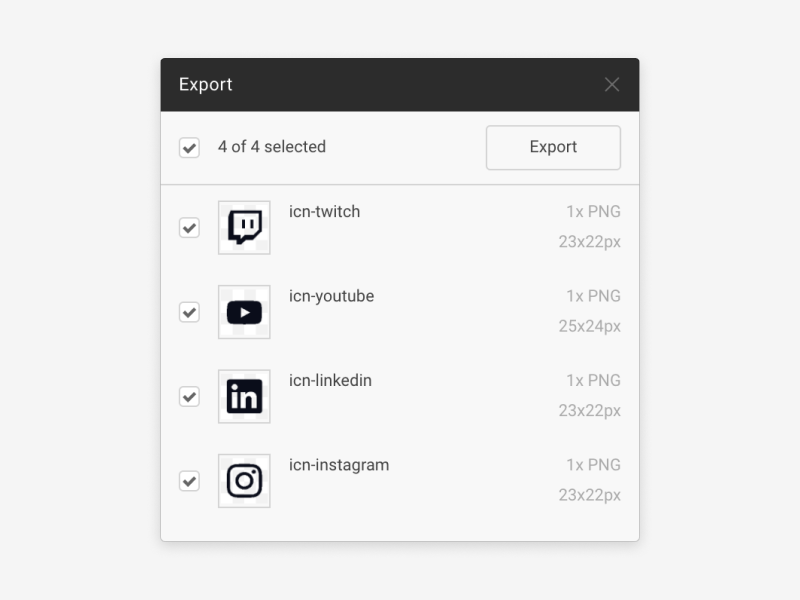
While this option can save you a lot of time, there are instances where you may need to download an item from a specific layer, i.e. an icon or a thumbnail. Again this is as easy as selecting and right-clicking on the desired layer/s.
In no specific order you can:
- Copy an item on the clipboard as CSS, SVG, or PNG: Selecting ‘Copy as’ after right-clicking on a layer. (SVG code paste; PNG is desktop-app only.)


- Export a full-res non-image: Click the name of the image on the File Name field — a blue label on Code Panel — and make sure to select the layer that uses the image as fill. (Any effects or cropping applied on the layer will be ignored.)
Side-by-Side Comparison
Assuming you need to code a website, you’ll have to make sure that the final result is as close as possible to the original design. A smart yet simple way to help you achieve the perfect result consists of opening two browser windows and putting them side by side. The first would have your local site, while the second holds the Figma file.
The trick here is to make sure the two windows have the same width as the frame you need to compare with the local site. Doing this gives you a quick and easy way to spot inconsistencies in spacing and sizes. It will also help train your design-eye — also known as the third developer’s eye.
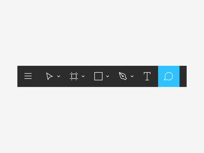
Comments and Feedbacks
You can access comment mode by clicking on the Chat bubble icon available on the toolbar. Comments will be displayed as pins on the canvas.

Viewers can read, add mentions and write comments on the file with no limitations. Currently, there’s no way to categorize comments so things could become pretty messy quickly. Luckily there’s the option to resolve or delete comments, so it’s just a matter of keeping things organized.
Further reading
- Figma — Dev Hand-Off, Quick Overview
- Figma — Sharing Files, Quick Overview
- Figma — Design Hand-Off Automation with Figma’s API
Mirko Santangelo is a Senior Designer at Paper Tiger, an award-winning, boutique digital design agency based outside of New York City. You can find him on Twitter @mirkosantangelo.