We refreshed Figma's UI: An inside look at our process


From typography and layout to color and iconography, you’ll notice a lot of subtle differences throughout the tool.
Share We refreshed Figma's UI: An inside look at our process
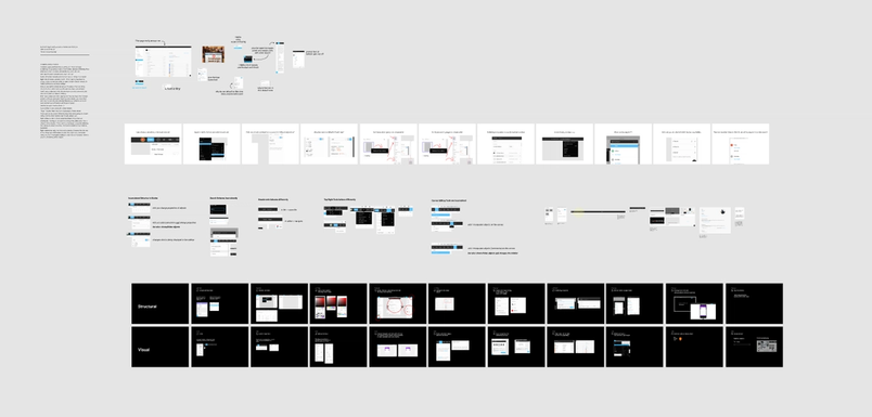
In the past half year, we’ve been working on a fresh coat of paint for Figma’s UI, and today is the big reveal. From typography and layout to color and iconography, you’ll notice a lot of subtle differences throughout the tool.
Our goal was to make this refresh as unobtrusive as possible. We focused primarily on surface changes instead of structural, and did months of qualitative and quantitative research. We had long and deep internal discussions over the details, to make sure different teams were onboard with the final product.
It’s impossible to please everyone with a redesign—and designers are, of course, particularly sensitive to this kind of thing. With this article, we wanted to give you high-level insight into why we made the changes we did, the process we took to get there, and the lessons we learned along the way. (We didn't get into the nitty gritty of the modifications though — you'll see them yourself when you open Figma!)
Sooner or later, most products have to go through a visual refresh of some sort, so we also shared a few tools and templates to help you get started on a similar journey.
It's time for a redesign
So, how do you know when it’s time to take on a redesign? There’s not usually one lightning-bolt moment, when the skies open up and Design Zeus peers down to proclaim: “It’s time!” Instead, much like a lobster in a pot of boiling water, the pressure builds slowly over time.
At Figma, we had a steadily growing sense that our UI didn’t work as well today as it did yesterday. We found ourselves inventing components on the fly—and building bespoke solutions for new features when the existing elements didn’t fit our needs. As a result, we wound up with an endless variation of tables, buttons and input controls, and multiple shades of grey, red and blue throughout the tool.
Our users notice inconsistencies and aesthetic details, and we do too. We’d discuss one off issues in casual conversations, which eventually snowballed to informal group chats.
It wasn’t surprising that we kept running up against the limitations of our original system. After all, the last time we holistically reviewed our interface, Figma didn’t have Multiplayer or Components. In other words, we built the foundation of our UI before Figma was even Figma.
Step one: Brainstorm ad infinitum

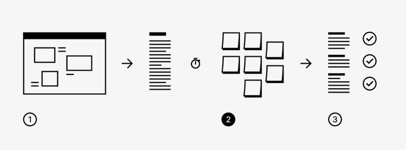
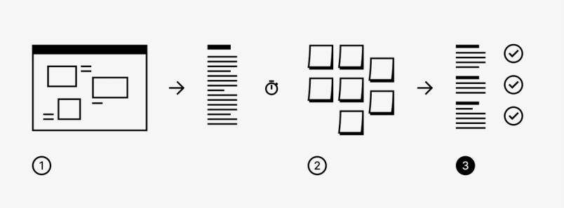
Eventually our concerns around UI coalesced and we decided to do something about it. We scheduled a two-hour brainstorming session with the entire design team where we came together to catalogue the quirks and shortcomings of our UI, as well as things we really liked.
We spent a while playing around with Figma on our computers, getting into the nooks and crannies of the product. We took notes and screenshots of everything we noticed and threw it all into (what else?) a Figma file.

After an hour or so, the team talked about different things we found, transferring the verbal notes into a shared text document as we went around the room. When everyone in the group had a resounding reaction to something (the “oh shit that’s bad” moment), we noted it, gathering early signal on what might have a large impact.
Then, we took a few days away from the information overload. Want to follow a similar process in your own redesign? We’ve created this simple brainstorming template in Figma that you can use to get started:
figma.com/file/J3XZEzlgTHP3Xj2ELcNywG
Step two: Organize and synthesize the universe

It was crucial to have that space after the brainstorm because it gave the team time to mentally process everything. Seeds of thought sprouted from the conversation, and people’s opinions evolved overnight.
We discussed it all in the next meeting. Some of us realized certain issues weren’t as important as we initially believed. Others doubled down on their causes, crafting compelling arguments for why particular issues needed to be fixed.
After all the cases were heard, we divided up the list evenly and each took a chunk of items to transfer to post-it notes, performing some ad-hoc synthesis along the way.

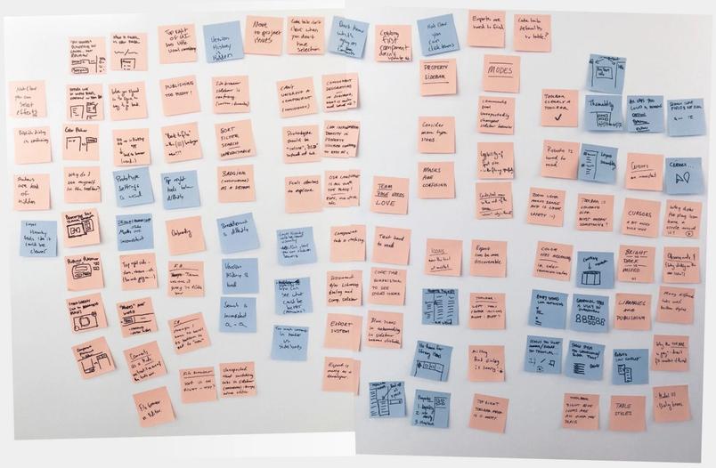
For example, if a list contained several items referring to notifications, the person transferring that list wouldn’t copy minutiae like: “The notification alert is different in this part of the UI.” Instead, on the post-it they’d say: “We need a system for how we handle notifications in the tool.” Our initial list was shortened in this way, because certain post-its would come to represent several different items.
As we put post-its on the wall, we collected them by “likeness.” For example, post-its referring to color naturally started to group together, as did post-its about legibility or use of white space. It wasn’t a perfect process by any means—there was plenty of repetition among individual notes—but that helped raise the signal to noise ratio of our most significant issues.
Eventually we deduced a handful of categories from the clusters:
- Icons, typography, legibility, color, dialogs, tone of voice, toolbar, editor vs. file browser, modes, team page, file browser, property sidebar, components, layers, history, sharing, publishing, exporting. PHEW.
We then made the mistake of trying to layer another dimension on top of that, arranging these categories along an axis from visual → foundational. Ultimately that was too complicated.

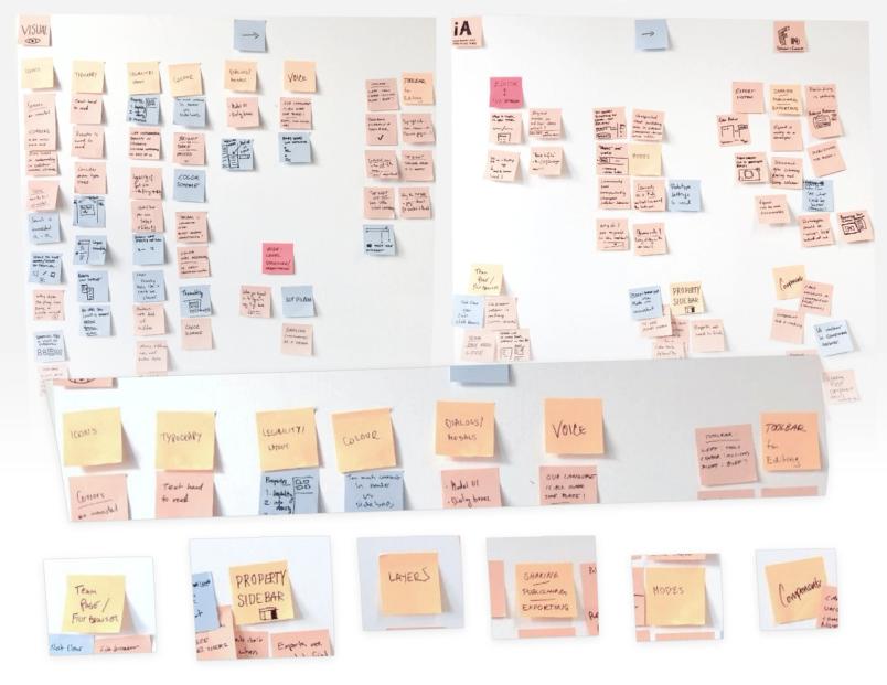
Learn from our mistake: In your own visual refresh brainstorm, don’t overthink your organization. Try to find categories that make sense and aren’t too abstract. For example, the ‘personality’ of the product is way too high-level of a theme, because almost everything fits into that. Don’t make your categories too specific either (like focusing solely on one type of dialog box).
At the end of the meeting, each Figma designer took one of the themes and typed them back into that same shared text document, now neatly organized by category.

Step three: Reducing the scope

We knew we collected far too much in our brainstorming meetings. Fixing all those things could take us two years or more — a cost we couldn’t afford as a quickly growing startup.
So, in our third meeting we decided to scope the project with a rather simple thought experiment: If we only had a week, what’s the one thing we’d fix? People in the room immediately had answers, which gave us clarity on the right direction.
We realized that surface-level changes would solve a lot of the most pressing shortcomings in our UI. When we looked in detail: “Why doesn’t this work here?” the answer would often be something along the lines of: “We never built a pop-up window with multiple options, so we customized many different pop-up windows to meet our needs.”
Our componentry no longer supported the things we were doing, because the things we were doing had changed so much since 2015.
At the same time, we realized that the fundamental structure of Figma — in terms of the information architecture — worked pretty well and we had fairly few issues with it. Yes, perhaps we could transition between comments mode or other modes more seamlessly, but those weren’t “pants on fire” problems as it were.

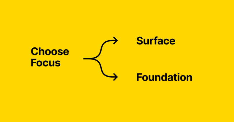
If you’re considering scoping your own redesign project, it’s worth analyzing which path to take upfront. There are three options to consider:
- Surface: Focus on how things appear in the UI, such as input controls, icons, typography, button behavior, and so on.
- Foundation: Focus on how things fit together and the underlying mental model, like modality and information architecture.
- Hybrid of surface and foundation: You could make both surface-level and structural changes, but only for part of the product (otherwise you’re doing it all).
At Figma, we felt like we’d have a broader impact if the refresh touched the entire product, so we chose path #1 — focus on improving the UI surface.
To narrow our scope even more, we decided roughly how much time we wanted to spend on it. We were willing to devote 3 people full-time, from engineering, design and product management, for a 5-month span. That constraint helped us make a lot of choices upfront. Namely, we decided that this was not going to be a complete UI overhaul, but rather a visual refresh. A fresh coat of paint or new furniture but no moving of walls.
Of course, it was painful to make that call. As designers our job is to care about these things (and as designers crafting a tool for other designers, we know you notice all the details). But we ultimately couldn’t solve it all given our time constraints. This was, perhaps, the biggest lesson of the UI refresh: We had to be ok with letting go.
Learn from our experience: When a group of designers starts talking about a wish list of UI changes, things can get out of control, fast. Unchecked tinkering can be a never-ending task, so one of the most crucial steps when you’re contemplating a redesign is to figure out how to scope it. Ask yourselves:
- If you only had one week to tackle this project, what would you fix?
- Are your biggest issues on the surface, or are they built into the structure of your product?
- How much time are you willing to spend on this?
Next, research what you’re in for
Once we decided to stick with a surface level refresh of Figma, we spent the next couple weeks doing research to prepare. We assigned working groups of 3-4 people to tackle each of the main themes synthesized from the post-it note exercise:
- Color
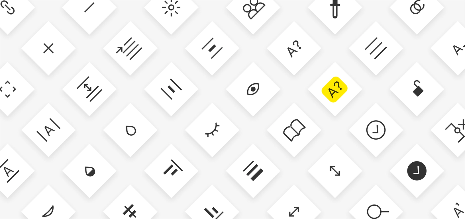
- Typography and iconography
- Spacing, grids and metrics
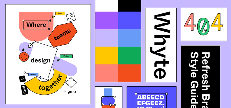
The goal was to explore the ideas and directions possible in each category by studying how we do things currently in Figma and how other software handles similar challenges. Each group created a Figma file of findings, with their own proposal for changes. For example, the team working on color proposed that we increase the contrast or depth of “Figma blue” so it would be easier to read in combination with white.
They all kept in mind four main goals for the project:
- Modernizing the UI. Times change and expectations change, that is simply a fact. What feels dated about our UI? How do we separate out trends from legitimate progression and improvements from what feels current and contemporary?
- Legibility & Accessibility. There are a lot of methods and philosophies for analyzing readability and contrast. We decided that what was most important was to pick one method for color contrast and be consistent, and we went with WCAG2. Typography was another topic in this category.
- Simplicity. As the product has gotten richer and more complex, it was time to look at how we could reduce the number of patterns in use. For example: Did we have the right kinds of user input controls? Did our UI labeling system allow expressing hierarchy in a clear and concise way? Did we have too much going on in the toolbar?
- Usability. We wanted to focus on ease of use and understanding, so we looked at discoverability in the product. Could people find the components sidebar with just an icon in a corner? Is it easy and straight-forward to navigate between pages of a document?
There was also an unmentioned goal: could we move cheese without people noticing in a negative way? If users couldn’t immediately say what changed, maybe that was a sign that we had pulled the visual refresh off well.
Now comes the real work
After a few weeks, the teams got together again and presented their findings. We discussed proposed suggestions and agreed on the general changes we wanted to make (but didn’t determine prescriptive solutions). For example, we agreed: “This current Figma blue isn’t working,” but we didn’t decide what blue to use instead.
Once we’d agreed on those high-level conclusions, we assigned one specific designer (me!) to champion the UI refresh project, and one front-end engineer to build it.
It was the right call to involve the whole design team in this early brainstorming and prioritization process. That way, everyone was bought into the decisions we implemented and had context on the changes coming down the pipeline.
The rest of the project proceeded how you might imagine. Although only one designer was dedicated to it full-time, we did daily check-ins with the rest of the design team, plus more formal design crits three times a week. We talked about the work on an ongoing basis so no one was caught off guard.
Living with your decisions
With a project like this, you have to live with your designs to know your decisions are right. So early on, we set a tight deadline to finish a smaller version of the refresh that we could test internally. (Figma relies on a private staging environment in our day-to-day work to help us catch bugs before we ship to the public.)
Specifically, we made typography, color and grid changes to the “base layer” of the UI in the editor — those are the parts which are always on screen, like the toolbar and properties sidebar. Once our engineers built it, we started using the changes internally to see what worked as expected and what...didn’t.
Another lesson: If you choose to dog-food your own redesign in stages, be prepared for things to get messy. For example, we would make a change to part of a toolbar but nothing else. Understandably, it would look frankensteined until we shipped other aspects of the refresh. We recommend you over-communicate to the rest of the company what they should expect via in-person meetings and Slack/email messages.
After making more progress throughout the product, we conducted several phases of user research to ensure our refresh didn’t cause any big problems or issues. We knew people wouldn’t be thrilled with the shift — in many products, redesigns are often met with skepticism from the existing community. But we wanted to make sure we didn’t actively harm our users with the changes.
There was a lot more to this project that I wish I could share with you, but it might take another 3,000 words to do so.
For now, we’ll leave you with the most important lesson of all. If you’re undergoing your own UI revamp, set up your project with a clear and doable scope...lest you toil forever in the land of the redesign.
I hope you enjoy the updated face of Figma :–).
Rasmus is a designer and software painter. He's worked as a creative- and art director, product designer and software engineer at a number of different companies, large and small. He was the founding designer at Spotify and went on to build products at Facebook and Dropbox before joining Figma as an early principal designer. At Figma he was foundational in developing many of the underlying models that power how the tool functions today. He is also the creator of the typeface Inter, which he made free and open sourced for the community. In addition, his photography has been published worldwide in publications like The New York Times, The Guardian, Wired, BBC, Forbes and The Economist.