Groups vs. Frames

Do you have trouble knowing when to use a frame or a group in Figma? They are both containers for housing objects, but they have their own unique properties and use cases. It's not always obvious how they differ from each other, so to help distinguish between them I wrote up this primer.
Groups
Similar to other design tools, groups in Figma allow you to combine multiple elements together as a single top level layer. A group's bounds are determined by its child elements, so resizing or moving those elements will cause the group's bounds to adjust automatically. You can create a group by selecting objects and pressing: ⌘ + G (Mac) or Ctrl + G (Win).
Making a group is non destructive—meaning it won't flatten or permanently combine the layers together. At any point you can ungroup the elements, by pressing: ⌘ + ⌫ or Ctrl + Shift ⌫ (Win).
Groups are really useful when you want to combine similar items together and manage less layers within your design. For example, you may have a selection of company logos that need to stay together. Grouping them is a great way to combine them into one single more manageable layer—clicking on any of the elements within your group will select the entire thing and allow you to move or manipulate it as a single object on the canvas. If you need to select a particular child element within a group, you can do so by double clicking.
You can also leverage features like Smart Selections inside a group to adjust the spacing between elements. In the example below you can see the group's bounds auto adjust to match the overall dimensions of the child elements when the spacing changes.
When you resize a group, its child elements will scale as you would expect vector artwork to scale. However effects, strokes, and type sizes will not scale. If you wish to scale these properties too, use the scale tool (K). If you want to apply constraints to define how elements will be resized, consider using a frame instead. Constraints applied to elements will always be relative to the closest parent frame—not relative to the bounds of the group. More on that as we uncover frames!
Frames
At the most basic level, what you may think of an "artboard" in other design tools is actually what we call a frame in Figma. We see frames as a foundational element for your designs that can act as a top-level container (like a device viewport) and/or represent areas or components within your design. Frames, and the ability to nest them, are an integral part of creating dynamic layouts in Figma.
Before we dive into the behaviors and properties of frames, let's quickly cover the three different ways you can create a frame.
- Select the frame tool (
F), and choose a preset device size from the properties panel on the right. This will place a new frame on your canvas set to the exact dimensions of whatever device that you picked. - With the frame tool selected, click and drag to make a new frame at whatever size you want.
- Similar to grouping, you can select existing elements on the canvas and contain them within a frame by pressing:
⌘ + Opt + G(Mac) orCtrl + Alt + G(Win).
If you wish to do the opposite, and remove the parent frame container, the keyboard shortcut is the same as un-grouping: ⌘ + Shift + G (Mac) or Ctrl + Shift G (Win). Now let's dig into their unique features and uses.
Frame sizes
Frame sizes are set independently from their child elements. If you reposition or scale child elements inside a frame, its bounds will not auto-adjust. If you want the dimensions of the frame to readjust to the contents, you can click the "Resize to Fit" button in the properties panel on the right.
It's also important to note that components in Figma behave in exactly the same way as frames. You can convert a frame into a component to re-use it in other places, and if you detach an existing component instance, you will see that it gets converted into a frame.
Resizing with constraints
Frames and groups differ in their behavior when resized. As mentioned, groups will resize in the way you would expect a group of vectors to scale. A frame's bounds will be resized independently from its child elements; however, you can define constraints which affect the resizing behavior of those child elements relative to their parent frame. By default, these constraints are set to "Top" and "Left."
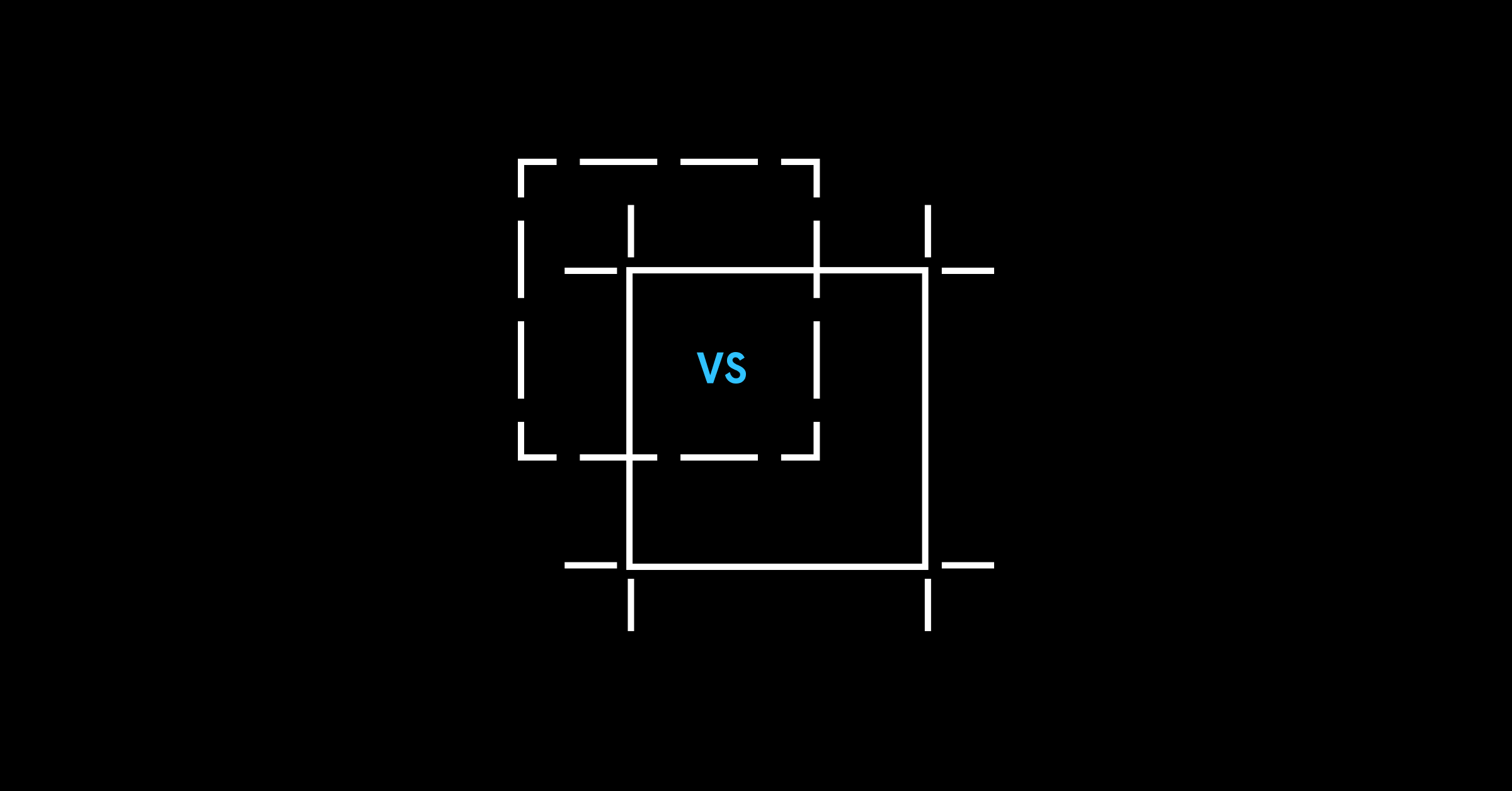
Setting up custom constraints can be really useful when you want items to maintain the size and position relative to the frame, which is usually the behavior you want when creating responsive components. The example below highlights the differences between groups, frames, and frames with specifically defined constraints.
Quick tip: If you want to ignore your constraints when resizing a frame, hold ⌘ (Mac) or Ctrl (Win) when dragging the frame.
Overflow content
Because the bounds of a frame can be adjusted independently of its children, the "Clip Content" feature (accessible in the right-hand properties panel) can be used in conjunction with this in many different ways. Here are some common examples:
- Hiding out of bounds content: By enabling "clip content," any part of an element that falls outside the bounds of the frame will be hidden.
- Showing out of bounds content: By disabling "clip content," you can enable elements that fall outside your frames' bounds to remain visible. For example, if you wanted to create a frame that contained a pull-quote with hanging punctuation, you may resize your frame so that its bounds are aligned to the left edge of the text box, leaving the quotation mark outside of the frame's bounds. In situations like this, it can make it much easier to align objects in your design.
- Reveal additional content: By setting up proper constraints and enabling "clip content" you can build frames and components that reveal more content when they expand. For example, you have a drop-down menu that gets used in multiple places with varying numbers of options. This gives you an easy way to simply resize a frame to reveal more menu items.
- Overflow content in prototypes: Elements that overflow beyond the boundaries of a frame can be set to scroll inside of a prototype. For example, you are nesting a frame in your design to house a scrolling carousel. You can configure the overflow behavior so that it is scrollable when viewed in prototype mode.
Grids
Layout grids are unique to frames and can be applied to any frame or component in your design. This is really useful because sometimes you'll want to have areas of your design that have their own independent grids. Resizing constraints in Figma can work in conjunction with the layout grids as well. In the example below, you can see that there is a 2-column grid on the top level frame, and a nested secondary frame for the tab bar, which has its own 3-column grid. With the constraints setup, as the top level frame changes in size, the resizing behavior of child elements happens relative to the layout grid.
Summary
You can use groups and frames in many ways (together or separately) to achieve different behaviors.
TLDR — use a group if:
- You want to combine multiple objects together into a single manageable layer
- You want to group elements together that will maintain a fixed relationship when scaled (ex: a logo or symbol made up of multiple shapes)
- You want the bounds of the group to auto-adapt to the child objects as you manipulate them
TLDR — use a frame if:
- You want to control the frame size independently of its contents
- You want to define the resizing behavior of child elements
- You want objects to be clipped by frame bounds, or reside outside its bounds
- You want nested scrolling behavior in your prototype (ex: horizontal carousel, or a map that you can pan vertically and horizontally)
- You want to use a layout grid within it
For more details about using frames and groups, check out our Help Center article.
If you want to see how any of the examples in this article are created, click here to add a copy to your Figma.