On pitching and presenting


Student Fellow Abigail Africa shares her tips for making and delivering a great pitch: understanding your audience, presenting with confidence, and why storytelling is key.
Share On pitching and presenting
Abigail Africa, one of Figma's inaugural Student Fellows, is currently taking a gap year Student Fellow Abigail Africa explores what it means to go “back to school” this fall. In her letter, she shares advice from mentors, reflects on the value of education, and invites other students to join the conversation.

An open letter about my gap year
On the first day of college, the dean of my program brought all the freshmen to hear from a Silicon Valley Bank investor, then informed us that we’d be presenting to him immediately after. With just an hour to prepare a pitch on Pet Rocks, I did what was familiar: cited market statistics, researched the history of the toy, and made what I thought were a few clever points about how nostalgia drives sales.
No dice. The investor smiled blankly and moved on to the next presentation, crowning a group of my classmates as the winners. "It's pretty simple," he said. "Some of you created apps to accompany the Pet Rocks, and some of you pitched big marketing campaigns. Only one group told a story."
I used to think that storytelling was reserved for social situations, like making my friends laugh or carrying the conversation at a dinner party. In spending the last three years presenting my ideas to design clients and preparing to pitch a startup, I know now that storytelling also has an important place in my coursework and the professional world. Whether you’re presenting in class, running a team meeting, or looking for a new job, great storytelling can help you present clear ideas, pitch solutions to complex problems, or carry an interview.
While many of us assume that storytelling is an innate ability, I’ve since learned that it’s a skill that you can refine and perfect over time. Here, I’m sharing what I’ve learned along the way, including how to develop the three main pieces of a presentation: what you say, how you say it, and crafting visuals to bring your ideas to life.
Content: what you say


Visuals and presentation style certainly matter (more on that below!), but they’re in service of the story you’re telling. What you say is the most important part.
Building audience trust
Before I start developing a presentation, I take a quick account of who might be in the room. Building trust is central to making an audience think, act, or feel differently, and to do that, you have to show your audience that you understand them. Here are some questions that I try to answer as I prepare presentations:
- What do they care about? Consider their challenges, needs, and goals.
- Why are they listening to your pitch?
- What do they have to gain?
- How do they communicate? Is there industry-specific language I need to incorporate?
Structuring your story
My presentations usually hinge on a story that shows the audience that I truly understand them. To that end, I learn everything I can about who might be in the room, articulate a problem statement that resonates with them, and introduce the solution. To frame the problem statement, my design strategy professor recommends completing this sentence: "A [stakeholder] who feels [feeling] about [a task] needs to [act] but [faces an obstacle]."
Then, introduce your solution, reinforcing how it solves the problem as you explain how it works. It's helpful to recycle language from your problem description into this section, or recall characters or events from early examples. End on a Call-To-Action (CTA) that asks the audience to act in a certain way: approve your project for further exploration, fund your work, provide mentorship, or even think differently.
Delivery: how you say it


While your words make your visuals matter, your tone, demeanor, and how you hold yourself can transform a series of slides into a convincing pitch.
Raise (and lower) your voice
After listening to my own recordings, I learned that my voice inflects less drastically than most others' voices, even when I'm really excited. In-person, I psych myself up a little bit: I drink coffee right beforehand, wear heels that make me stand up taller, and shake out my limbs in the bathroom. During the presentation, I gesture with my hands, let my feet move around, and lean forward when I need to emphasize something.
Humans like to mirror authentic emotion, so if the audience feels your excitement, it’s more likely that they’ll be engaged as well. As you get subtle feedback from your audience—based on eye contact and body language—you can adjust your presentation style accordingly. If it seems like people in the room are zoning out, that might be a cue to change things up: move around the room, speak a little louder, or try to make eye contact with a couple people in the audience.
Adjusting to virtual presentation mode
Presenting remotely can be daunting. Beyond the potential for technical difficulties, you might find that your usual voice intonation and hand gestures don’t translate as well virtually. To see what I'm talking about, try spending five minutes reading aloud to yourself in private, recording your voice. Listen to your recording, and you'll have a sense for what the audience hears when you’re presenting.
Whether it’s an internet hiccup or participants have their video and audio turned off, video conferencing limits presenters’ access to immediate emotional feedback from the audience. Here are a few ways I adjust to Zoom meetings:
- Stand while you present (you can stack your computer up on some books)
- Pin your video to the screen and amp yourself up by watching your own performance
- Add sticky notes to your computer reminding yourself to smile and raise your eyebrows
Repeat yourself
When I first started presenting, my dad told me that he repeats himself three times whenever he has something he really wants to drive in during a sales pitch. To make things more cohesive and memorable, pair verbal repetition with visual motifs—small tweaks to the same repeated diagram, repeat images, or repeat words on the screen.
Dress for movement
Wear comfortable, flexible clothing so that you can move and gesture in it without worry. Wear what makes you feel confident. If you have a go-to outfit that makes you feel your best and stand tall, put it on! Just make sure to keep temperature in mind, especially if it’s a new-to-you environment.
Visuals: how you show it


While a deck might be beautiful in its own right, its job is to reinforce the words you say aloud. Slides should illustrate your argument, add meaning, and anchor your audience's attention in evidence or examples that support your speech. I build my decks in Figma, where I can manipulate and replicate design elements across slides in a few clicks. Components, set colors, and set styles are great tools for efficient slide design, especially when I work on decks with others.
Slide simplicity
There's a design principle called visual economy that basically means useful simplicity, cutting out everything that distracts from the essential parts. This has been one of the most consistently useful guiding principles for me over the past few years. Your visuals do not need to be wildly artistic or complex. Below is a slide I used in a recent presentation on writing:


Since I had a lot to get through in the talk track, I wanted the accompanying visual to be simple and relevant.
While simple is usually better, that doesn't always mean fewer slides. I like to declutter slides that contain more than two separate pieces of data or information, even if that means doubling the number of slides in your deck; I recently gave a 6-minute presentation with 54 slides. Here are some general slide-making rules I swear by:
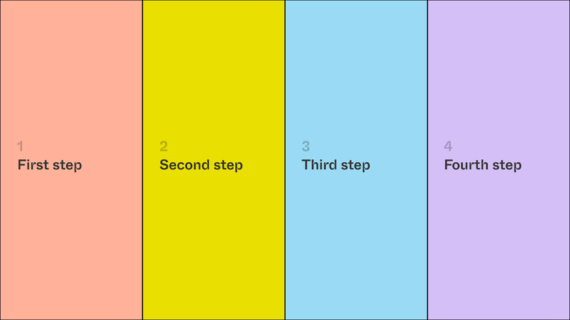
If you're presenting multiple pieces of related info, align them laterally instead of stacking them like bullet points:

The TED Talk method of using one-word or wordless slides is also a popular trick, especially when you’re trying to drive home a point:

Alignment and spacing
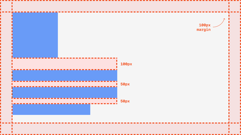
Meticulous attention to alignment and spacing can make it significantly easier for your audience to see and understand your slides. If you choose to have repeated elements on every slide (page numbers, subtitles, etc.), make sure that they're in the same position from slide to slide, pixel to pixel. In addition to distracting the audience, spacing that looks even a little off can make the presentation feel less polished.
Here's an example of what it looks like to set consistent margins and spacing in a slide. My favorite way to enforce margins is to create a slide template with a built-in rectangular clipping mask to crop the margins automatically:

Typography
Excellent typography sets great presentations apart from good ones! Here are the basics:
- A distinct typeface can give your presentation a lot of character, but readability is your top priority (before you make any final decisions about your typography, see the next section on accessibility).
- Even if you don't own any typefaces, a few hours' research on free web fonts can help your typography go from generic to polished. An old design trick is to mix two typefaces; Typewolf is great for helping you find perfect pairs.
- For deeper dives: there are free type courses online and a few good Medium publications that cover the fascinating world of type.
- If you're looking for a great free sans-serif font, check out Inter by Rasmus Andersson, a previous Figmate. Inter is a beautiful typeface that's already built into Figma and Google Docs through OpenType.
- Speaking of OpenType, Figma’s resident typography enthusiast, Marcin Wichary, wrote an ode to OpenType—it's a great place to dive in.


An ode to OpenType: Fall in love with the secret world of fonts
In Figma you can now turn on additional ligatures, customize the style of digits, switch to alternative letterforms, and make use of adjustments available in many of today’s fonts.
Accessibility
Accessibility is key, and there are many guides out there (like this one) on accessibility in presentation design. Here are some other guidelines to get you started:
- If you're presenting in a classroom, raise the text contrast across your slides and underexpose your images.
- Sunny rooms fade projections and add glare to LED displays, so black will look gray, white won't be bright, dark colors will look diluted, and bright colors will look like pastels.
- If you're presenting in a large room like a lecture hall or a long conference room, where it may be difficult to see the screen properly, you can share a link to view the presentation before jumping in, so that people can follow along on their own devices.
If you're giving a virtual presentation, you have a little more leeway, because people can customize their viewing experience and read at a close distance. Just make sure to check in at the beginning of the presentation to ensure that everyone can hear you and see your screen.
Imagery
Photography, illustrations, icons, and videos can all help you tell a compelling story, but it can be overwhelming to figure out where to start. Here are some considerations:
- Every piece of imagery either contributes or distracts from your main story, so make sure that your images add meaning, not decoration. A common example of decorative imagery is iconography. While it's easy to gravitate toward icons because they're so present in everyday UI, remember that no one is clicking on anything in a pitch deck.
- Take advantage of free design resources and free-use photography. Figma even has a plugin for this! Just make sure to give credit, either by adding a caption, linking to the resource somewhere on your slide, or dedicating a slide at the end of your deck to citations.
- Depending on your audience, they may respond well to edgier imagery. Think: memes, pop culture references, and screenshots of news articles can all work. Just make sure that your references are relevant, and when in doubt, err on the side of caution—it’s not worth alienating or offending anyone in the audience for the sake of a meme.
Color
In most cases, sparingly used accent colors can add polish to your slides. You can use color to highlight specific words or data points, or to help tell your story in more subtle ways: In one presentation, I changed background colors gradually to parallel an evolving concept. I've also used accent and background colors to separate topics from one another. In some cases, decks look better with a shocking amount of color in them. Be creative and have fun with color, but make sure it doesn't interfere with readability.
Visualizing data
Facts and figures can offer powerful supporting points. Just remember to present them in context of the broader story. As you think about what data to include, prioritize data that can be represented visually, like growth over time. For inspiration, I like to reference data-centered journalism from The Pudding, Our World in Data, and visual stories and graphics from The New York Times. Graphics Team, who regularly publish clear, data-oriented stories.
Where to go from here
Most of us tell stories in everyday life, without even realizing it. I’ve started to be more intentional about practicing whenever I can, and I rely on these three habits:
Tell stories in everyday conversation
These are some ways you might practice telling stories in different social settings:
- Think of every conversation as a presentation or a pitch of some idea. What storytelling structures are most successful? Why?
- Even in casual conversations, pay keen attention to the person you’re talking to responds. Over time, you'll get better at reading people, and adapting your storytelling style accordingly.
- Practice being precise with your words, even if it means an awkward mid-sentence pause as you find the right phrase.
Consume great storytelling regularly
Seek out great storytellers in podcasts, TED talks, books, and publications. Hearing from professional storytellers—writers, journalists, podcast hosts—can help you refine pacing, intonation, and structure. I like podcasts that focus on intimate storytelling (like The Memory Palace or Modern Love) and publications that distill complex ideas into clear and concise writing (like The Atlantic and The New York Times).
Keep track of things well said and things well presented
I collect my favorite sentences and phrases in a Notion page. Beyond reminding me what “good” looks like, the document offers inspiration when I’m stuck on a word or phrase. I also dedicate a file in Figma to screenshots of slides from great visual communication, like the decks and templates from Yuhki Yamashita, VP of Product at Figma.
Remember that storytelling is a skill, and it comes with practice. Beyond the more practical tips that I shared, becoming a better storyteller is also about learning and developing your own voice. More than anything, work on finding a style and approach that feels right—whatever that looks like to you.