Analogous Colors
What are analogous colors?
Analogous colors are like best friends who sit really close to each other on the color wheel. In visual design, the pairing creates a seamless flow that’s easy on the eyes, often involving a main color and its supporting colors.

The design concept will work well with most ideas, especially if you’re going for a peaceful, smooth effect. Designers looking to instill a sense of calm and trust should try their hand at implementing analogous colors into their next project.
In a world full of bright lights, loud noises, and clashing, different colors, analogous schemes serve as a pleasant reprieve. Enjoy learning about this delightful approach to color combinations.
How to use analogous colors in modern design
The idea of peace and relaxation seems nice, but how can you apply color theory to your product designs? You're building an app, website, or cutting-edge piece of technology. How can analogous colors enhance your modern designs? Here’s a step-by-step guide:
1. Consider the tone of your product
First, consider the tone and voice of the product you are creating.
Do you want to be revered as prestigious? Purple is often a color linked to royalty. Think about brands like Cadbury and Hallmark as a great example of that.
What if you want to just promote a fun, positive outlook? Yellow cheers us up with its sunny hues. Think about the McDonald’s arches and their happy meals.
What feeling do you want people to associate with your brand base color?
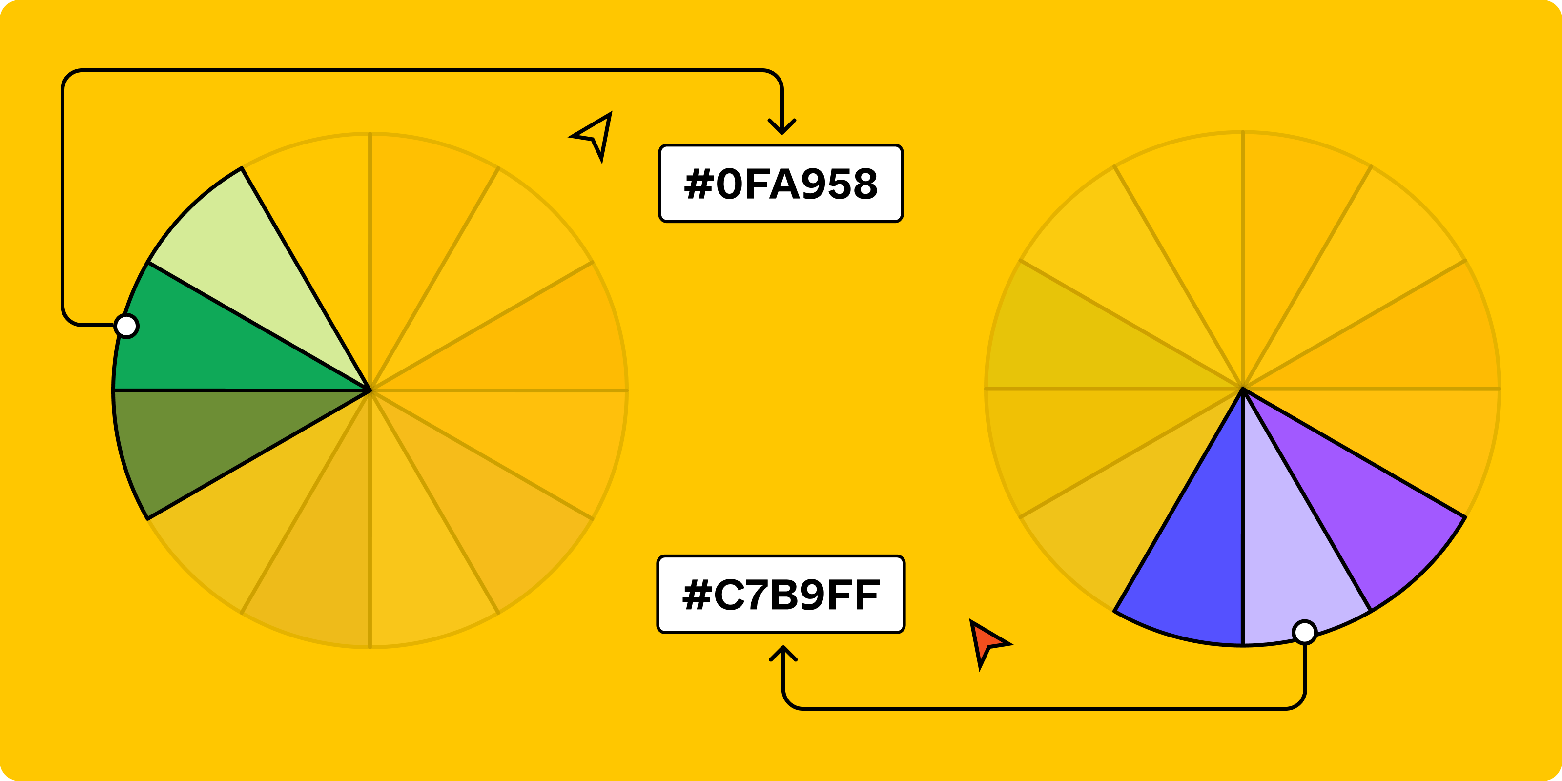
2. Choose your place on the color wheel
Here’s where you’ll start building your analogous color scheme. Now that you know the right feeling you’re going for, it’s time to pick the right color.

Building an analogous color palette isn't difficult, and tools like Figma's color wheel can be incredibly helpful. Select your primary color—the dominant color associated with what you uncovered in the previous step. From there, you can choose to pick complementary, triadic, analogous, split, square or monochromatic colors.
3. Get creative and experiment
Don’t confuse simple with boring. There’s no reason your set of analogous colors has to stick to basic hues like red-violet, blue-green, or red-orange. Feel free to throw in some pastels, neons, and various tints and shades into the mix.

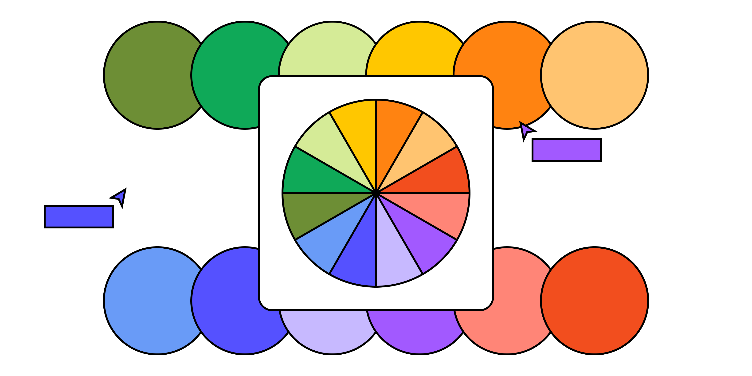
Experiment with color combinations and just enjoy the process! Keep mixing, creating, and figuring out what works best with your users.
Word to the wise: Simple can be boring, so it’s important to find a combination that suits your mission, personality, and company culture. It’s an art more than a science, so don’t get discouraged if you don’t get it right the 1st (or 11th) try.
Practical applications of analogous colors
Analogous color schemes offer designers a reliable path to creating visually pleasing and emotionally resonant projects. Whether you're crafting a logo, building a website, or spicing up your social media assets, analogous colors can be your go-to palette for a cohesive and impactful design. Read on to discover how to make the most of these color combinations in various design contexts.
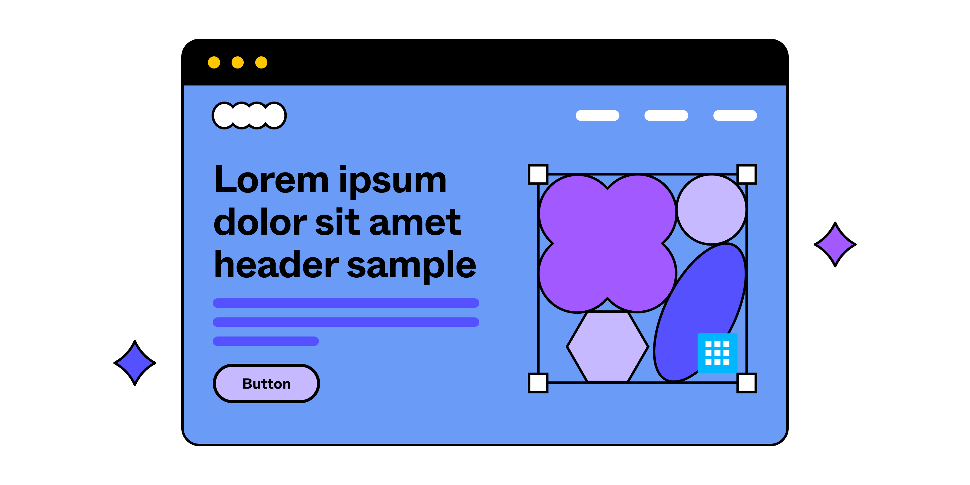
1. Logos
Analogous colors are ideal for logos, creating a unified and pleasing look that can also subtly convey brand values. For instance, calming blues and greens might suit a wellness brand, while warm reds and yellows could work for a food business. The scheme's simplicity allows for flexibility in other design elements, like typography, without overwhelming the viewer.
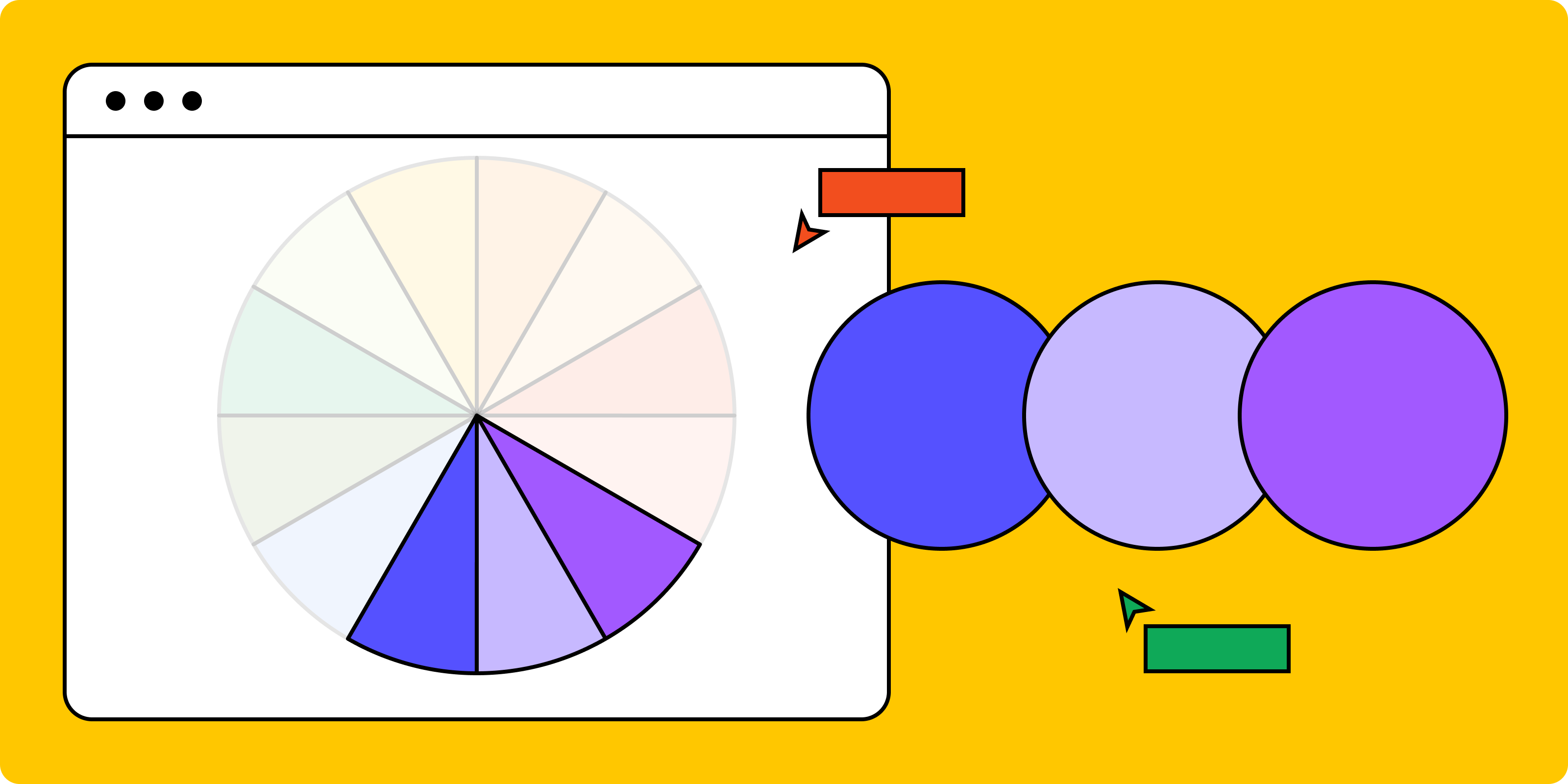
2. Website design
Analogous colors are a very easy way to promote a sense of flow on your website. Rather than looking for bold, clashing colors, designers can use a more understated scheme to promote a sense of security and serenity.

3. Social media graphics
Utilizing analogous colors in your social media graphics can bring a consistent and harmonious feel to your brand’s online presence. Whether it's Instagram stories, Twitter banners, or Facebook posts, analogous colors help maintain a cohesive look across various platforms, making your brand instantly recognizable.
Sign up for Figma today
Ready to create harmonious color schemes? Explore Analogous Colors with Figma today!
Related Terms
We enjoyed exploring this topic with you. Want to keep going? Pick one of these related terms to read next:
A. Gradient, noun:
As the perfect transition, jump into this definition of gradients. You’ll learn about how to use them in modern design… Read the full definition »
B. Skeuomorphism, noun:
Apple taught us the simplicity of effective design through this nostalgic technique… Read the full definition »
C. Vector Graphics, noun:
This scalable image file is a favorite for many reasons, especially if you’re an illustrator… Read the full definition »