What to expect when moving from Sketch to Figma
Getting started

Moving sucks! Whether you're moving across the country or down the street, it's never fun. The biggest pain isn't necessarily the packing, cleaning, or unpacking —instead, it's the new routines you're forced to adopt. You're probably still going to store your silverware in a drawer in the kitchen, but now that drawer sits to the left of the sink instead of the right. It takes time to retrain your muscle memory that tells you to reach to the right.
In a similar fashion, moving from a tool like Sketch to Figma can be a bit of a struggle at first. The UI is slightly different, the keyboard shortcuts aren't all the same, and there are some core differences that take a little while to get used to. I remember when I switched to Figma, I had to work on a real project for a solid week or so to finally feel comfortable with it.
So, if you've recently made the move to Figma (or are considering doing so), I hope this article helps you understand the differences and similarities. We want Figma to feel like home as quickly as possible for you.
The nice thing about moving from Sketch to Figma is that you get to keep all of your old designs. We have an import feature that allows you to bring in individual Sketch files into your Figma account. It keeps your layers intact and even brings over your symbols as components. (More on this in the tips section below.)
Here's how to do it: Click the import button found in the file browser or simply drag and drop a Sketch file in Figma.
Note: Depending on the size of the Sketch file it may take a few moments to import.
Once it's done importing, you can click on it to open, and voila! All of your pages, layers, text, shapes, etc. should now appear in Figma, exactly as they were in Sketch. With that being said there are a few things that we unfortunately can't bring over, like Sketch styles, due to how different our implementations are. For more information on what will or won't import from Sketch, check out our help center article.
What's different
Figma's UI should feel familiar to Sketch users for the most part, however there are some core differences with our information architecture that are important to grasp early on to help ease the transition.
Sketch artboards => Figma frames
In Figma we have a parent object called a frame. Similar to artboards in Sketch, frames are used to contain content. However, unlike artboards, frames have default constraints and can be nested within each other. Think of them more like powerful groups or divs as opposed to just artboards.
Frames also have a few additional properties like a background fill and multiple layout grids (more on that later). They also give you the ability to clip or unclip nested content. We offer frame size presets based on devices (Google Pixel 2 phones, iPad mini tablets, Apple watches, etc) or use cases (letter paper, Instagram post, Twitter header image, etc). You can find all of these settings in the properties panel on the right.
Creating frames in Figma is super easy too, in fact you can still use the shortcut "a" from Sketch to create them. You also have the option to use the shortcut "f," or the dedicated frame tool which is located just to the right of the move tool.
Sketch symbols => Figma components
In Sketch, symbols are a great way to reuse elements throughout your design files. In Figma, we have something similar called components. The ideas underpinning components and symbols are the same, however our approach has a few unique differences.
When you create a symbol in Sketch, it adds it to a page in your file that acts as a container for all of your main symbols. You can then use instances of these main symbols in other pages throughout the same document. Editing these instances (like changing the text of a button component) is done via the overrides panel on the right. If you need to edit the main symbol, you'll have to go back to the symbol page and edit it there. Essentially, in Sketch, main symbols and instances can't live in the same page, which can sometimes make it difficult to edit symbols without the proper context.
In contrast, Figma lets you manipulate the instances of your components directly on the canvas. Want to override the color of your button in an instance? Just change the color. Need to tweak the text? Double-click the text object and do it! No need to navigate to an overrides panel to make simple changes. While we might be a bit biased we believe this method is more flexible and makes creating and editing components/instances much simpler.
Another benefit to our implementation is that main components and their instances can live on the same page. This makes creating and editing components much easier because you can see, in context, how the changes affect all of the instances. In my initial design creation phase (before I organize and publish my components to the library), I find it super helpful to have components and instances next to each other on the canvas.
(That said, most design ops teams prefer to keep all their main components in a separate file. That way, they can control the edit permissions for the design system that's used by the whole company.)
Libraries
Both Sketch and Figma have libraries, which make sharing and consuming a collection of components easier. In Sketch, libraries are just .sketch files that you can specify as a library within the preferences panel. Then you can access the symbols contained within that Sketch file in other files.
Figma libraries work a little differently. First of all it's important to note that the team library is a paid feature that's part of our Professional plan. You can still create components on the free Starter plan, you just can't access them across different files. Again I'm biased, but even before joining Figma I paid for the Professional plan as a freelancer to use the team library. Totally worth it! You can learn more about our pricing here.
The team library in Figma allows you to publish your components, and then access them across different files and projects. Unlike Sketch, when you create a library in Figma we publish only the components from the file (not other elements). In fact, you can specify exactly which components you want to publish.
If you don't want a particular component to get published (maybe it's not finished yet, or you only plan to use it in one file), just add a period at the beginning of the component name. Alternatively, right click it in the assets tab in the layers panel and remove from the library.
To get started with publishing components, go to the assets tab (in the left-hand layers panel in Figma) and then click on the Team Library button. Here you'll see the name of your file and a publish button. After publishing, you can add an optional description (I like to think of these as commits). Put in details that will help you keep track of what you're changing and why.
Overall, you'll improve your workflow with components a lot by taking advantage of Figma's library functionality, especially if you're part of a team. If you want more information on components my colleague, Tom, wrote a best practice guide that goes into much more depth about how to name, structure, and use components, libraries, and styles (which we'll go over next). I definitely recommend giving it a read.
🔎 Pro tip: To make sure a component doesn't get published, just add a period at the beginning of the name.
Styles
In Figma we currently allow you to create four different types of styles — grid, color, text, and effect. They can be used locally and/or published to your Team Library.
Like our component and library functionalities, Figma styles work a little differently than Sketch's do. Instead of bundling certain properties together, like color and text, we broke them apart into their own unique styles. We found this modular approach made it easier for designers to adapt styles across different use cases because the styles themselves were more flexible. In contrast, in Sketch (at least up until recently), you would have to create multiple text styles for each color and alignment.
Creating styles in Figma is done by simply clicking on the little square icon made up of four dots. You'll find this button under the text, color, effect, and grid sections within the properties panel. This brings up a dropdown with all of your current styles that you can select from. To create a new style, just click on the plus button in the top right corner of the dropdown. From here a modal will appear that will let you name and create the style.
You can learn more about best practices for using styles in that same best practice guide from Tom, or check out our help content too.
One note: Our system for creating and manipulating styles is a bit different from Sketch, so unfortunately they won't migrate over with you.
Constraints
Constraints in Figma will feel very familiar to Sketch, but there's one big difference: They're at the frame level — not the group. (You can read a quick primer on frames versus groups in Figma here).
It can take some time to get used to constraints that function like this, but there's a big upside: By having constraints at the frame level, you can create responsive-esque screens or even nest frames to create tables, etc.
Where you really start to see the power of constraints is when you combine them with layout grids. On to that next…
Layout grids
Layout grids in Figma are a bit unique compared to the grid options in Sketch. The first thing you'll notice is that they aren't limited to just the file/page level, and instead can be added to any frame of any size. You can also add multiple grids to a single frame, so having a 8 * 8px square grid, a 16px vertical baseline grid, and a horizontal 12 column grid is all completely possible. We even allow you to create styles out of grids so that you can publish them to your library.
I've found that adding layout grids to your components can help communicate padding or other spacing values. This shouldn't be a surprise, but again Tom has a great overview about how and when to use layout grids here.
Prototyping
I won't go too much into prototyping here. For more information I recommend checking out our help articles, our prototyping livestream, or our guide on prototyping best practices.
With that being said there is one thing that I wanted to call out that is different in Figma than Sketch.
In Figma, we allow you to prototype with any part of a component, whereas in Sketch you can only use the whole symbol as a transition point. The benefit of this is that you can actually set up the prototype connections from a master component (within the same page). Then when you duplicate it, thus creating instances, it will carry those connections over. This has a lot of great use cases, like quickly setting up a tab-bar navigation.
File Browser, Projects, and Saving
The last thing I wanted to touch on before getting into some tips and tricks is the File Browser. While this isn't anything revolutionary, you'll notice that Figma comes with built-in file management. This means that all of your files live in the cloud, so you no longer need to worry about sharing things with a service like Dropbox or Google Drive. This also helps keep your hard drive clear of all those Final, FinalFinal, and FinalFinalv2FINAL files. ;)
Here's the standard hierarchy of how files are organized in Figma:
Teams > Projects > Files > Pages
With the free Starter plan you're limited to 3 projects with unlimited files within them. Think of a project more as a space, not necessarily as a specific design project. When I was on the Starter plan I set up my 3 projects like so:
- Personal
- Client
- Resources
And then each of these projects had files within them. Eventually I needed more organizational flexibility and wanted to start taking advantage of the Team Library. So, after upgrading to the Professional plan my workspace looked more like this:
- Portfolio
- Client A
- Client B
- Client C
- UI Kits
- Icons
- Other Resources
- MISC files
With the Professional plan you can have unlimited projects and unlimited files within them. You also get unlimited version history and access to the Team Library features. If you're a part of a larger organization that's considering the move from Sketch to Figma, I'd recommend checking out our Organization tier. This offers unlimited teams, added security, SSO, and a bunch of other enterprise level features.
There's a few other things that might be helpful to learn more about within the File browser like Drafts, team settings, etc. I recommend checking out these resources here to dig deeper:
Now on to the tips and tricks...
Tips and tricks for the move
We've covered all the basic concepts you need to understand when making the switch from Sketch to Figma. Hopefully you have a better sense of how the tools compare and differ. Before leaving you I wanted to share a few other miscellaneous tips and tricks that may help your adjustment, from which keyboard shortcuts you should memorize to hacks for importing style properties from Sketch.
Keyboard Shortcuts
A lot of the keyboard shortcuts should be the same when transitioning from Sketch to Figma, however there are a few different ones that might throw you off. To see all of our shortcuts we have an awesome interactive panel that lets you know whether you've used a specific shortcut or not. You can access this by clicking on the question mark in the bottom right of Figma, and then on Keyboard Shortcuts or...surprise...by using the shortcut control+shift+?.
Unfortunately we don't offer the ability to create custom shortcuts at the moment, but we hope this is something we can build out in the future.
Navigation
Figma should feel like home rather quickly. Here's some of my top navigation shortcuts that I use all the time to get around:
- Use
Command + /to quickly traverse the menu. When using this shortcut it opens up the file menu with the search field activated. This lets you quickly search for a command without ever needing to reach for your mouse or trackpad.
Note: I'm using the arrow keys to navigate up and down the menu and then use enter to select the desired item.
- Use
Option + 1to open up the layers panel,Option + 2for the assets panel, andOption + 3for the Library Modal. These 3 shortcuts make it super quick to navigate between your library, components, and layers. I use them all the time. - Use
Shift + Command + []to navigate between tabs in the browser or desktop app. I usually work out of the desktop app, and this shortcut lets me quickly go back and forth between different files.
Sketch Import
Like I said above, there are a few things that Figma unfortunately can't bring over from Sketch, like styles. This tip should help you overcome these challenges in the migration process:
- Under the edit menu you'll find a bunch of properties that all start with
Select all with...This command lets you select everything within the page that has the same property like fill, stroke, effect, font, etc. You can then use this command to help quickly turn a bunch of objects back into styles or components.
Integrations
Figma has some amazing prototyping features and a built-in code panel to help with handoff. However, if you and your team are already in the workflow of using something like Zeplin or Principle, no need to worry, we support these along with a few other integrations. Here's where to find them:

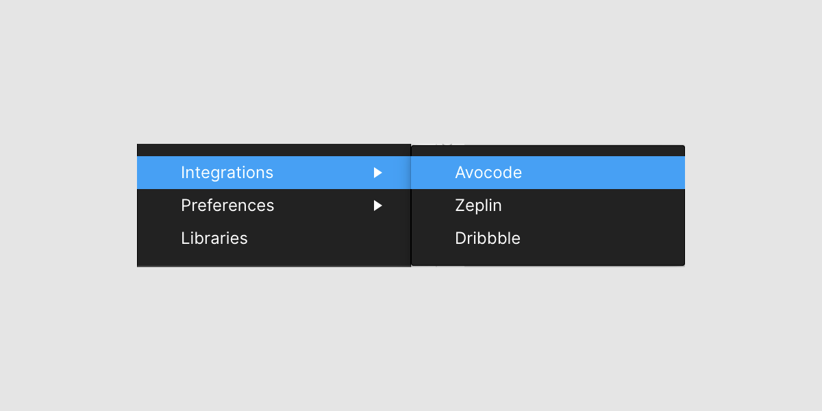
Also we have an API so feel free to get creative and build your own custom integration like Uber did.
Settling in
Sometimes it takes seeing how others do it before it hits "home". So, here's a collection of articles that are from our community about why and how they switched from Sketch.
- Switching from Sketch to Figma: Onboarding for Sketch users that covers all the major features
- A Sketch user's perspective on switching to Figma
- Figma for Sketch users
- Sketch vs. Figma — why I switched (Charli Marie)
- Why our remote design team is moving from Sketch to Figma
While there are still a ton of amazing features, workflows, and tips that I didn't cover, I hope this article is a start in helping you with your move from Sketch to Figma. If you're looking for more information on a specific topic, I highly recommend checking out our help center, our YouTube channels, as well as getting involved with our community on Spectrum. Also, as always, if you have any questions feel free to hit me up on Twitter.
Welcome home! :)