A Sketch user’s perspective on switching to Figma


I used Figma for a month and I was blown away by its features and how well it works.
Share A Sketch user’s perspective on switching to Figma
Figma editor’s note: We don’t usually put Figma reviews on our blog, but here we made an exception. Marco Pacifico explained our tool’s benefits better than we could have, so we wanted his article (which originally appeared on Prototypr.io) to be a resource for our users. Thanks Marco for letting us cross post it 🤗!
I used Figma for a month and I was blown away by its features and how well it works. I liked it so much that I’ve been campaigning for my team to switch from Sketch. This post is adapted from conversations I’ve had at work, and it’s sort of a pitch for product teams, especially distributed ones, that talks about why Figma is better in many ways that matter.
First let’s get the basics out of the way
Figma is a web-based design tool with real-time collaboration
It’s like Craft Freehand but with all the features of Sketch (and more). It works in web browsers, and there are also native apps that let you work offline.
Why is web-based a good thing?
- There’s no software to download, install, and continually update.
- There’s no need to save and organize your files. Your work is automatically saved to a shared space in the cloud.
- One URL becomes the source of truth that everyone gets to see. Which means…
- There is no need to continually upload, sync, and arrange PNGs in multiple places.
But is Figma slow?
Nope. People experience Figma being more performant than Sketch. This has been my experience as well, even when working with a large file.
But what about the Sketch ecosystem? Sketch has so many plugins that we rely on for our workflow
Well, I’m here to tell you that we’d lose nothing significant by using Figma; we’d only gain.
Figma has all the features and capabilities of Sketch + Abstract + InVision + Craft + Liveshare + Freehand + Zeplin + Dropbox all in one, plus a bunch more. Here are just some of the features Figma has:
- A similar interface and all the same drawing tools as Sketch.
- Prototyping. Figma has a clickable prototyping feature that’s similar to Craft + InVision.
- Built-in Commenting. Anyone with the link can add comments anywhere on the design, similar to how commenting works in InVision. You can tag people in comments, mark comments as resolved, and even integrate with Slack.
- Developer Handoff. Devs can get dimensions, styles, and download icons and images from the project URL. It’s like Zeplin, but again, you don’t have to sync your artboards whenever you update your designs.
- Version Control. Figma includes version history for all collaborators. You can roll back to or fork from a previous state. This works like time machine on a Mac.
- Multiplayer Collaboration. Multiple people can collaborate in real time. Similar to Freehand, we all see each other’s cursors on the screen and can draw things and make comments.
- Liveshare. If you click on someone’s avatar, you get to see what they’re seeing on their screen and follow their cursor around. This works just like InVision Liveshare (RIP Liveshare).
- Components. Similar to Symbols in Sketch, but more flexible and easier to design with. (More on this below)
- Constraints. Similar to Resizing in Sketch, but more intuitive.
- Team Libraries. You can share and update collections of components across projects.
- Bonus: you can even embed Figma projects in Dropbox Paper.
Now let’s get to the really good stuff…
Figma covers all the bases with the features mentioned above. But it gets really interesting when you consider how it improves our workflow.
Below are four ways Figma can fundamentally improve how we work.
1. We can iterate WAY faster with real-time collaboration
You can do a design review, make updates on the fly, and instantly get feedback on your changes. The time between iterations can go from days down to minutes because there is zero time wasted uploading or syncing screens, creating share links, messaging people to look at the links, and so on. When I experienced this first-hand it was so amazing that I shed a single tear of joy.
Below are some real-life scenarios that can make work slow and tedious at the best of times and incredibly frustrating at the worst of times. All of these scenarios go away by using Figma:
- When after syncing all your screens to InVision you realize you want to increase the font size slightly in a header component, so you make the change in your design file and then have to re-sync all the screens to InVision.
- When you use Craft to sync a complex, multi-screen prototype to InVision and then need to spend what feels like an hour dragging and dropping the screens in the correct order in InVision because Craft uploads them in a random sequence.
- When someone in another timezone forgets to commit or upload their work so you have to wait until they’re back online to get the latest designs.
- When there’s a software update and all the 3rd-party plugins break and you lose hours.
2. Our design process becomes more inclusive and seamless
All of a sudden the design file becomes a venue where anyone can meet up and have a discussion about the designs. This means that it’s easier for designers to work in parallel, exploring options and iterating in shorter increments. This means that developers can spot and voice technical concerns sooner rather than later. And this means that stakeholders, project managers, or anyone with the link can see how the design is unfolding from an idea to a polished visual, rather than waiting for a big reveal.
Instead of fragmenting the design process across multiple files, there is now one place that can tell the whole story and evolve as the design process unfolds.
I like what Thomas Lowry, a designer at OpenText, wrote about how his design process has changed by using Figma:
As we begin to dive into a massive website project, Figma is quickly becoming an essential part of our process. We will produce our wireframing and low-fidelity prototypes in Figma all the way through to the the visual design phase. During this process we will begin establishing components and push them to the team library for use across many files. As we vet out the components in different scenarios, and the design evolves, being able to make modifications that are global across all files will be a huge time saver.
3. Our transition from design to code is likely to be faster and more consistent
That’s because with Figma, it’s easier to structure our designs in a way that reflects how those designs will be coded.
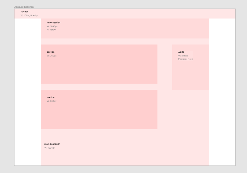
To understand why, you need to know how frames work. Figma uses frames instead of artboards. Frames are different because you can nest frames inside a frame. When you place a smaller frame over a larger frame, the two frames are automatically grouped and the smaller frame becomes the child of the larger, parent frame. Children frames are positioned and constrained relative to their parent. This is one of those things that takes some getting used to, but then once you do, you wonder how you ever did without it.
You can use frames to divide a screen into content areas and then nest components (which are themselves a bunch of nested frames) inside of those sections. This approach combined with auto-grouping, relative positioning, and constraints makes it easy to quickly build out consistent and responsive designs.
Using frames like this is helpful for developers because a frame in Figma is akin to a container in HTML. When developers inspect the designs, they’ll be able to see UI elements nested in their respective containers, which means they’ll have a more accurate blueprint to refer to as they write their code.

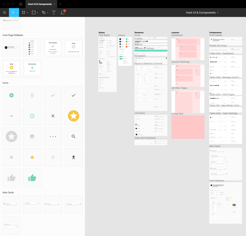
4. Our design systems will be more flexible and easier to design with, which means we’ll save time and gain consistency across projects
Sketch has Symbols and Figma has Components. The difference is that components are more flexible than symbols, which means we can do more with less of them, which means we’re more likely to actually use them instead of breaking them or starting from scratch.
How are components more flexible than symbols?
In Sketch you can use Symbol Overrides to edit text or swap out nested symbols. But if you want to change anything else — say, text size, border weight, or background color — you’d have to Detach from Symbol and create a slightly different version of the same UI element. To solve this you can nest every variation in one symbol, but then you end up with an overrides panel from hell. With large projects and complex UIs, organizing and maintaining all the permutations quickly becomes untenable.
With Figma, you can access and modify the properties of any layer in a component without detaching it from the master. The same thing goes for nested components. Now whenever you change a property of a layer in the master component, those changes will only get propagated to instances for which that property hasn’t already been overridden.
I think these three gifs do a good job of visually describing how it works.
How are components easier to design with than symbols?
First of all, you don’t have to worry about a naming structure (i.e. Icons/Search) as you’re creating components. You can rename a master component later and it will update all instances — not the case in Sketch. And to create a category of components, just group them in a frame and name that frame whatever the category is. That means it’s easy to reorganize things later just by dragging components around. For me, this really reduced the cognitive overhead of both creating components and keeping track of them.
Second of all, accessing components in Figma is way easier than accessing symbols in Sketch. Once again you don’t have to think about a naming structure to navigate a nested menu of symbol names. Instead, you can find (and see!) components as a list of thumbnails. To add a component to a screen or to swap an instance, just drag and drop to the canvas. Or you can copy-paste the master component to create a new instance — you can’t even do this in Sketch without creating a new symbol.

Another thing that makes designing with components easier is that in Figma you can edit the master component in context of the larger view, rather than having to go to a separate page to make edits. I find it super annoying getting bounced to another page in Sketch every time I want to edit a symbol, then having to switch back to the design to see if my changes line up.
Wrapping up
The more I use Figma, the more reasons I find to like it. There are a ton of details you end up discovering as you start working with it. Overall it feels like a more evolved and well-thought-out tool for interface design.