Behind the feature: comments, contextually


Engineer Emily Zhong shares insight into how we introduced commenting on files in the Figma Community: interactions, edge cases, and a new paradigm for sharing and connecting.
Share Behind the feature: comments, contextually
We recently introduced commenting on files in the Figma Community, allowing you to ask questions, share your opinion, or offer feedback. Here, engineer Emily Zhong shares how she and a team across design, product, and engineering thought anew about what it means to connect and engage in the community. She provides insight into the difficult interactions and edge cases, and a behind the scenes look at what we left on the cutting room floor.
One evening, as I was scrolling through the Figma Community, I stumbled upon this WatchOS Clock Animation file. After duplicating the file, I realized that the prototype’s starting frame was set incorrectly. I wanted to offer this feedback (and share how much I loved the resource!), but I wasn’t sure how to get in touch. After some digging, I found a personal website and Twitter account that finally led me to the creator’s email address. In hindsight, had I not been an avid Figma Community user (or an engineer on the product), I might not have gone through the hoops to find a way to communicate with the file creator.
When we first announced the Figma Community There is a lot we are excited about as we look to the year ahead. At the core of it all is the community.
Bringing the community together in Figma
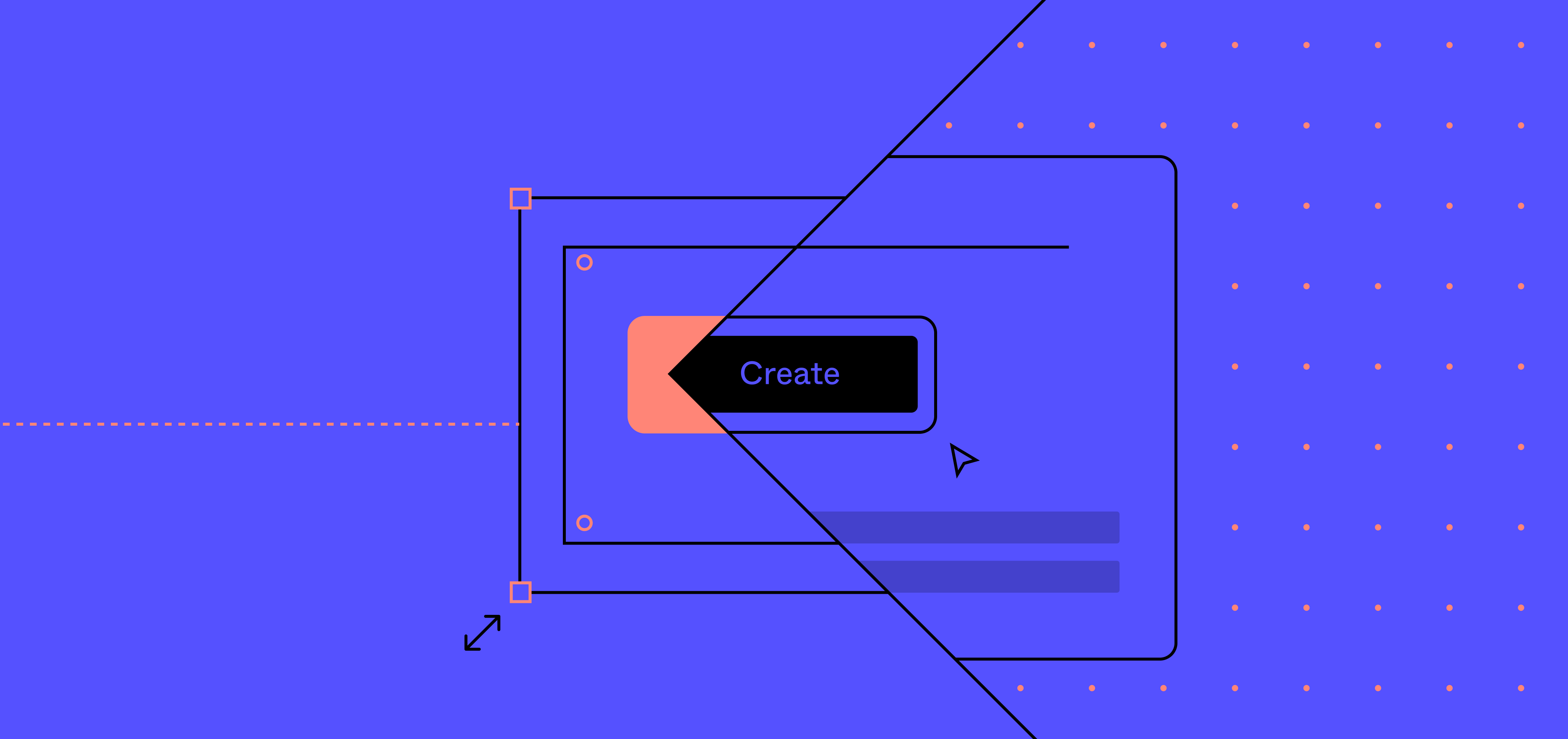
To do that involved introducing a new paradigm of what interacting in the Figma Community could look like. Our vision was to enable two types of comments: general comments—which show up as a feed below the file—or contextual comments, which follow the existing in-editor commenting design of attaching notes to a specific place in the file itself.
Old meets new
When we first started working on bringing comments into the Figma Community, I thought it would simply be a matter of layering the existing comments interface and code onto the file preview, with maybe a couple lines of code changed here or there. As with any code-repurposing project, there were a couple of technical hiccups: we had to replace the previous iframe file preview to support viewport information communication, and consider the performance implications of a potentially large number of comments.
Surprisingly, one of the largest wrenches in the development process was less about the technical challenges and more about the back-and-forth feedback cycle on minute interaction details. This really uncovered how different interactions had to be to make them seem the same as the in-editor commenting we were trying to port over.
A lot of this boiled down to the fact that we were turning a one-way alleyway into a two-way street, with no clear guidelines on how to tunnel traffic into the new direction provided. In other words, we were providing a new avenue of audience-to-creator communication on a platform that was mostly creator-to-audience, via published resources. Beyond that, we were breaking the generally linear paradigm of comments, often thought of as a feed of questions and input. With contextual comments, we needed to think more spatially, specifically about how a comment would anchor to a point on the design while still allowing users to view and pan across the canvas. Top of mind was arriving on the best experience to encourage the audience to leave comments on files, without degrading the existing view-only experience.
Initial explorations
Throughout the whole development process, we formed a tight feedback loop between engineering, design, and product, as we scoped out how to best modify the file viewing real estate to support contextual comment creation.
Our designer, Heather Tompkins As the Figma Community starts rolling out to all Figma users, six creators share the inspiration behind their files—everything from finding a creative outlet during Covid-19 to adapting to a digital classroom.
Explore the Figma Community
The group generated a lot of great ideas, including places to embed a new comments feed, as well as ways for the user to interact with the canvas preview to better view comments. With such detailed prototypes available, we were quickly able to scope out and narrow down the product behavior based on technical feasibility, UI edge cases, and the general product timeline.
In the process of this exploration phase, we revisited inputs from the product, engineering, and design sides, and prioritized the ones we deemed essential for the initial launch. In turn, we decided that we wanted to:
- Bring the users into the commenting experience as quickly and easily as possible, to encourage users to browse and use this method of communication
- Display contextual comments in a space large enough to really analyze and understand the file location the comment was placed in
- Arrive at a solution that was technically feasible, within our timeline, and not overly-complex
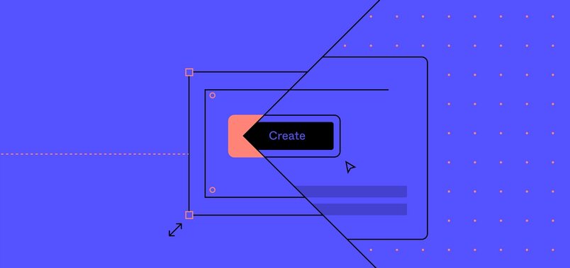
With these goals and constraints in mind, we decided that contextual comments would appear only in the fullscreen view, where there would be enough screen real estate to view the relevant context. To bring the user closer to the comments-viewing experience, we opted to have the viewer expand to fullscreen mode upon clicking on the canvas; clicking and panning would be disabled on the minimized canvas view, to encourage viewing the file in fullscreen.
Back to the drawing board
Once we had mostly built out the commenting experience, the team got together for a routine bug bash, during which we test out the feature to catch hidden bugs. By this point in the development process, we usually catch a couple small bugs (think: misaligned text, broken buttons, or edge cases) that cause the feature to break. This time, we realized that there was a bigger problem—the UX felt a little awkward and clunky, so we needed to spend more time on refining the experience. After putting our heads together, we identified the specific UX issues and came up with approaches to fixing them:
No exit
The first one was that the current design made it too simple to enter fullscreen mode, but too hard to exit. In an effort to make the commenting experience easier to access, we decided that any click on the canvas expand to a fullscreen view. However, this meant that users who accidentally clicked on the canvas—or those who were used to exploring on the smaller preview size—would be forced into a view where the only escape was a small “collapse” button in the upper right corner. The ease of entering and the lack-of-ease for exiting created a “trapping” experience for those using it.
To address this, we played with a couple of options to decrease the extent this larger preview dominated the screen. We tried switching from a fullscreen experience (where the page would takeover the entire desktop) to a full-window experience (taking up the browser window, but still giving user control over the page). In the end, we went with a modal solution brought up by Jessica Wang, another engineer on the comments project. We took inspiration from the lightboxes from photo-sharing websites, reusing the expected enter-and-exiting behavior that this design pattern afforded. We also brought back the drag-to-pan functionality on the minimized view, allowing users who did prefer to navigate that way to do so.
Feed vs. preview
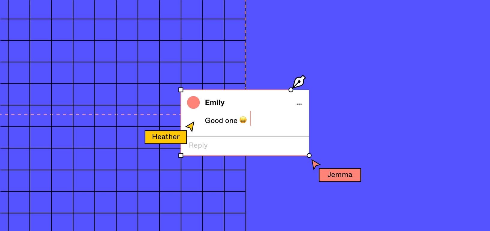
Another issue that we identified was a disconnect between contextual comments in the feed versus in the file preview. While one way to explore contextual comments was through the fullscreen preview mode, another was in the general feed below the file preview. There, contextual comments were mixed in with the non-contextual comments, and clicking on a contextual comment would bring the user up to the top of the page, to view the comment in the preview.
We realized that this behavior could be unexpected, because we didn’t differentiate between the two types of comments enough in the UI, and it wasn’t clear whether or not the scrolling action would occur after clicking on a comment. Additionally, after the user was brought to the top, they would have no way of returning to their previous spot, aside from manually scrolling back down. This meant that if a user unintentionally clicked on a contextual comment, they’d be thrown into a completely different part of the page—with no clear way to get back.
To solve this, we added more visual indicators for contextual comments, like a pin icon next to the commenter avatar and a “See in context” blurb to indicate the scroll-to-top behavior. We also built a “back” button that appeared after scrolling to the top, allowing the users to easily return to their location on the feed.
Fun implementations along the way
Throughout the development process, there were a lot of fun, animation-related problems that greatly improved the experience and overall polish of the final feature. Here are a couple that I found particularly fun and interesting to work on:
Animating between comment locations on the file preview
When clicking through comments on the sidebar in the expanded view, the default experience is to “jump” between the different locations, with no transitions whatsoever. While this experience worked for in-editor comments, this sudden jump was flagged as slightly jarring in the Figma Community, especially as users were navigating files that they were unfamiliar with.
In order to support a smooth pan between two different locations on the canvas, I had to modify viewer code directly, which is the same system used to show prototypes in Figma. Fortunately, most of the logic for interpolation between positions was already built-in, so my job was mainly surfacing animation and timing parameters to the viewer’s typescript interface. While it was a small code change, it was my first time dipping my toes in this part of the codebase and writing Skew code, which is the language that our viewer is built in.
Expanding hover effect on the file preview
To better indicate that clicking on the file preview would open the user up to an expanded modal, we added a slight expanding animation when the user hovered over the file preview. The most straightforward approach to this—adding to the height and width of the container element on hover—didn’t work in this case. Since the viewer re-renders when its viewport or size of the containing elements changes, the simple six-pixel expansion became choppy as the browser kept recomputing the viewer canvas for this hover effect.
The solution was to flip our thinking on its head: instead of having a smaller default state and expanding on hover, the viewer container would always have the height and width of the expanded state. We then created a separate element that was placed over the canvas, with a border that masked the edges of the viewer to make the canvas seem like the minimized size. When hovering, instead of increasing the size of the canvas, we decreased the border width of the overlaid mask, revealing the edges of the viewer that were previously hidden and creating the illusion of expansion when hovering.
Animating between the default and expanded modal file preview
When the user clicks on the file preview, we animate it from its default state to a modal state. While the change in size is not that difficult to animate, the part that was difficult was animating between two different types of positioning placement, position: absolute to position: fixed. The position CSS attribute determines how the coordinate system is set up when we set the top, bottom, left, and right CSS attributes for an element.
When the file preview is in its default state, its position is set to absolute. This means that the top, bottom, left, and right coordinates we use to determine the positioning of the file preview is relative to its parent container, which is nestled nicely in the flow of the page between the title and the description. When the file preview is in its expanded state, however, its position is set to fixed, meaning that the coordinate system is relative to the browser window instead of the container in the page flow. The fixed position is often used for “sticky” elements, like a navigation bar that freezes at the top of the page and moves with you, no matter how far you scroll.
For many CSS properties, the browser can create animations on its own given a start and end value (this works for the top, bottom, left, and right properties). However, animating between different position values unfortunately isn't supported out-of-the-box. We couldn’t simply change the starting or ending preview states to the other position either. Doing so meant that the default preview would always be stickied to its position on the page, no matter how far you scrolled, or that the expanded preview modal would be one that could be scrolled past.
The solution was to create an intermediary state that occurs right before the expanding and collapsing animation. In this intermediary state, we take the current state’s position value, as well as the top, bottom, left, and right coordinates, and do a bit of math and set what the equivalent coordinate values would be in the next state’s coordinate system. This way, for a brief moment before the animation starts, the existing view is translated to the next view’s coordinate system so that the browser can interpolate and animate coordinate values.
The (seemingly) invisible parts of the final experience are a result of many revisions and countless gifs sent back and forth to get the animation details, timings, and edge cases just right. As a new grad engineer, it was fun and fulfilling to be part of this tight feedback loop—I had the opportunity to contribute not just code, but also my thoughts about user experience, interactions, and design.
Check out the Figma Community to connect with others and see comments in action. If this type of project sounds like an interesting challenge, learn more about Figma—we’re hiring!