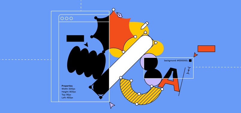
Behind the feature: the making of the new Auto Layout


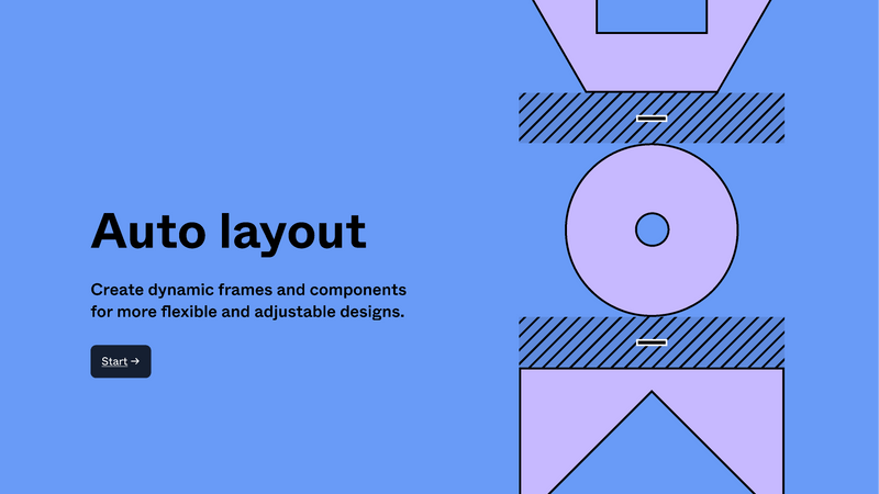
We’re excited to release the latest version of Auto Layout, introducing a new look and more flexibility to layouts in Figma. Here, we share a look into the evolution of the feature, how we made tradeoffs between flexibility and usability, and what it took to bring our stretch goals to life.
Share Behind the feature: the making of the new Auto Layout

To get started, check out the playground file, or catch up on the recorded office hours, where we explore this new feature.
When we first launched Auto Layout, we really focused on making it approachable and usable. Over time, we worked hard to incorporate user feedback, bringing more power and flexibility while keeping an intuitive editor experience. Ultimately, this led to where we are today—a refreshed and revamped Auto Layout that goes beyond just a new coat of paint.
Resizable dreams
Before we launched Auto Layout in 2019 With Auto Layout buttons can resize with their text. Lists can rearrange themselves when items are moved around. And elements can be nested to create complex interfaces which respond to their content.
Design more, resize less, with Auto Layout
We’ve all been there, and it’s frustrating. Beyond feeling tedious, this type of manual work can become a roadblock to building responsive design systems. It’s why bringing the power of automatic layout to designers has always been in our plans.
In fact, early designs of Figma incorporated ideas of automatic layout in the sidebar. While it was an unlabeled dropdown under the “Layout” section of the properties panel, the idea was the same. Instead of manually laying out objects within a frame, users could rely on Figma to do the work automatically, with options for vertical or horizontal layout. Unfortunately, this wasn’t implemented when Figma launched, and traces of the fabled Auto Layout laid dormant in Figma’s source code until Maker Week Our first fully remote Maker Week is behind us, and we’re sharing what it took to bring it to life: the theme, the creative direction, and how we moved our most analog company tradition online. 

The making of Maker Week

During this week when all Figmates can do and build anything they want, our product director Sho breathed new life to our Auto Layout dreams by reimagining the feature in prototypes. The following year, I joined Figma and landed on a newly formed team whose goal was to make Auto Layout a reality.
Team alignment
When we started building Auto Layout, we were inspired by the power and versatility of flexbox. (Figma’s built on the web Our vision for the future of design tools is one where both the tool and the content are easily available to anyone, anywhere. 
Building a professional design tool on the web
This sort of mission statement for the team guided the design decisions we made, unlocking functionality while reducing the number of moving parts for ease of use. Ultimately, this boiled down to a few core concepts:
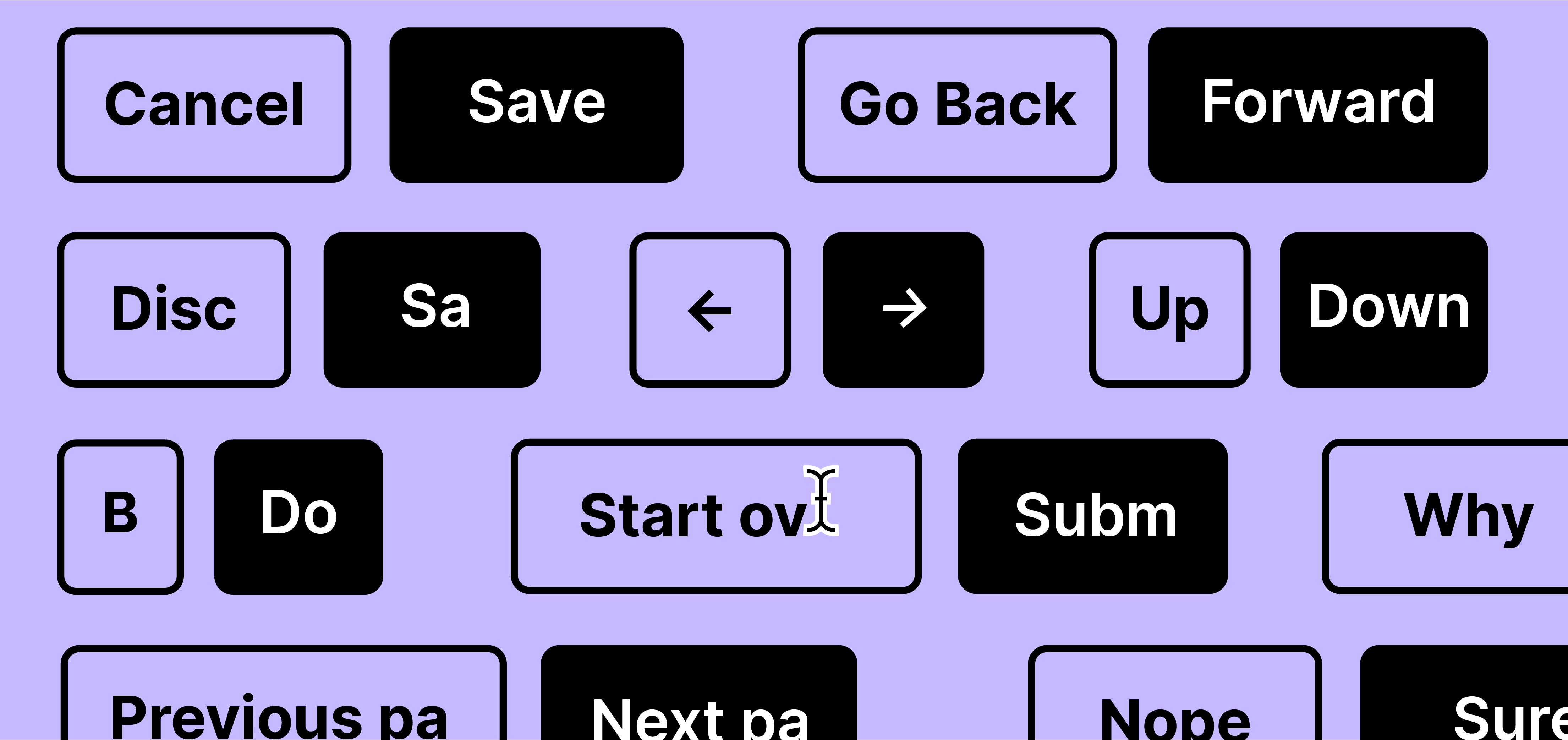
- Auto Layout can be enabled on a frame, allowing components to be laid out vertically or horizontally
- Vertical and horizontal spacing between items can be set
- An Auto Layout frame will hug its components in the main axis while the other “counter” axis can also be set to a fixed width to hug the components
- Components in Auto Layout frames can each have their own alignment to the container, either being aligned left, center, or right—or top, center, or bottom in horizontal Auto Layout frames
It was really helpful when Marcin, the designer of Auto Layout, started by making a prototype completely in HTML. It gave us a feel for the feature early on and helped us iron out many details in our first version, like frame handle decoration, drag behavior, and outlines.
Stretch goals
The first version of Auto Layout quickly proved to be useful. I also noticed that Figmates were using the feature internally to organize everything from artboards to presentation slides and create reusable components like sticky notes and name tags. But we knew we had more work to do.
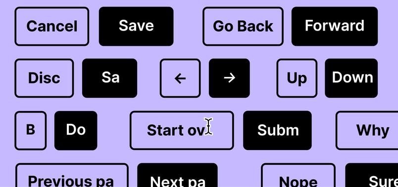
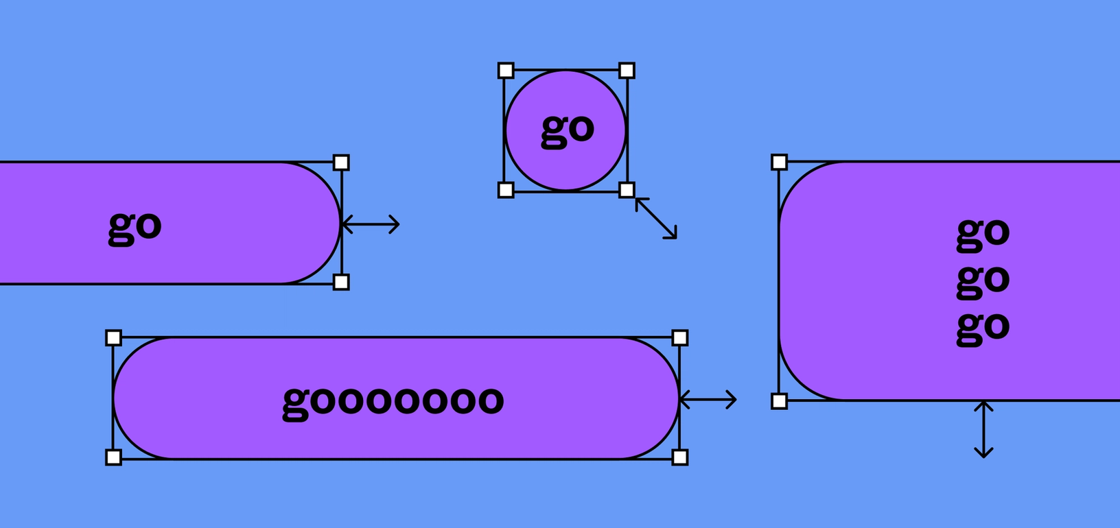
Auto Layout allowed for automatic alignment to the left, right, or center of a frame. However, as the frame grew, the components would stay the same size. What designers needed was “stretch”—an alignment option that would allow components in an Auto Layout frame to expand, filling the entire width or height of the container, no matter how it was resized.
It sounds pretty straightforward on paper, but actually getting this to work in the layout engine was tricky. In the first version of Auto Layout, containers only relied on the size of their components, so it was guaranteed that by laying out the components first, and containers last, you would end up with a valid layout. However, stretch meant that the components could also depend on the size of their containers, so our layout assumptions no longer held up. We had to develop a new engine that could handle these new relationships, with the ability to go back and forth between container and component to make sure all layout demands were met.
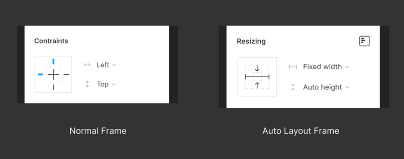
On the design side, we played around with some pretty bold ideas. Looking at help center articles and feature requests, we found a lot of designers referring to Auto Layout alignment options as “constraints,” which is another feature in Figma. Conceptually, there were many similarities, as they both included options for left, center, right, and now stretch. We toyed around with the idea of Auto Layout being integrated into the constraints panel, making Auto Layout feel more integrated with the rest of Figma’s layout tools.
However, we ended up shipping stretch without these UI changes because we already had additional features in mind for the next iteration of Auto Layout. It was important to give ourselves the necessary time and space to thoughtfully change the UI in a way that would comfortably include all of them.
Staying flexible
As we began to design more flexibility into the next version of Auto Layout, we got a much needed team boost. Emily, our new product manager, learned flexbox to put together an amazing spec that included everything from flexbox terminology to relevant support tickets to user requested features. Sawyer, an engineer on an adjacent team, whipped up a quick prototype on a Friday night, incorporating many of the advanced layout features on our wishlist. And Rasmus, our designer, got to work exploring countless ideas and mockups, eventually arriving on our final designs.
When we sat down to scope and flesh out these features, we realized one of the new features—stretch in the primary axis—would introduce complexity. To date, stretch was tied to alignment and only able to be set in the counter axis. But as designers became more familiar with Auto Layout, it was pretty common to see Auto Layout frames nested within other Auto Layout frames. This revealed use cases where it would be helpful for items to stretch in the main axis as well.
Unfortunately, bringing stretch to both axes wasn’t as simple as adding another alignment button for stretch in the primary axis. Making the primary axis fixed would allow us to stretch items. However, adding the option for fixed size in the primary axis would also mean adding an option to align items in the primary axis when there’s free space. With container and component frames, these additions would result in two different alignment and resizing options and create a cluttered and confusing sidebar.
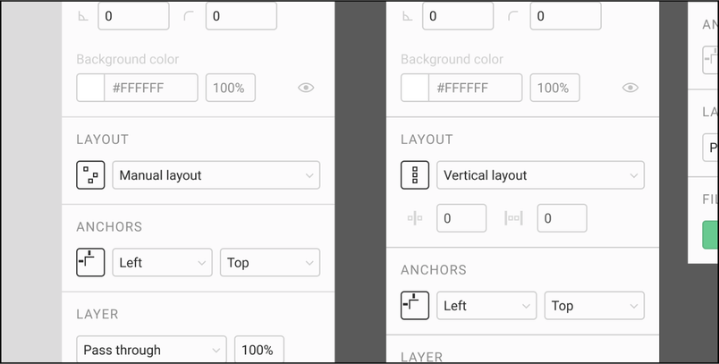
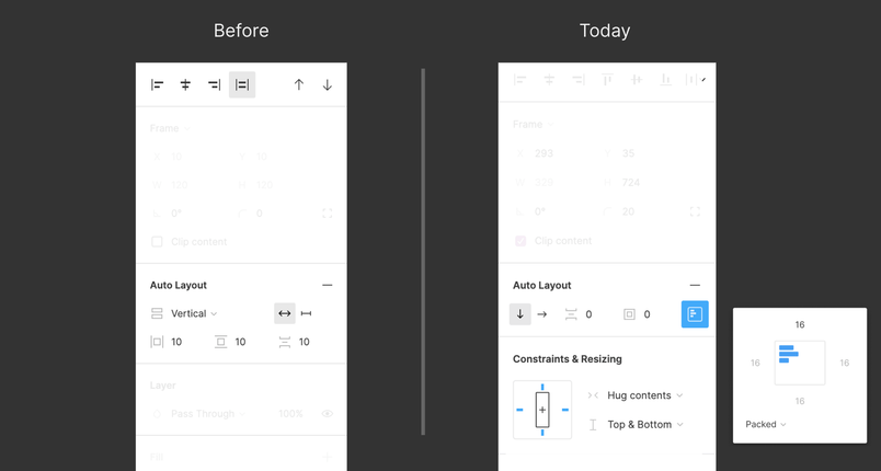
To simplify alignment, we made a conceptual leap to move all alignment to the container. Instead of setting alignment at the component level, alignment is set at the container level. Components can still be individually aligned by wrapping them in an additional Auto Layout frame. A point-and-click UI to set alignment (with a built-in preview), which we tucked away in a popover menu, allowed us to keep the main properties panel footprint minimal and approachable.

With alignment taken care of, we wanted to make resizing more intuitive as well. Since a frame can’t stretch and hug at the same time, we thought about consolidating these controls into a single three-way dropdown, with “Fill Container,” “Hug Contents,” and “Fixed.” Knowing that these controls are possible in both axes, we realized that two dropdowns were necessary: one for width and the other for height. The end result was a constraints-like UI that would appear when selecting an Auto Layout frame.

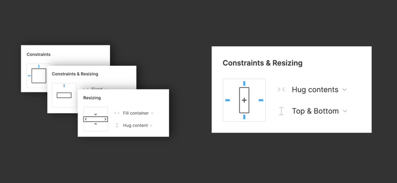
Testing the new UI revealed cases where both the constraints and resizing panels would show up. While this was expected, users found it confusing to have two similar (but distinct) panels. The hidden interrelationships between constraints and resizing created an invisible dependency that didn’t sit right with us. While jamming on this, the team came up with a hybrid panel that would surface the right options no matter what was selected.

Together, the new alignment panel and the new resizing/constraints hybrid panel make up the biggest changes we’re bringing to Auto Layout today. For the past few months, the Auto Layout team has been hard at work bringing this to life. In addition to building the new panel, there’s plenty of under-the-hood work the team has tackled: tweaking the Auto Layout engine itself, writing migration that allows us to introduce these new features, and preserving the layout behavior of existing Auto Layout documents. This has been a huge team effort with the amazing engineers that I get to work with every day, as well as teams across the company, from infrastructure to product education.

Taking Auto Layout from the forgotten traces in our code base to what it is today has been quite the journey. Auto Layout has grown to fill some pretty big dreams and aspirations, and I’m so proud of how our team stretched what was possible while keeping the feature intuitive to use. We’re really excited about putting this new functionality into your hands, and can’t wait to see what you’ll make with it!
If you’re interested in learning more, get started with the playground file, check out our Help Center, or check out our recorded office hours.