Behind the scenes of creating the official Figma kit for Tailwind UI


How the team at Tailwind Labs created a set of fully responsive components, and what they learned along the way.
Share Behind the scenes of creating the official Figma kit for Tailwind UI
David Luhr, Lead Developer at Tailwind Labs, shares how the team created a Figma kit for Tailwind UI, a set of fully responsive components that helps designers and developers collaborate more efficiently. Here, he shares what he learned—from organizing the project, to getting customer feedback, to the small polish details that made all the difference. Today, a starter pack of the kit is live on the Figma Community.
Tailwind UI is a collection of thoughtfully crafted, fully responsive HTML components built with Tailwind CSS, a utility-first CSS framework.
Since Tailwind UI launched in early access in spring 2020, customers have asked almost daily if and when Figma files would be available. By the fall, demand from customers became overwhelming, and I set out to create the official Figma kit for Tailwind UI. With over 400 fully-responsive code components, Tailwind UI's surface area rivals most design systems, so I had quite the challenge ahead of me.
For much of the next few months, I'd be heads down in Figma, building (and even rebuilding) over 1,400 components and 10,000 distinct elements, all while keeping quality and usability top of mind. Here's what I learned.
Attention to detail at every level of a design system
Building a commercial design kit requires the utmost attention to detail. This is in contrast to working files for designing new products and features, which are often messy, temporary, unpredictable workspaces whose sole purpose is to unlock new ideas and solutions as efficiently as possible.
When the design files are the final product, decisions at every scale define the user experience—from layer names to component structure to page layout. To build the best Figma kit possible, we had to flip the typical workflow, and have the final code product inform the design files as a pixel-perfect standard to match. Maintaining high quality at every level of a design system was our north star.
Naming layers
Let's start with layers themselves. I established naming conventions and labeled everything accordingly, making sure I was staying consistent throughout. In Figma, consistent naming also allows for overrides to carry over when swapping instances or changing variants of a component. For example, a "button" component has a simple text layer named "Text." If I change my button to a larger size variant, the custom text I create carries over. With more complex components, this saves a lot of time for users, who might customize icons, headings, paragraphs, link text, and more, then decide to swap their component for a different variation.

Organizing layers
Now, how to organize these layers? With the latest auto layout features, combined with layout grids and layout constraints, you can create layers that mimic HTML markup pretty well. While I'd love an option to stack Figma's layers bottom-to-top to further match the stacking context of the web, you can get a good approximation. This is worth it for a couple reasons: there's shared understanding between designers and developers around what's possible in terms of layout in the browser, and there's similar architecture for customers to navigate in both design and code versions.

This also reveals opportunities to document patterns that otherwise might go unnoticed. For example, many components in Tailwind UI have consistent responsive padding and a centered, max-width container. By creating design file layers that match what's needed in HTML markup, developers can see this consistency and create a dedicated container to handle these repeated layout rules.
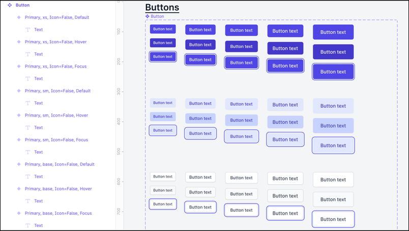
Crafting variants
With well-structured components, variants can vastly simplify design systems and make components much more adaptable.
Instead of manually maintaining and arranging a collection of 80 unique badge components, for example, I created a single Badge with convenient variants for type, size, theme, and some optional secondary elements. While it takes some upfront work to create these variants, it makes the final component much simpler and more adaptable for users. Customers can drop in a single badge and quickly adapt it to their needs with an intuitive set of options.

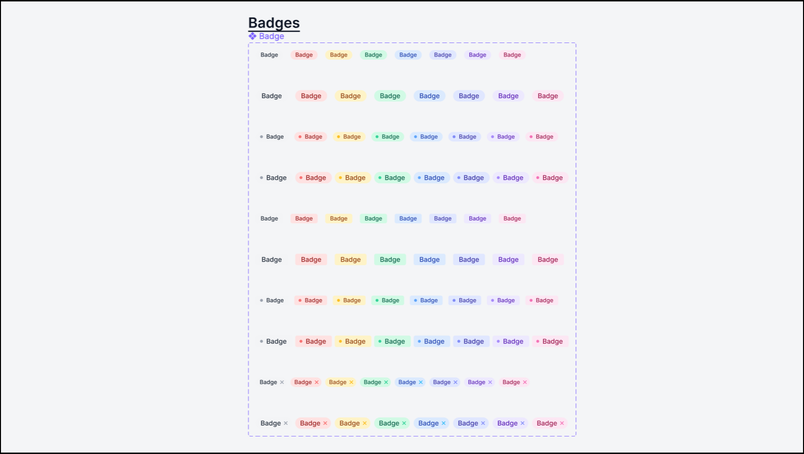
When creating variants, it’s important that the same properties a developer might provide with a code component exist on a component in Figma, using the same terminology. Again, consistent naming conventions and structure for variants provide a predictable experience for design kit users. When building Tailwind UI's Figma kit, I found that across hundreds of final components, I could use the same variant names for the vast majority: type, size, theme, position, breakpoint, and state.

Variants are essentially self-documenting. Anyone can look at a component, see the distinct variations and how they map to settings in the variants panel. And wow, do they keep the final component count slimmed down. When the Tailwind UI Figma kit was complete, we had 1,430 components, with an average of seven variants. Without variants, this would be more than 10,000 components. Since we wanted to focus the kit on the final components found on the website, variants helped us keep the component count down much closer to the 400 or so code components that customers will be using in their work.
Auditing components for pixel perfection
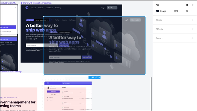
If you're recreating existing components or UIs, I highly recommend using screenshot overlays to speed up and improve the accuracy of your work.
When I mentioned pixel-perfect earlier, I wasn't saying that lightly. As I built each component in Tailwind UI's Figma kit, I made heavy use of the Dev Tools' "Screenshot Node" feature to create images that I overlaid with 50% opacity on top of my designs in Figma. This helped me double check my work at every level, and even revealed a few inconsistencies in our code components that we later fixed. More on that feedback loop later.

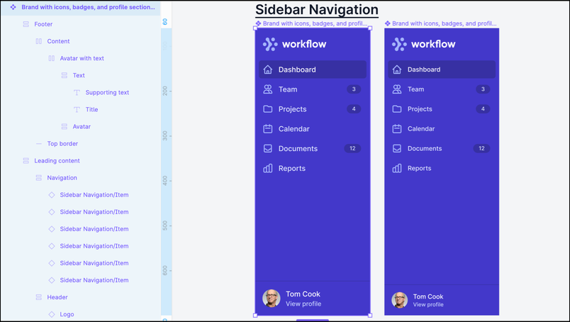
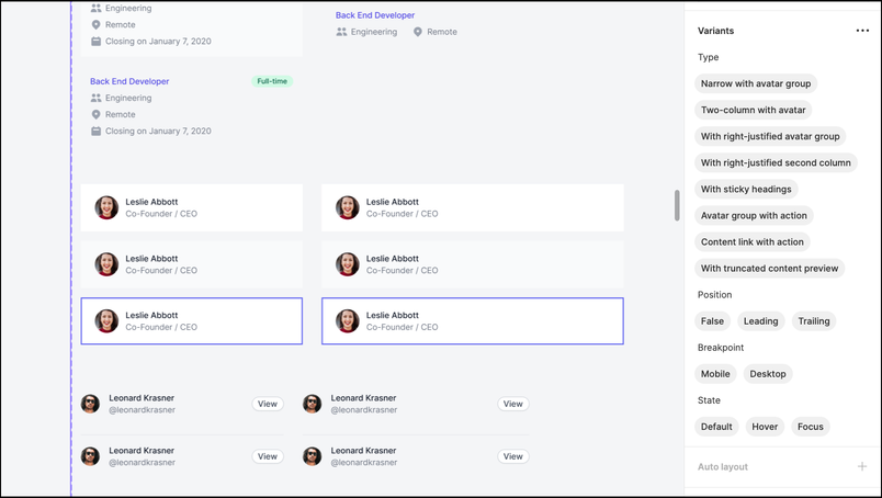
Designing a showroom
Code components on the website are each displayed in a responsive preview that users can adjust to see how each component adapts across Tailwind CSS's defined breakpoints. This creates a sort of showroom—allowing users to see each component in context—which we wanted to recreate in the Figma kit.
To do this, I built every component at a mobile and desktop breakpoint, while making them as flexible as possible with auto layout and layout grids.
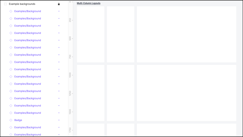
To further replicate the website's user experience, each page of the Figma kit matches a page on the website. Every page has a dedicated heading that links to the corresponding page on the website. A page contains only the final components, complete with example backgrounds to show the component in context with the intended viewport size. These example backgrounds are components themselves, and are kept tidy in a locked group layer at the very bottom of the layer list. This allows users to instantly select the components without the example backgrounds, so they can quickly copy/paste them for their own use.

When the design files are a product in their own right, these little details of polish and consistency in how you present components go a long way.
Creating a parts inventory
With only the final components on each page, where do all the granular, building-block components go? To keep the main pages clean and focused, I created a dedicated “Parts” page that's home to every component outside of the "showroom" pages. The Parts page can grow to be a behemoth, but it's easy to maintain with auto layout layers and dedicated headings that back link to the respective pages in the kit. The majority of the time, users will reach for a final component and never need to look at the Parts page, but those who want to dig deeper have a complete inventory of well-organized components they can peruse and adapt to their own use cases.
How to structure a design system project
Beyond the more granular decisions of layers, components, and pages, we learned how to best sequence a project of this scale, when to rethink our approach, and how to engage customers along the way.
Here are our main takeaways:
- Start with the foundations. Build the most granular components—buttons, dropdowns, badges, and avatars—first. These can be immediately reused to create more complex components like styles and colors.
- Next, tackle the tough challenges. From there, start on whatever seems the most difficult, tedious, or unknown, with the goal of reducing risk upfront. In our case, that was tricky tables, intricate description lists, and elaborate marketing sections. Doing so will reveal how to build even the most complicated components as early as possible, which makes the rest of the project more efficient (and less stressful). You’ll also be able to commit to naming conventions, layout approaches, and overall organization at the outset, knowing that they’ll apply to all situations.
- Polish as you go. Finalizing each component and page along the way makes for calm, easy, and quick launch prep once the full design system is ready, with no flurry of QA needed. In fact, on February 16, after several months of work, I completed the final component in the Tailwind UI Figma kit at 10 AM, and we were able to officially announce and launch the kit, ready for download, just four hours later.
- Know when to rebuild. If things aren’t up to standards, a naming convention isn’t scaling, or a major new Figma feature launches, don’t be afraid to start over. It’ll be faster to build on a second pass, and the design system will be more resilient and easier to maintain. With the Tailwind UI Figma kit, we decided to completely redo months of work when the new auto layout features and variants landed in November 2020. By starting fresh, our customers have the best possible kit to use in their work.
- Involve users along the way. Look for opportunities to share your work. Provide preview files to users for feedback on things like component features, naming conventions, or page organization and share your work to drum up excitement. To help with the overwhelming demand, we provided a number of preview releases to existing customers to gain valuable feedback, and I did multiple livestreams of showing my process for building the Figma kit so anyone could learn from our approach.
- Give back to the community. While Tailwind UI is a paid product, we’re heavily involved in open source and wanted to create value for customers and non-customers alike. As a thank you to the community, we created Figma Community files to help the design community kick off a new project with Tailwind CSS styles, as well as a free preview set of Tailwind UI components to explore and use.
The feedback loop
This project was rooted in designing components from existing code, which provided an interesting feedback loop. Originally, every Tailwind UI component began life in Figma with initial designs. Then, those were developed into code components, which were recreated as design components in Figma. We found some inconsistencies and bugs in the code components while building the kit, which we were able to immediately improve on the website (isn't it amazing how much you notice when you study every single component, line by line?). As the project came to a close, we had more confidence than ever in both our design files and our code components.
So, design informs development, which informs design, which informs development further—polishing everything with each loop. And, on that note, I better get back to Figma to add the latest batch of new components.
Now, you can check out a starter pack of the Tailwind UI kit on the Figma Community.