Customer journey mapping with Figma


Learn how to create interactive customer journey maps to better understand your users.
Share Customer journey mapping with Figma
For many designers, Figma is the tool of choice for creating digital interfaces from web sites to mobile apps. However, Figma is also incredibly useful for user experience research. In fact, the first project I ever completed in Figma was a customer journey map.
My company, Lextech is based in Chicago, Ill., and has a distributed worldwide workforce of talented technology leaders, engineers, and experience designers. Nearly all of our designers are cross-functional, so they’re comfortable doing research and design.
A lot of our focus is spent on improving Fortune 500 customer and employee experiences by analyzing critical workflows in life sciences, aviation, and finance. How do pilots prepare for a flight? How do patients interact with health care professionals? How can financial service representatives better engage customers at a bank?
In many cases, the best way to understand a workflow and collaborate on finding solutions is to create a journey map. The years our design team has spent researching, interviewing, and building those maps taught us a lot about building great customer journey maps – and also how to leverage Figma’s features to deliver it effectively to others.
A single customer journey map isn’t always the best way to explain a process. If a process is not linear or has many branches or dependencies, you might choose a more traditional two-dimensional user flow diagram. Or if the process is already well documented via other visual means, a customer journey map might not be as valuable.
Why map?
When researched correctly and designed elegantly, customer journey maps are incredibly helpful in creating a shared understanding of a customer process, such as shopping for a car or buying a product from a web site. The customer journey map serves as a visual storytelling aid that clearly explains each step in that process, and often, a level of emotion or pain that the customer faces during each step.

By looking at the same map, people with different viewpoints can easily digest the research that went into building it, and identify places where that process can be improved.
How Figma makes it easy to build journey maps
We’ve created numerous journey maps in Figma over the past two years, and in that time, we’ve learned a lot about how Figma can improve both our research and design processes. Here’s how our user experience researchers and visual designers have used Figma’s unique features to turn ordinary customer journey maps into extraordinary ones.
A journey map component library
By creating your own team library of journey map components and styles, you can bring a level of consistency to your design and make it easy to build out new maps quickly. When style changes need to be made, it’s as simple as updating a component. We’ve created a Figma sample file and component library that includes some components you might want to consider for your journey maps. You can also check out Figma’s customer journey map template.
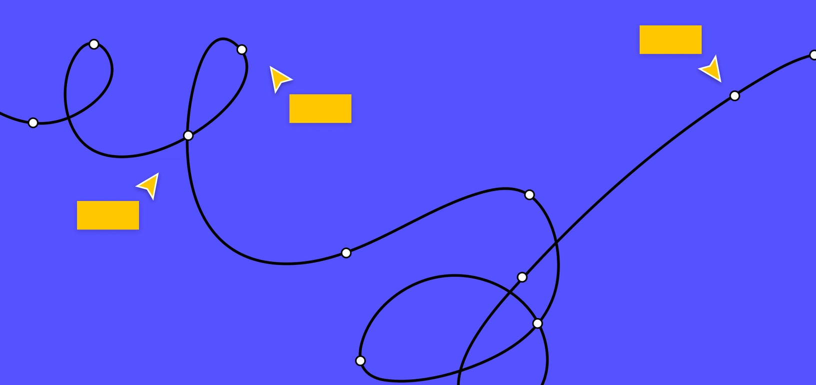
Tidy Up command
The Tidy Up feature has multiple benefits. It can be used to easily modify the spacing between map steps. It can also be used to insert and/or reorder steps without significant reworking of the map.
Real-time collaboration
In addition to the obvious benefit of having multiple designers work on the journey map at the same time, our team has also experimented with using Figma to take interview notes directly in the tool. This approach keeps all our interviews and notes in one central location, rather than in multiple tools.
Version history
Before we deliver a version of our journey map for client review, we manually timestamp a version in our history file, just in case we need to refer to it later on in the project. Sometimes, it’s helpful to show a client how the map evolved over time as we learned more about the customer.
Leverage comments in Figma for continuous feedback
We make it a habit to share rough versions of our customer journey maps with actual customers. That allows us to see if they agree with our research findings and whether there are any crucial steps we may have overlooked. The comment tool is a great way to request and collect that feedback to ensure a single source of truth.
For example, we recently shared a journey map with a user group that frequently travels by air, to ask them how their personal experiences differed from the journey we documented. Their feedback helped us uncover new areas to explore and where we could guide future research activities.
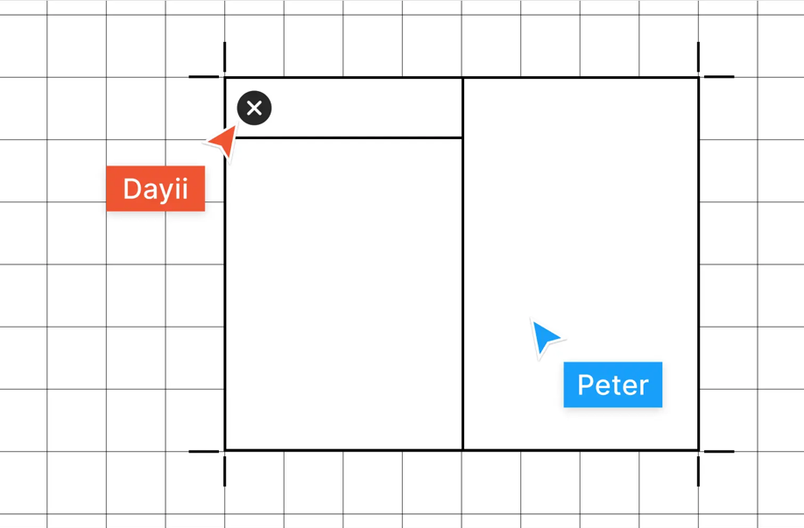
Our practice at Lextech is to duplicate the Figma file and then share the map as a single-screen prototype, then invite one or more users into the file and add comments asynchronously. One benefit of this approach is that we are able to respond in Figma to ask follow-up questions in the comment thread.
Other times, when reviewing the map on a conference call or in person, we’ll have a designer type in feedback from all participants via direct comments into the file. In both cases, the exact placement of these comments ensures that when they’re reviewed later, we’ll know exactly where in the journey that feedback was given.
In some cases, we’ll create multiple copies of the same Figma file, so that feedback isn’t “poisoned” by previous comments. This ensures that each set of new eyes sees an unbiased view of the journey map, plus, it also helps us organize feedback by source. For instance, it’s sometimes helpful to see whether journey map feedback from customers matches that from the client, to see what differences may exist.
Make your journey map interactive
Even if you only plan to share your customer journey map as a printed document, consider adding navigational hotspots. In our sample file, we not only created a printed version with all the phases combined, but also one with a main navigation menu and links to each phase.
During one project, we had so many great customer quotes that we couldn’t fit them all in the print version of the map. In the digital version, we offered viewers a way to tap the map to read those extra quotes.
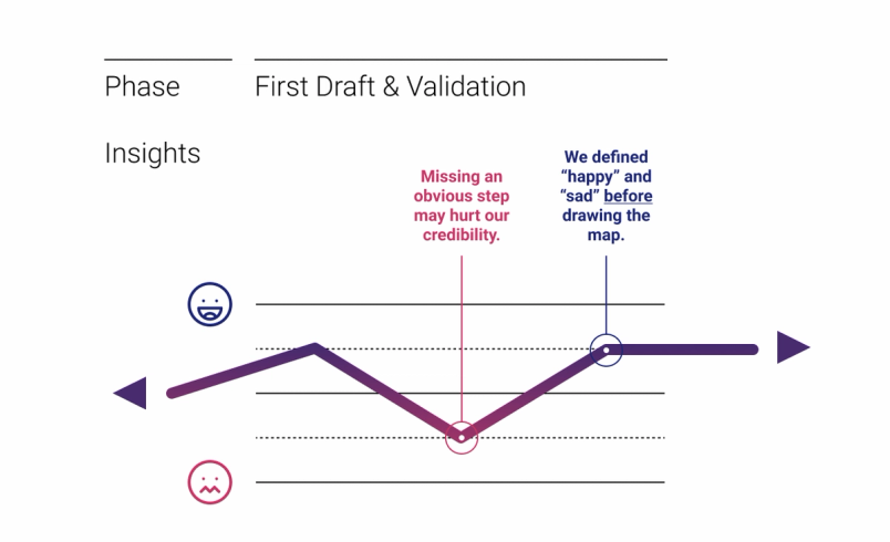
In the sample interactive journey map, if you tap on one of the happy or sad faces, you’ll get a popover that explains the grading scale a bit more. This helps reduce the amount of data you actually need to place on the screen, to make the key content more obvious.
In the end, the best customer journey maps are not created once and forgotten, but are continually reviewed and revised – just like a digital product. As your experience research teams learn more about customers, you might find yourself adding new steps into the journey, or revising existing ones to be more accurate. Thinking of your journey map as an iterative learning tool is the best way to stay continuously connected to your customers. To get started, check out this sample Figma file we have created.
Any other journey map tips that you’d like to share? Let me know on Twitter @LextechApps.