In good company: How retailers use Figma to elevate e-commerce


Brands like Nuuly, Ruggable, and GitHub are designing multidimensional experiences that build customer trust, serve employee needs, and uphold core values.
Share In good company: How retailers use Figma to elevate e-commerce
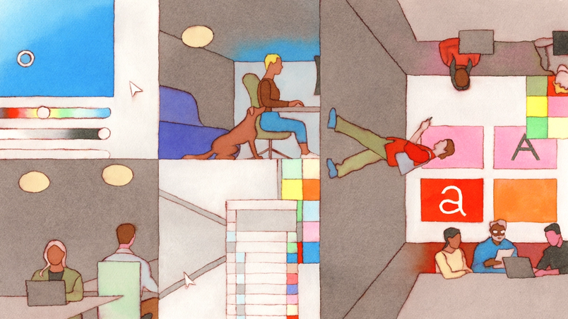
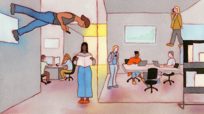
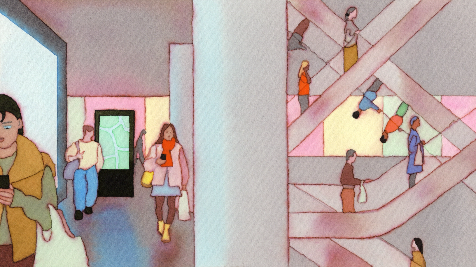
Hero illustration by André Derraine
Whether it be promoting circular economies or translating across different digital touchpoints, the world of e-commerce has grown more sophisticated. To build trust, facilitate a smooth customer journey, and tell a cohesive brand story, a consistent—and compelling—digital experience is a must.
We chatted with teams at leading brands to learn how they’re hitting these goals and evolving their processes with Figma. Here, we’re sharing how Nuuly handles the logistics of clothing rental, how Ruggable connects its e-commerce and marketing touchpoints, and how Design Business Company worked in lockstep with GitHub to build a storefront that’s decidedly for developers.
How Nuuly streamlines the clothing rental user experience
For more about how Nuuly enhances cross-functional collaboration with Figma, read our case study.
While some companies have normalized renting clothes for special occasions, newer players like Nuuly, launched in 2019, are trying to make it mainstream for everyday wear. “Nuuly celebrates the idea of change,” says Laura Petrini, Director of User Experience at Nuuly. “We’re giving customers access to changing their style so they can express themselves and get creative with their wardrobe.”
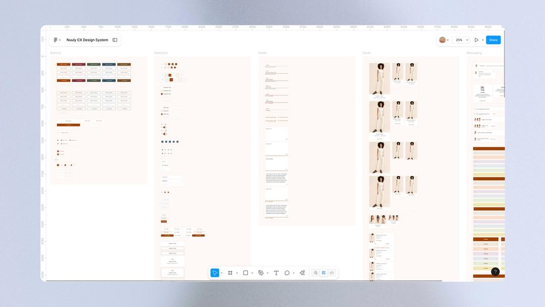
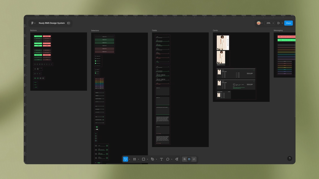
To deliver on this promise, Nuuly has crafted a seamless rental experience that subscribers have come to know and love. Because clothing subscription services are still nascent, Nuuly has also built much of its own technology to power the other side of rental: circular inventory management, cleaning, and repairs. This meant creating two design systems from the ground up—one for customers, and one for rental logistics—both with unique goals and a scaling business in mind. “We set up our design system with color and type tokens that can be easily swapped out, giving the brand room to grow as the seasons turn over—just like we give our customers room to flex their style,” says Laura.


While the technology underlying rental logistics is complex, Nuuly’s goal is to make it as simple as possible for customers to adapt to a new way of shopping. “We’ve stripped experiences down to their simplest, most intuitive form,” Laura says. For example, the site’s My Nuuly feature represents a customer’s Nuuly bag and guides them through over 26 possible rental statuses—from what happens now, to what to expect next.
Managing and scaling the design systems behind all this complexity led the team to adopt Figma in 2023. “Our original design systems were broken up due to constraints of file size, and since they needed to be synced to our server, performance was slow,” says Erica Benamy, Principal UX Designer at Nuuly. “We ended up managing a total of 16 files. We took migrating to Figma as an opportunity to consolidate and rebuild in two simple Figma libraries.”
Leveraging Figma has significantly sped up workflows. “We’re designing at a way faster pace,” says Erica. Using Figma’s native prototyping tools has also helped designers better communicate expected interaction patterns with developers during design handoff, she says: “It’s made us a lot more nimble and feeling really in tune with each other as an organization.”
[Figma’s] made us a lot more nimble and feeling really in tune with each other as an organization.
Nuuly’s UX migration to Figma has prompted other departments to do the same. The content design and studio photography teams now design in Figma alongside the UX team. And with collaboration tools like FigJam and Figma Slides, the wider Nuuly business has also jumped on board to collaborate, brainstorm, and review enhancements to the customer journey like The Thrift Shop, which gives subscribers access to final-sale styles they don’t have to rent to buy.
For Nuuly’s customers, this means faster enhancements and innovation in their experience. For the Nuuly team, it means more time spent on collaboration, creative exploration, and the kind of customer-centric design thinking that helps foster the relationship Nuuly has with its subscribers.
How Ruggable ensures consistent digital surfaces
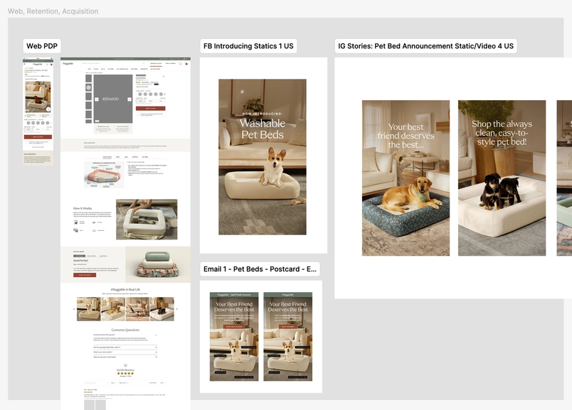
When Director of UX Product Design Alicia Clapper joined Ruggable six years ago, she was thrown into several parallel, siloed workflows. This led to discordant experiences across its digital platforms—from ads on social media, to the homepage, to product detail pages—and therefore a disjointed customer journey. Since it often takes 10 days or more for Ruggable’s shoppers to purchase a rug after browsing, building consistency between all of these touchpoints was key—particularly in an increasingly competitive landscape.
“Historically, the UX and e-commerce team had been pretty separate from brand and creative,” says Alicia. A social campaign would feature one set of imagery, while the website leveraged another. “We never really had much insight into what they were doing, and vice versa, until things went live.”
This was, in part, because their work was dispersed across several tools, then manually shared in Google Drive. Without a centralized component library, elements like colors, font styles, buttons, and footers were hard to wrangle. “We were simply copying and pasting from one page to another and editing them based on the project and content,” Alicia says. “It was very manual, and created a lot of room for error from one project to another. Version control was non-existent, so we really had to make sure we were copying the latest files. I don’t know if I would even categorize this as ‘managing’ a design system.”


Five years ago, the UX team embarked on a migration to Figma to bring things into alignment. Now, they’re able to design, prototype, and test new designs all in one place. Plus, moving from design to development is 10 times faster than before thanks to Dev Mode. Instead of manually creating annotations, designers can check a box to prepare the files. “The feeling was, ‘This is perfect. We don’t need anything else.’” Alicia says. Now, there’s less back-and-forth between designers and developers, and it’s clear which version of a design is most up-to-date.
After being invited into Figma as collaborators, the Brand, Creative, Retention, and Acquisition teams at Ruggable have joined the platform as well. “We were able to involve the creative team by easily sharing links, and allowing them to comment on any specifics that they felt aligned better with the brand,” says Alicia. “The ease of updating and implementing our design system in Figma after our 2024 rebrand inspired other teams to want to use it. This was a big catalyst for wider adoption.” Now, Alicia brings in multiple teams to FigJam for cross-functional meetings and brainstorm sessions, too. “One of our product managers has even commented how fun, engaging, and productive meetings are,” she notes.
The ease of updating and implementing our design system in Figma inspired other teams to want to use it. This was a big catalyst for wider adoption.
This new standard of engagement and collaboration has been essential for creating a consistent customer experience, which is key for brand building. “There's a familiarity that resonates with people,” Alicia says. “And it really strengthens trust with the brand and allows them to find what they are looking for and make the purchase.”
How GitHub and Design Business Company bring delight to developers
As a beloved developer platform, GitHub saw an opportunity to use its online Shop to both amplify the brand and build community. To pull this off, GitHub teamed up with creative studio Design Business Company to create a standout shopping experience on Shopify that offers coding-related collectibles, apparel, and lifestyle goods. The project called for a new design system, branded merchandise, product photography, and packaging, which was all completed in Figma. Not only did the redesign save the GitHub team from having to make cumbersome, manual updates to the store, but it also made room for play in the form of developer-centric “Easter eggs” that speak volumes about GitHub’s brand identity.
Founded by Stewart Scott-Curran, Judson Collier, and Jordan Egstad, DBCo embeds within client teams for each project, shifting away from the agency-knows-best framework that once ruled the design industry. Instead of presenting ideas every few weeks or months, DBCo offers visibility into what and how it’s designing to create an ongoing conversation with its clients, which are usually early- and mid-stage startups that expect highly responsive, nimble workflows. “Clients get to help us correct the direction so much more quickly,” Jordan says. “That's a huge time savings.”
As soon as a project kicks off, DBCo invites clients to a shared Figma mood board where everyone can drop in ideas and leave comments. “That's our first line of defense when it comes to collecting feedback because of the context and granularity it gives us,” Judson says. The store redesign involved over two dozen people, including stakeholders from GitHub’s Shop, Brand, Design, and Web teams, as well as accessibility consultants. Mapping out everything in the file meant that these collaborators could easily jump in at any point and orient themselves to the project.
After the brainstorming phase, it was time to build out the design system. To expedite the process, DBCo starts with a universal foundation it built called the Construct Design System, which is set up with Figma variables. As a starting framework, Construct hits “the sweet spot between having enough system in place to be helpful and having too many constraints,” says Jordan, who shares that it condenses a day and a half’s worth of work to just 30 minutes.
[The Construct Design System] condenses a day and a half’s worth of work to just 30 minutes.
The Konami Code (↑↑↓↓←→←→BA) is a cheat code that’s appeared in many video games. It’s also known as the Contra Code, since it gave players 30 extra lives in the NES version of the game “Contra” by Konami.
Prototyping was also a key part of the process, especially when it came to bringing the product pages to life. These designs often involved eight variants—from size, to color, to customization—that required conditional UI and “nerdy, idiosyncratic developer moments,” as Jordan describes. When someone enters the Konami Code, for example, the site images turn into ASCII art. “Developers use words and letters as tools, so we thought, ‘We’ve got to find a way to animate and bring these words to life,’” he says. “We came up with different motion studies and dropped them into prototypes so that we could really get a sense of how the interface would respond with different transitions, button hover states, and things like that. Helping GitHub visualize the designs and having them feel tangible was really helpful in arriving at a decision.”
In the end, being able to collaborate so closely with multiple teams in the same file led to a cohesive retail experience, from browsing to checkout to delivery, for GitHub’s highly discerning audience. “Developers are good bullshit detectors,” Judson says. “We were challenged to make sure that we were being true to the form and true to the work of developers because whatever we did, we wanted to do it at a very high bar.”
E-commerce today is about much more than getting a customer to click “add to cart.” As the market grows, outstanding digital experiences for all steps of the customer journey, from brand awareness to the actual purchase, will become more important. Creating space for teams to brainstorm ambitious ideas, quickly prototype them, and get them in front of customers is essential. Learn more about how teams are using Figma, and get in touch for a demo.