

Workflow lab: Deploying designs directly with Figma Make

The handoff from design to code doesn't have to be a one-way street. This workflow shows how a designer can connect a codebase to Figma Make, make the changes directly, and bring the whole team into review—right up to the PR.
Share Workflow lab: Deploying designs directly with Figma Make
Hero illustration by Marine Buffard
Workflow fact sheet:
Figma products: Figma Design, Figma Make
Tools: The Figma agent, GitHub integration, Make with production code, annotations
Team: Designer, engineer, and product manager
Question to solve: What if the small fixes that make a website inclusive didn't have to wait in the backlog?
Welcome to Workflow Lab, where we present a sample workflow As teams build faster, design and code can drift apart just as quickly. This workflow shows how to close that gap—bringing real product states onto the canvas so designers can shape what actually ships.Workflow lab: Expanding the canvas with Figma MCP
Traditionally, the path from “I noticed a minor thing” to “it shipped” runs through a ticket. The designer writes it up, it lands in the backlog, and it gets buried under everything the engineering team has already committed to. For small, high-craft fixes, that queue is where good intentions go to die. The work is too granular to prioritize and too important to drop, so it lingers.
There’s a second cost, too. When the designer hands off a written description, the nuance gets lost. “Make the spacing a little tighter” or “the screen reader announces this wrong” turns into a back-and-forth of screenshots and clarifications, and the engineer becomes a translator of decisions the designer could have made directly. But what if there’s another way to tackle this workflow?
The problem
Take the Museum of Speculative Futures (MOSF), a fictional museum exploring how culture imagines what comes next, as our example. They’re improving the accessibility aspects of their website alongside a complete architecture rewrite. With various competing priorities, resourcing this project is a big challenge. The designer wants to address the accessibility gaps, while the engineer needs to stay head-down on the equally important rewrite. To meet both goals, the PM suggests a different path: Keep the heavy lifting with the engineers, while the designer takes ownership of the low-lift, craft-level changes end to end using Figma Make with their production code From visual editing to contextual prompting and collaboration, Figma Make is expanding how teams can design with code.Figma Make, now on your local code

Gathering feedback on the canvas
Zoom out
Synthetic personas don't replace real user research, but they surface obvious friction early—creating space for in-person sessions to go deeper.
Before touching anything, the designer wants to pressure-test the current experience. They use the agent Prompting gets you started. Custom tools, real context, and skills take the design agent further—so what ends up on the canvas actually looks like you.
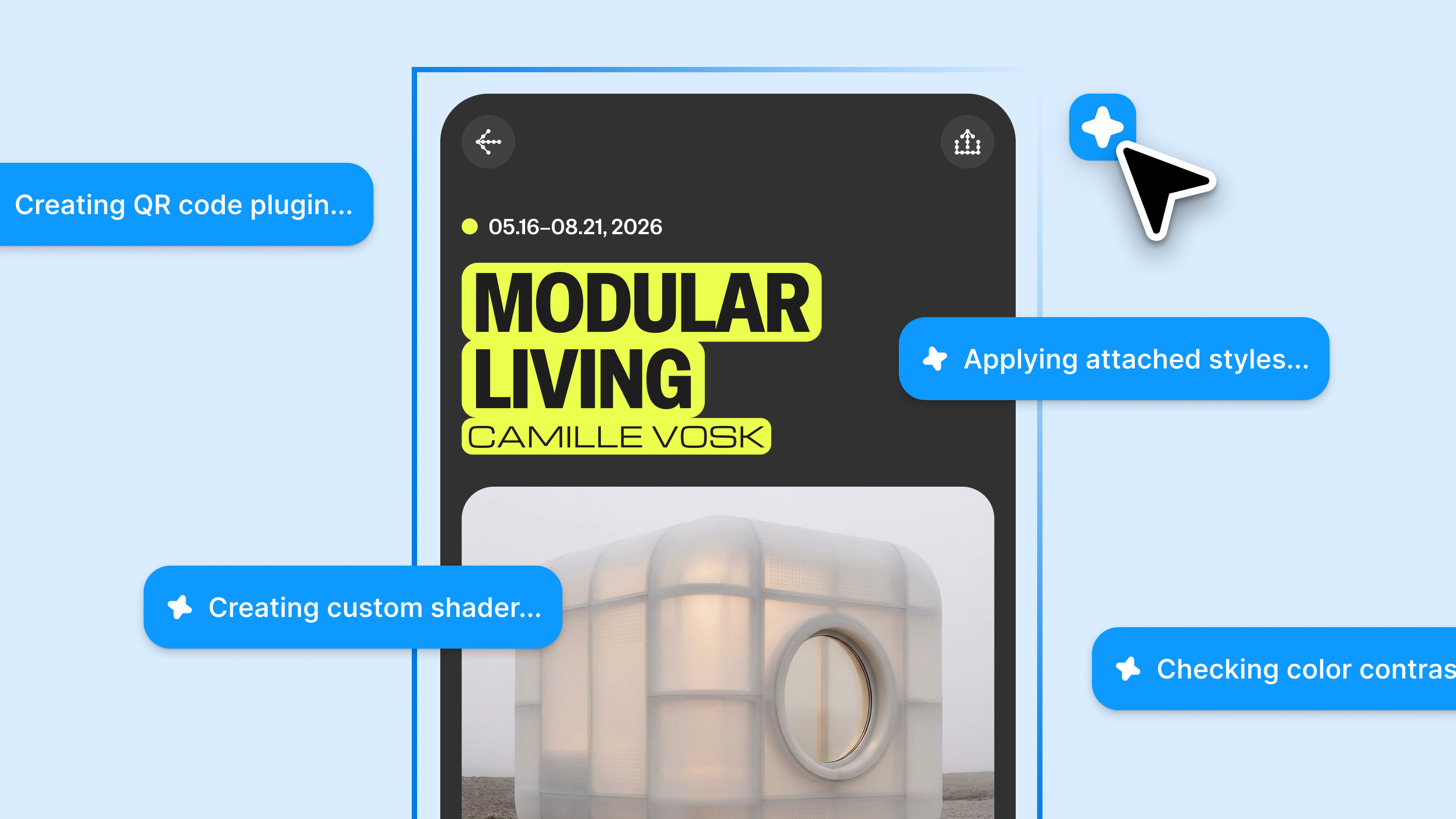
Figma’s design agent, now with custom tools and greater context
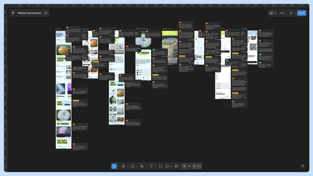
The feedback comes back specific and mostly small: a confusing label on the exhibition page, a call-to-action that's easy to miss, a date picker that's hard to parse at a glance, and a search that dead-ends on a blank screen when a collection turns up no results. None of these is a big change, but together they're details that make the website easier to use.
The designer addresses the feedback, then brings the design changes back to the team for a gut check. Together, the designer, engineer, and PM walk through each one: a clearer label on the visit page, a more visible call-to-action, and a more user-friendly date picker. They agree these serve the shared goal—a site everyone can navigate and enjoy, however they experience the web.
Working with code directly to skip the backlog
Zoom out
The handoff inverts. Instead of the designer describing changes for an engineer to build, the designer builds them and the engineer reviews—the reverse of the usual direction, with the engineer's judgment landing at review rather than implementation.
The agreed-upon changes are small and well understood, so rather than write a ticket and wait, the designer asks the engineer for access to the codebase—not to take over the rewrite, but to handle these specific fixes directly.
The engineer grants access, and the designer connects the project’s GitHub repository From visual editing to contextual prompting and collaboration, Figma Make is expanding how teams can design with code.Figma Make, now on your local code
In a static mock, this is a five-minute change. But working against the code, Make surfaces something the canvas can’t: the date picker isn’t a one-off. It’s a shared component—the same one used on the events calendar and inside the membership sign-up flow. What looked like a single tweak is actually a change that needs to happen in three places at once.
Zoom out
A ticket would have said “fix the date picker on the exhibition page”—one screen, one fix. But the date picker is one shared component rendering in three places, and the code knows it even when the ticket doesn't.
A ticket-based workflow might have fixed the date picker on the exhibition page alone, leaving the events calendar and the membership flow on the old version—an inconsistency nobody would notice until much later, if at all. Because the designer is in the code, the shared dependency is visible now, and the fix can be made once, in the right place.
Once completed, the designer works down the rest of the list: the clearer label, the more visible call-to-action, the friendlier empty states. Each is minor on its own, but together they're what turns a site that merely works into one that feels considered—the last 20% that usually never makes it out of the backlog.
Reviewing with the whole team
Zoom out
The date picker's screen reader experience gets decided in the same review as how it looks onscreen, shaping accessibility alongside design, not after it.
With the changes in place, the designer sends the work to the team for a final review. This is where the accessibility goal gets specific. The visible fixes are in. Now the team annotates how each one should work for assistive tech, right where it lives. That includes: the aria-label the shared date picker should announce so it's not just legible but readable aloud, a screen reader label that matches what's on screen, a focus order that reaches the call to action instead of skipping past it, and an empty state with a message a screen reader can announce so a search with no results isn't a silent answer.
The PM confirms it all still ladders up to the accessibility goal, the engineer weighs in on what to handle in code, and the designer folds in the final tweaks.
Pushing the PR
Once the last annotations are addressed, the designer pushes a pull request to the codebase straight from Make. The engineer reviews the code (now with the updated design intent, the team’s comments, and the accessibility annotations all attached to the same change), approves it, and merges the branch. The fixes that would have spent a quarter in the backlog, shipped in a day.
Zoom out
The PR becomes a record of how the change happened, not just what changed.
This way of working is a simple change with a long payoff. A ticket closes and disappears, and the decisions that lived inside it evaporate with it. The merged change keeps them: the comments, the accessibility annotations, the reasoning for making the date picker shared. When someone revisits the date picker in six months, the path that led to this point is right there in the team’s shared history.

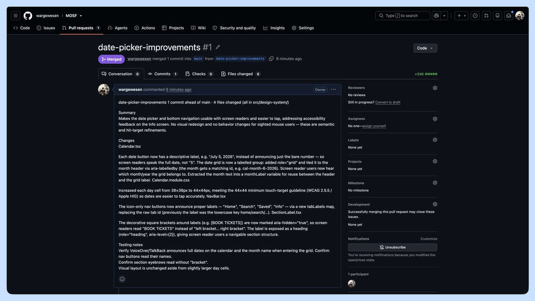
Path to production: A different kind of handoff
The traditional handoff model treats the designer and the engineer as two stations on an assembly line. That works well for large, well-defined features. But finer finishes, accessibility improvements, and polish that defines the full product experience, call for a different kind of handoff, one where the designer works directly in code.
This way of working doesn’t ask the designer to become an engineer, or the engineer to become a designer. It lets each apply judgment where it matters most With work moving more fluidly between code and canvas, workflows aren’t just changing—they’re converging.What the design-to-code loop unlocks
With this workflow, the last 20% didn’t get cut. It got shipped.
Learn more about pushing your Make projects directly to GitHub in our help center or watch our latest Config talks on designing in code and working with the Figma design agent.
Laura bends design systems, materials, and sometimes herself (often upside down). She likes to say she lives under a rock—her own creative escape from the noise. Her process runs on morning dog walks, a second brain that doubles as a therapist, and a refusal to build what everyone else is building.