Here’s everything from Config 2026
New release
Update
Figma
AI
Figma Community
Design
Here’s everything from Config 2026
New release
Update
Figma
AI
Figma Community
Design

We recently announced new features and capabilities that expand what you can do in Figma. Here’s everything we shared at Config 2026:
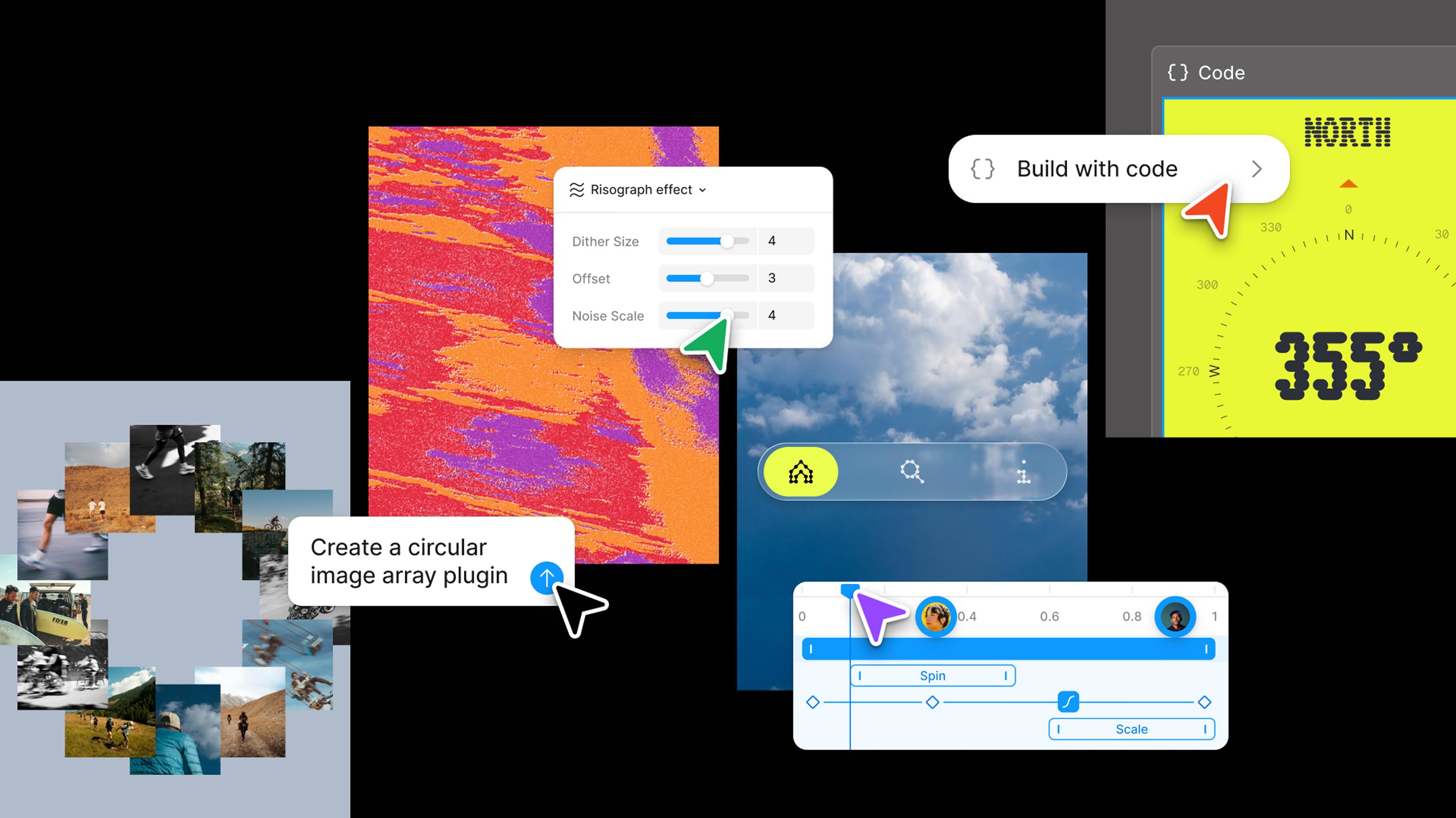
Create with new materials. Motion, depth, texture, and code — all on the canvas now.
- Motion: Create precise, expressive animations in the timeline or with the Figma agent. Build out reusable systems, and ship dev-ready animations. Learn more.
- 3D transforms: Give your designs and images 3D dimension and depth. Combine with motion to make objects move like they do in the real world. Beta signup
- Shaders: Describe what you want and our agent will build it for you—shareable and ready to bring texture to your files. Learn more.
- Code layers: Prompt interaction ideas, compare directions, and dial in the details—starting from designs or your codebase. Beta signup
Create custom tools. The Figma agent connects to your tools, your files, and your team.
- Agent skills: Add skills, attachments, or connectors to help the Figma agent help you — more context for the agent, more control for you. Learn more.
- Agent in FigJam and Slides: Generate boards and diagrams in FigJam and draft and bulk-edit decks in Slides. Beta signup
- Generative plugins: Tell the Figma agent what you need and let it generate custom tools for your creative work. Learn more.
- Figma Weave tools: Get quality assets on repeat with tools that transform any visual — style transfer, perspective shifts, and more, without leaving Figma. Learn more.
- Weave workflows: Create and publish Weave workflows as a tool or a template file for others to use on the Figma Community. Try them out.
Explore everything we launched at Config in our recap blog post.