How our design team level set on career leveling


Design Manager Sara Culver takes us through evolving Figma’s product design and writing career levels.
Share How our design team level set on career leveling
When I joined Figma as a design manager in 2021, I wanted to get a better sense for what made a designer successful at the company. I would be hiring soon, and I wanted to set my future team up for success. Everyone seemed to agree: It was all about craft. The problem was, we didn’t all agree on what “craft” meant. Was it about great visual design skills? Amazing prototyping capability? Designers with specialized skills like motion design? Without a clear definition, it was hard to coach and evaluate the team. The only resource we had was an early version of ladders and levels that our head of design put together a few years back. That artifact had served us well as a smaller team, but hadn’t grown with us as the organization expanded to support multiple products and teams. So, I wanted to dig deeper: How did we measure craft at Figma?
It wouldn’t be a real project without some scope creep, so of course improving our definition of craft snowballed to revamping our entire career ladder. A year later, we're excited to share our new Figma Product Design & Writing Career Levels and accompanying Skills Widget. But first to quickly backtrack—here’s how I took point on bringing our vision to life.

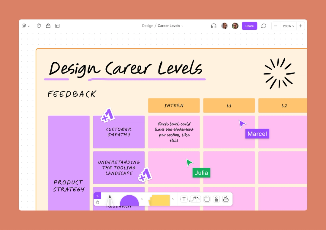
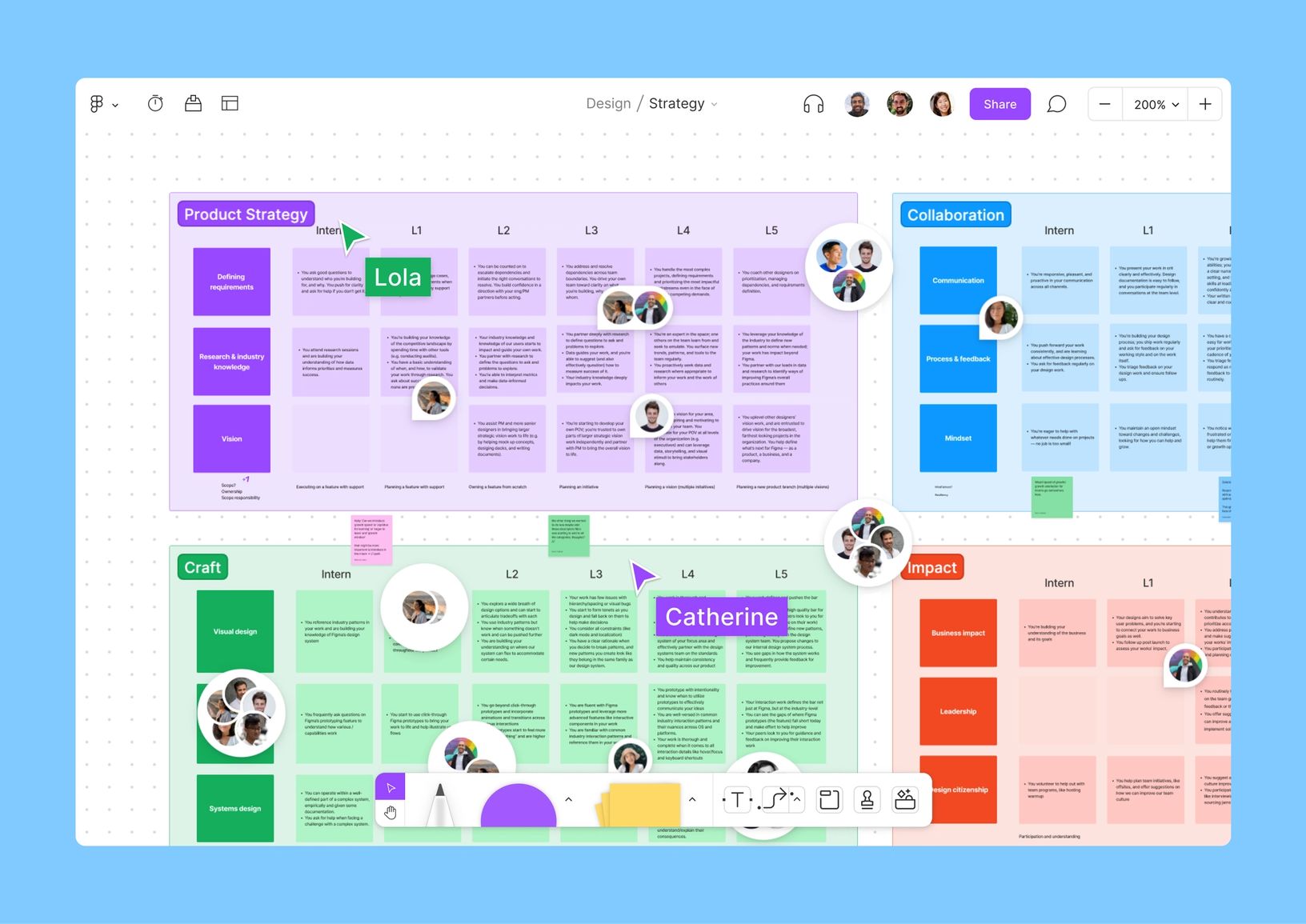
We created a FigJam that shows how the Figma Design organization thinks about performance at each level, including a skills chart and detailed descriptions of the core competencies we expect for each role on our team.
Research, research, and a little inspiration gathering
As a growing team, with many designers hitting their two- or three-year marks at Figma, it was the perfect time to rethink this fundamental management tool. A new, better career ladder would scale with us for the next few years, allowing managers to make stronger hiring and performance management decisions, and help individual designers on the team understand where to invest in developing their skills.
Our existing career ladder was a one-page Notion document that mapped to each role’s level, including a range of skills: product strategy (to make sure designers were engaging with research, influencing their team’s roadmaps, and understanding core user needs), craft and quality (a designer’s bread and butter), and upleveling others (to encourage mentorship and feedback-giving on the team). My sense was that some of this content was worth keeping.
I also wanted to get input from designers across Figma about what they’d like to see in an updated career ladder. These documents can carry a lot of weight, particularly with those who pore over what’s expected of them at their level (or the next level). I also knew our wider team would likely have some smart suggestions about the content and format for the ladder.
I sent out a basic survey to get started, asking questions like:
- How are you using the existing career ladder today?
- What questions do you want an updated career ladder to answer?
- Anything you like about the current ladder you’d like to keep?
- What other strong examples of levels or ladders have you seen?

Our team was, of course, extremely thoughtful and helpful in their responses. The main themes we heard were:
- A desire for more detail. Phrases like “can handle complex product challenges” weren’t specific enough or were too subjective to be helpful in performance and growth conversations. The team had a clear hunger for more concrete examples.
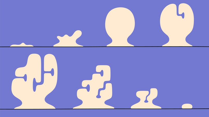
T-shaped designer
Someone called a T-shaped designer is a designer with an extensive set of skills, but an expert at one of these skills.
- A need for clarity around senior levels. Designers can tend to be spikier in their skillset, or more “T-shaped,” as they get more senior. The team wanted us to make an explicit call on how we saw promotion and hiring at those levels. Did we want to continue to require someone to be excellent across the board as their seniority grew, or did we want to reward the natural specialization that often occurs?
- Craft, craft, craft. As expected, we saw a strong theme around articulating what good craft looked like at each level in a more robust way, and teasing out which skills made up a strong craftsperson.
Delightfully, we also got some great suggestions for other ladders as inspiration. Several folks referenced Slack’s (which I worked on previously), Buzzfeed’s, Meta’s, and Basecamp’s. A designer on the team (Shana Hu) took the time to break down her feedback on the existing ladder extensively, and propose a new, more visual format using FigJam.

First draft (plus feedback)
As I drafted, I looked deeply at examples across the industry, and asked the rest of our management team for help sourcing even more. We pulled together an inspiration board (in FigJam, of course) of all the artifacts we liked. Combing through these, a few approaches I liked were: (1) Grouping skills by area, (2) Ditching “ladder” language in lieu of “stages” or “levels”—which better reflect the rambling, nonlinear path most people take in their career, and (3) Visualizing the information so that it was easier to scan and understand, which we thought we could achieve by using FigJam.
I put together a proposal of four core skill areas and the skills I thought should be included in each. Craft, of course, would be top of mind due to its importance to our team; a category around “product,” encompassing vision, strategy, and research was also essential. Finally, I wanted there to be a couple of skill areas that would be translatable across the functions on our team, which includes specialties like design operations and UX writing. Here’s our final list:
- Product Strategy: Defining requirements, research, vision
- Collaboration: Communication, process and feedback, mindset
- Craft: Visual design, interaction design and prototyping, systems design
- Impact: Business impact, leadership, design citizenship
I started putting these into a similar visual format to the one Shana had proposed, and soon I was ready to bring a draft of the overall framework to a crit Learn six unique methods for design critique used by the Figma design team, along with some tips and best practices for running them effectively.

From Figma's design team: How to run a design critique

The overall skill areas landed well with the other managers, and they offered some great feedback on places where skills could be consolidated. We also had really rigorous (and fun!) debates on certain skills: Did we want to incentivize hiring specifically, since we were a growing team? Were we sure “systems design” was widely understood and needed to be reflected explicitly in a levels document? Where did “communication” fall as a skill, since there were so many places it impacted work? How should we capture the old ladder’s sentiments around rewarding a focus on quality not only in one’s own work, but across all of Figma’s products?
As designers know, for big projects, one crit is never enough—so I made some heavy revisions and brought these drafts back to our managers a couple more times. Together we honed our framework, riffed on individual skill descriptions, and developed an onboarding section to help designers understand how to use the career levels. We solicited more feedback from outside of our team, which pushed us to go even deeper: Clarifying how we saw skills changing for senior designers, adding summaries for each level, reducing bias, and, yes, further defining "craft" were all important to get right before launching officially.
More drafts—and sharing more broadly

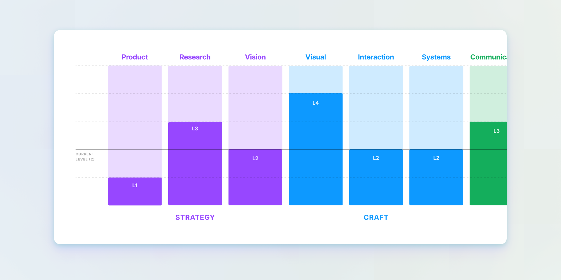
We built a Skills Chart widget that lets you interact with a visualization of skills across our design and writing career ladder.
In terms of timing, we felt ready to roll out the new levels to the team more broadly in May 2022 (a full year after kicking off this work). We wanted to land it early in a performance cycle, so that our team didn’t feel like they were surprised with new information right before reviews. We also wanted the tool to encourage a more dynamic conversation between managers and reports. Noah Levin, our head of design, iterated on the visual format for the file and developed a FigJam widget that would allow for easy (and delightful) self-assessments and performance reviews.
With the internal announcement, I reiterated why we’d taken on this project and what we hoped this work would contribute to career growth conversations for all designers at Figma. The biggest differences? Streamlining our previous ladder from seven nebulous to four clear-cut categories (Strategy, Craft, Collaboration, Impact), as well as improving clarity through better definitions, concrete examples, and visual infographics. We’ve gone through one performance cycle with these new levels since launching, and iterated on formats for giving feedback in FigJam using the widget. The goal is for every manager to have regular career conversations with their reports, and we’ve suggested (but not mandated) that the levels document be referenced in those meetings.

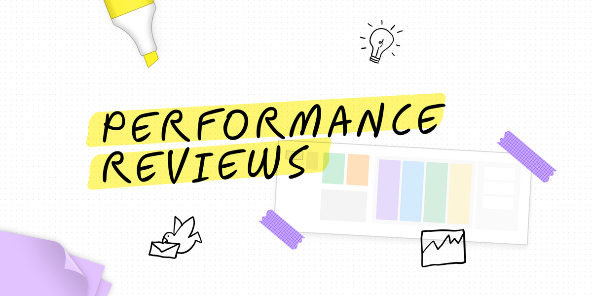
Noah created a FigJam template that mirrors how we conduct performance reviews at Figma.
In my experience, many companies have broad or vague prompts for their feedback cycles, so it’s been particularly rewarding as a manager to tie performance feedback so closely to our stated expectations. The new format in FigJam also allows us to make these expectations much more visual and easy to understand at a glance. It feels nice to be able to leverage a more flexible open-ended canvas to include screenshots for context and, most interestingly, to “jam” together with my reports on ideas for growth with sticky notes and tables. We even ended up using this format for performance reviews and calibration across the design organization as a whole. FigJam allows all people managers a bird’s-eye view of every designer’s completed skills chart, which makes it easier to understand performance as a whole and guide conversation efficiently.

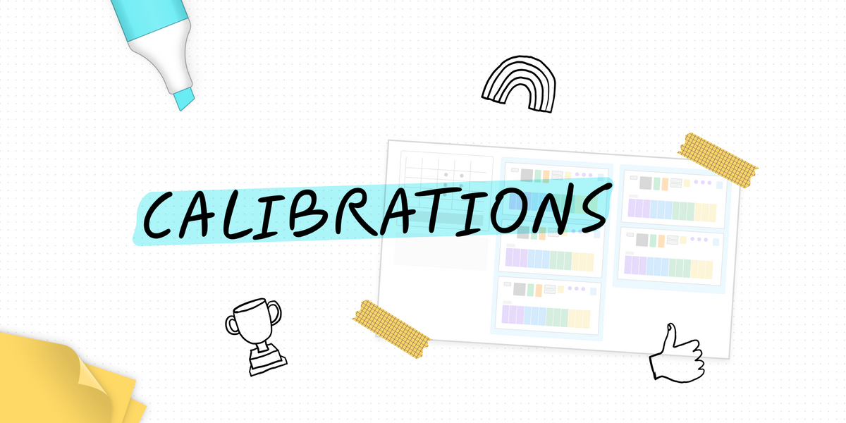
This template is somewhat similar to how we run calibrations on the design team at Figma. This template offers a wide range of tools, with the idea that you should pick what works for you and your team specifically.
Career levels are always living documents, so we’re still soliciting feedback on ours, and will surely need to update it in the future as our team continues to grow. We know we need to think about how it intersects with Figma’s values more carefully, and have plans for adapting it into an artifact we can use for when assessing candidates for hiring decisions as well. We also plan to add manager career level descriptions here, for transparency and accountability to the whole team. This kind of work is never quite “done”—like any digital project How do you make progress when work is always in flux? Chief Product Officer Yuhki Yamashita discusses how to embrace (and enjoy) endless iteration and shares Figma’s approach to developing collaboration features designed with an always-in-progress state of mind.
Welcome to the WIP
We created a FigJam that shows how the Figma Design organization thinks about performance at each level, including a skills chart and detailed descriptions of the core competencies we expect for each role on our team.
Check out our final Figma Product Design & Writing Career Levels (and widget), and let us know what you think!
Sara Culver is a design manager on the Product Design team.