Little Big Outtakes


The quick pivots and aha moments we made on the way to launching 30+ Little Big Updates.
Share Little Big Outtakes
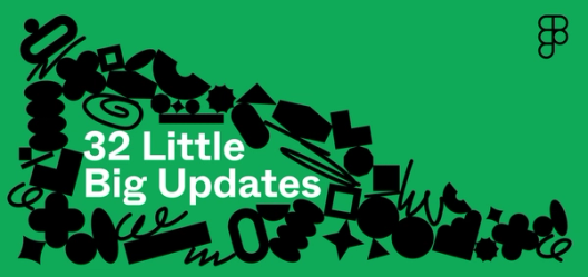
Today we’re launching the latest installment of Little Big Updates, 30+ small but mighty features to help you work faster in Figma. Here are a few of our best-of anecdotes from the designers and engineers who worked to bring this class of Little Big Updates to life.


Feature: Multi-select search. Use Shift + Click or Cmd (Windows: Ctrl) + Click to select specific search results to edit and replace.
Team: Jackie Chui (design), Akshay Subramaniam (engineering)
After launching find and replace in Figma and FigJam Designer Jackie Chui on the complexities of sorting logic, designing specialized UIs for Figma and FigJam, and why experimentation and intuition go hand in hand.
Behind the feature: Find and replace
The problem? When Jackie and Akshay tested an early version of multi-select, they realized that it was hard to tell what you were actually selecting because in Figma, you can’t select a “parent” (a frame, component, or group) and “child” (an object contained within a parent) separately. So, with multi-select search, both the parent and its children could show up at the same time as results. While the feature technically worked, the user experience was jarring. “I kept thinking to myself, ‘Is this a bug?’” Akshay says. Everything worked as expected when you selected the first item, but the moment you selected the second item, it would pull in a bunch of descendent items that you may not have intended to select. Throw in a file with a lot of nesting, and it was impossible to tell what’s what. “Suddenly you’re lost in this big file and you’re struggling to multi-select,” he adds.
The breakthrough? Jackie and Akshay created a visual hierarchy in the find and replace sidebar to make it clear which children fall under which parents, and what you’re selecting in turn. When you hold Command or Shift to “hover-select,” Figma highlights the indirect items that are automatically selected in the background and outlines the children you’re selecting, acting as a preview. “To me, that felt really pivotal,” says Jackie. In the end, it was the edge cases that got them to the best solution. “Even the original find and replace didn’t have so many different edge cases,” says Akshay. “Multi select is [pretty much] defined by them.”

Feature: Blur effects. When you add an overlay with background blur in prototyping, things actually get a little fuzzy.
Team: Brandon Lin (engineering)
Before today, blur effects on overlays didn’t reliably work in Figma. The prototyping viewer would render a blur by grabbing what’s directly beneath the frame. But with overlays, there isn’t something directly beneath the frame. Brandon was just a few weeks in when he took on debugging overlay blur effects in prototyping—an onboarding project to help him ramp up and get to know how his new team works together. After spending some time coming up with potential approaches, Brandon was worried that he was missing something. He took a step back to write up his thinking, potential “gotchas,” and a solution, and shared the doc with his teammates.
They offered suggestions for refining his solution: to pass information about the overlay’s position to the code, so it knows where to correctly look for things to blur. Based on the team’s feedback, Brandon added concrete structure and pulled in relevant data to more clearly make the association between overlays and their respective frames. These changes allow different overlays to be drawn at their respective correct places and, in turn, correctly layer on top of each other. Brandon’s instincts were right. As a new Figmate, he simply needed a gut check from the team. “It gave me more confidence,” he says.


Feature: On-canvas previews. Hover over design panel options to preview different settings and properties before committing to them.
Team: Hauke Gentzkow (design), Molly Lloyd (engineering)
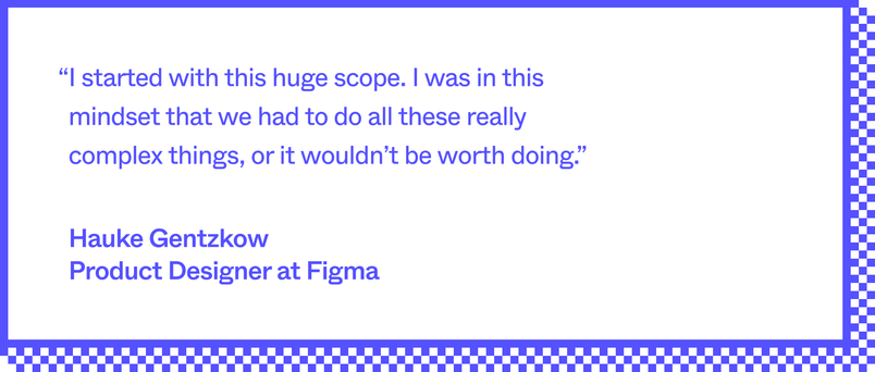
Building on-canvas previews was an exercise in scoping down. Before the team decided on the handful of settings and properties that you can now preview in Figma—like layer blend modes, effects, and color blend modes—they also considered supporting boolean ops, component props, and the font picker. “I started with this huge scope. I was in this mindset that we had to do all these really complex things, or it wouldn’t be worth doing,” says Hauke. “I was nervous that the set that we have today wouldn't be enough, but I think once we started to really play with it, we realized it's super powerful.” The tension for me was just [having enough] time,” says Molly. So how could they move quickly, while also perfecting the details?
Instead of trying to ship everything at once, they decided to ruthlessly prioritize. Hauke audited the Figma editor for all attributes that have a dropdown, and then he and Molly went through it together. “I would say, ‘Okay, this is super doable,’ or ‘This might be tricky,’ or ‘This will blow up users’ memory,’” says Molly. She and Hauke jointly agreed to an approach. “We ultimately landed on building the features that didn't require a lot of geometry change or huge changes on the canvas” says Hauke.

The internal response was validating. “When I shared an engineering proposal, everyone was like, ‘I've wanted this for so long.’ I think there's a lot of internal excitement over something small, which is very Figma,” says Molly. “People really appreciate the details and get excited about nerdy design usability updates.”


Feature: Hanging punctuation. Preserve the flow of your text by letting punctuation like quotation marks hang outside of the text box.
Team: Amanda Yeh (design), Joanna Chen (engineering)
Design is in the details, and the product team often finds itself poring over decisions to perfect those details. Case in point: As Amanda and Joanna worked on the text bundle, they found themselves left hanging on hanging punctuation.
“Joanna thought that this should be a keyboard-only entry point, and I was thinking this could be a toggle that's in the type settings panel,” explains Amanda. The “keyboard-only” approach would mean thinking about hanging punctuation as functional indentation; a UI toggle would lean more towards type design. It took a long time to think through because there weren't a lot of precedents in other products, there’s no standard way to implement this in CSS, and they wanted to make sure that the approach was intuitive for users.
“We both have different reasons for [favoring one approach over the other], so we’re still discussing,” Amanda says. “We’ll let you know what we decide.”

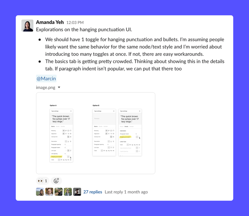
While things were undecided at the time of our conversation, they of course came to a decision in time for launch: the UI toggle approach, knowing that designers would ultimately treat this as a stylistic change.
Check out these fixes and features, along with all 30+ updates here.