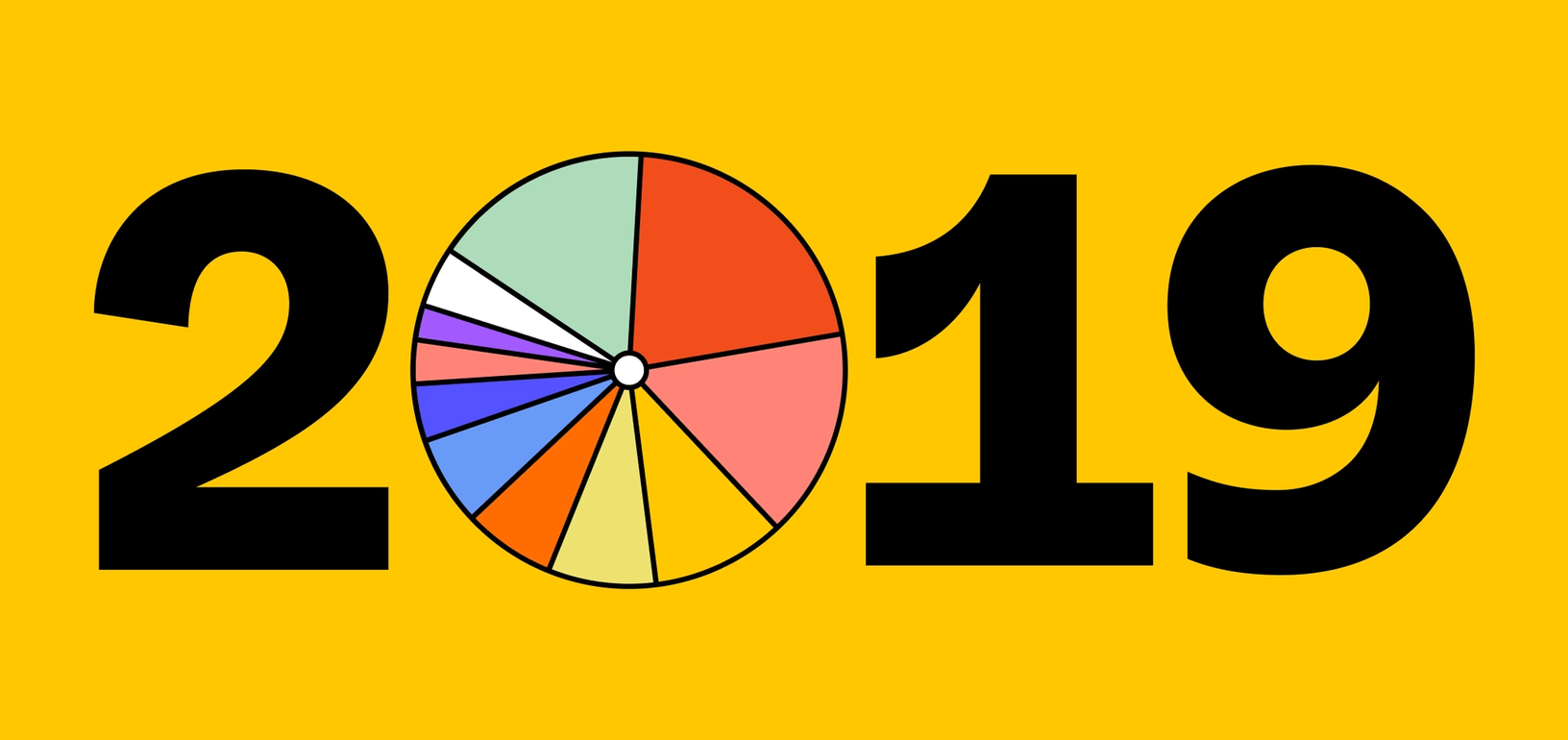
Made in Figma, 2019: Design by the numbers


What you made in Figma, and how you made it, in 2019.
Share Made in Figma, 2019: Design by the numbers
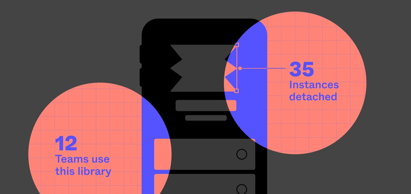
This year was a big year for design, for you, and for us. More people, in more places, are participating in the design process and new features like design system analytics Design System Analytics enables you to see library usage trends, compare libraries, and drill into component usage.
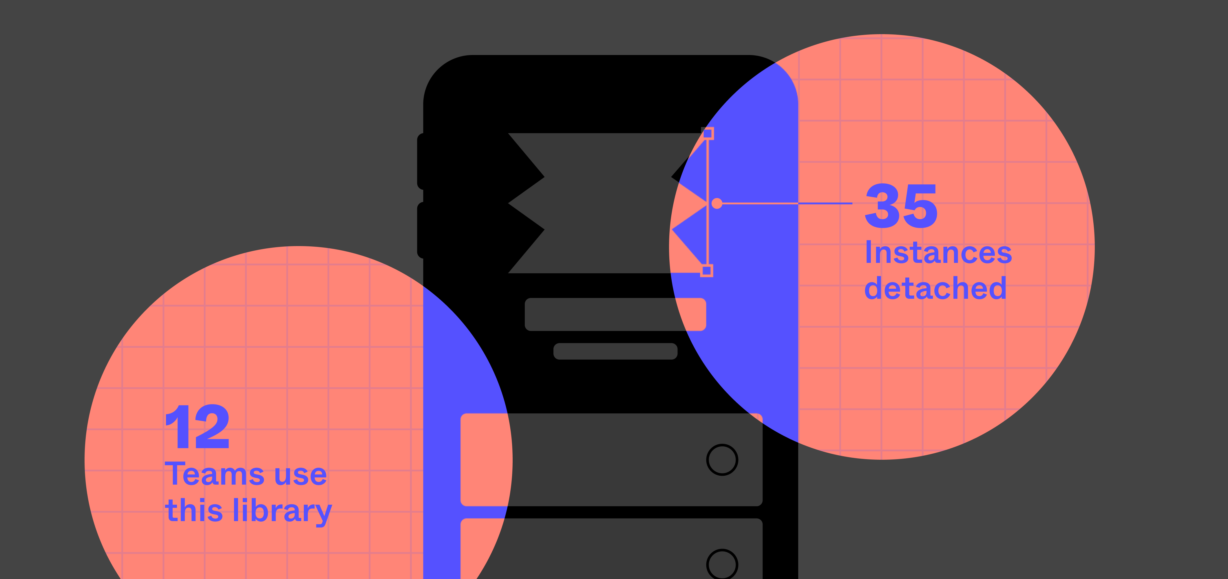
Opening up the data behind your design systems
Design is evolving The tech industry, which long exalted the engineer, has finally begun to appreciate the designer too.
The decade of design: How the last 10 years transformed design’s role in tech
Here’s what 2019 looked like in Figma:
File style: Your favorite colors and fonts
Figma provides a space for all phases of design, from free-form explorations to complete prototypes. Fonts, styles, and colors play a critical role in creating something that fully expresses a product and brand.
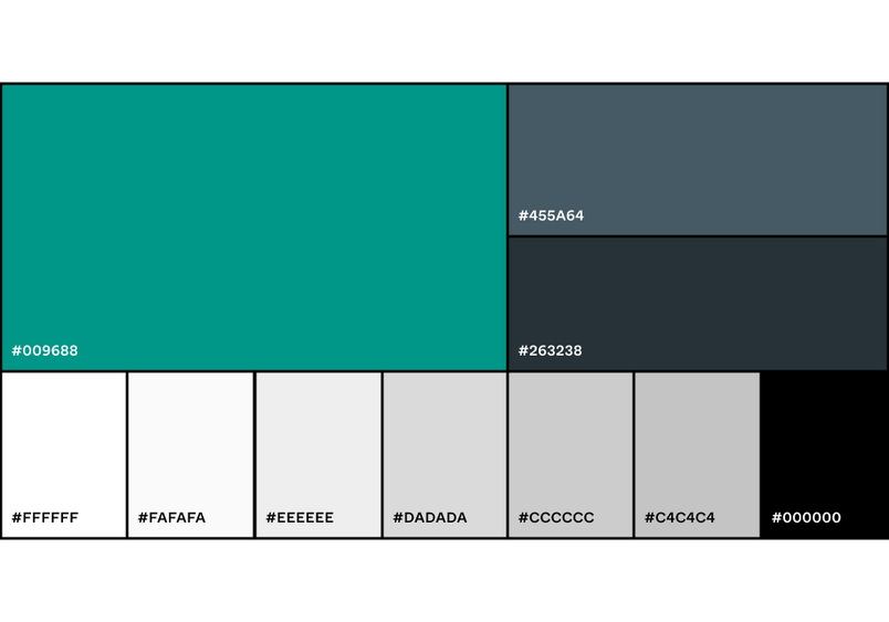
Keeping it cool
Beyond greyscale colors (top five depicted below), Figma customers kept it cool this year with lots of greens and blues. The most commonly-used non-greyscale color was #009688 with two dark blues, #455A64 and #263238, next in line. These colors, often key segments on the color wheel, are leaps away from the 2019 Pantone color of the year, Living Coral (#FF6F61).

Google Fonts reign supreme
In Figma, you can choose from over 900 pre-installed fonts or add a custom font. Unsurprisingly, the top three fonts in 2019 were Montserrat, Open Sans, and Lato which are all Google fonts. Because they’re so readily available in Figma, Google fonts represent six out of the top 10 most-used fonts. Despite not coming out-of-the-box, SF Pro Text, SF Pro Display, and Proxima Nova also made the top 10.
While we weren’t surprised to see both Apple UI fonts as top contenders, we were surprised to learn Arial surpassed Helvetica in the systems font race!

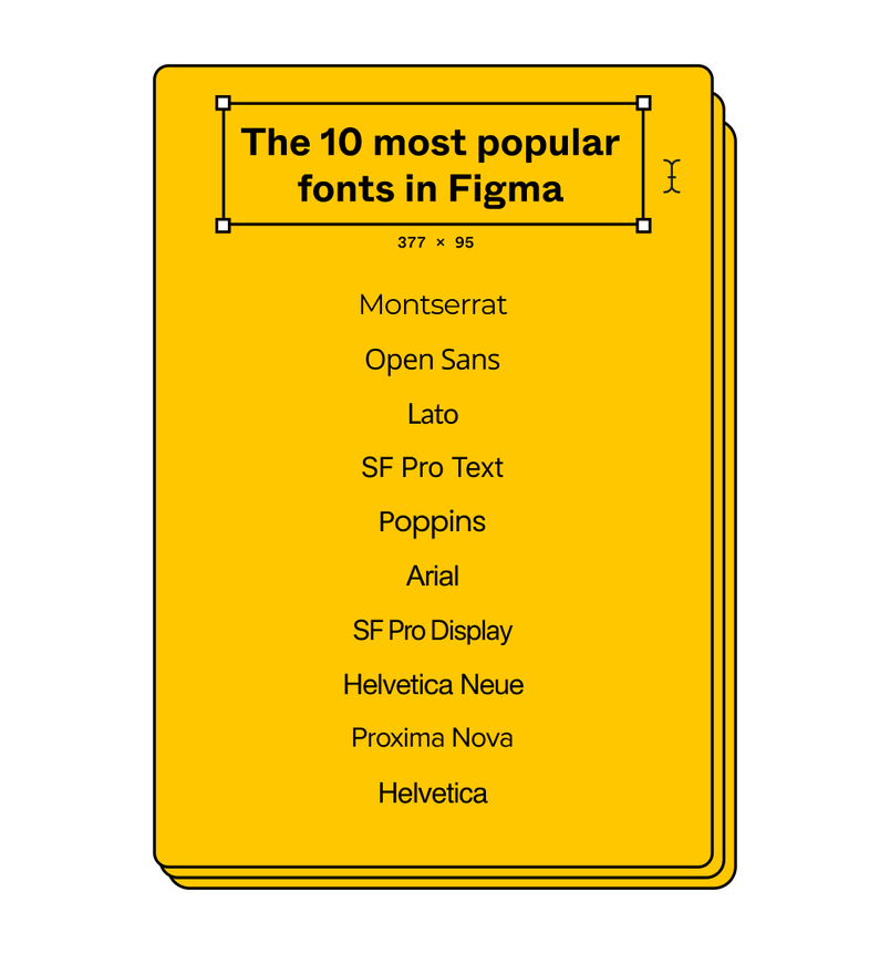
90% of all font usage was concentrated in the top 11 (top 10 above + Roboto, the default). We’re looking forward to seeing how type usage evolves over time as designers continue to push the boundaries of creativity and readability.
Beyond the top 10
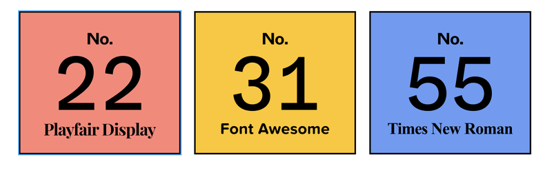
Font Awesome, the first icon font, was ranked #31! Not bad in a world dominated by characters. Our oldie-but-goodie Times New Roman didn’t make the top 50 (ranked #55). And, we have to go beyond the top 20 to get our first Serif font, Playfair Display (ranked #22).

Getting heavy
Finding the right font isn’t enough on its own. Text style is a key factor in bringing a design to its full expression and we saw some clear preferences. Figma users were 13X more likely to manipulate type weight than to italicize. In fact, 1/3 of all Figma files use bold or heavy styles.
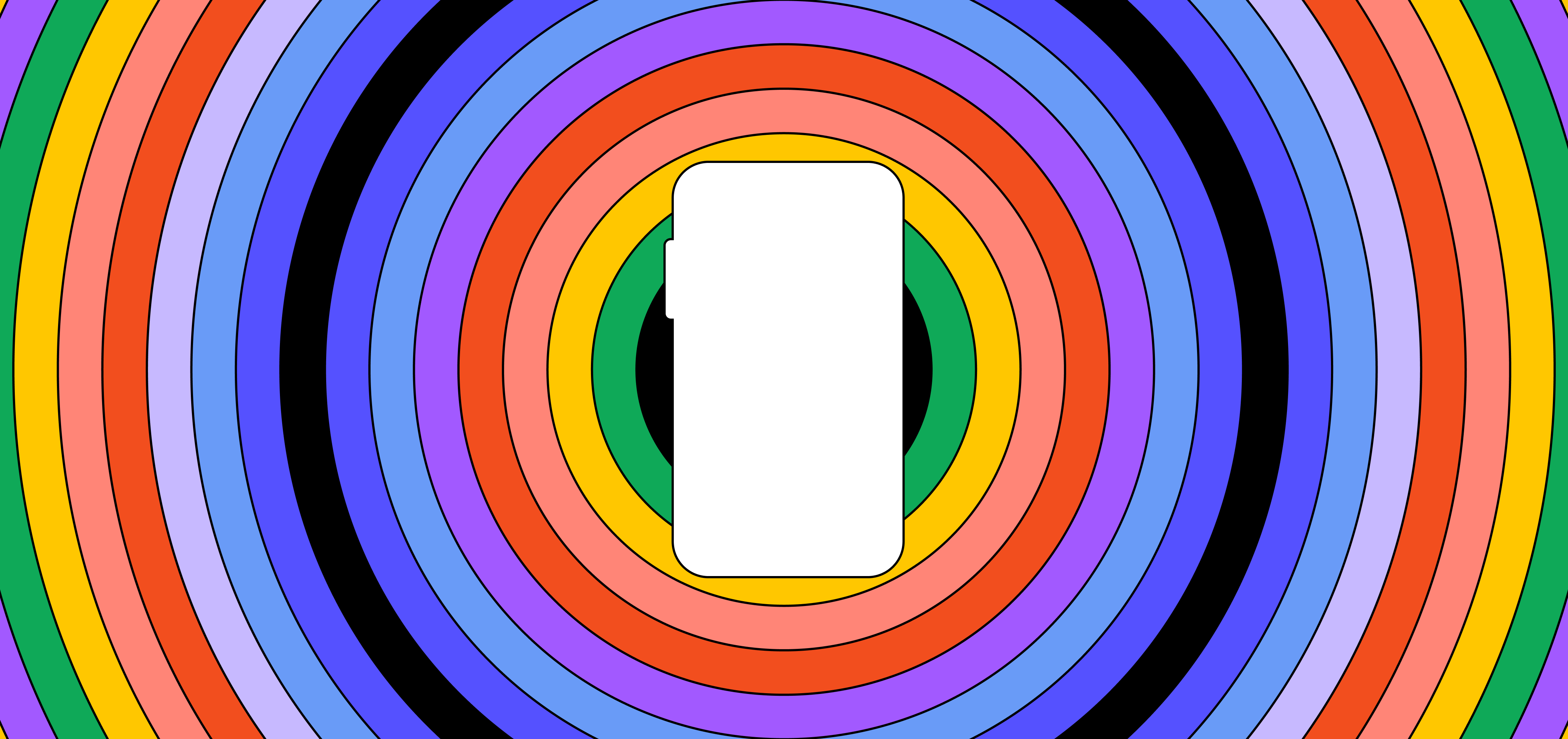
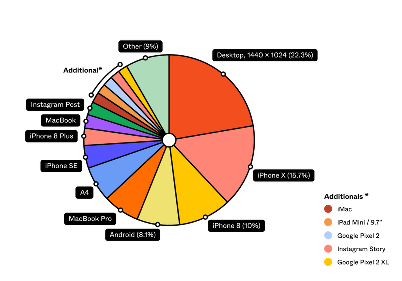
Framing your design: in a frame, but not in a box
Figma comes with 36 frame options to serve as a starting point for file design and 33% of files created in Figma started with one of these pre-defined frames.
Among those who start with preset frames, Figma users design for a variety of frame sizes and devices. The 1440 x 1024 desktop frame is the most popular, with mobile frames for iPhone X and iPhone 8 right behind. With global Windows penetration more than triple OS X, you might expect a different order.

Collaborating in Figma: more people, more places
Figma’s product was created based on the idea that design would become more open and collaborative and we’re seeing that reflected in the way Figma’s users are working together. No matter where you and your teammates work, you’ll always have a home on the Web to design together.
Building products collectively
Looking across Figma files at larger organizations, the average number of collaborators per file is six. This team can be a mix of designers, developers, product managers, writers, and others from around the organization. We looked into the lifecycle of a file to learn how these groups worked together.

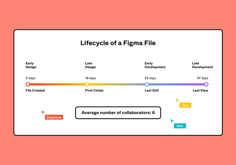
A design file usually starts with a single user, designing independently. After an average of 19 days, the first collaborator is invited into the file to review, comment, or help design. While the last edit comes at day 52, on average, we see developers not only joining early to learn and scope but also other collaborators continuing to jump into the file to view designs or grab code snippets or specs.
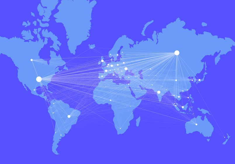
Designing without borders
Figma users are collaborating across multiple countries and time zones a lot. With nearly every continent represented, we see teams working together across the globe. Overall, more than 80% of Figma’s active users are currently outside the United States.
It’s particularly exciting to see design hubs in Eastern Europe, Asia, and Africa lighting up. Design products have historically favored Mac OS, but Figma’s OS-agnostic tools are unlocking collaboration pathways for regions with more platform diversity.

We hope to share more and more of our data findings. Give us a shout on Twitter @figmadesign to share how you designed this year, let us know what stats you loved or found most surprising, and suggest future stats you’d like to see!
A note on methodology
To create this report, we analyzed anonymized file data from a sampling of over 50,000 of Figma’s active and paying users. To understand collaboration habits, we looked at teams who had shared files between at least two people and had collaborative interactions for over a period of at least two weeks.