FigJam
Collect your thoughts with an affinity diagram example
Before you can organize your ideas into a picture-perfect process map, you’ll want to see how they relate to each other. Find the perfect blend of spitballing and structure with an affinity diagram template from FigJam.

Affinity diagram template
Find the calm in the (brain)storm with a free affinity diagram tool that group ideas and information together by similarity.

Let your affinity for order be known
Make sense of infinite information, spot common themes, and bring order to chaotic strategy sessions.
Demystify data: Present data analysis results with absolute clarity.
Spark discussions: Encourage conversations around hierarchies and relationships via categorization.
Uncover patterns: Notice never-before-seen connections between data points.


FigJam
Group your ideas in a group setting
Host an all-hands-on-deck affair from anywhere when you create your affinity diagram in FigJam. Drag shapes around with ease, elicit in-the-moment feedback with polls and emotes, and generate ideas through drawings on a shared whiteboard—no conference room needed.
To affinity and beyond
Make heads or tails of your ideas through classification. Once you’re satisfied, transfer your thoughts to other templates from the FigJam community.


FAQs
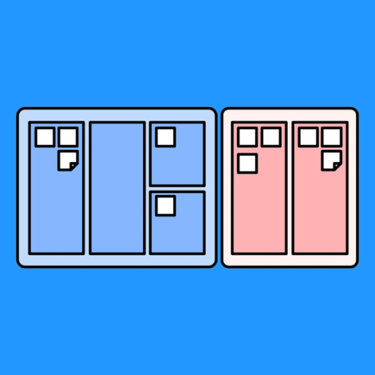
Also called the K-J method, an affinity diagram is a two-part graphic organizer that brings structure to swaths of data by consolidating information into groups based on similarities.
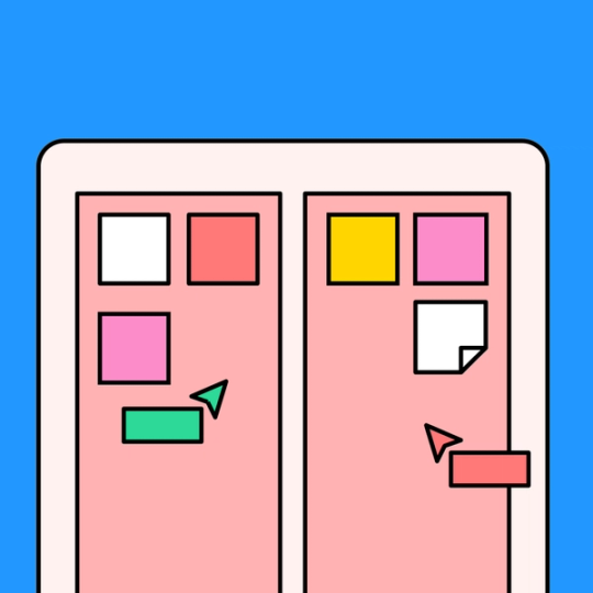
The best affinity diagram examples consist of movable parts and traditional versions can end up looking like clouds of sticky notes on a wall. Why sticky notes? They’re the perfect canvas size—enough room for you to make your point, but small enough to keep your ideas high-level.
Reach for an affinity diagram when the amount of data you’re dealing with feels endless. By separating concepts or stats into a handful of families, you shift the conversation from overwhelming to understandable. It’s easier to talk about five ideas than fifty.
For an example of affinity diagrams in the wild, just look into the meeting rooms of UX and UI designers—you’ll often find them there.
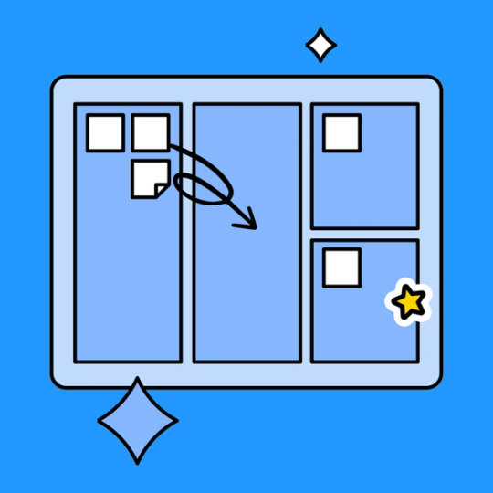
To create an affinity diagram, begin by jotting down all of your information onto sticky notes—whether they’re fresh ideas from brainstorming or copy-and-pasted survey responses.
Once you have your data on display, it’s time to group the different ideas together. Sift through your sticky notes one by one and sort them into categories. When all of your notes are grouped by category, come up with a name for each “family” of ideas, and voilà—you have an affinity diagram.
Wary of the ink-covered hands, paper cuts, and recycling bins full of waste that come with a drawn-out sticky note session? For a cleaner, greener, and more inclusive affinity diagram, try an online template from FigJam. With drag-and-drop sticky notes, intuitive connectors, and a host of other handy features, anyone can join in on the fun.
Other templates you might like


Explore 1,000+ templates on the Figma community
Explore even more templates, widgets, and plugins—all built by the Figma community.