FigJam
Group your ideas from the get-go with our T chart template
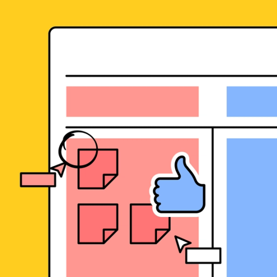
Every successful gap analysis chart or lean canvas begins with a brainstorm. If you like a hint of structure in your planning sessions, start with an editable T chart template from FigJam.

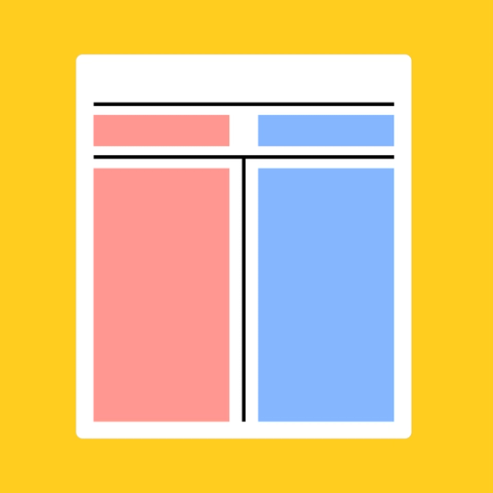
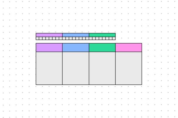
T chart template
Add unlimited users to this free T chart template and watch the bullet points pile up on either side.

Strategic planning that suits you to a T
Break down complex conversations into the simplest possible terms: A or B, yes or no, now or never.
Compare and contrast: Oppose any two ideas in a clear, succinct manner.
Group like with like: Separate individual items into a pair of distinct categories.
Embrace duality: Create a before/after table, illustrate cause vs. effect, or deliberate over pros and cons—the sky’s the limit.


FigJam
Two columns. Unlimited possibilities.
Simple doesn’t need to mean boring. With FigJam, you and your team can leverage ready-to-use shapes, colored markers, and built-in reactions to elevate any whiteboard jam session—even if it’s as straightforward as two intersecting lines.
Where function and form collide
Craft side-by-side comparisons that are polished and precise. Discover more charts, tables, and tools from the Community.


FAQs
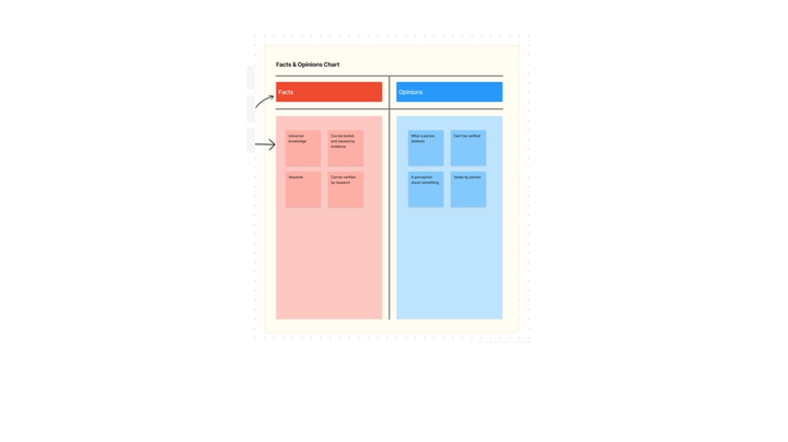
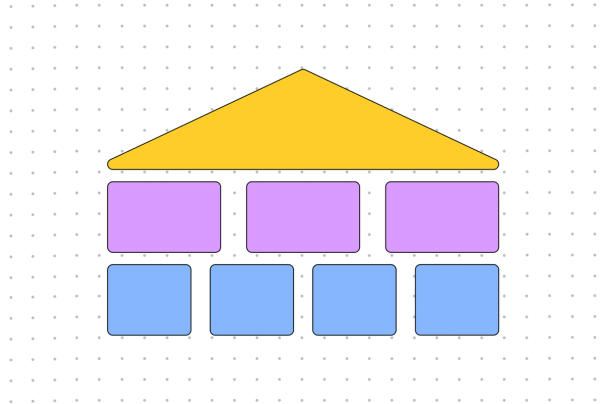
At its core, a T chart is nothing more than a giant “T” that separates a page into two distinct groupings. You might be familiar with T chart examples that examine pros and cons, but their uses go well beyond comparisons.
Ideas rarely fit into neat little boxes. But sometimes, it helps to see information in stark contrast. A T chart removes all the background noise and forces a decision—it’s either column A or column B.
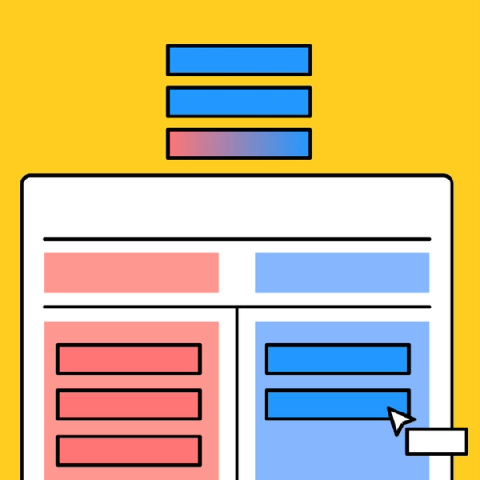
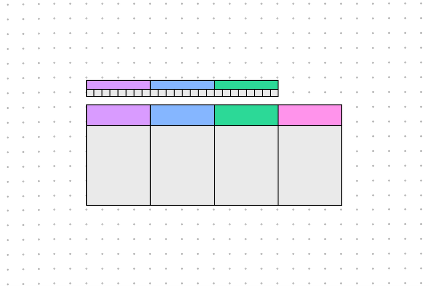
Learning how to use a T chart graphic organizer template is a breeze. Start by adding the titles of your two categories above each column. For example, you might label them “Keep” and “Delete” or “Before” and “After.”
From there, all you have to do is classify each main idea or feature that comes to mind. Two-factor authentication? Keep. Unmoderated usernames? Delete.
And if you find a suggestion that doesn’t fit into either category, ask yourself why that is. That’s the beauty of a T chart—its deceptive simplicity breeds infinite potential.
So, what are the uses of T chart models (or any graphic organizer, for that matter)? In short, you can use them all the time for anything. Graphic organizers add a much-needed visual representation to the day-to-day. They take meetings from drab to dazzling; they translate dense engineering topics into easy-to-understand tidbits for your writers; they classify linear plot points into the present timeline vs. flashback scenes.
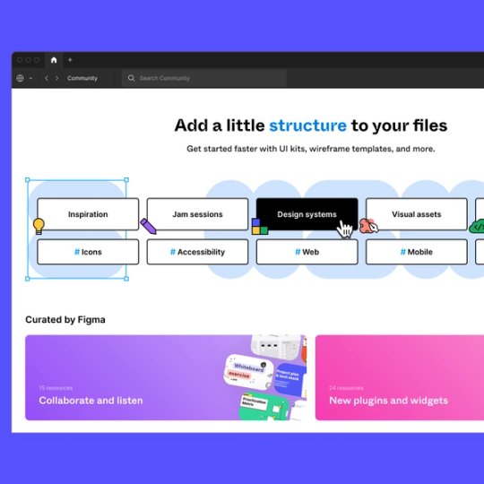
If you’re ready to bring that data visualization to your virtual meetings, look no further than FigJam’s editable templates. From T charts to timelines, you can draw the whole organization into a vibrant whiteboard space—and give them markers to draw with, too.
Other templates you might like


Explore 1,000+ templates on the Figma community
Explore even more templates, widgets, and plugins—all built by the Figma community.