FigJam
Track ups and downs with a bar graph example
Compare data and follow the patterns for a big picture overview along each axis of this customizable diagram.

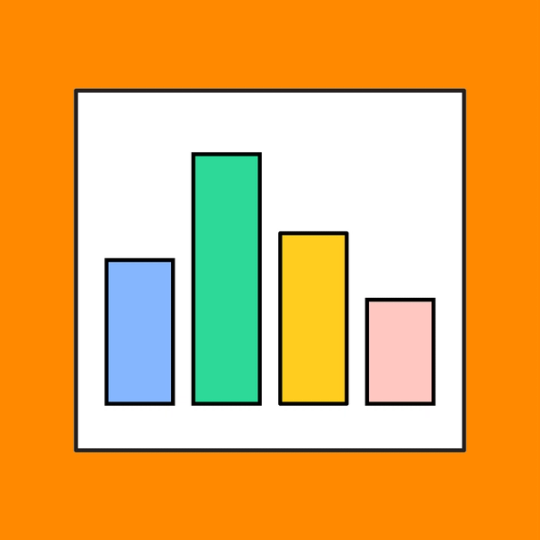
Bar graph maker
Analyze trends and track progress with this comparative chart that uses bars to visually represent data changes over time.
The easiest graph to make—bar none
Present a visual earnings report that’s as crisp as it is convenient. Analyze trends to predict your fiscal future. However you apply this interactive chart, you’re bound for clear comprehension.
Compare and contrast: Visualize relative numbers and proportions to establish trends.
Sum it up: Estimate values and predict future growth with a quick glance.
Stop the clock: Represent data on one axis and frequency distributions on the other.


FigJam
Teamwork is on tap
It’s not that type of bar, but when you bring your team together around a FigJam template, cheers are certainly in order. Clink to collaboration, inspiration, and bubbly rushes of newfound creativity when you uncork FigJam’s fine reserve of free resources.
Raise the bar with Community templates
Follow the bar chart to understand your data. Then, put your findings to work with Community templates and reach new heights together.


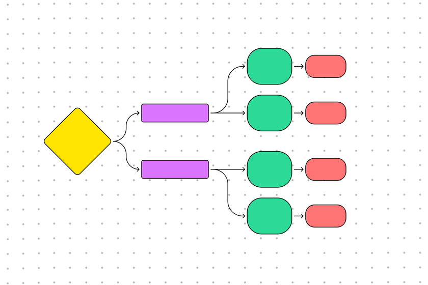
Sentence diagram generator
Map out the different parts of your sentence for strong grammatical comprehension.

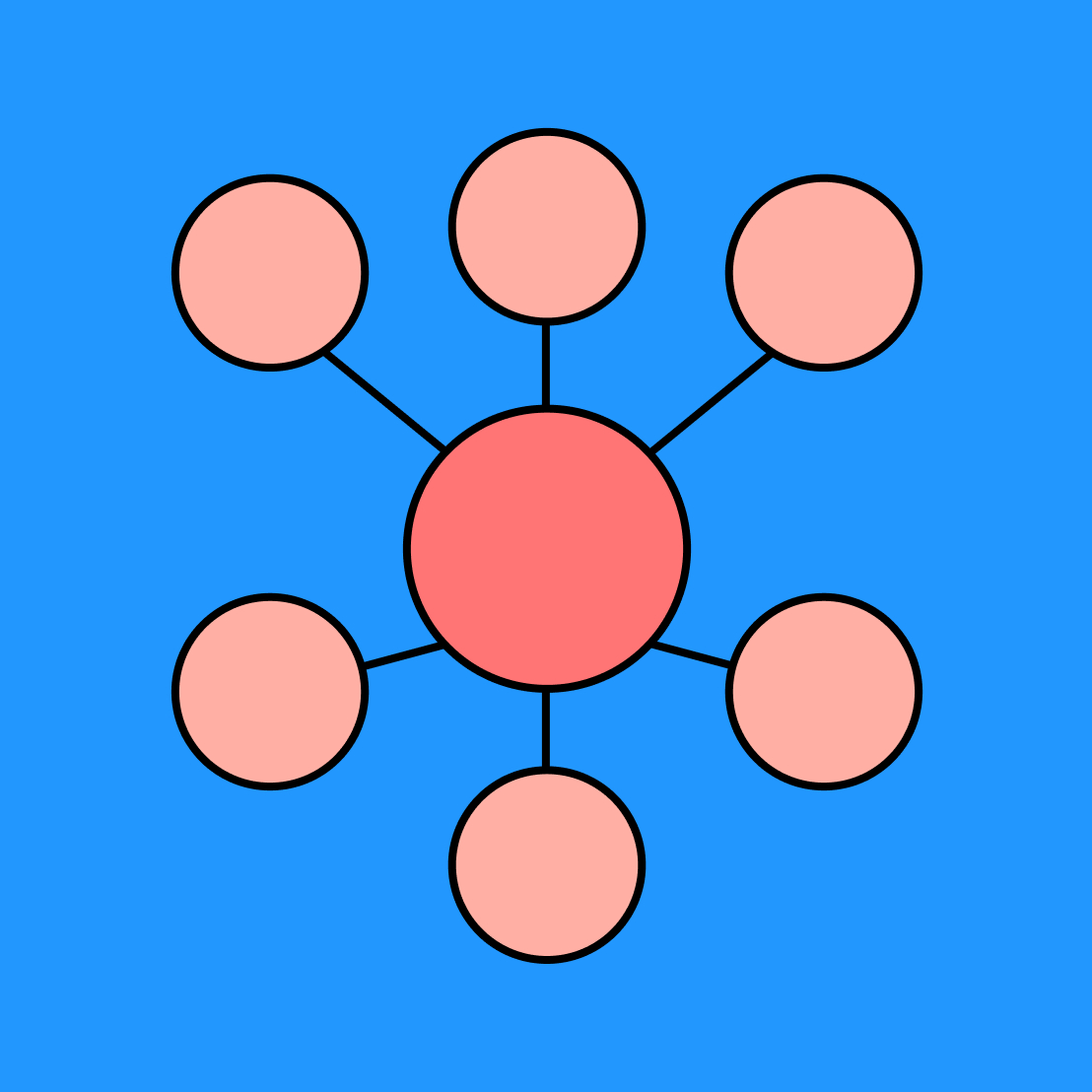
Bubble map
Visualize big ideas and their associated qualities to get closer to the mark.

Other templates from the community
Slide under the limbo bar of work pressure with ease using FigJam’s flexible templates.
FAQs
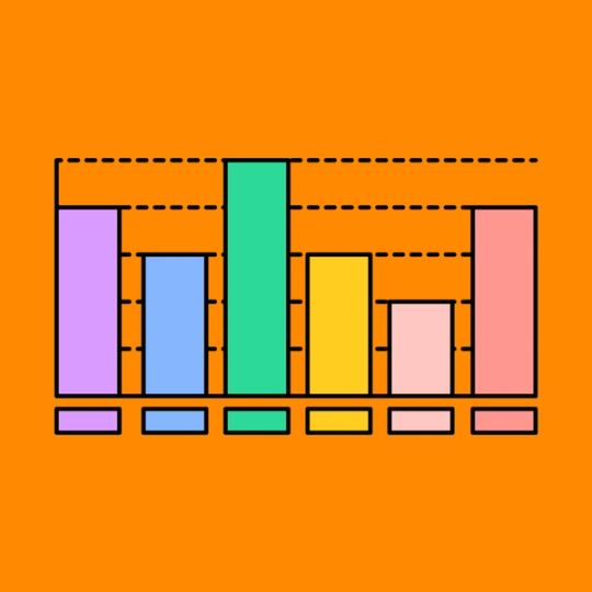
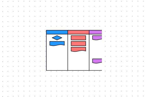
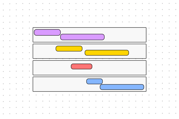
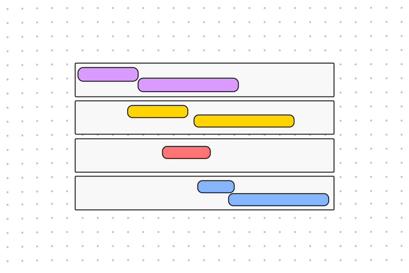
A bar graph chart uses columns along an x and y-axis to plot data points and their frequency. Whether plotted vertically or horizontally, each bar corresponds in length and width to the value that it represents. Compared to other diagrams that summarize data over time, bar graphs are simple to make and read, making them an ideal choice for workplace presentations, infographics, and research papers.
If you’re wondering how to make a bar graph, start by downloading FigJam’s free customizable bar graph generator. Then, follow these simple steps to transform your blank template into a professional example of a bar graph:
1. Plug your information in the title and legend areas of the template.
2. Add values to the graph, with frequency on the vertical axis and data on the horizontal axis.
3. Plot out values across the graph.
Because they’re so easy to interpret, bar graphs can be helpful for sharing categorical data in presentations and reports of all kinds. Let’s say you want to loop in your stakeholders on a trend you’re noticing in your annual sales. Instead of pointing them to a crowded, complex spreadsheet, you can send them a bar graph that efficiently tells the story of each cell.
Why a bar graph? What is a bar graph used for that makes it perfect for this scenario? By covering multiple categories in one pictorial map, these visualizations clearly illustrate changes and trends across discrete variables and time. You might use them to illuminate dips in month-to-month revenue using numerical values from different product families, shifts in consumer demographics over quarters, or changes in party registration by gender from election cycle to election cycle.
So, what is the difference between a bar graph and a histogram—its lookalike data viz cousin? At their best, bar charts can tell a layered data narrative, comparing multiple categories (say, R&B record sales vs. pop record sales in Germany in the 1990s) and revealing key inflection points. Histograms, on the other hand, are like a simple bar chart that paints a clear picture of the distribution of one set of numerical data over time (record sales in Germany over the 1990s).
FigJam’s bar graph creator makes interpreting your data visualization easy. Just tap into an example of a bar graph, assign your graph a title and a legend, flow in your values for each category you’re comparing, and take in the big picture.
Each of your categories will be represented by rectangular bars in colors that correspond to your legend and are sized in proportion to their value. If you look at all of your bars combined, you’ll find a traceable map of data points stacked alongside one another—and a clear picture of how your data compares.
Other templates you might like


Explore 1,000+ templates on the Figma community
Explore even more templates, widgets, and plugins—all built by the Figma community.