FigJam
Balance the relationships in a system with a causal loop diagram
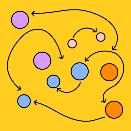
Every organization is a complex web, woven together from moving parts. FigJam’s causal loop diagram tool will help you identify and map how every variable relates so you can uncover holistic solutions.

Causal loop diagram
Understand the foundational relationships and feedback loops that drive your organization.
Learn to love the loop
Diagram the systems and structures that form your unique organization and learn how to rev up key relationships on a causal loop template.
Dive deep: Gain an explicit understanding of the implicit interrelatedness of your org.
See clear: Create a visual aid that simplifies communication and collaboration.
Make connections: Use systems thinking to recognize the value of every relationship.


FigJam
Rely on your relationships
Embrace interconnectedness on every level. When you work together on a FigJam template, you can keep everyone in the (feedback) loop, strengthening relationships between variables—and team members. Communicate seamlessly with FigJam’s collaborative widgets and create delightful diagrams with our intuitive design tools.
Circle the wagons
Cause a collaborative commotion with clarifying causal loop diagrams. Then, effect improvements to your system’s underlying structures with templates from the Community.


FAQs
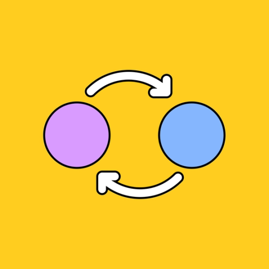
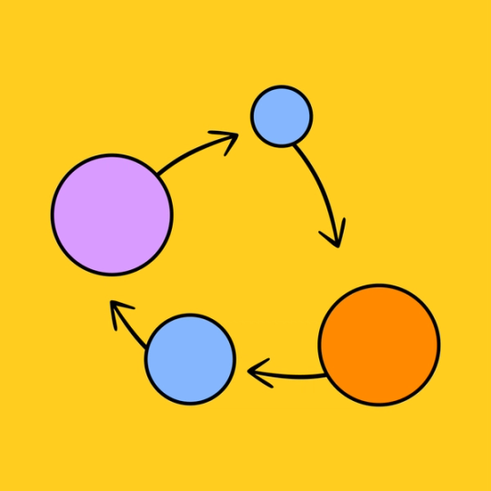
A causal loop is a cyclical relationship between certain variables and their outcomes. A causal loop diagram represents these relationships visually, complete with directional arrows to distinguish causes from effects, and effect indicators (+ and - signs) to show whether the process represented a gain or loss of a particular resource.
If you’re wondering how to create a causal loop diagram, the process is fairly simple. First, you’ll need to gather a group of team members to brainstorm with. Then together, you can work through each cause and effect step of your operation, mapping out how they relate to one another. Using a causal loop diagram tool from FigJam will streamline this process.
In a causal loop diagram, the letters B and R represent two kinds of loops: balancing and reinforcing causal loops.
A balancing loop naturally evens itself out and remains stable. A reinforcing loop will increase or decrease exponentially over time.
Since a causal loop illustrates a complex system of interactions, there are countless ways for it to begin. You've found your start point if you can pinpoint the first “event” to occur.
For example, consider the simple reinforcing causal loop of a savings account. You earn interest on the money in the account, in turn increasing your balance, which increases the amount of interest you earn. The start point of this loop could be identified as the moment that you deposited money into the account, but if you’re looking at it from the bank’s perspective, the start point of the loop might be the moment that they established an interest rate.
Other templates you might like


Explore 1,000+ templates on the Figma community
Explore even more templates, widgets, and plugins—all built by the Figma community.