FigJam
Turn up the temperature with helpful heat map examples
With a ready-made heat map sample, your data analysts can start cooking with fire. Visualize any dataset in an immediately understandable format, or choose from other analysis templates that fan your flames.

Heat map template
Take your heat map online with this template and share your results with everyone around the campfire.
Heat has never been so sweet
Turn hard-to-parse information into simple-as-can-be diagrams with your own heat map example.
Code by color: Assign a different color to variables to create a clearly understandable graphic.
Give your stats substance: Use heat map visualization to transform numerical values into tangible visuals.
Understand your users: Plot clicks, taps, and cursor movement on your website to design a better, smarter experience.


FigJam
Some like it hot—invite them to join
Give every heat-seeking employee and exec a place to explore data visualization when you create your heat map in FigJam. Invite anyone you please to leave feedback with Lil’ Notes or Anonymous Thoughts and add some personal flavor with stamps, emotes, colored markers, and more.
Fire on all cylinders
Track trends and make informed moves with a handy heat map. Harness the power of data with more solutions from the FigJam community.

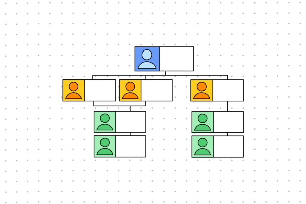
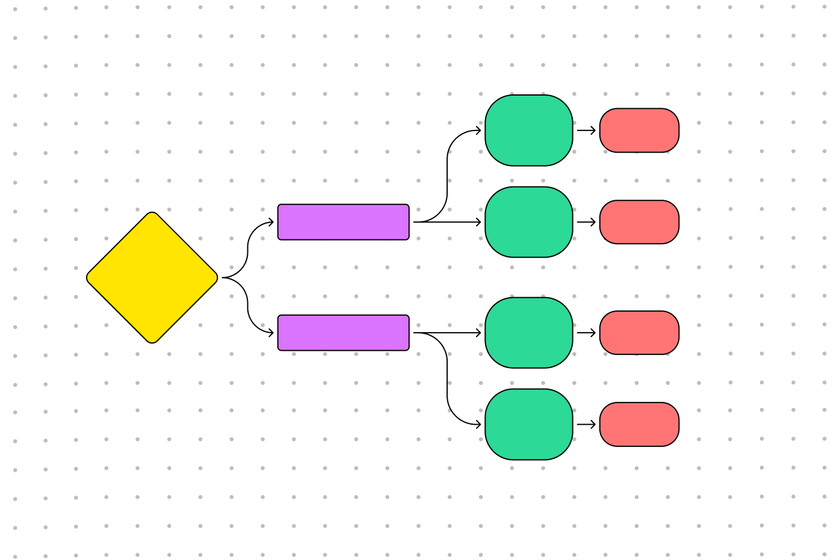
Website flowchart
Look into your site’s structure to find more ways to improve user experience for every visitor.


Infographic example
Turn your hot, hot data into a digestible infographic.

Other templates from the community
Discover dozens of other ways to display (or gather, or glean insight from) a data point.
FAQs
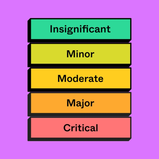
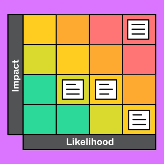
The most well-known (and literal) use for a heat map chart is weather tracking. By using shades of red for high temperatures and blues for lows, analysts can place data over a geographical map or on a table to paint a picture of the climate.
With that said, because heat maps track concentrations of activity (or any other variable), they have countless use cases. To give you an idea of their versatility, you could create a heat map sample to display:
- Clicks and mouse movements on a website to improve UX
- Patterns on the sports field
- Large DNA or RNA datasets
- Groups congregating in different areas of a building
In short: heat maps are used for data visualization.
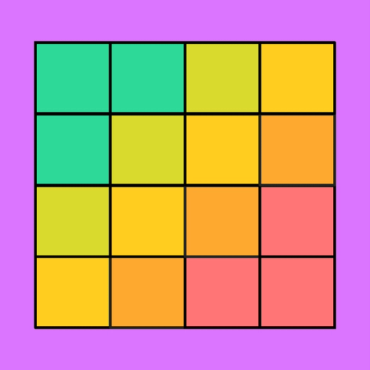
When using a heat map, you first need a color palette. One of the best practices for creating a legible heat map design is to use varying degrees of a single color.
For example, you might choose green to indicate how many trees you’ve planted in various areas. Darker shades of green would correspond with a higher value, while lighter shades would indicate lower concentrations.
From there, all you have to do is fill in each area with the corresponding color—dark green for the spots with 1000+ trees, medium green for the 500-999 areas, and so on.
How you visualize a heat map depends on the purpose of your data analysis. If you’re looking at user behavior on your website, you might visualize the data overtop of your home page. If you’re visualizing weather patterns, you might overlay your data on a map of the continent.
Ultimately, you have to choose a format and a color palette that makes sense with the data you’re presenting. To do that, think hard about the heat map’s purpose, its intended audience, and the insights you’re trying to uncover.
Other templates you might like


Explore 1,000+ templates on the Figma community
Explore even more templates, widgets, and plugins—all built by the Figma community.