FigJam
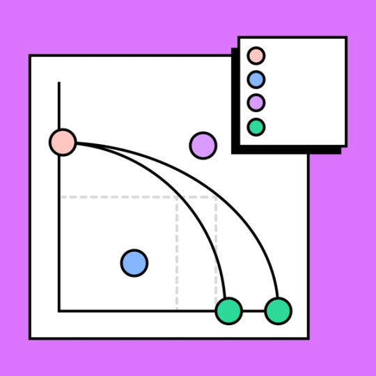
Prioritize products with a production possibilities curve graph
Lay out the comparative production costs and divvy up your available resources with informed expertise. Don’t wonder about what kind of investment you’re making—see it clearly, with a PPC graph maker.

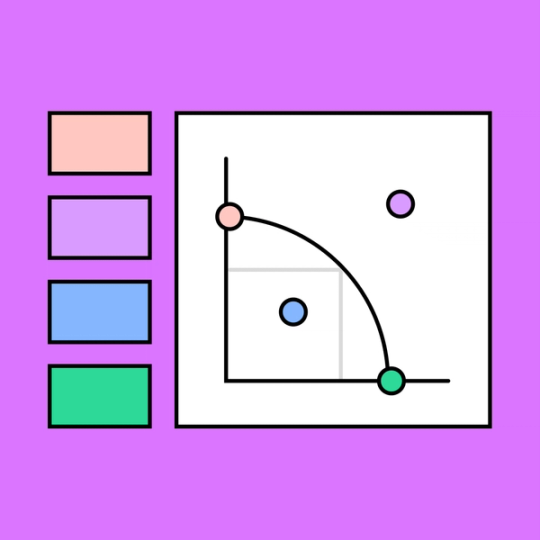
Production possibilities graph
Visualize every path that two different goods or products can take on FigJam’s collaborative PPC generator.

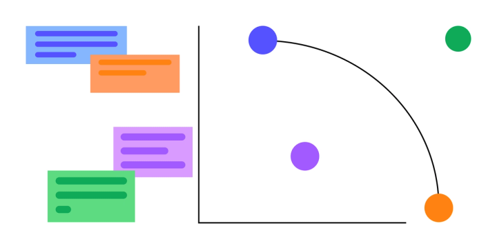
Chart a more efficient course
Create a production possibilities frontier graph to plot efficiency and economic growth—and plan your progression toward a more profitable future.
Predict: Accurately project upcoming production trends, for your own organization and other entities.
Allocate: Manage available resources more efficiently by laying out how different product streams interact.
Understand: Gain a holistic understanding of what you have to give and what you have to gain.


FigJam
The (production) possibilities are endless
Whether you’re plotting your company’s potential economic growth or a nation’s financial forecast, FigJam’s production possibilities curve maker takes the frustration out of cooperation. Share feedback with Simple Vote and Lil Notes and easily integrate your Figma designs for a highly polished PPC graph.
Take your operations up a notch
Level up your prioritization and planning process with PPC graph examples. Then, optimize every other operation with top-notch templates and tools from FigJam’s Community.


FAQs
A production possibilities curve graphs the relationship between resources and the creation of different products. When you create a PPC graph, you gain insight into the ideal allocation of resources between two products.
For instance, let’s say your organization fabricates stuffed toys. You are currently producing a stuffed dog toy, and you’d like to add a stuffed cat toy to the line. By displaying the additional resources required for each product in relation to one another, a PPC graph would show if the production level of the stuffed cat toy takes too many resources from the production of the stuffed dog toy without adequate returns. These findings would likely influence your decision to move forward with the stuffed cat’s production.
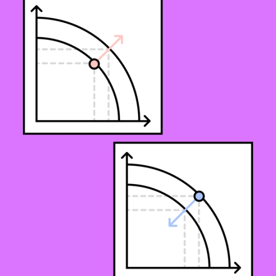
The curved shape of a PPC/PPF graph demonstrates what economists call “the law of increasing opportunity cost.”
Consider the example of the stuffed toy company.
The stuffed dog toy produced by your organization sells well, but there are still units that go unsold. Say you reroute the resources that would have been used to create unsold dog toys into creating a stuffed cat toy. These are your opportunity costs. By expending them, you may see an increase in net sales without losing profit.
But the more that you increase the rate of production of the cat toy, the more opportunity costs you might accrue. Remember, every dollar spent on creating the cat stuffed animal comes out of the budget for the dog stuffed animal—and it’s not certain that it will sell as well in the end.
It’s also possible that—between the whiskers and the fluffy tail—the stuffed cat toy requires slightly more fabric than the dog toy, which speaks to the increasing nature of opportunity costs. Whatever the reason for it, opportunity costs tend to go up as you allocate additional resources one way or the other.
A production possibilities frontier is bowed outward into a curve when resource allocations vary in productive efficiency between the two products.
A production possibilities frontier is a straight line when the relationship of resource allocation is constant, and the opportunity cost does not increase. This scenario is rare since it means that the resources are perfectly substitutable between the two different goods or products.
Other templates you might like


Explore 1,000+ templates on the Figma community
Explore even more templates, widgets, and plugins—all built by the Figma community.