FigJam
Hit the bullseye with our radar chart maker
Stay focused and hone your aim with a collaborative radar chart template that gets straight to the point.

Radar chart maker
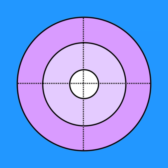
Weigh priorities and visualize outliers with a radar chart generator that uses concentric circles to organize information.
Hit the mark every time—no luck necessary
Wind up and prepare for a game-changing technique that guides your figurative darts toward precise solutions.
Plant your feet: Confidently compare a wide range of variables from one vantage point.
Avoid the outliers: Easily identify any projects and tasks that don’t make it into your center circle.
Go the distance: Use different measurement scales on one graph and enjoy easy, quick comparisons.


FigJam
Gather round
Who needs darts or billiards when you can play on a shared canvas. Call your inner circle to the table to create illuminating diagrams together. Take a cue from our interactive templates and sync ideas with collaborative features like Badge, Lil Notes, and Flipcard.
Boost your game together
Free, customizable diagrams on your radar? Hit the FigJam Community game room, where everybody’s on the leaderboard.


FAQs
If you can draw circles, you can make a radar diagram. Or, let FigJam do the handiwork and tap into our radar chart creator to get started right away.
Here’s a quick, step-by-step breakdown of how to create your radar chart:
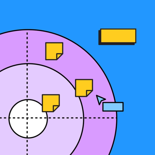
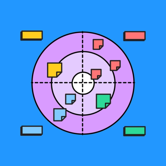
1. Add as many circles, or levels, as you need surrounding your center circle for main priorities. You can base the number of circles off the scope of the project, adding however many rings you need for a project with lots of moving parts.
2. Separate your radar into four quadrants—each focused on different categories. Then, lay out individual tasks within their corresponding quadrant.
3. Enjoy a concise visual depiction of upcoming tasks with the most prevalent apparent in the center.
Radar chart examples can be used to analyze every aspect of a project and organize plans of action. These visual aids take priority into account, representing vital steps in hierarchical order.
If you’re having trouble identifying the most important tasks to consider or looking to eliminate extraneous tasks, a radar diagram can make a concise and intuitive tool.
To analyze a radar chart, pay attention to which tasks fall into the outer circles and which items make it to the middle. You can weigh each task’s importance and value based on how far out from the center circle it falls. At the end of the exercise, your analysis should reveal which tasks are essential priorities, making workflow more efficient.
Other templates you might like


Explore 1,000+ templates on the Figma community
Explore even more templates, widgets, and plugins—all built by the Figma community.