FigJam
Move past-a your roadblocks with our customizable spaghetti diagram
Use noodle-like lines to untangle the complex webs of your work process, from digital user experiences to prep lines in the kitchen.

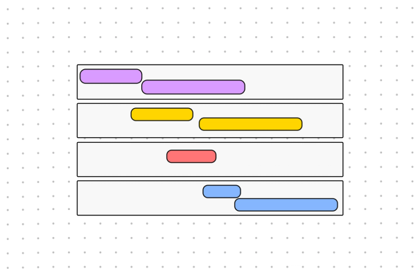
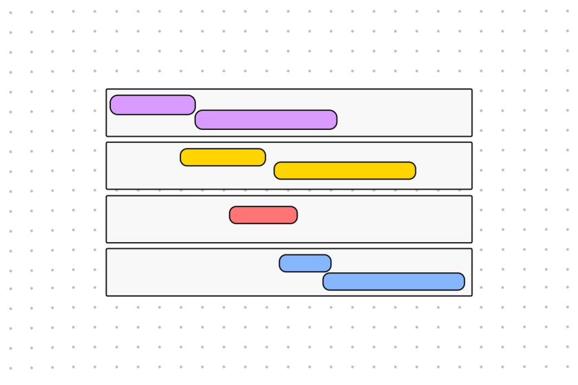
Spaghetti diagram template
Make delicious decisions with a globalized team when you download our editable spaghetti map.
Get to the meat(ball) of your operations
Lay out every aspect of a system or process and see how everything connects—then adjust to taste.
Eat with your eyes: Visualize the movements and interactions of materials, documents, products, and people within your space.
Start from scratch: Lean on the clarity of a spaghetti graph to quickly and effectively engineer—or re-engineer—your business processes.
Crank up the heat: Discover where the hold-ups are so you can increase efficiency within your process flow.


FigJam
Suss out your systems, family-style
When you diagram in FigJam, you can bring every employee and investor to the table to enjoy a Michelin-star meeting. Start with a blank spaghetti diagram in an infinite online canvas, then add and rearrange pre-made shapes and connectors, pull in branded content and links, and discuss via Chat, Lil Notes, and Anonymous Thoughts. Bon appetit!
Discover your secret sauce
Find the missing ingredient in your recipe for success with this handy diagram. Perfect your offerings with more farm-to-table ideas from our community of creators.


FAQs
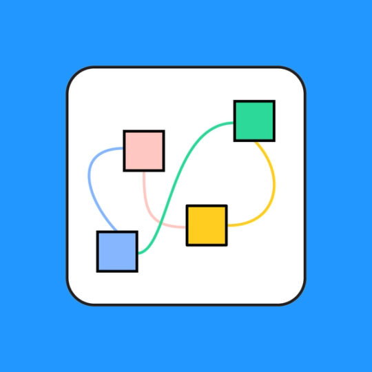
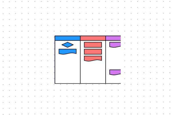
Reading a spaghetti diagram is like interpreting a map of a physical place. The text boxes are locations of interest, and the lines are the most direct paths between each part of the process.
A spaghetti map is a great tool that often represents real-world flows of activity, so the distances between each “location” can be relevant. What’s more, the squiggly lines represent the movement of people, items, and information within the process.
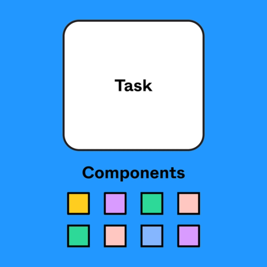
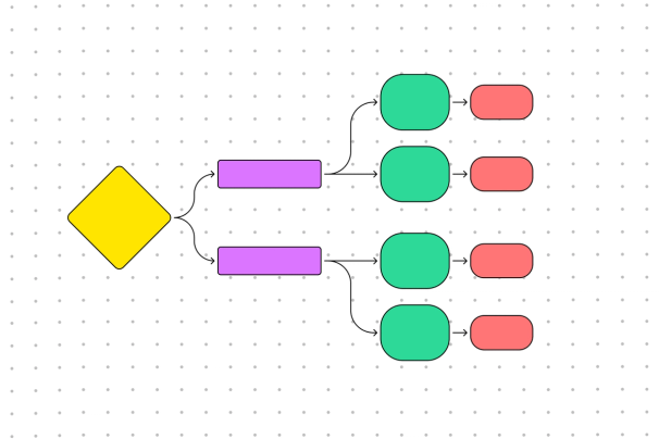
All you need to start spaghetti mapping is a canvas, a writing utensil, and an understanding of the process you’re looking to draw out. Create a box for each person, product, web page, or piece of equipment involved in your process, then use spaghetti-like lines to connect the boxes every time they interact.
While you could doodle all this on the back of a cocktail napkin, there’s a much simpler (not to mention more eco-friendly) option: start with a spaghetti chart template from FigJam. You can move your boxes and lines around with ease, add and remove sections as needed, and invite your entire staff to participate.
Step 1: Plot out the space – Create a bird’s-eye-view map of the area you’re working with. Try to add every relevant task, person, and product involved in the process, and be sure to account for the real-world distance between any physical assets (scaled down, of course).
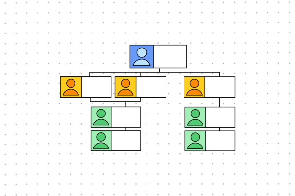
Step 2: Assemble your team – Gather the people who work in that space.
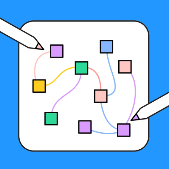
Step 3: Draw your lines – Ask your team to picture themselves working through the process at hand, then have them draw lines between each piece of the puzzle. Each differently colored line represents the flow of materials and the movement of each person.
Step 4: Evaluate your spaghetti – Look at what’s on your plate, and see where you can improve. For example, a thick line means that people and goods are making that trip over and over. Could you move the two stations closer together? These are the decisions a spaghetti map helps you make.
Other templates you might like


Explore 1,000+ templates on the Figma community
Explore even more templates, widgets, and plugins—all built by the Figma community.