FigJam
Step into your customers’ shoes with our perceptual map template
FigJam templates provide a clear picture of the marketplace and your services from a consumer perspective so you understand how your brand fits in—or stands out.

Perceptual map template
See the market—and how the market sees you—on an intuitive visual template.
Perceiving is believing
Reflect on your reputation, understand how your business connects with consumers and competitors, and make a stronger impact on the market—together.
Compare and contrast: Take note of how your brand relates to competitors to strengthen your identity in the marketplace.
Take another look Understand how consumers perceive your business so you can establish a niche and nail your positioning statement.
Analyze brand potential: Identify the strengths and weaknesses of your current brand strategy to find new opportunities.


FigJam
Call in a fresh set of eyes
With shared workspaces, open canvas designs, and collaborative tools, FigJam helps you align your vision across teams for clearer messaging and stronger products. Use Badge text, alignment scales, and priority matrix to stay up to date on the latest competitor insights and consumer trends.
Templates for people-people
See the market from your customers’ point of view. With Community templates, you can deepen your understanding of the players—and develop a smarter marketing strategy.


FAQs
A perceptual map illustrates how users and customers perceive a brand, organization, good, or service regarding the larger market and relevant competitors.
These visualizations are commonly used by businesses and brands to help uncover their niche and explore areas for improvement and differentiation. By providing a snapshot of the competitive landscape through consumer perception, perceptual maps can influence product design, messaging, pricing, and more.
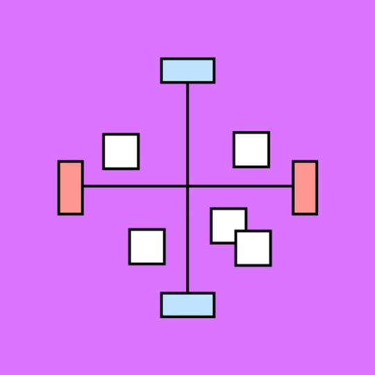
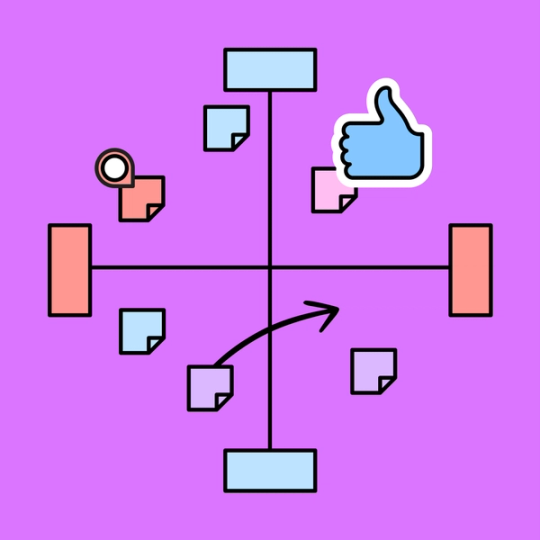
To begin your analysis, start with a blank perceptual map template with unlabeled x- and y-axes. Choose two parameters that you would like to measure your brand or product by and assign one to each axis, creating spectrums that run from “low” to “high.” If you’re unsure which parameters are best, consider your industry. For example, if you’re an apparel brand, you might want to explore design and price, so your y-axis might run “low price” to “high price” while your x-axis runs “high-quality design” to “low-quality design.”
Then, begin plotting away. Position relevant competitors within the four quadrants of your chart as they relate to your parameters.
Ready to see how you stack up? Our customizable perceptual map examples provide an easy-to-follow framework so you can focus on your parameters and enhance consumer perception.
Arranged from low to high, these two axes represent the parameters that your perceptual map will explore. Common parameters in a perceptual map example include cost, quality, size, safety, and more, depending on your industry. These two axes separate your graph into four quadrants, into which you plot the brands that satisfy those parameters.
Other templates you might like


Explore 1,000+ templates on the Figma community
Explore even more templates, widgets, and plugins—all built by the Figma community.