

What is design thinking? A guide to the 5 stages and principles
Discover design thinking, a human-centered approach blending empathy, creativity, and cutting-edge AI to solve problems. Learn how to apply it with Figma tools.
Skip to main content
Strategic planning

Design system scaling is what happens when a shared component library has to grow up. The goal is to evolve your system from a set of building blocks into a governed infrastructure that keeps consistency intact across every team, platform, and brand that depends on it.
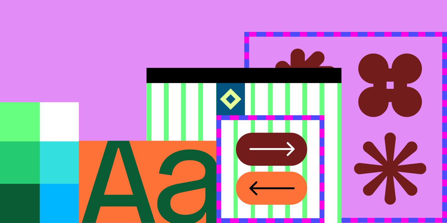
That pressure usually hits all at once: the company doubles, a second product line launches, and suddenly, engineers across three time zones are building from the same library but shipping products that look nothing alike.
What separates systems that hold up from those that fragment is whether the system was built to grow. That means treating it less like a deliverable and more like a product, with a roadmap, clear ownership, and feedback loops that keep it honest.
Read on to learn:
As teams grow and products evolve, a static library becomes a liability. Components go stale, coverage gaps widen, and contributors start working around the system rather than with it. The fix is a fundamentally different way of thinking about what a design system is.
Samira Rahimi, head of platform experiences at Uber, has been vocal about this shift, saying that a design system only succeeds when it’s treated like a product with real customers, clear OKRs, a roadmap, and measurable output. Anything less, and it stalls.
A product-minded design system runs on three things:
Together, these structures make it possible to measure and communicate design system ROI, giving you the evidence you need.
Growth introduces a new category of problems related to infrastructure, processes, and people. Here’s a look at the most common places design systems break down as organizations scale, and how to address them:

When a design system is young, one small team controlling every update makes sense. As the organization grows, that model creates a bottleneck. Product teams wait on approvals for components they need now, and the system starts feeling like a bureaucratic hurdle rather than a shared resource.
As more teams start contributing, the centralized model hits a new problem: you can't review everything without slowing everyone down. Teams new to using a design system will need clear guardrails before jumping in. Otherwise, quality slips, and inconsistencies spread faster than any one team can catch them.
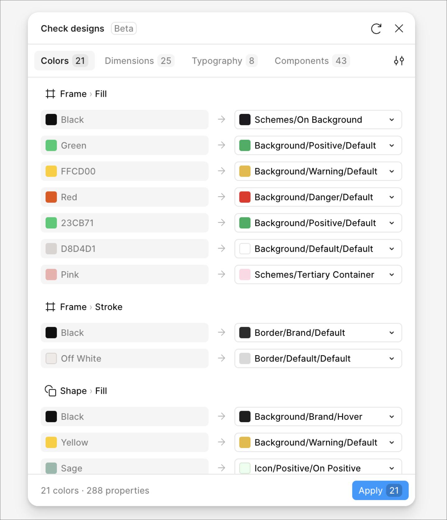
Solution: Use Figma branching to let more teams contribute in isolation before changes merge into the main library. Set clear contribution standards around component anatomy, variant structure, accessibility, and token alignment—and use Check designs to flag hard-coded values and library mismatches before anything goes to human review.

Bloated libraries with hundreds of variants slow down workflows and still somehow fail to cover every use case. Sarah Kelly, Product Marketing Manager at Figma, puts it plainly:
The most common reason adoption stalls is a gap between the system and real product workflows—teams bypass it when components don’t solve their actual needs. Early signals include low library usage, frequent local components, and inconsistent variants despite published assets. Watch for rising detachment rates, duplicate styles, bloated libraries with hundreds of variants, and teams creating parallel files instead of using shared libraries.
When designers consistently detach a component just to swap out an icon or image, that points to a design problem, not a workflow problem. As Kelly notes, “The component is too rigid for how it’s actually being used—that’s a good signal the component needs a slot.”
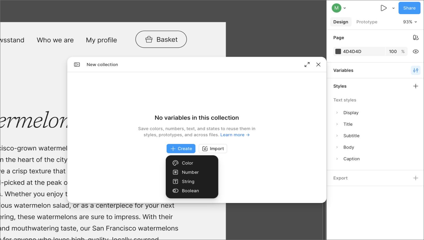
Solution: Audit your most-detached components, and use variables, semantic tokens, and slots to build in flexibility from the start.
When design and code live in isolation, handoffs create gaps. Engineers interpret specs manually, small details slip through, and the shipped product drifts from what was intended. At scale, that drift compounds quickly across teams, platforms, and product lines.
Design collaboration tools help make sure designers and engineers work from a shared context, so that fewer details get lost.
Solution: Use Dev Mode and Code Connect to link design components directly to their production code counterparts, giving engineers real implementation snippets and one shared source of truth.
Dev Mode gives engineers direct access to design specs, assets, and production-ready code snippets without leaving Figma.

A component library without documentation is one that teams will interpret on their own. When designers have no guidance on how or when to use a component, they make judgment calls—and across a large organization, those judgment calls add up to inconsistent user experiences even when everyone pulls from the same library.
The problem compounds at scale. What one team treats as a primary action button, another uses for secondary interactions. Components stay consistent, but the experiences built with them don’t.
Good documentation explains the component’s purpose, when to use it, and how it behaves across contexts. This matters most for components that serve subtly different use cases, where the distinction isn’t obvious without guidance.
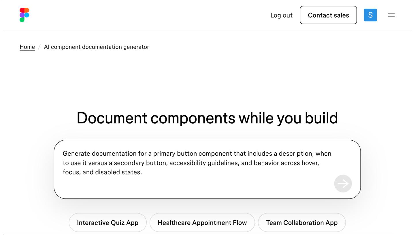
Solution: Ship every component with clear usage guidelines covering purpose, context, and edge cases so teams make consistent decisions. Try Figma’s AI component documentation generator to get a head start.
Most design systems are good at adding components but less disciplined about retiring them. Legacy components accumulate, and teams waste time navigating outdated options.
Without a deprecation strategy, outdated components linger, and technical debt builds on both the design and engineering sides.
Solution: Treat deprecation as part of your contribution process. Use staging libraries to phase out legacy components on a clear timeline so active projects aren’t disrupted mid-build.
Fixing foundational mistakes gets your system on solid ground. Keeping it is a different challenge, requiring ongoing maintenance, proactive monitoring, and workflows that scale as your organization does. Here are three strategies to help you stay ahead of the drift:

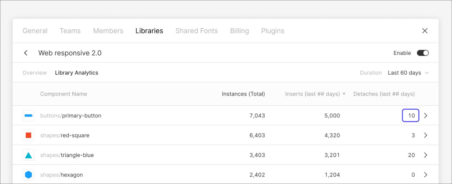
Figma’s Design System Analytics shows you exactly how your library is being used. Tracking which components are being used, detached, or ignored tells you where the system is working and where it needs attention. Kelly explains:
Start by looking at which components are being detached most in library analytics, and then go one level deeper: look at which teams are doing it. One team responsible for most of the detachments on a single component tells you something very different than detachments spread across the org.
Those signals are a roadmap. High detachment rates point to components that need greater flexibility. Low usage points to components that are redundant, hard to find, or solving a problem that teams no longer have.
Run audits regularly, and the analytics stop being a report—they become part of how the system evolves.

Breaking your library into smaller, purpose-specific files makes the system faster and easier to navigate. Platform-specific libraries, brand-specific libraries, and foundational token files each serve a different audience. Teams subscribe only to what they need, reducing noise and keeping the system relevant.
A well-organized file structure also makes it easier to onboard new contributors and audit usage as the library grows.
A design system either grows intentionally or by accident. Standardizing the path from one-off design to global component keeps it that way. Every new component should follow the same process, from proposal and review to documentation and publishing, so the system expands based on product needs.
FigJam works well for mapping contribution workflows, aligning on design system governance models, and documenting the decision logic behind what gets added or retired.
Teams can also use Figma’s MCP server to let AI agents build and update components directly on the canvas, guided by the system’s existing components, variables, and documented conventions, making contributions faster without loosening governance standards.
Good design systems don’t stay good on their own. Someone has to own them, tend to them, and make hard calls about what stays and what goes. When you’re ready to get started with design system scaling, we’re here to help.
Here’s where to start:
Figma Design is where teams come together to design, collaborate, and ship products, from the first component to the full system.
Discover design thinking, a human-centered approach blending empathy, creativity, and cutting-edge AI to solve problems. Learn how to apply it with Figma tools.

Explore 12 inspiring design system examples from top companies and the Figma Community. See how teams build consistency, scale, and collaborate effectively.

Want to stay ahead of the curve? Learn about the latest Web design trends and how to apply them in Figma to build modern, user-friendly sites.

Curious how AI in design is changing the way teams work? See how tools like Figma make it easier to bring ideas to life with real-world examples.

Learn the key differences between Web design and development and their roles in creating stunning and functional websites.

From bold CTAs to clean UI, these 10 mobile website design examples and best practices will help you design for smaller screens with confidence.