
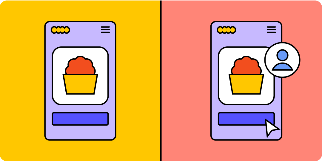
What is the difference between UI and UX?
UI and UX design is an important part of the design process for your products, but what is the difference between UI and UX? Read on to learn more.
Skip to main content
Discover the fundamentals of design with articles that cover the core principles, tools, and techniques every designer should know.
Featured articles
UI and UX design is an important part of the design process for your products, but what is the difference between UI and UX? Read on to learn more.

Read on to learn more about the best fonts for websites in 2026, how to find the right typeface for your brand, and how Figma can help.

Pairing the right colors together creates harmony in UI designs. Learn 100 color combinations for your next project and how Figma can help.


Learn how UX validation helps you spot logic gaps and refine interaction patterns before dev. Use Figma Make to ship dev-ready designs with confidence.


Product design and UX design both involve designing user-centric experiences. Learn about their differences, then use Figma’s design tools to get started.

Design tokens are the shared language your team needs to scale. Learn how to build a resilient hierarchy in Figma and bridge the gap between design and code.


Learn best practices for pricing pages and explore design examples to create a page that informs your potential customers and boosts conversions.

Want to stay ahead of the curve? Learn about the latest Web design trends and how to apply them in Figma to build modern, user-friendly sites.

Button states are the visual signals that tell users what a button is doing. Learn the 9 core states, how they work in CSS, and how to build them in Figma.


Understanding UX for product managers helps you build products people love. Learn how to step into the design process early and collaborate on user problems.

Explore 29 AI website examples across industries like SaaS, tech, and retail. See how AI handles complex hierarchy and use these files to start your Web design.

Validate your startup idea faster with these 11 no-code app examples. From games to complex dashboards, see what’s possible without hiring a developer.


Explore 12 real-world vibe coding examples that show how to build apps from prompts. Learn a workflow to turn your best ideas into functional prototypes instantly.

Discover 16 landing page examples and templates to help boost conversions for your brand. Learn what makes each design effective to inform your Web strategy.


Explore web development trends defining 2026. Learn how AI-driven workflows, server-first performance, and new browser standards are reshaping how teams build.

Explore 60+ Web design statistics for 2026. From AI and bounce rates to UX and accessibility, discover how to keep up with the shifting digital landscape.

Explore 79+ essential design statistics for 2026 and see how AI, workflow trends, and ROI metrics are shaping the industry.

Discover the advantages, drawbacks, and differences of static vs. dynamic websites and how to create a website that best suits your goals with Figma.

Looking to create a portfolio website? Explore inspiring portfolio website examples, tips for creating your own, and how Figma can help in this guide.
Explore all topics