
Types of color palettes: Definition, examples, + tips
The right color pairings can evoke emotions, increase brand awareness, and encourage user action. Discover how to create a compelling color palette with Figma.
Skip to main content
Design basics
All your design work, in one place.

Somewhere in your design system, there’s a shade of blue living three different lives. Maybe it’s a named style, a hardcoded value in a component, and a hex value buried in a developer’s stylesheet. They all look close enough until a rebrand hits or a new platform gets added.
Design tokens are the logic-based fix your workflow has been missing. Each token is a named, reusable value that updates everywhere it’s referenced the moment you change it. Whether you’re just getting started with design systems or looking to tighten up an existing one, getting your token structure right is one of the highest-impact things your team can do.
Read on to learn:
Design tokens are the named values that store your team’s core design decisions. Each token pairs a raw value with a meaningful name that both designers and developers can reference. So instead of saying, “use #0D99FF,” you say “use primary-blue,” and that name stays connected to the value everywhere it lives. That shared naming is what keeps a design system from fracturing as it scales across platforms and teams.
In practice, tokens live in a format that both Figma Design and your codebase can read. When a designer updates a token in Figma Design, that change carries the same name that a developer is already using in their code. The result is a workflow where design decisions and production code stay in lockstep, without anyone playing messenger in between.
As your product grows, your design system grows with it, sprawling across platforms and passing through the hands of people with very different mental models for how things should work. Without a shared system of values, that complexity compounds fast.
Tokens provide your team with a common foundation to build on. Here’s what that looks like in practice:
Most design systems organize tokens into three layers, each one building on the last. That way, your system stays flexible and consistent as it grows. Here’s how they fit together.

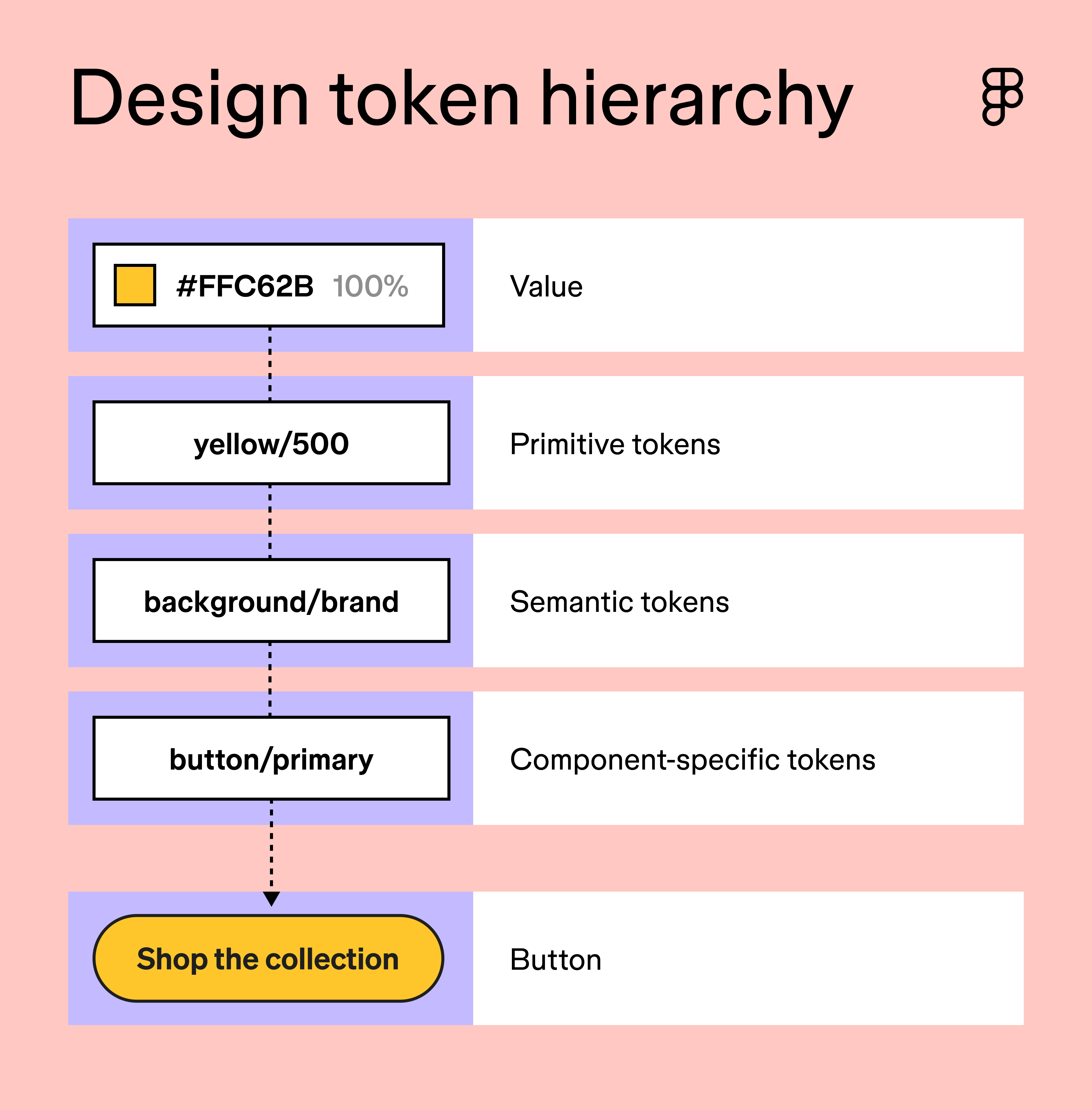
Primitive tokens are the raw values at the foundation of your design system. They store the data your system runs on, like a color value, a pixel measurement, or a font size, without any context for how or where those values get used. Think of these as your system’s constants—the numbers and values that rarely change once they’re established.
A typical color palette might include dozens of global tokens that cover every shade in your brand’s spectrum. A spacing scale might span 2px to 64px. On their own, these tokens don’t carry any meaning beyond the value they store. Their job is to be the reliable source that everything else in your system points back to.
Semantic tokens (sometimes called alias tokens) are the middle layer of your token system. They take a raw value and give it a name that describes its role in the interface. So blue-500 becomes action-color, and anyone on the team immediately understands what it’s for.
Sarah Kelly, Product Marketing Manager at Figma, says that ignoring this layer is one of the most common mistakes teams make:
When a primitive changes, you have to hunt down every component that references it instead of updating one semantic token and having everything follow.
The naming is doing a lot of work here. When a developer sees action-color in the codebase, they understand its purpose without needing to trace it back to a specific hex code. Role-based naming is what we mean by the future of design systems being semantic.
Component tokens are the most specific layer in your token hierarchy. They map directly to individual UI elements, storing values such as the background color of a primary button, the border radius of a card, or the padding of an input field. Where semantic tokens describe intent, component tokens describe execution.
They also give you precise control when a component needs to deviate from your broader system defaults. If your primary button uses a slightly different shade than your general action color, a component token lets you make that call without touching anything else in the system.
Figma Design gives you everything you need to set up your tokens, manage variables, and keep your entire team working from a single source of truth.
Good token naming follows a consistent taxonomy that makes values easy to find, understand, and maintain. Most teams structure their token names in tiers, moving from broad categories to specific use cases. A common pattern looks like this: category/role/variant.
So a color token for a primary action might be named color/action/primary, and a disabled button label might be color/text/disabled. Your team should always be able to tell what a token does and where it belongs just from reading its name.
Tokens are typically stored in JSON, a lightweight, machine-readable format that works well across tools and platforms. Each token is defined as a name/value pair that any part of your stack can consume. The W3C Design Tokens Community Group is actively working to standardize this format across the industry.
As Kelly puts it:
There’s no single right naming convention—every team lands somewhere different based on their product and history. The general guidelines are simple: pick a structure, apply it everywhere, and name every token for what it does rather than what it is.
Figma design tokens are managed through the variables system, which lets you define and connect values across your entire file. The setup takes some upfront thinking, but once your token hierarchy is in place, everything downstream gets easier. Here’s a closer look at how to use tokens in design.

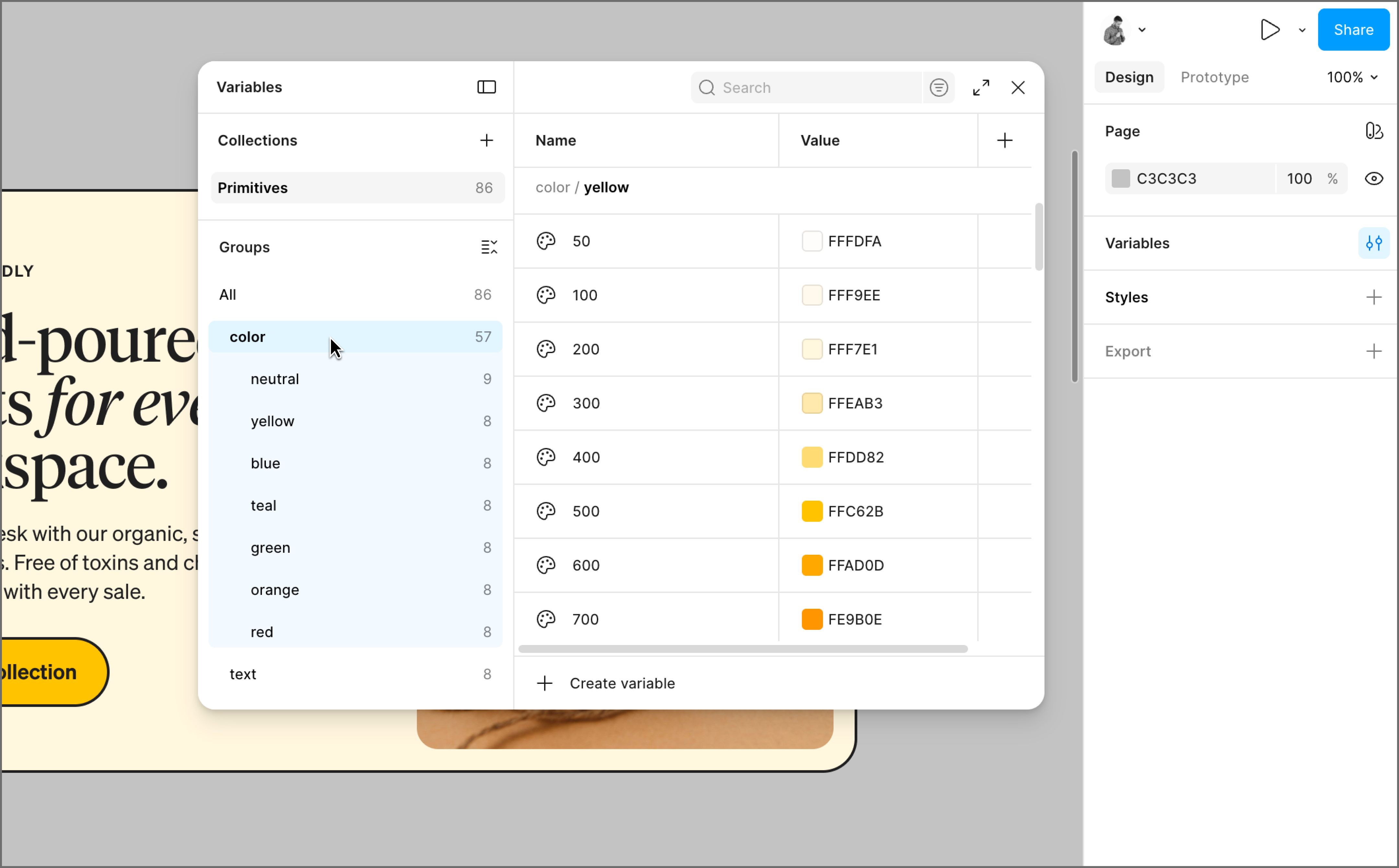
Open the local variables panel in Figma Design and create your first collection. Think of a collection as a bucket that holds a related group of variables. For your primitives, this is where your raw values live: every color in your brand color palette, step in your spacing scale, and font size your system uses.
These constants don’t carry any context about where or how they’ll be used. What matters at this stage is completeness and consistency. A well-built primitives collection covers your full range of values so that every semantic token you create later has something reliable to point back to.
The Figma team recommends prioritizing color, spacing, and typography first. Name your primitives clearly but simply. A color might be named blue-100, blue-200, and so on up the scale. A spacing value might be space-4 or space-8. The names don’t need to be semantic yet. Your primitives just need to be easy to identify and easy to reference.

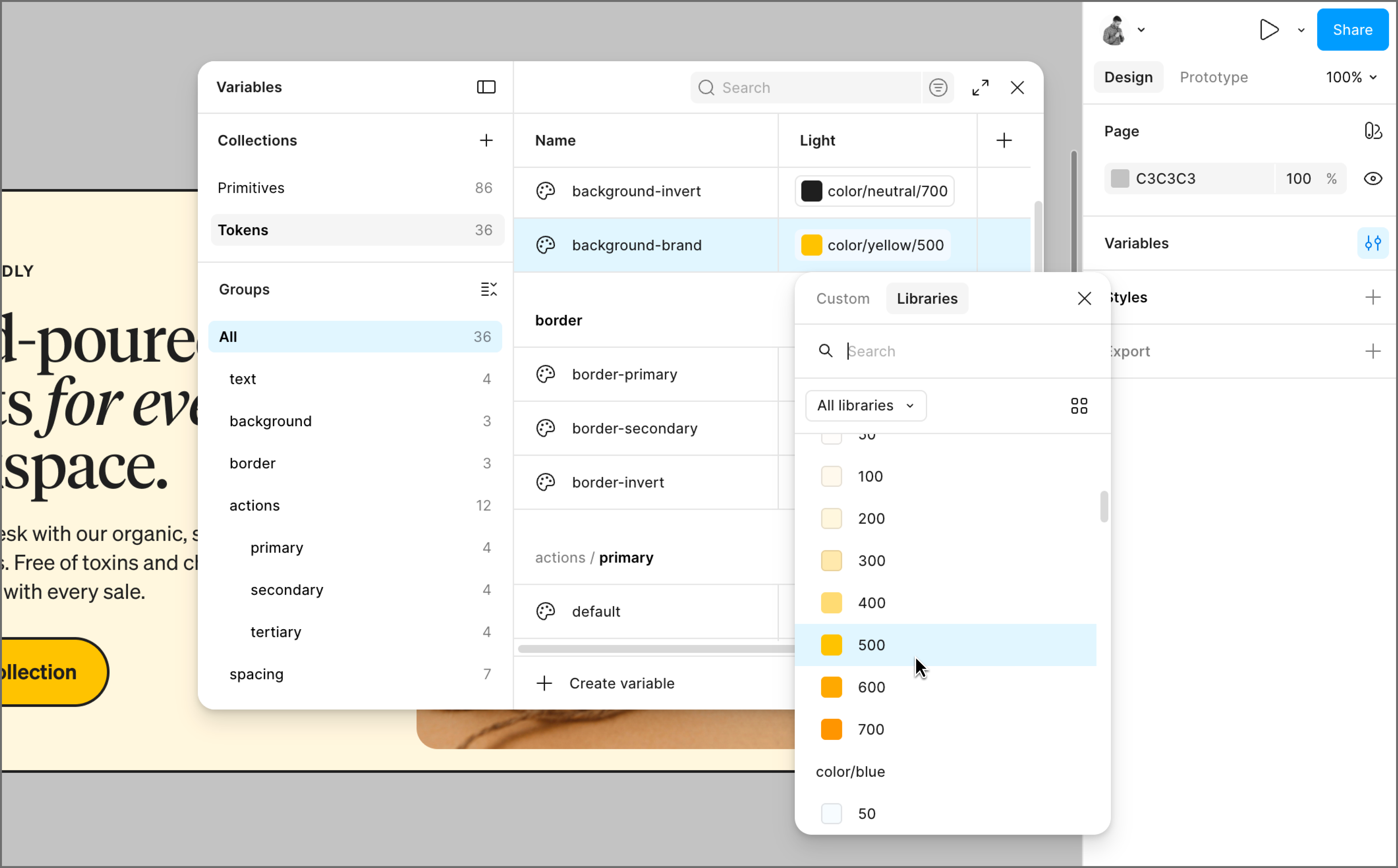
With your primitives in place, create a second collection for your semantic tokens. Each semantic token points to a primitive, so when the primitive updates, the semantic token updates as well.
To create a semantic token in Figma Design, open the Edit a variable window for your new token and set its value by referencing an existing primitive from your library. So instead of assigning a color value directly to text-secondary, you link it to gray-300 from your primitives collection. The token inherits that value, and the connection between them stays live.
A few things to keep in mind as you build out your semantic tokens:
Whatever convention you land on, apply it everywhere. A system where naming patterns vary from component to component quickly becomes one that new contributors can’t navigate without guessing.

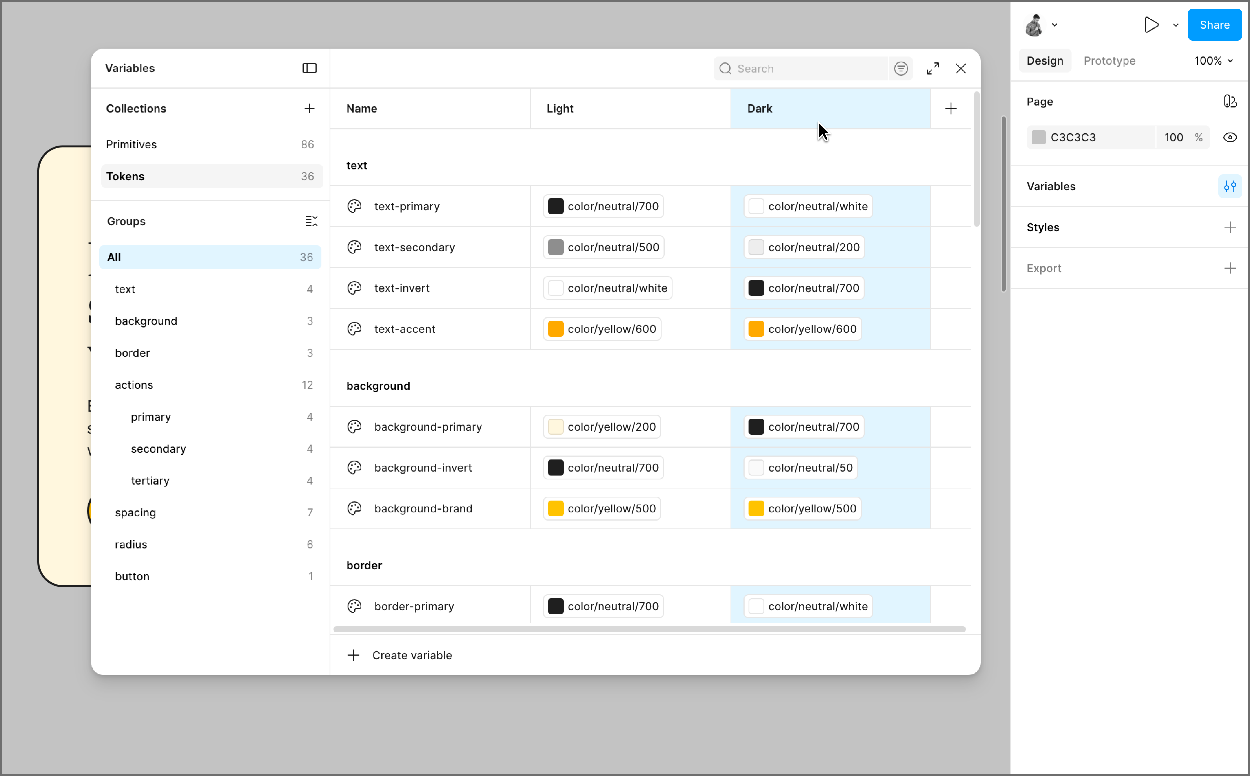
Once your semantic tokens are set up, modes are where the system gets really efficient. In Figma Design, every variable collection supports multiple modes, and each mode is essentially a column in your variable table. Your semantic token text-primary stays the same name across both columns, but in Light mode it points to gray-900, and in Dark mode it points to gray-100.
Instead of maintaining separate component sets for each theme, your components stay the same, and the mode does the switching for you. Swap a frame from light to dark mode, and every token in that frame updates instantly, pulling the correct value for that context.
Modes aren’t limited to light and dark theming. For multiple brands, each brand gets its own mode that overrides colors and typography while everything else stays shared. For platforms, an iOS mode might use different corner radius values than a Web mode because each platform has its own conventions. You switch the mode, and the whole file adapts.
Share your file with developers and point them to Dev Mode. When they inspect a layer, they’ll see the token name you assigned. So a button background token named color/action/primary shows up in the inspect panel as --color-action-primary, ready to drop into a stylesheet.
For teams that want to go further, Figma’s REST API lets developers pull variable data directly from your file, so they’re always working from the most current values without any manual handoff. And with Code Connect, you can link a Figma component to its coded equivalent, so developers see the production code snippet in Dev Mode.
Design tokens are the broader concept: named, reusable values that store design decisions in a format that both design tools and codebases can reference. Variables are how Figma Design brings that idea to life inside your files. If you’re building a token system in Figma Design, variables are the tool you’ll reach for.
Hardcoded values create a maintenance problem at scale. A single brand update can turn into a sprawling audit across dozens of components, with plenty of room for things to slip through. Tokens centralize that decision so a change in one place propagates automatically across every component, platform, and codebase that references it.
Not entirely, but for most use cases, variables are the more powerful system. Styles still hold up well for complex properties like gradients and typography, which variables don’t yet fully support. For color and spacing, variables give you capabilities that styles can’t match, like theming with modes and direct code sync through Dev Mode.
Yes, and they’re worth knowing about. Figma Design has a native variables system that covers most teams’ needs, but plugins like Token Studio extend that functionality for more complex setups. Token Studio supports multi-file token management and direct sync with code repositories, and it works alongside Figma Design’s variables rather than replacing them.
Getting your design tokens right takes some upfront thought, but once your hierarchy is in place, the whole team moves faster. Designers move faster, developers spend less time asking clarifying questions, and global updates stop being an all-hands effort. We hope this guide gives you a solid foundation to build from. When you’re ready to set up your token system, we’d love for you to try Figma Design.
Here’s how to start:
Figma Design gives your team one place to define variables, manage themes, and keep design and code in sync.
The right color pairings can evoke emotions, increase brand awareness, and encourage user action. Discover how to create a compelling color palette with Figma.

Master responsive Web design with examples of how to build websites that adapt across desktops, tablets, and smartphones for a superior user experience.