25 best sans serif fonts for your designs and websites
Share 25 best sans serif fonts for your designs and websites
Explore more from
Design basics
Design and prototype with consistent type
Bring type to life in every interaction.

Fonts set the tone for your work, sometimes subtly, sometimes dramatically. Whether you’re designing a resume, poster, or responsive website, the right sans serif font can offer the clarity and personality your project needs without diverting attention from your message.
Read on to learn:
- What makes a sans serif font different, and why it matters
- 25 standout sans serif fonts to try in your designs
- Specific projects and uses each font works best for
- How Figma can help you experiment with and apply fonts
What is sans serif?
Sans serif fonts are typefaces without the small projecting lines or “serifs” at the ends of each letter. Their clean, simple shapes make them easy to read across both digital and print formats.
You’ve likely seen some of the most popular sans serif font examples already, like Helvetica, Arial, and Futura. While each has its own personality, they all share a crisp, modern feel that works in everything from digital interfaces to print layouts. Designers often choose sans serif fonts for their versatility and clarity, whether it’s for bold headlines, UI elements, or long-form text.
Font 1: Abel

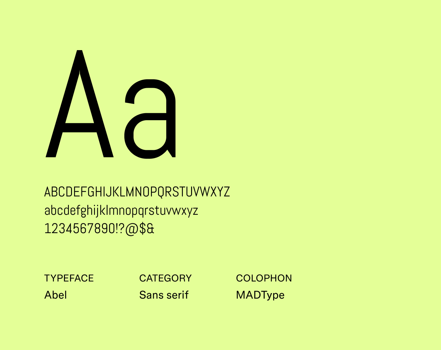
Abel is a sleek sans serif font with a slightly condensed design, giving it a refined, professional look.
Its tall, narrow letterforms are highly readable both at any size and add just enough personality to stand out in minimalist designs. It pairs nicely with more expressive fonts to create a balanced design.
It’s a great alternative to classics like Helvetica or Arial when you want something readable with subtle personality.
Best for: Posters, presentation slides, editorial layouts, and marketing headers
Font 2: Alef


Alef is a geometric sans serif font with softly rounded edges, created for screens to expand web-friendly font options. Its even proportions make text legible at any size, while the gentle curves add a hint of warmth, keeping it from feeling rigid.
It’s a reliable alternative to Lato or Open Sans and pairs well with more decorative fonts.
Best for: Websites, apps, multilingual projects, and professional documents
Font 3: Be Vietnam Pro

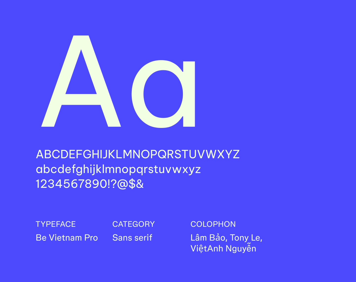
Be Vietnam Pro was designed with digital reading in mind, featuring generous spacing and open letterforms that make text easy to scan across screens. Building on the original Be Vietnam typeface, it supports Vietnamese and extended Latin scripts, making it a reliable choice for multilingual projects.
This font works well as an alternative to Inter or Roboto, offering clear, structured text without feeling bland.
Best for: Dashboards, websites, apps, and product interfaces
Font 4: Biryani

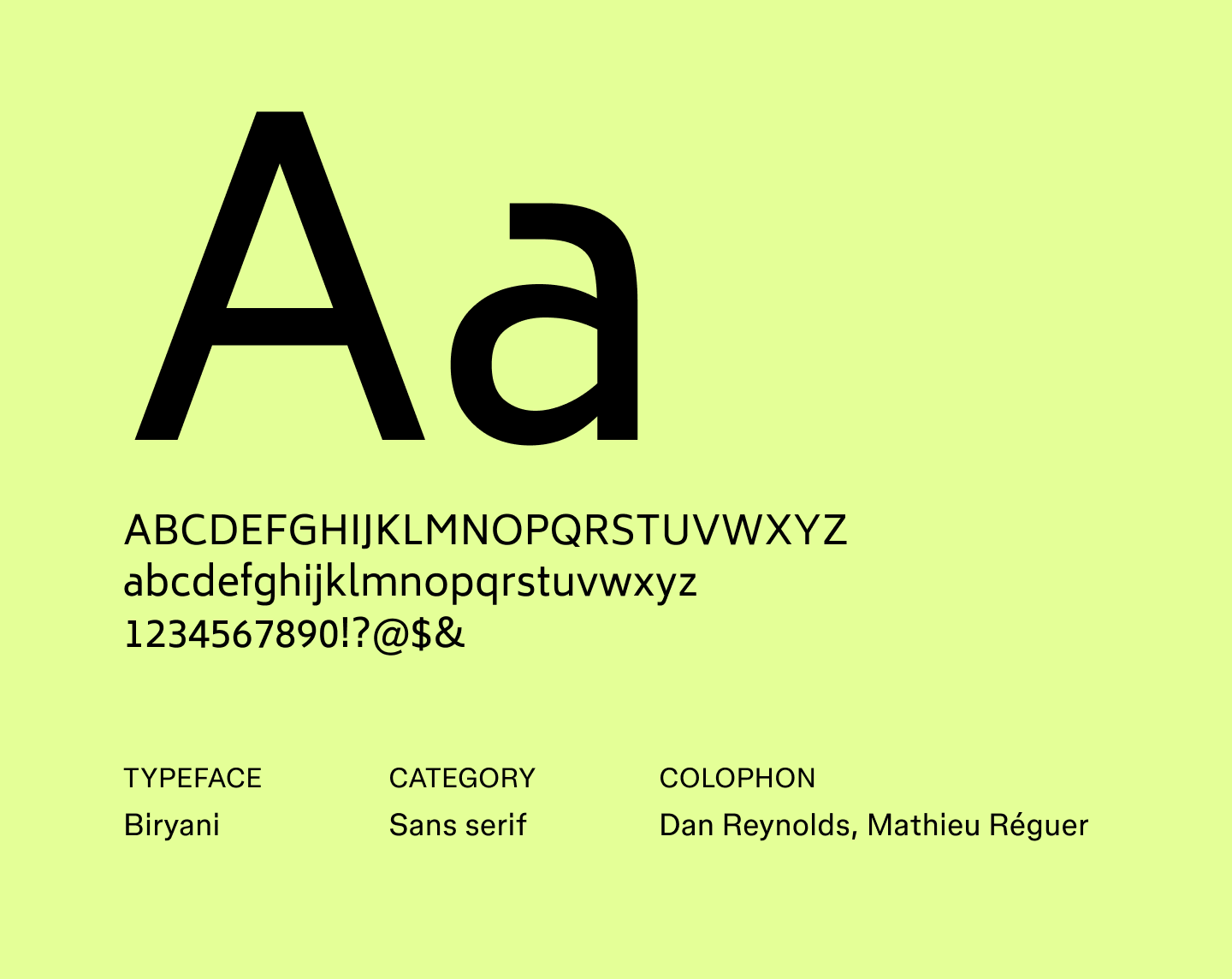
Biryani is a bold sans serif font with narrow letterforms, giving it a strong presence without feeling heavy. Crafted with headlines and display text in mind, it effectively grabs attention while remaining readable. The font pairs smoothly with simpler body text and works well as an alternative to fonts like Poppins or Montserrat.
Best for: Headlines, banners, posters, and social media graphics
Font 5: Cabin

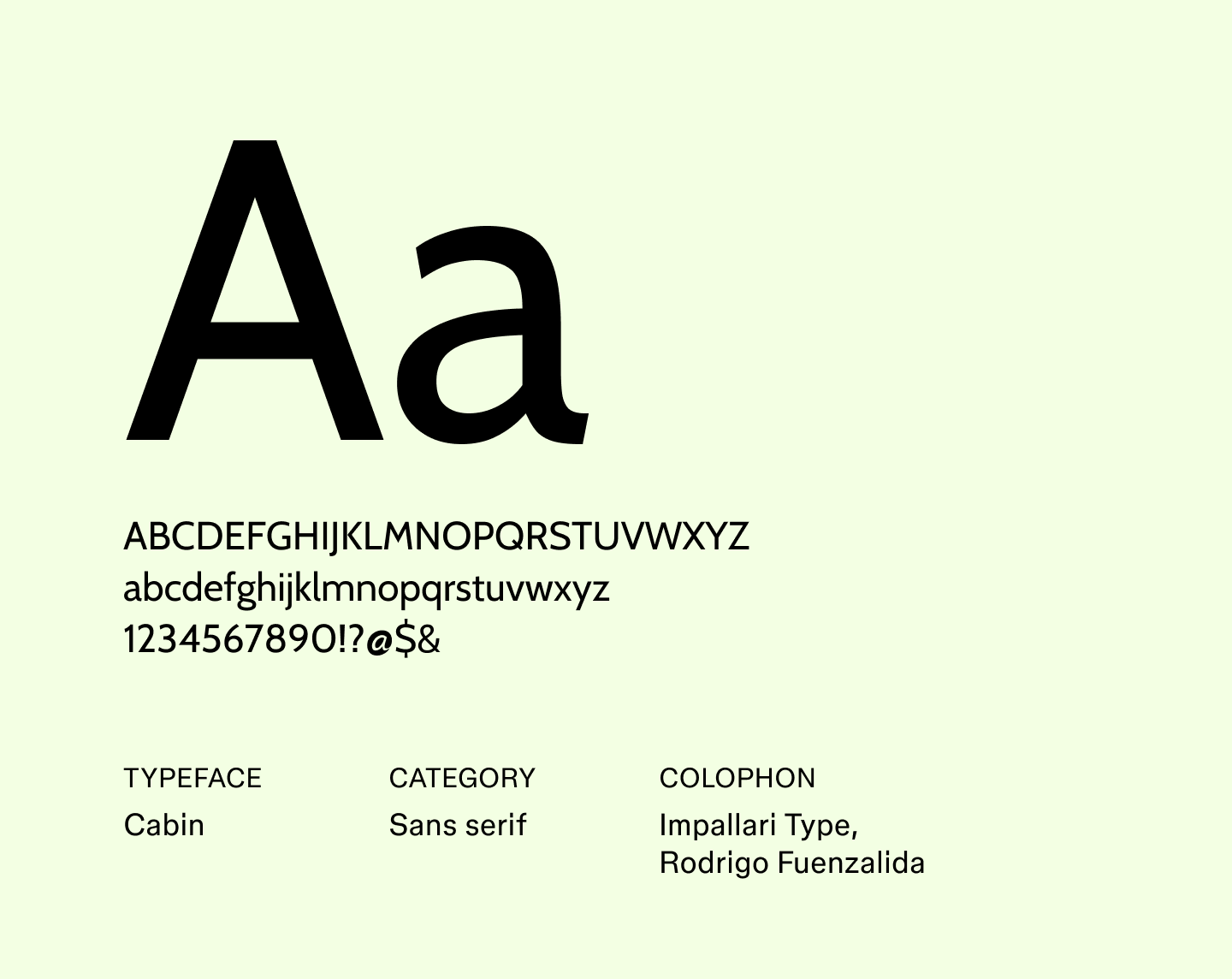
Cabin is a humanist sans serif font that combines geometric precision with gentle curves, giving it a friendly tone without sacrificing readability
Inspired by Edward Johnston’s typefaces and optimized for screen use, Cabin has become a great pick for brands that want to feel thoughtful and modern.
Best for: Websites, presentations, user interfaces, and branding with a warm touch
Font 6: Capriola

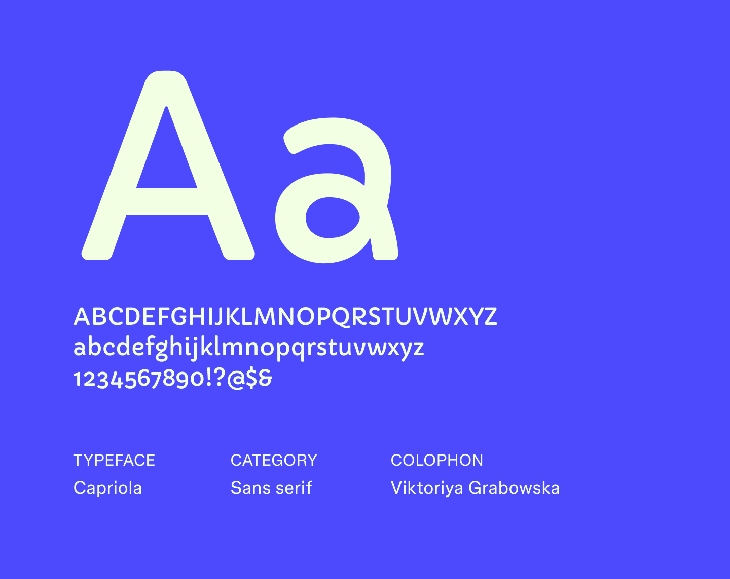
Capriola has a lively, slightly playful style with subtle vertical stress that adds movement to text. Its well-proportioned shapes help content feel energetic without compromising readability.
Created for digital screens, Capriola is a friendly alternative to fonts like Verdana or Tahoma, bringing a bit of character to editorial and web designs.
Best for: Headings, editorial content, apps, and web interfaces that need a dynamic feel
Font 7: DM sans

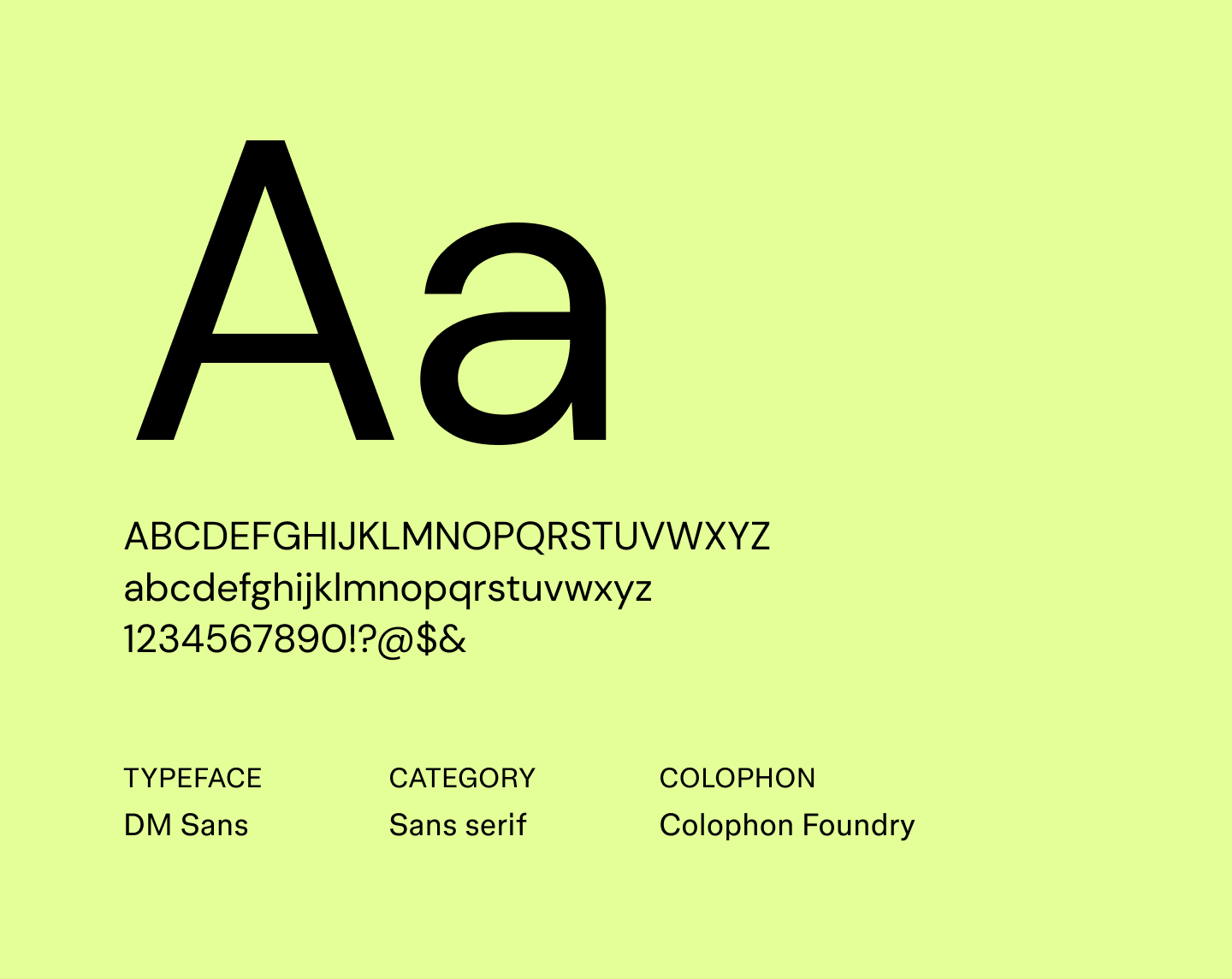
DM Sans is a geometric sans serif font with soft terminals and a minimalist style that keeps text crisp and easy on the eyes. Its even proportions give content a calm, structured appearance that works well for both headings and body text.
Created as a web-friendly alternative to classic geometric fonts like Montserrat, DM Sans is perfect for digital projects that need typography to feel clear and contemporary.
Best for: Websites, apps, newsletters, and UI interfaces
Font 8: Encode Sans

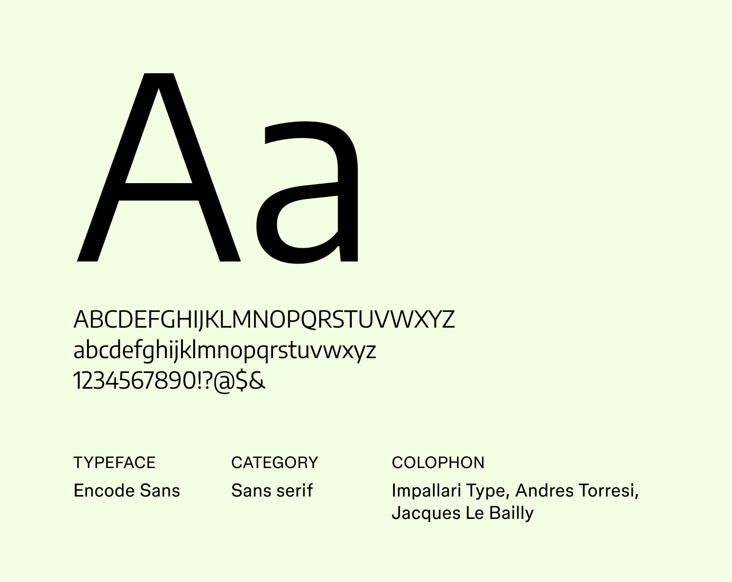
Encode Sans brings a slightly technical edge to text. Its consistent letterforms and thoughtful spacing make it easy to scan and give an organized appearance without feeling cold or rigid.
With multiple weights and styles, Encode Sans works well for data-heavy designs and digital products. This makes it a solid alternative to Roboto or Source Sans Pro for projects that require order.
Best for: Dashboards, tech-focused websites, data visualizations, and apps
Font 9: Epilogue

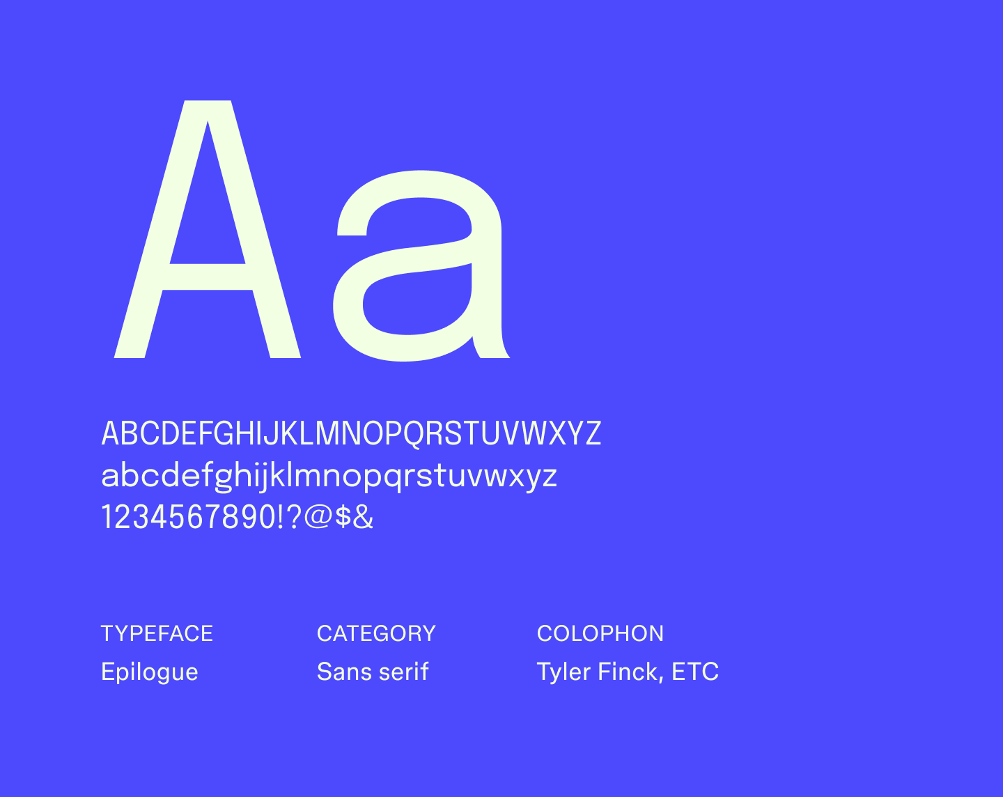
Epilogue is a clean, versatile sans serif font with open spacing and steady structure, making it ideal for straightforward communication in digital projects. It’s a great alternative to Lato or Helvetica, and especially helpful when you want content to lead and typography to stay out of the way.
Best for: Digital interfaces, presentations, minimal websites, and internal documentation
Font 10: Inter

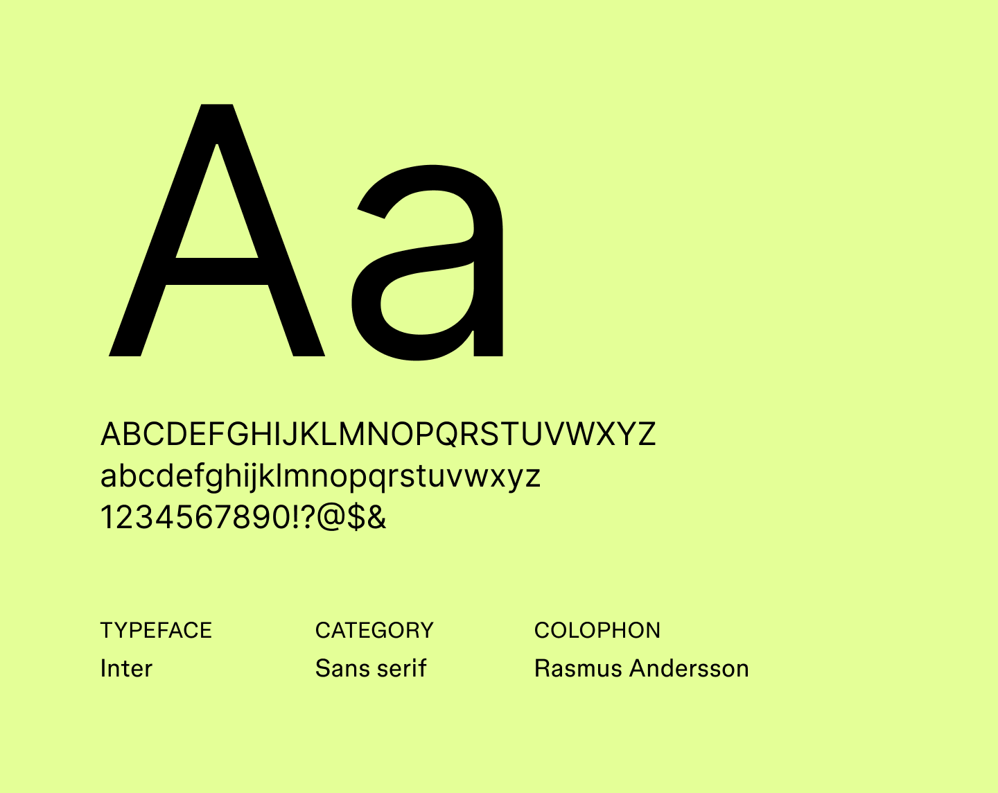
Made specifically for screens, Inter features open letterforms that make text easy to scan. It includes features such as tall x-heights and open apertures that improve readability in dense layouts.
Its attention to legibility and subtle detailing has made it a common choice for professional documents and one of the best fonts for resumes.
Best for: Resumes, websites, apps, and interface text
Font 11: Lato

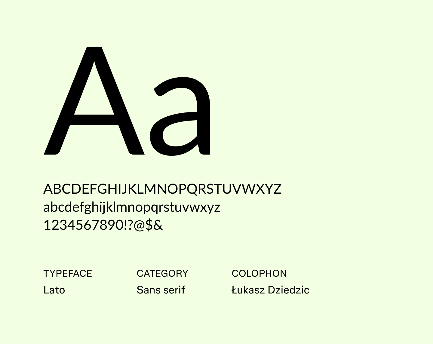
Lato was originally designed in 2010 by Łukasz Dziedzic for a corporate client, and its name means “summer” in Polish. The font combines strong structure with subtle curves, keeping text both readable and visually appealing. Over the years, it has become one of the most popular fonts, known for maintaining clarity at both small and large sizes.
Best for: Marketing emails, corporate reports, infographics, and portfolio websites
Font 12: Merriweather Sans

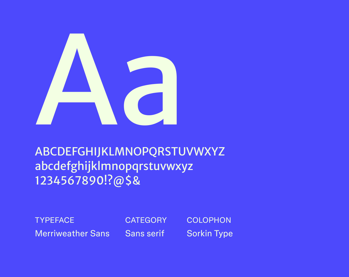
Merriweather Sans is the sans serif companion to the popular Merriweather serif, designed for legibility, even at very small text sizes. Its compact letterforms keep long passages readable without feeling cramped, and its low-contrast strokes make it ideal for dense text on a phone, tablet, or desktop.
Best for: Articles, reports, presentations, and web content that needs a professional tone
Font 13: Montserrat

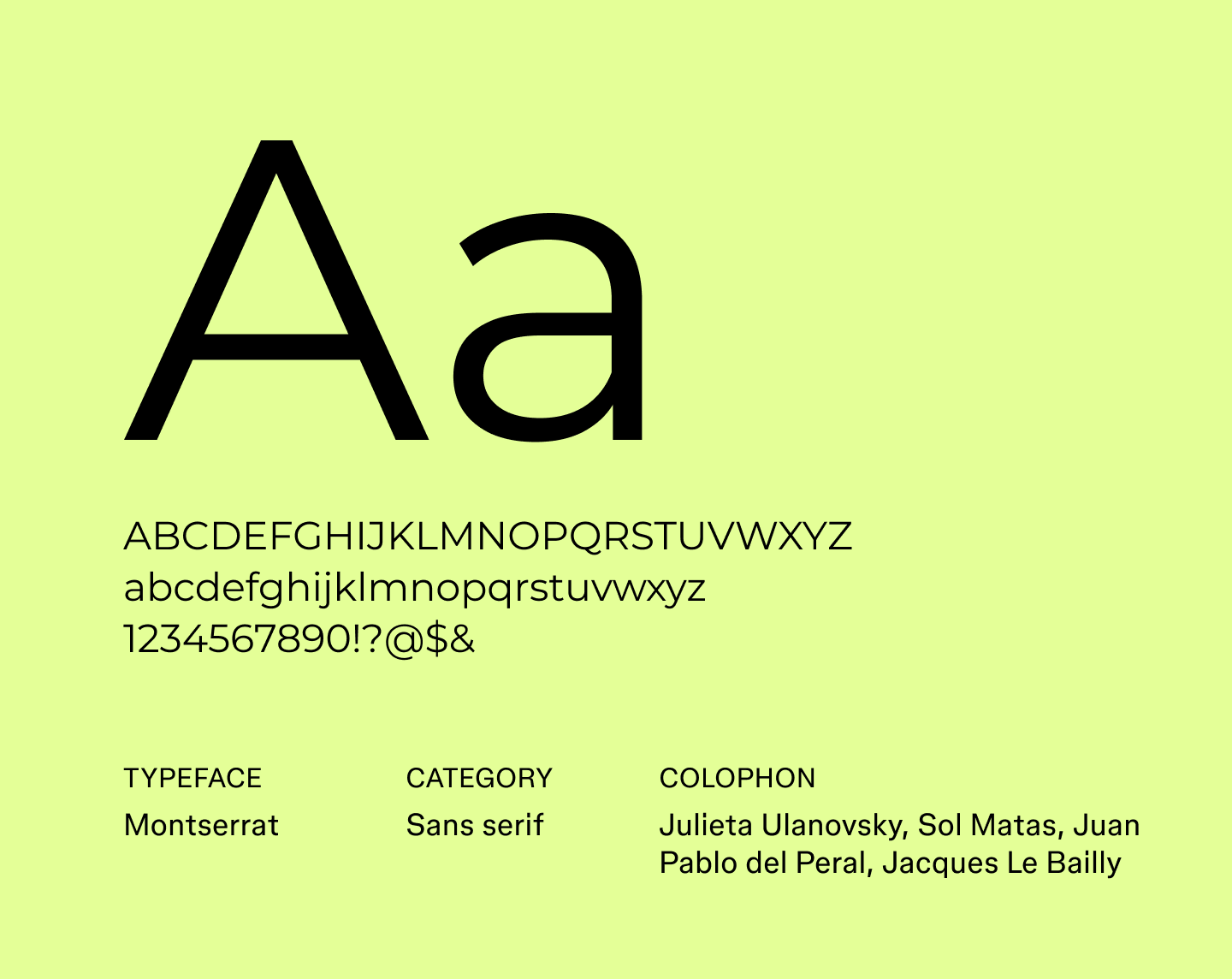
Inspired by the old signage of Buenos Aires, Montserrat brings a bit of the city’s energy into a sleek, geometric sans serif. Its variety of weights makes it work well for everything from bold headlines to smaller text, and it’s a go-to choice when designers are looking for modern fonts that feel fresh and confident without being stiff.
Best for: Headlines, posters, social media graphics, and brand identities
Font 14: Open Sans


Open Sans is recognized as one of the most readable fonts, designed with wide letterforms and generous spacing that make it easy to scan on any screen.
The font's neutral style has made it a favorite among designers seeking accessible fonts that work well across platforms. As a result, designers often consider Open Sans to be one of the best fonts for websites.
Best for: Blog posts, marketing websites, dashboards, and accessible web interfaces
Font 15: Poppins

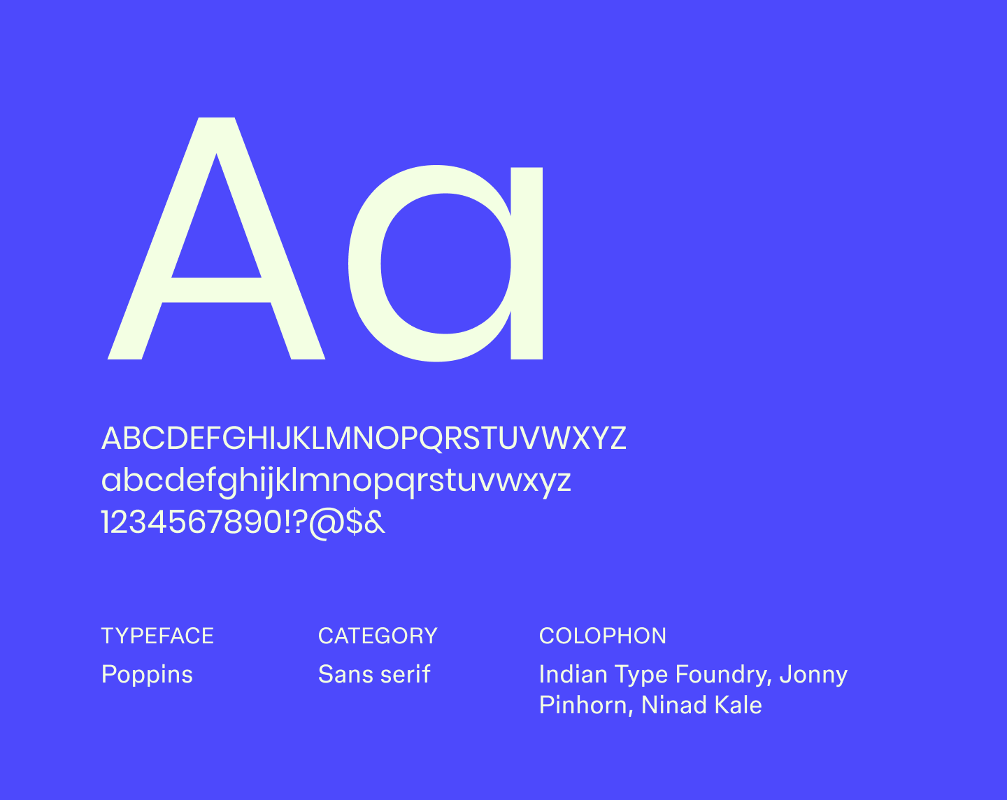
Poppins is a geometric sans serif developed initially in India, supporting both Latin and Devanagari scripts for multilingual projects. Its range of weights allows designers to create clear contrast and guide readers’ attention naturally. Its bold and distinctive letterforms also make it one of the best fonts for logos.
Best for: Logo designs, hero sections, social media banners, apps, and multilingual projects
Font 16: Public Sans

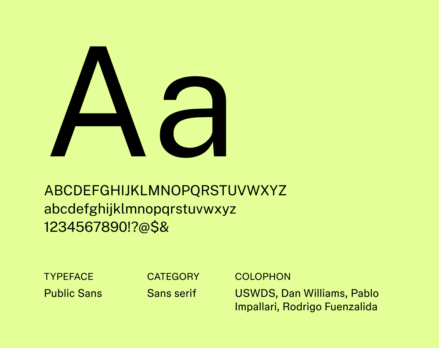
Public Sans is a neutral sans serif that keeps text clear and easy to read. Its even proportions and straightforward shapes give it a polished feel, placing it among the most trusted professional fonts for digital and print projects. Slight nuances in its letterforms create a subtle sense of structure and flow, making text feel cohesive across different sizes.
Best for: Websites, government projects, corporate communications, and user interfaces
Font 17: Raleway

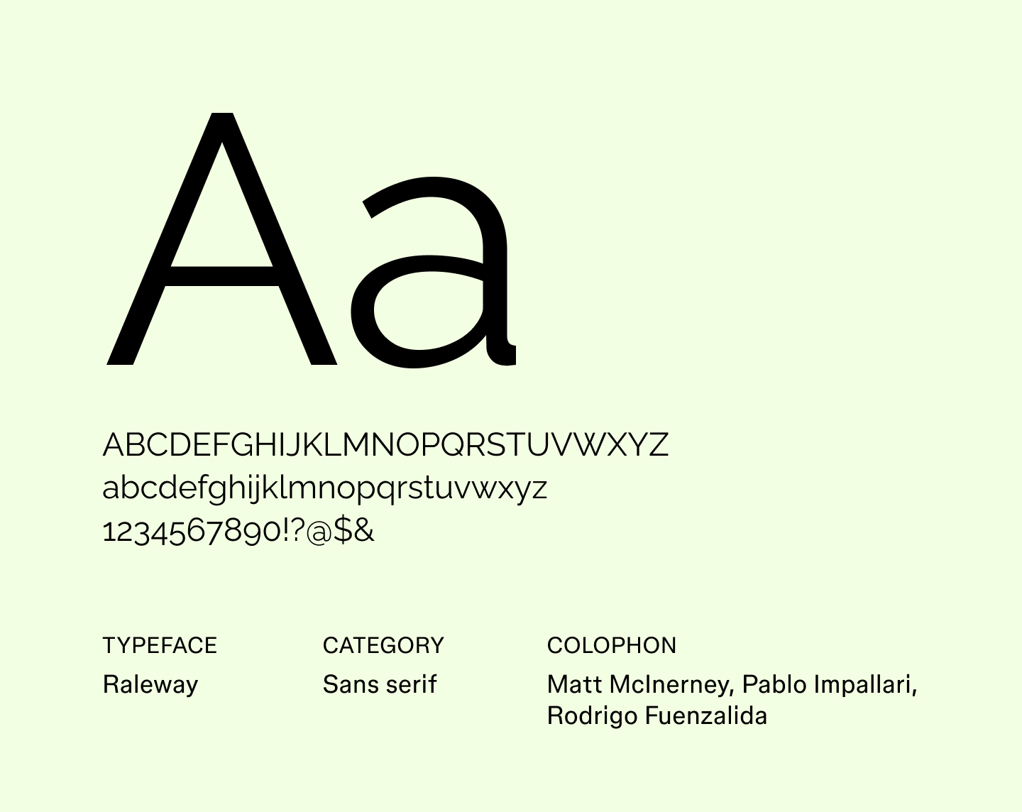
Raleway is an elegant font with sleek letterforms that give it a light, airy feel. Its refined shapes and generous spacing make it ideal for headings, display text, and designs where sophistication is key. Designers often reach for Raleway when exploring minimalist fonts that feel stylish without overwhelming other design elements.
Best for: Elegant headlines, event invitations, fashion branding, and editorial layouts
Font 18: Roboto

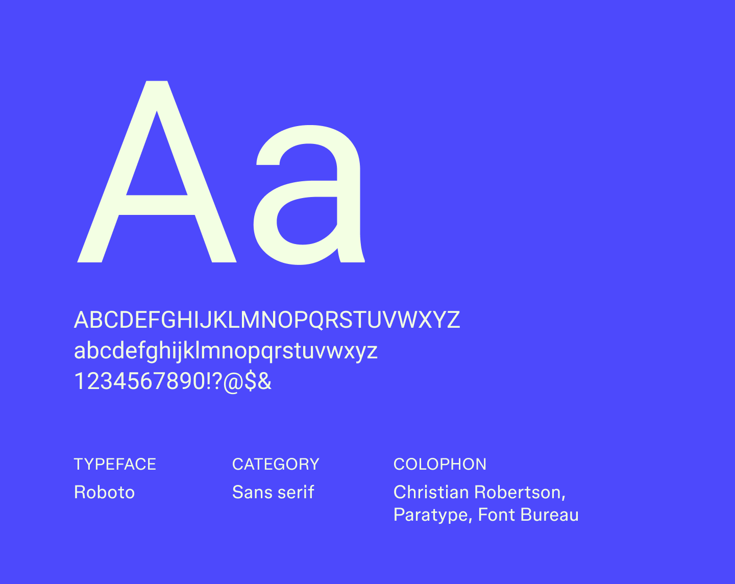
Roboto was developed as the system font for Android, combining a mechanical, geometric structure with friendly curves. This mix makes it highly legible across different screen sizes while keeping a human touch.
With multiple weights and styles, Roboto makes it easy to create contrast and hierarchy in layouts. Its adaptability has made it one of the most widely recognized sans serif fonts in digital design.
Best for: Mobile apps, web dashboards, content-heavy websites, and UI interfaces
Font 19: Sen

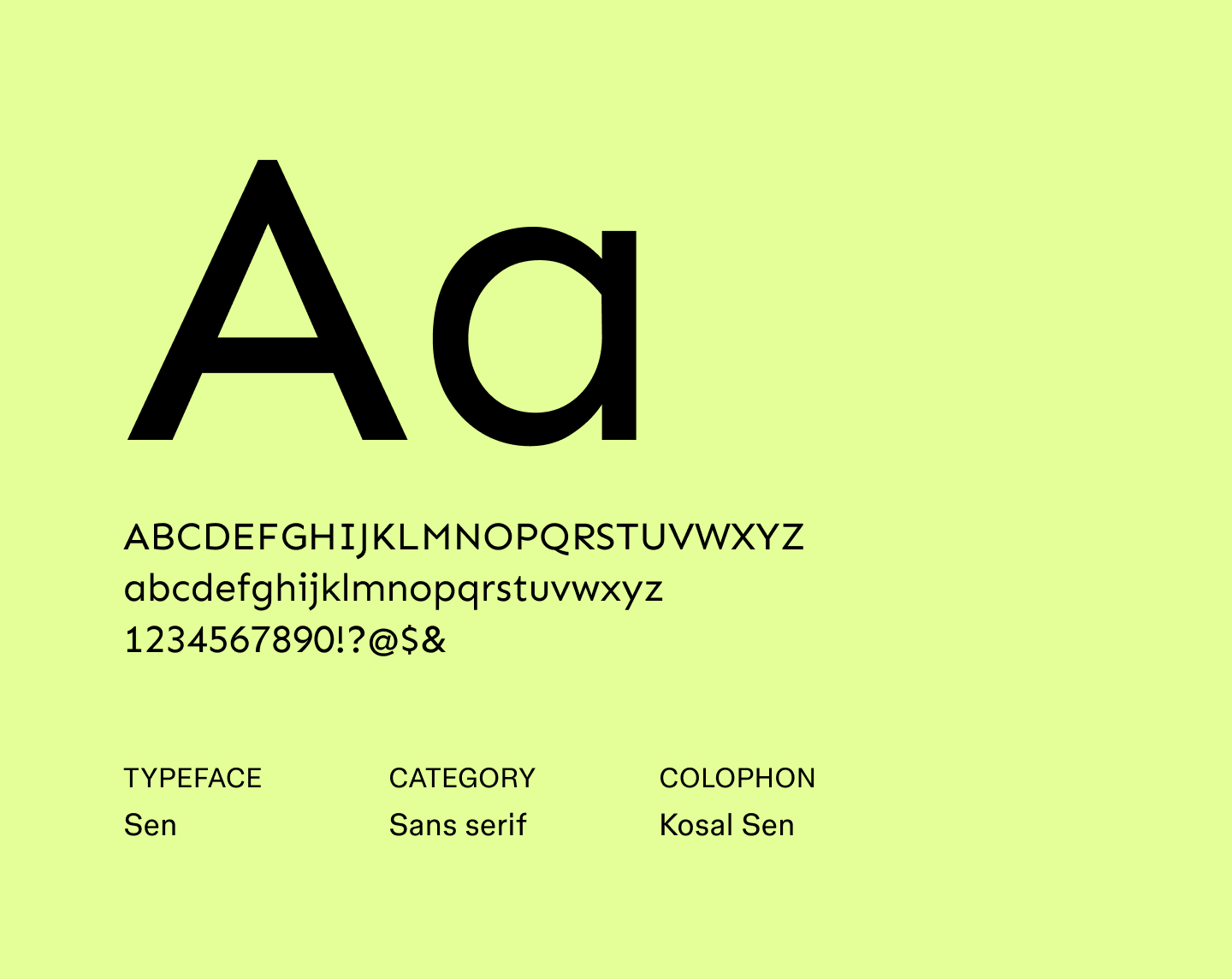
Sen’s compact letterforms and generous spacing help guide the eye through long reads. Its consistent strokes create a smooth reading rhythm, helping longer passages feel organized and approachable. Sen is a great choice when you need to make dense text feel more approachable, like for tutorials or long-form explainers.
Best for: Long-form articles, e-books, newsletters, and educational websites
Font 20: Sono

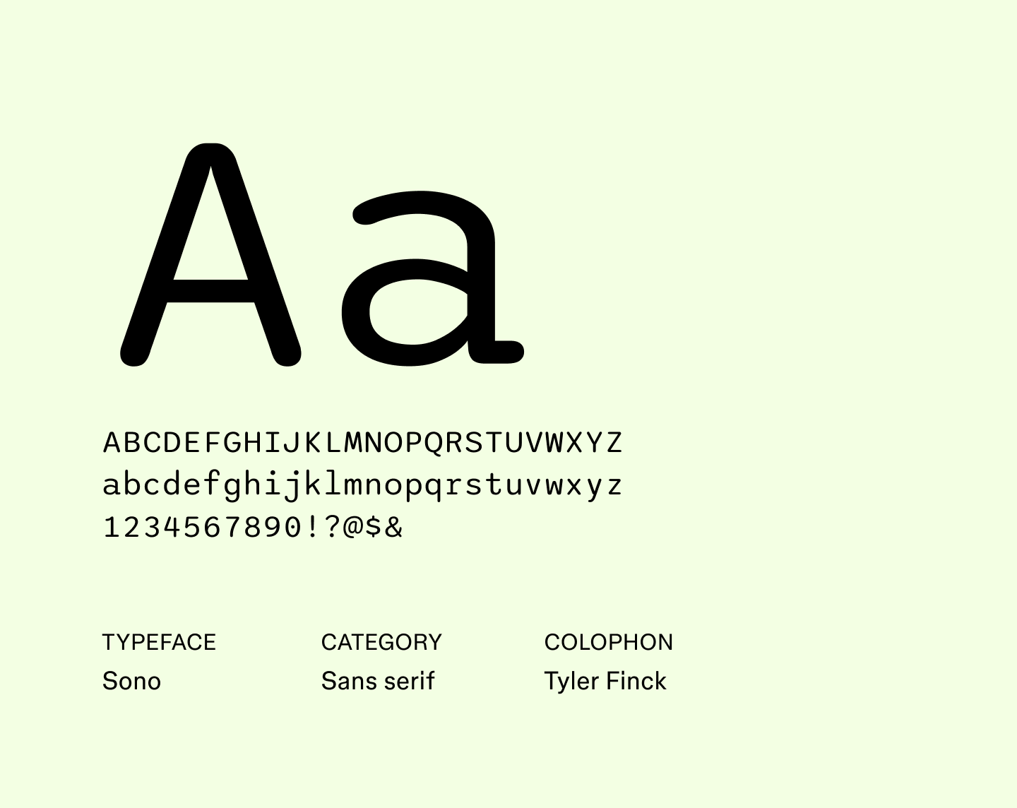
Sono is a geometric font with distinctive letterforms that give it a bold edge. Its uniform strokes and open counters make it highly legible, while the slightly extended proportions give the text a striking presence.
As a result, Sono is a strong pick for projects that need typography to make a statement, like attention-grabbing logos or standout posters.
Best for: Logos, magazine covers, posters, and branding that needs to stand out
Font 21: Source Sans 3

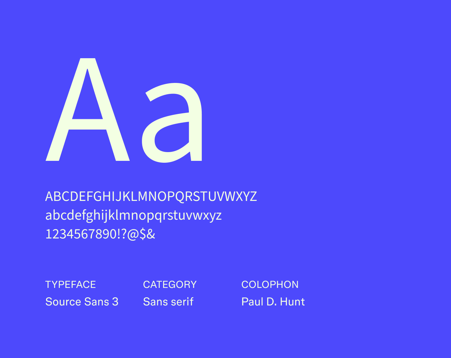
Source Sans 3 builds on Adobe’s original Source Sans, with spacing and proportion improvements that help text feel orderly and easy to scan. Its slightly taller forms give paragraphs a light, airy appearance that reduces visual fatigue over longer sections.
The font’s range of weights and widths makes it easy to differentiate headings, subheadings, and body text while keeping a cohesive look. Designers often choose Source Sans 3 for structured content where readability and clarity are essential.
Best for: Reports, company handbooks, forms, and professional dashboards
Font 22: Tenor Sans

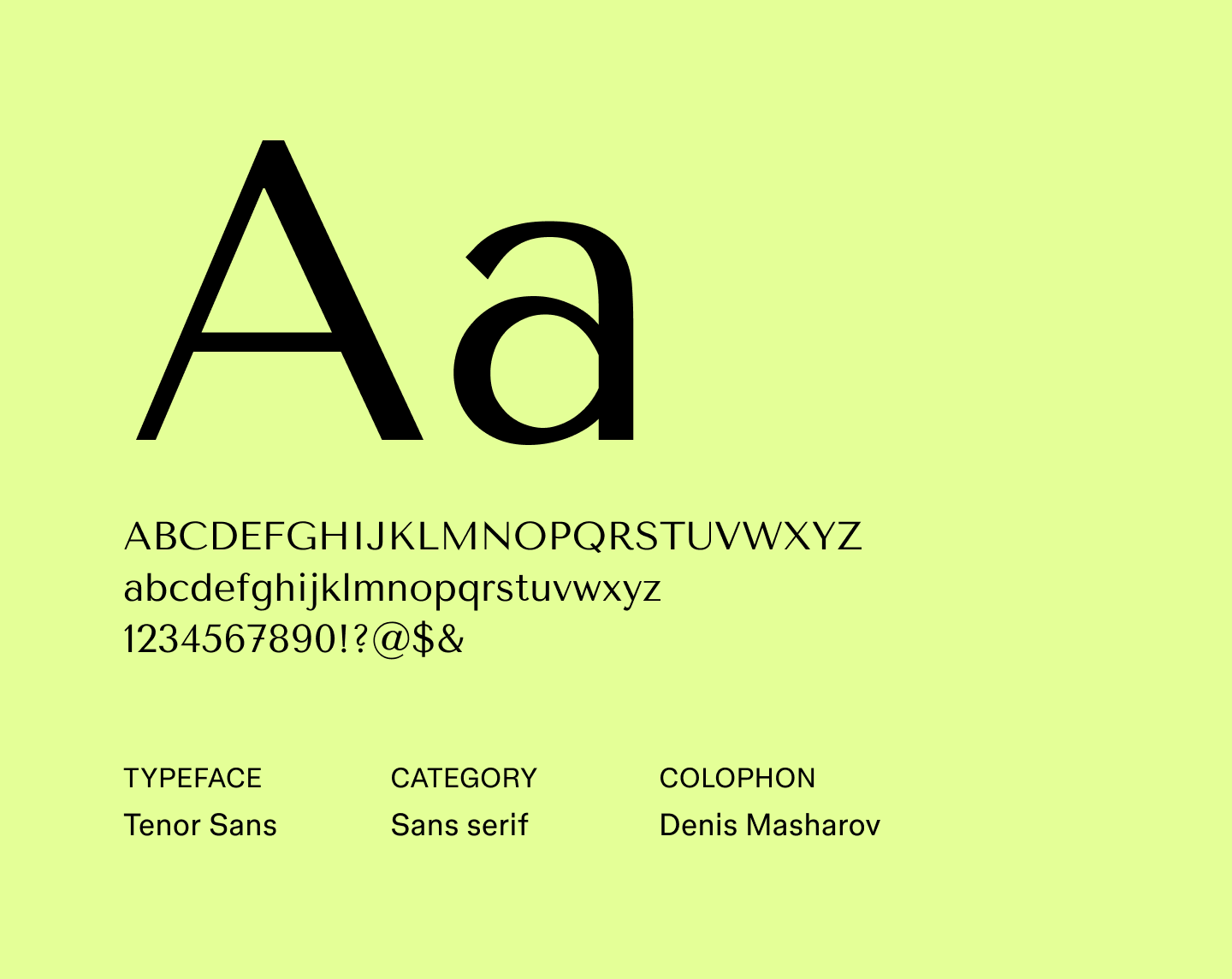
Tenor Sans has elegant, extended forms that bring calm and balance to dense layouts. Its uniform stroke thickness helps maintain structure in content-heavy layouts. It offers multiple styles that let designers emphasize headings, subheadings, or important points without interrupting the page's flow.
Best for: User manuals, instructional guides, data-heavy reports, and corporate presentations
Font 23: Titillium Web

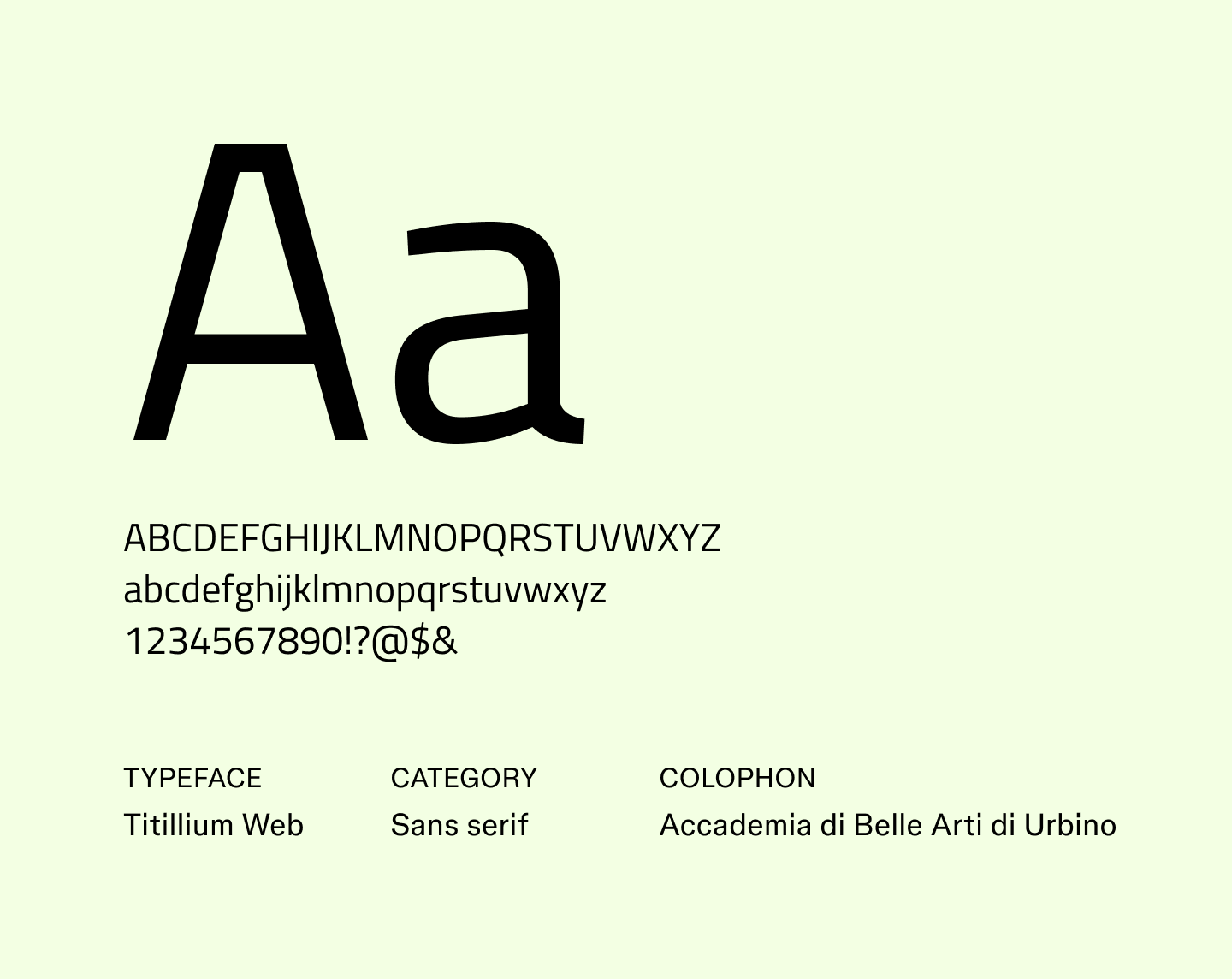
Originally developed as a collaborative university project, Titillium Web brings an academic precision to modern web design. Its tightly arranged letterforms save space without feeling cramped, helping text remain clear and purposeful even in dense layouts.
The family’s many styles make it easy to balance emphasis and consistency. It feels especially at home in interfaces and editorial layouts that call for structure without stiffness.
Best for: Online articles, tech blogs, digital portfolios, and UI headers
Font 24: Ubuntu


Ubuntu's rounded letterforms give text a welcoming, easygoing presence. It was designed for screens, so letters remain distinct and comfortable to read even at smaller sizes. Its variety of weights lets designers emphasize different sections of text without breaking the flow.
Best for: App interfaces, tech tutorials, open-source guides, and onboarding materials
Font 25: Yaldevi

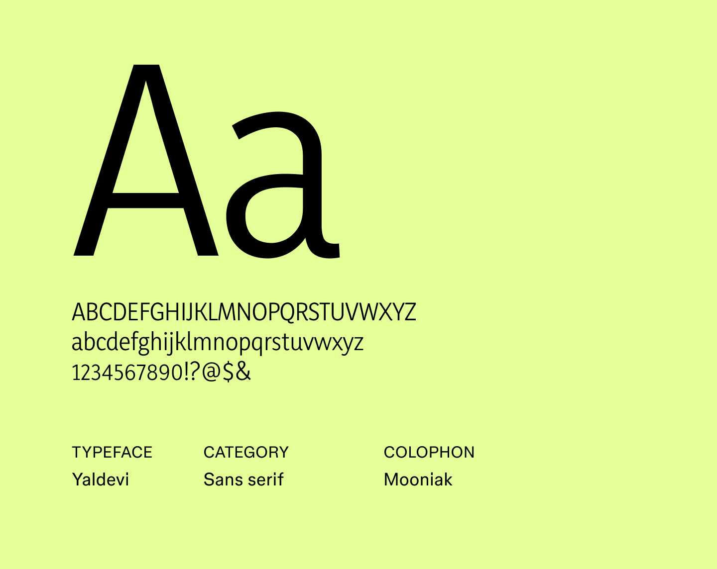
Yaldevi is a narrow sans serif that works well for headings and shorter passages. Its compressed letterforms let you fit more text on a line without feeling cramped, while the gentle curves add a subtle touch of personality.
The font family includes multiple weights, giving designers flexibility to emphasize key elements without changing the overall rhythm of the text. It’s especially effective for projects that need a neutral yet slightly playful tone.
Best for: Web headings, short-form content, banners, and presentation titles
Discover trending sans serif fonts with Figma
Choosing the best sans serif fonts helps your design feel intentional, clear, and on‑brand. With the right tools, you can explore multiple options, test pairings, and adjust spacing, all in context.
Ready to put these fonts into action? Figma makes it easy. Here’s how:
- Explore Figma’s sans serif font collection to see more examples and find inspiration for your next project.
- Visit the Figma font generator to explore built‑in font support, web font integration, and licensing details.
- Browse the Figma Community for thousands of font files, typography systems, and design templates from other designers.
Experiment with fonts instantly in Figma
Figma Design makes it simple to test fonts, play with layouts, and fine-tune text styles so your ideas always look their best.
Keep reading

39 impressive font pairings to elevate your designs
Learn how to use font pairings to elevate your designs, get tips for choosing the right font combination for your brand, and discover how Figma can help.

32 futuristic fonts to make your designs pop
Looking for a high-tech, modern typeface? Explore 32 futuristic fonts to upgrade your projects with cutting-edge sci-fi flair and space-age aesthetics.