25 Shades of Red in Design


Share 25 Shades of Red in Design
Explore more from
Design basics
Master color to elevate your designs
Experiment, refine, and apply color palettes in Figma.

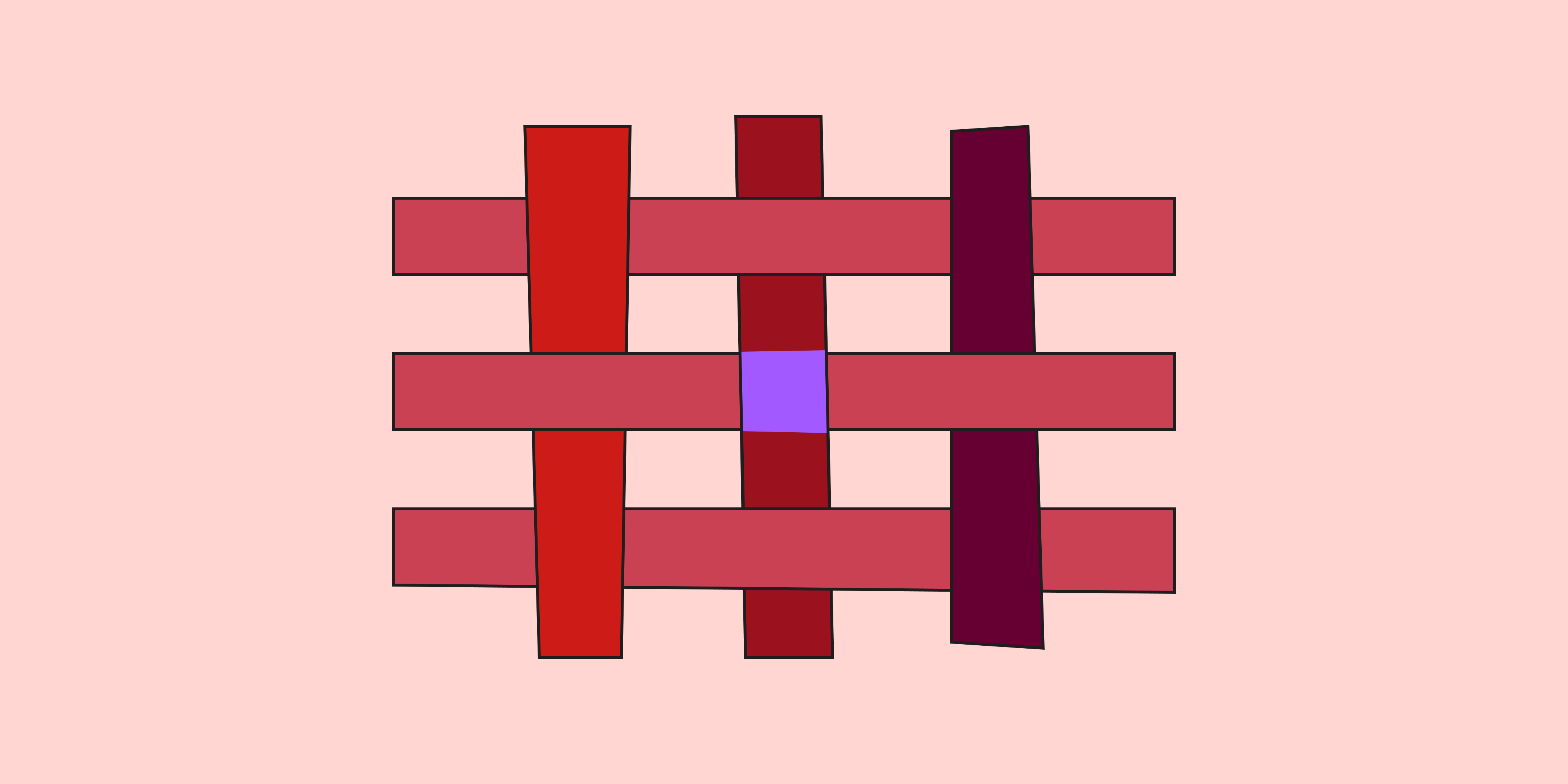
Quick—think of a color that signals an error message or warning. Now name a color that inspires appetite and hunger. Finally, pick a color that embodies passion and love. Bet you guessed red! From Chinese red lanterns to Hollywood red carpets, red has graced designs across cultures for centuries. Its many hues give designers a powerful range, from the exciting urgency of orangey reds and the intensity of blood red to the earthy warmth of Roman reddish ochre.
Read on to learn:
- Red color basics
- Benefits of using red in design—and three brands that use it effectively
- 25 different red shades with hex codes
- Pro tips to make red shades work for your designs
Red color basics
Red is a primary color on the color wheel that commands attention and provokes strong emotions. Globally it's associated with traffic signals and national emblems—including the English, American, and Spanish national flags. Print designers who use the CMYK color system know that combining magenta and yellow produces a red pigment.
Along with green and blue, red is a primary color in the RGB color model for digital displays. Primary colors can be combined in varying amounts to produce millions of colors, each with a unique hex code. For example, digital designers might recognize fire engine red by its color code: #CE2029.
Mixing red with black creates deeper shades like rich burgundy or maroon. Adding white produces lighter tints, from soft rose to pastel red. You can also blend red with other hues for vibrant color combinations like orange-red, purple-red, or brown-red. To find the perfect shade of red for your palette, try Figma's interactive color palette generator.
Benefits of using shades of red in design
In interior design, graphic design, and product design, you can use red color palettes to create memorable user experiences. Red helps designers to:
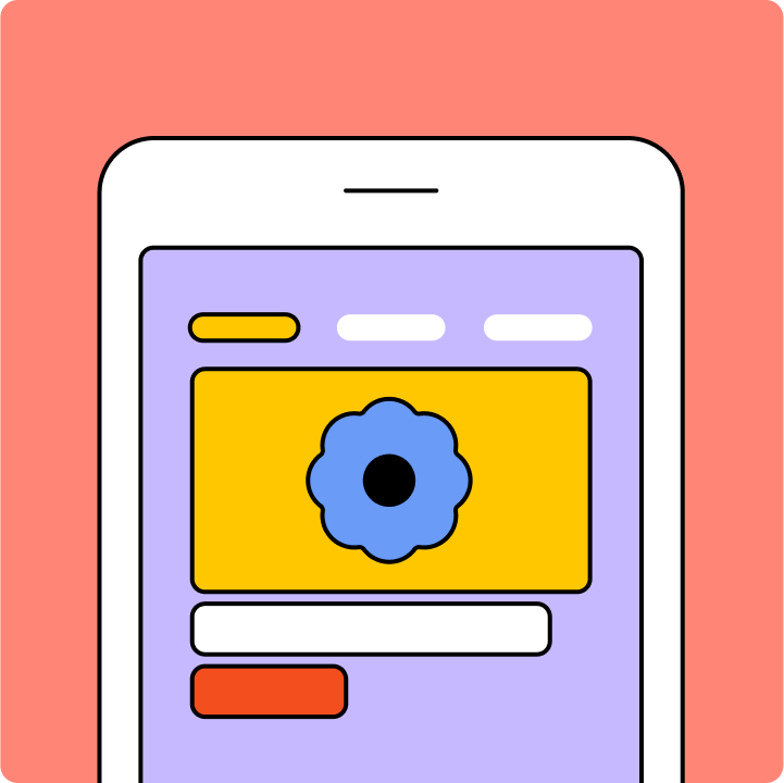
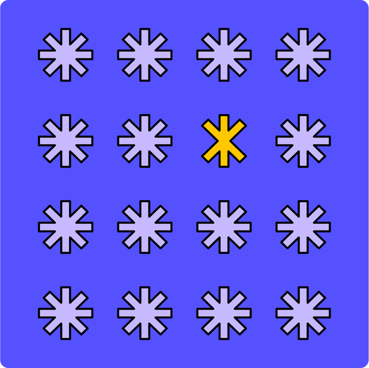
- Grab attention. Bold red directs users' attention to important actions and information. That's why it's the go-to choice for buttons and alerts.
- Evoke emotion and sensation. In color psychology, red evokes strong emotions from love to anger, and also stimulates hunger.
- Boost energy. Red can generate excitement and raise energy levels for vibrant, high-impact designs.
How to use 25 different shades of red in designWhether you plan to use red for a bold logo or for UI designs with a complementary color scheme, choosing the right shade of red is critical. Check out Figma's color guide for a deeper dive and tips on effectively using each hue in UI design, covering symbolism, history, and brand design examples. To experiment with shades of red, use Figma’s interactive color wheel. Kick off your exploration by looking up your pick of the 25 reds below.
Warm reds
Warm colors evoke energy and passion. Try these warm reds for attention-grabbing design elements:
- Chili red (#CD1C18) is a bold, warm hue that makes a statement. Ideal for call-to-action buttons and or highlighting important information, it pairs well with yellow-orange, beige, soft pink, and light blue.
- Scarlet (#ED2100) is fiery and exciting—ideal for CTAs and key design elements. Scarlet pairs well with champagne, cognac, rosewater, and black.
- Cinnabar (#E84B3D) commands attention with bold and fiery qualities. You might see this hue in CTAs, urgent notifications, or progress bars. Cinnabar pairs well with navy blue, almond, hunter green, gold, and cream for harmonious color schemes.
- Rose red (#FA003F) is a vivid, striking hue that brings a youthful, modern look to UI designs. Combine it with midnight blue, pale rose, gold, charcoal, and ivory.
- Fire engine red (#CE2029) is synonymous with urgency and excitement and ideal for emergency notifications. Pair it with black, white, and chrome for a clean, high-contrast look.
- Vermilion (#E34234) is a bright red-orange hue that adds energy and enthusiasm to designs. Combine it with turquoise, white, or charcoal gray for visual impact.
Cool reds
Cool reds have blue or purple undertones, bringing a refined and sophisticated feel. Some popular cool reds include.
- Ruby red (#9B111E) has a subtle blue undertone, creating a sophisticated, elegant look that works well for luxury branding. Ruby red pairs well with silver, navy blue, and slate gray.
- Wine red (#722F37) adds depth and mystery to designs with its deep, rich blue undertones. It’s often associated with high-end fashion and beauty brands, and works well with gold, cream, and deep green.
- Berry red (#B6316C) blends red and purple to create a cool, vibrant hue perfect for playful and modern designs. Berry red pairs well with teal, light gray, and white.
- Venetian red (#C80815) is a classic historical shade with a deep, luxurious tone that evokes tradition and heritage. Venetian red pairs well with gold, cream, and dark green.
- Magenta (#FD3DB5) combines the energy of red with the coolness of blue in a striking modern hue. Magenta pairs well with black, white, and teal.
- Carmine (#960018) is a deep, rich red with a hint of blue that adds rich Renaissance elegance to your designs. Carmine pairs well with gold, cream, and navy blue.
Soft reds
Soft reds bring a sense of tranquility and warmth to designs, making them ideal for designers looking for a delicate, inviting color palette.
- Pastel red #FF746C has a welcoming feel with soft, calming qualities. This hue is a natural choice for designs and apps aiming to create a soothing atmosphere. Pastel red pairs well with teal, mint green, lavender, light gray, and creamy white.
- Dusty rose (#DCA1A1) is a gentle, muted shade that works well as an accent color for buttons, icons, or tabs. ITry using it in apps to promote relaxation. Dusty rose pairs well with navy blue, green sage, and blush pink.
- Pink (#FF8DA1) brings a soft touch to design with warm undertones. Use it as an accent for a subtle, soothing effect on websites or apps with sensitive content. Pink pairs well with white, navy blue, pastel yellow, gold, and celadon.
- Rosewater (#FFD6D1) is a muted shade with a calming effect. Designers often use this subtle blush to evoke health and wellbeing. Rosewater pairs well with pastel yellow, mint green, soft gray, brown, and white.
Deep reds
Deep reds are intense, saturated hues that exude sophistication, richness, elegance, and depth. Often confused with dark reds, deep reds typically have a more vivid quality. Here are some notable shades:
- Red (#FF2C2C) grabs attention with its bold energy. It's commonly used for warnings and error messages. Pair it with aqua, light orange, light rose, cream, and navy blue.
- Burgundy (#660033) is a perfect hue for high-end websites and luxury branding. Named after the wine region in France, it adds elegance everywhere it goes with its rich, sophisticated vibe. Pair it with gold, cream, navy blue, slate gray, and dusty pink.
- Puce (#E491A6) brings intrigue with deep, rich tones. Combine it with sage green, navy blue, champagne, slate gray, and cream for captivating results.
- Maroon (#550000) conveys tradition and reliability, with earthy undertones that nicely offset midnight blue, rosewater, and green sage.
- Crimson red (#B22222 ) evokes passion with its bold, bright tone. For striking, impactful designs, combine this hue with dark gray, beige, bronze, or pastel red.
- Rose (#FF1D8D) shows the deeper, saturated, romantic side of rose. Perfect for Valentine's Day branding or dating apps, rose couples nicely with navy blue, mint green, lemon yellow, light gray, and cream.
- Chili pepper (#B53333) adds a spicy touch to designs with warm undertones. Use it for accent elements that need to stand out, paired with ivory, mustard yellow, or olive green.
- Garnet (#8B0000) brings luxury and sophistication to high-end brands with its deep, dark red tones. Garnet pairs well with gold, cream, and dark green.
- Brick Red (#CB4154) has an earthy tone that gives a grounded, natural look. Use it to add warmth and stability to a design, pairing it with beige, cream, or sage green.
Red in branding vs. design
Red packs a punch, but it works differently depending on where you use it.
In branding, red has the power to stir strong emotions like passion, excitement, and urgency. When used strategically, red helps create strong, memorable brand identities. Think of Coca-Cola's iconic red, also known as the company’s “second secret formula."
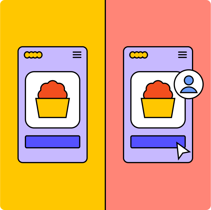
In product design, red has a more practical job. Designers often use this high-visibility hue for important elements like buttons, notifications, and error messages. Since too much red can overwhelm and distract, it’s wise to exercise restraint. For example, Figma incorporates red into its logo but keeps its website interface neutral, helping the user stay focused on their task.
3 brands that use red shades effectively
These brand examples show how red shades can elevate product design, build strong brand recognition, and create meaningful connections with users.
- Target's signature bold red conveys energy and enthusiasm, reflecting its brand promise of bringing more value and fun to shopping.
- YouTube uses a vivid red to draw attention to key features like the play button and progress bar. This bold shade enhances user navigation and aligns with the brand's energetic, dynamic image.
- Netflix uses vibrant red strategically for a visually engaging experience, inviting users to immerse themselves in their favorite shows.
7 pro tips to apply red in UI design
Create captivating and functional user interfaces using red shades in your next design with these seven pro tips.
- Highlight key elements. Use red to draw attention to the most important elements. Bright reds can make buttons and important links stand out, capturing the user's attention.
- Establish hierarchy. Use lighter shades of red for background elements and darker shades for foreground elements. This creates depth, naturally drawing user focus to the most important parts of your design.
- Balance with neutral colors. Pair red shades with neutral colors like gray, white, or light shades to prevent red from overpowering other elements.
- Set a mood. Choose red shades that match the emotional tone of your design. Plush deep reds like maroon give a sense of indulgence or sophistication, while brighter reds like crimson can evoke energy.
- Enhance branding. Select a shade that reflects your brand's personality and apply it consistently across the UI to boost brand recognition
- Ensure accessibility. Use accessibility tools to check red shades for color contrast to ensure readability for all users—especially if using red shades for text and background combinations.
- Research cultural context. From Africa to Asia, red carries different cultural meanings—so always research the history and symbolism of your color choices to broaden the appeal of your design.
Put the power of red to work with Figma
Wondering which shades of red will fire up your next project? Figma offers powerful tools and resources to help you hit the right hue every time:
- Learn more about the history of many shades of red in Figma’s color meanings and symbolism guide.
- Experiment with Figma’s color wheel to explore shades of red for RGB digital displays.
- Create, collaborate, and select color palettes using Figma’s collaborative design tool.
- Apply red palettes using color plugins developed by Figma’s professional design community.
Ready to go deep with color?
Keep reading

What is UI design
What is UI design today, and what role does it play in the design thinking process?
Learn more

What is visual hierarchy
If everything looks the same, then you see nothing. Visual hierarchy can change that.
Learn more

UI vs UX
Read on to find out what it takes to design engaging UI, and create a memorable UX.
Learn more
From the blog

How Decagon uses AI for design system saturation
The fast-growing customer experience platform explains how Figma MCP and Figma Make helped them scale a new design system and keep pace with customer requests.
The Figma design agent is here
Starting today, work with an agent that is built for Figma—directly on the canvas.

The TL;DR on MCP: Why context matters and how to put it to work
Figma’s MCP server brings your design decisions into the tools where code gets written—so what gets built actually matches what was designed. Here’s what that unlocks for everyone who builds products.
How to supercharge your design system with slots
Slots give you the ability to customize components without breaking the system. We’re sharing five field-tested tips from early users to help you unlock more freedom without giving up control.
The new business case for design systems
Design systems have evolved from static libraries to key drivers of business revenue, customer loyalty, and product strategy. Here’s what you need to know about how to track and communicate the value of your design system, based on new research from the Design Executive Council (DXC).

5 shifts redefining design systems in the AI era
As AI reshapes how we make products, design systems are evolving from libraries of reusable parts into living frameworks that scale taste and craft. We spoke with product leaders and practitioners about the shifts they’re seeing in how design systems are built, used, and maintained.