What is visual hierarchy

Share What is visual hierarchy
Explore more from
Design basics
Create, collaborate, and ship in Figma
All your design work, in one place.

We’ve all experienced information overload. Slides that are just too dense. Web pages with no clear call to action. Forms with too many options.
“If everything looks the same, then you see nothing,” explains Miguel Cardona, Designer Advocate at Figma. "Visual hierarchy can change that."
What is visual hierarchy?
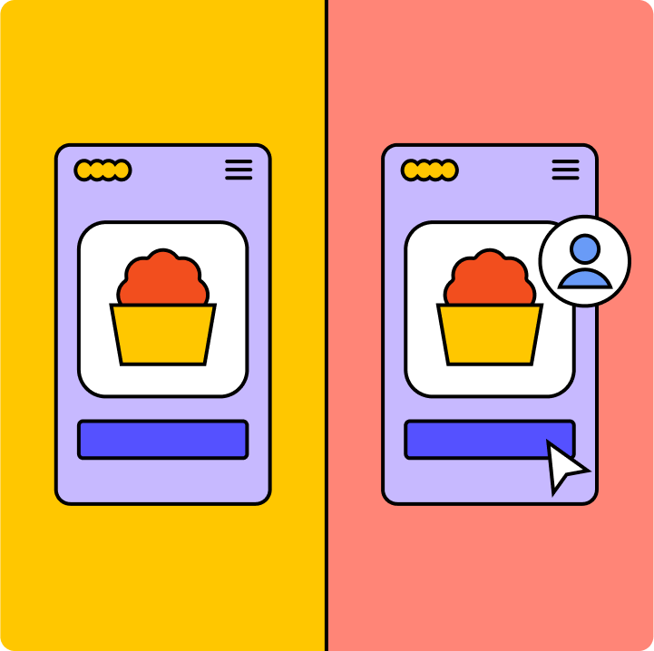
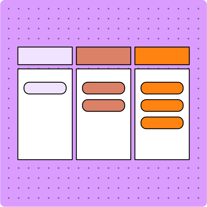
Visual hierarchy is the practice of arranging elements in order of importance, to direct a user’s attention to content and tools that can meet their needs. What catches their eye first? Then where do they look? Do users take the action you intended and feel satisfied by the outcome
Done well, visual hierarchy helps people understand information intuitively. It’s how audiences can quickly understand from a glance at a movie poster what the movie is about, who’s in it, and its release date. Look closer and you might spot less critical information, like its rating and studio affiliation.
7 essential visual hierarchy principles
Visual hierarchy takes inspiration from Gestalt psychology, which explores how the mind creates order out of chaos, makes patterns, and groups separate elements into a unified whole.
Designers apply eight key visual hierarchy principles to help the mind grasp ideas quickly.
1. Alignment refers to the placement of one visual element in relation to the others in a group. When objects are aligned, or lined up, they're understood as related to one another.
2. Color is often described in terms of hue, lightness, and saturation. Color can be tricky, though, because people perceive it so differently. To establish a clear visual hierarchy, Cardona specifies luminance and brilliance in design. It is recommended to use a pre-set color palette with good contrast, which can be easily set using a color wheel generator.
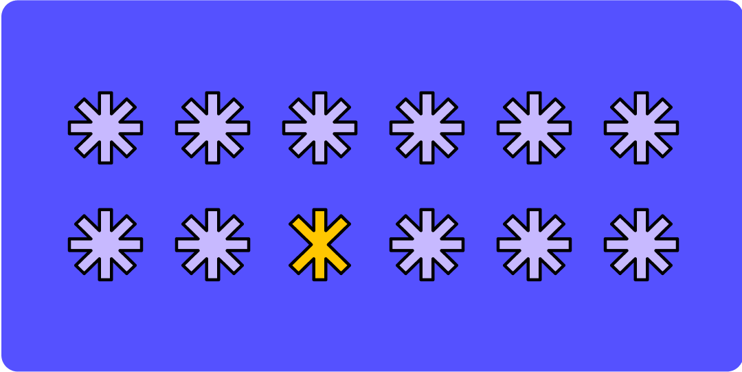
3. Contrast is when notably different elements are close together. Designers often juxtapose warm and cool elements or complementary colors to enhance visual appeal and boost contrast ratios for accessibility.
4. Proximity describes how near or far items are in relation to each other. Grouping or “chunking” objects is an example of this principle in action.
5. Size refers to the dimensions of an object or design element. The size of UI elements like buttons or content can be an important consideration for accessibility. “If you don't provide low-vision users the opportunity to have agency over text and image size, you're making your content difficult to read and understand,” Cardona says.
6. Texture is the way a surface feels or a UI element is perceived to feel. "Texture allows you to ascribe meaning to design, and may help give a clear visual indication of how something is to be used," says Cardona. When UI designers use texture to mimic the appearance of tactile, real-life material, that's referred to as skeuomorphism—and it can come across as dated or literal unless handled carefully. "With digital design, a lot of designers avoid texture—but it can be really impactful,” Cardona explains. “Texture can be used to create highlights, instead of relying on color."
7. Time unfolds on screens differently than on printed pages and static products. Screens can change, react, and transform, opening up a new world of temporal design.
Inspired visual hierarchy examples
Cardona’s favorite example of visual hierarchy is the work of Massimo and Lella Vignelli.
“The thing about the Vignellis and their work is the way they employ scale and hierarchy. Their work is just out of this world,” Cardona says.
“The Vignellis designed books, print posters, spaces, furniture—all with this interplay of scale, understanding that there's something for you based on your relationship to that object. For every degree of distance that you have from a design, there is an engagement point.”
You can browse the Vignelli archives here. On Figma, the community also honors the Vignelli legacy via Figma design resources.
5 visual hierarchy pro tips
From his experience teaching design and creating Figma design resources, Cardona shares these five takeaways on visual hierarchy.
- Know your end user and their context. You might be designing a visual hierarchy for a mobile device—but that device is in someone’s hand at a specific space and time. “Are their users rushed, or are they able to peruse content at their leisure? Do they have a child in their left hand and a bag of groceries in their right?" Cardona asks. "Designers can forget the context of the individual trying to make sense of their hierarchy. We assume that everybody is the same distance from their phone, but what happens when other things are at play?”
- The medium matters. When it comes to creating visual hierarchy, Cardona says, the medium determines which principles are going to be the most useful in actual practice. For example, when it comes to a billboard or a mobile app, scale will be one of the most important factors in your design.
- Question, experiment, test, and iterate. Don’t be afraid to be bold and try new things—because when everything looks the same, nothing stands out. Digital design thrives on creative iteration and beta testing, says Cardona. Once your work is released into the wild, you’ll start to see how people are interacting with it, creating a feedback loop that inspires further optimization.
- A little goes a long way. “Often, people try to do too much,” Cardona observes. "Seeing what’s necessary might reveal a better solution.” Using white or negative space effectively is a tactic long used by Apple and Google that’s worth revisiting, he says.
- Consider progressive disclosure. Progressive disclosure is a technique UX designers use to break up information or steps into more digestible chunks. By sequencing content across several screens, the approach lowers the chances that someone will feel overwhelmed by what’s in front of them. “That's something all designers need to work on,” says Cardona.
Get a headstart on visual hierarchy with Figma
As you work on your next design project, Figma's tips and tricks for visual hierarchy will help you communicate more effectively.
Figma’s all-in-one design platform streamlines collaboration with an online whiteboard built for researching, brainstorming, designing, testing, and easy handoff. Widgets, sticky notes, and templates bring your design to life, step by step.
Explore visual hierarchy with Figma.
Keep reading

UI vs UX
Read on to find out what it takes to design engaging UI, and create a memorable UX.
Learn more

What is UI design
What is UI design today, and what role does it play in the design thinking process?
Learn more

What is product design?
Learn how product designers help define which goals matter, from both user and business perspectives
Learn more
From the blog

How Decagon uses AI for design system saturation
The fast-growing customer experience platform explains how Figma MCP and Figma Make helped them scale a new design system and keep pace with customer requests.
The Figma design agent is here
Starting today, work with an agent that is built for Figma—directly on the canvas.

The TL;DR on MCP: Why context matters and how to put it to work
Figma’s MCP server brings your design decisions into the tools where code gets written—so what gets built actually matches what was designed. Here’s what that unlocks for everyone who builds products.
How to supercharge your design system with slots
Slots give you the ability to customize components without breaking the system. We’re sharing five field-tested tips from early users to help you unlock more freedom without giving up control.
The new business case for design systems
Design systems have evolved from static libraries to key drivers of business revenue, customer loyalty, and product strategy. Here’s what you need to know about how to track and communicate the value of your design system, based on new research from the Design Executive Council (DXC).

5 shifts redefining design systems in the AI era
As AI reshapes how we make products, design systems are evolving from libraries of reusable parts into living frameworks that scale taste and craft. We spoke with product leaders and practitioners about the shifts they’re seeing in how design systems are built, used, and maintained.