
Usability testing: The key to designing with confidence
Usability testing turns feedback into design clarity. Learn all about its benefits, methods, and how to run effective tests with help from Figma.
Skip to main content
Design basics
Share flows, gather feedback, and iterate fast with Figma.

A design can look perfect in a static mock and still leave a lot of unanswered questions. How does that dropdown sort with 200 items? What happens when a modal gets dismissed mid-form?
These are the details that users actually feel. Historically, testing them meant investing in high-fidelity prototyping, so most teams pushed it to the end.
Tools like Figma Make have changed that. You can now generate and stress-test functional prototypes from the first prompt. Here’s what you need to start validating interaction patterns earlier.
Read on to learn:
UX validation is the process of verifying that your interaction patterns are technically sound, consistent, and ready for development. Where other testing methods focus on user comprehension, UX validation focuses on whether the design holds up under real-world conditions.
Done well, it gives your team confidence that every state is accounted for, every transition makes sense, and the logic behind your patterns will hold up under real data.
Not all design testing is the same, and knowing where each method fits can save your team a lot of back-and-forth later.
Concept testing, also known as UX concept validation, happens early. The goal is to confirm whether a feature solves the right problem before you start building it.
With usability testing, you put a real flow in front of users to see if they can navigate it and complete a task without friction.
UX validation differs from both because it focuses on execution, not whether users understand the design, but whether the design itself holds up.
There’s no single way to validate your interaction logic. Most methods fall under three general approaches: moderated validation, unmoderated validation, and AI-powered validation.
| Approach | How it works | Ideal for |
|---|---|---|
| Moderated | A facilitator guides participants through the prototype in real time, asking questions and observing reactions | In-depth feedback on complex or unfamiliar flows |
| Unmoderated | Participants navigate the prototype independently, with their actions recorded for later review | Faster, broader feedback across a larger group |
| AI-powered | Synthetic users simulate real interactions to surface logic gaps and edge cases | Early-stage validation before recruiting participants |
Each approach plays out across a range of specific methods. Here are the most common ones:
Designs that haven’t been stress-tested tend to break in predictable ways once engineering starts. A navigation pattern that works with three menu items can fall apart with fifteen. A card layout that looks clean with short product names gets unpredictable when those names run long.
Responsive behavior surfaces similar issues, especially around spacing and containment. At smaller viewports, modals can overlap content and form layouts can collapse entirely when a user pastes in a paragraph.
Caught during validation, these are quick fixes. Caught mid-development, they create rework that pulls design and engineering back through a process they thought was done. Stress-testing early keeps the rest of the process moving.
Figma Design is where teams explore, iterate, and bring digital products to life, with real-time collaboration built in from the start.
Good UX validation doesn’t happen all at once. Here’s a step-by-step workflow for stress-testing your interaction patterns at each stage of the product development process.

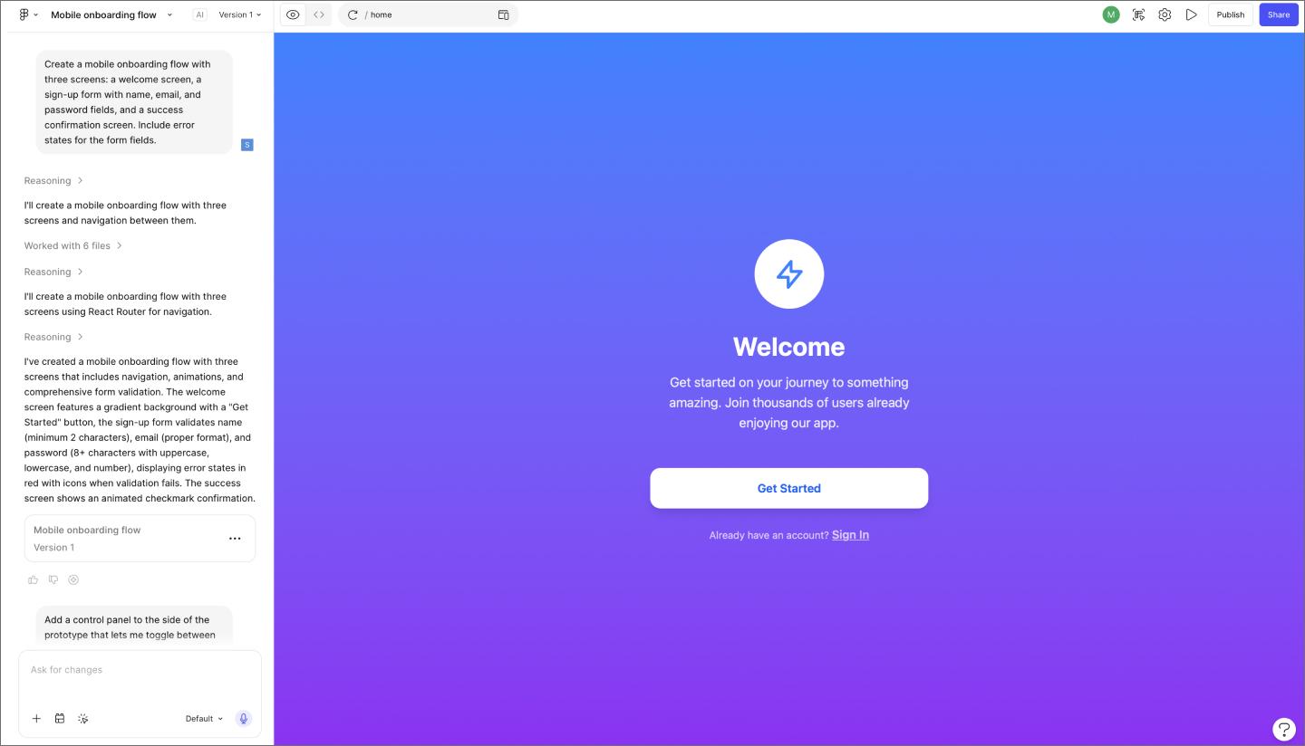
The starting point for user validation is a prototype that behaves like the real thing. Figma Make lets you get there fast, whether you’re working from a static screen in Figma Design, a product brief, or even just a rough idea. You can also bring in production user interface design that’s been pushed to Figma Design via Code to canvas, then move it directly into Figma Make to start testing.
If you’re starting from scratch, building within your existing design system keeps generated prototypes on-brand without extra cleanup work.
Quickly get something interactive in front of your team—a prototype you can click through will surface interaction questions that a static screen never will.

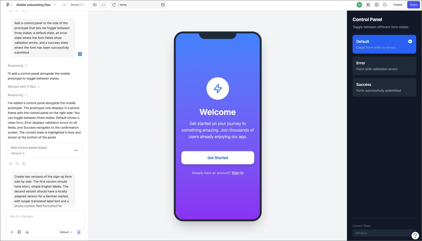
Once you have a working prototype, the next step is to test its logic under different conditions. Variables let you simulate the full range of states a user might encounter—loading, error, empty, success—without building separate flows for each one. This is where you find out whether your interaction patterns hold up across the board, or just on the happy path.
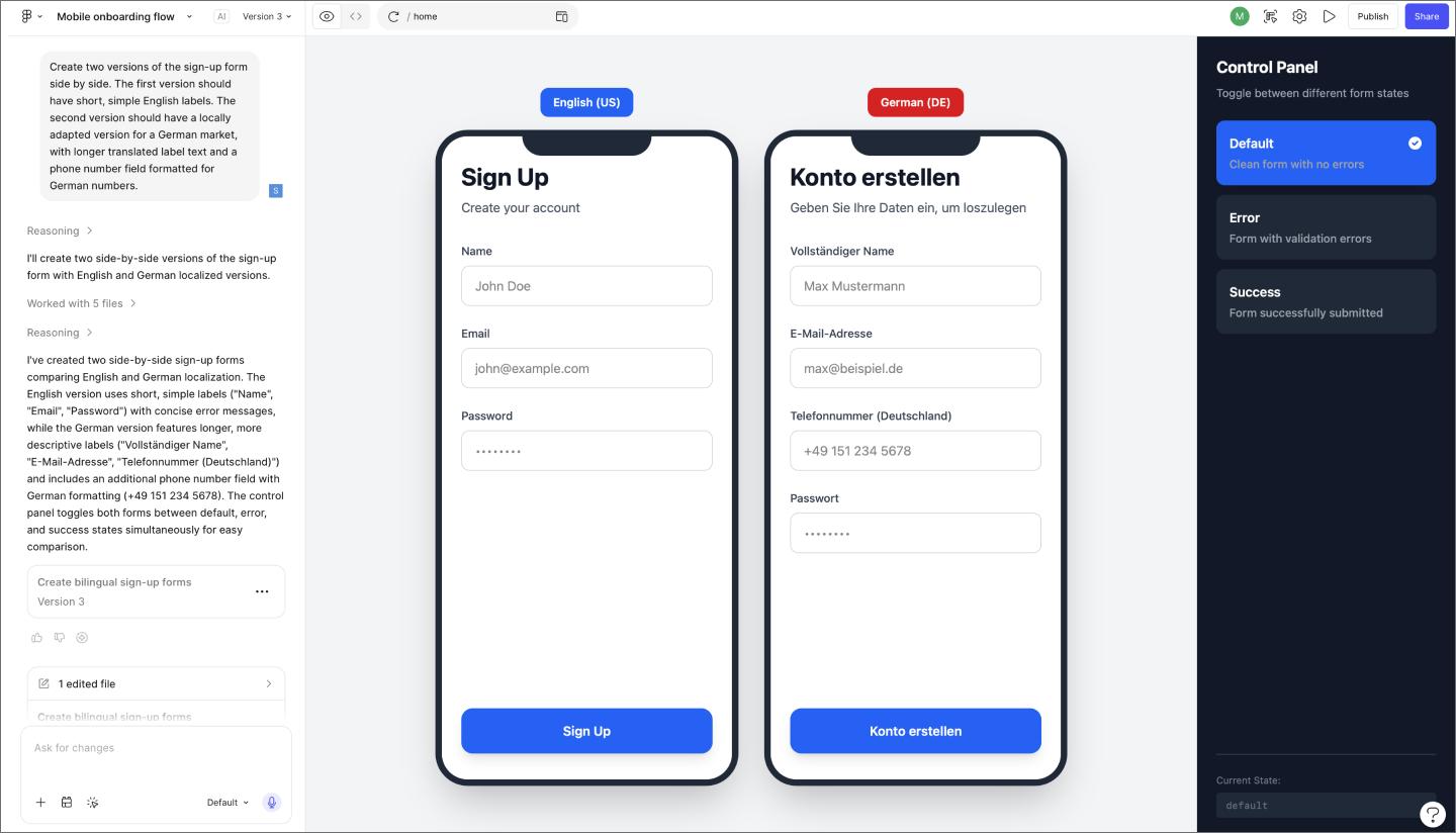
One useful technique is building a control panel alongside your prototype. You can set up toggles to switch between user states, permissions, or UI treatments on the fly, making it easy to explore how the same flow behaves for different user types or personas.
If a pattern breaks when you switch states or feed it unexpected input, those are UX signals worth knowing now.

Real-world data is messier than anything in your mock. Testing with varied, realistic data lengths early is one of the most reliable ways to catch structural issues before they become engineering problems.
Localization is another layer worth pressure-testing at this stage. UI patterns that work well for one market can behave differently when content is translated, currencies change format, or regional UX conventions shift.
Figma Make lets teams generate localized UI components and compare multiple market-specific approaches side by side, rather than building each variation from scratch.
A validated prototype makes the engineering handoff smoother. Dev Mode surfaces the exact measurements, variable values, and CSS properties tied to each component, so developers have what they need without a lot of back-and-forth about intent.
Code Connect takes this further by linking design components directly to their code counterparts. When a developer inspects a component, they see snippets from their own codebase, keeping the implementation consistent with the design.
Even with a solid workflow, there are a few places where teams consistently run into trouble. Here are the most common missteps to watch for.
Designs built around placeholder content look great until data gets involved. Names run longer than expected, images fail to load, and lists that were designed with five items suddenly have fifty. These are the conditions that expose whether your layout logic holds.
Testing with realistic content in Figma Make early catches these issues before they become structural problems in development. If a component breaks when the label runs long or collapses when the list is empty, that’s worth knowing now.
Most user flows have a clear starting point and a clear end state. What’s easy to overlook is everything in between. Hover effects, loading sequences, error states, and dismissal behaviors all need to be designed and validated, but they’re often treated as details to sort out later.
Developers need to build that in-between logic just as much as the screens themselves. When those moments haven’t been thought through, engineers are left making judgment calls during implementation.
Validation gets treated as a final checkpoint more often than it should. The problem is that technical blockers rarely surface at a convenient time. They show up the night before a handoff, or mid-sprint, when there’s no room to redesign a pattern that never got properly stress-tested.
Building a prototyping culture where teams validate as they go is a much more predictable way to work. Catching a logic issue during the design phase takes minutes to fix, while catching it during development can cost days.
UX validation should happen throughout the design process. The earlier you start stress-testing interaction patterns, the less likely you are to hit technical blockers during development. A good rule of thumb: if you have a working prototype, you have something worth validating.
Keep documentation visual and tied directly to the prototype. In Figma, you can annotate designs with comments, flag specific states or edge cases, and share live links so stakeholders can interact with the flow themselves. Focus on capturing what your team tested, what broke, and what decisions came out of it.
The most useful metrics to track during user validation are:
Edge cases that trigger unexpected behavior consistently are usually where the most useful fixes are.
Teams that ship with confidence treat UX validation as an ongoing part of the design process. Working through edge cases, error states, and logic gaps early means fewer surprises once development starts.
Here’s where to start:
Figma Make lets you generate high-fidelity prototypes from a prompt, so your team can stress-test interactions while there’s still time to refine them.
Usability testing turns feedback into design clarity. Learn all about its benefits, methods, and how to run effective tests with help from Figma.

Explore concept testing examples to validate your product ideas. Learn how to gather user feedback, reduce risk, and ensure market fit before you build.

Explore MVP testing methods to validate desirability and feasibility at the start of a product lifecycle, and see how Figma Make helps test MVPs faster with AI.

Explore 7 AI for A/B testing tools to shorten your feedback loops. Learn how to integrate AI into your testing workflow and ship validated designs faster.

A product requirements document (PRD) is a list of design guidelines and functions that project managers write to ensure key features make it into the release.

Product design and UX design both involve designing user-centric experiences. Learn about their differences, then use Figma’s design tools to get started.