
What is interaction design?
Explore the five dimensions of interaction design and start building intuitive and enjoyable digital experiences with tools from Figma.
Skip to main content
Design basics
All your design work, in one place.

Think about the last time you clicked a button and immediately knew it worked. It might’ve been a slight color shift, a brief spinner, or a checkmark. Each of those micro-moments is a button state. Together, they’re what make an interaction feel like it’s working.
Designing them well means thinking through every possible condition a button can be in, across every screen. That includes what happens when a payment fails, a file upload stalls, or an action isn’t available yet. This guide covers what you need to build and document button states that work for every user.
Read on to learn:
Button states keep users oriented by signaling what’s clickable, what’s processing, and what’s complete. When they’re consistent, users build trust quickly because the product behaves as expected.
That consistency becomes even more important as user interfaces (UI) grow in complexity. Most products span dozens of screens, each with buttons that can exist in multiple states at once. Mapping how those states trigger different outcomes lets you catch logic gaps before they become user complaints.
Type, style, and state each describe a different dimension of UI buttons. Keeping them straight matters when you’re building a consistent design system.
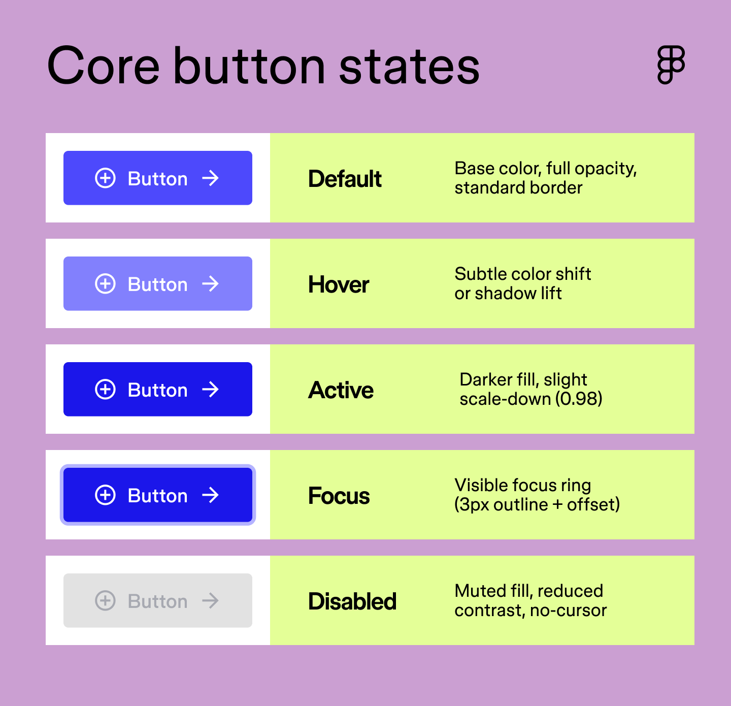
Every design system needs at least five button states to cover the full range of user interactions. These are the states users encounter most often, and without all five, your interface will have gaps in feedback that erode trust. Here’s how they break down.
| Core state | When it appears | Visual treatment | CSS selector | Figma variants |
|---|---|---|---|---|
| Default | Page load; no interaction | Base color, full opacity, standard border | .btn | State=Default |
| Hover | Cursor moves over button | Subtle color shift or shadow lift | :hover | State=Hover |
| Active | During click or tap | Darker fill, slight scale-down (0.98) | :active | State=Pressed |
| Focused | Tab key or keyboard nav | Visible focus ring (3px outline + offset) | :focus-visible | State=Focused |
| Disabled | Action unavailable | Muted fill, reduced contrast, no-cursor | :disabled | State=Disabled |
The default state (also known as enabled, idle, or normal) is what users see before they’ve interacted with a button. It’s the baseline, the visual from which all other states derive. At rest, a button should clearly indicate it’s clickable without any additional context or instructions.
That means getting the fundamentals right: sufficient color contrast, a shape and size that reads as interactive, and a label that tells users exactly what will happen when they click. A default button that looks like plain text or a decorative element will confuse users before the interaction even begins.
The hover state activates when a user moves their cursor over a button, confirming that it’s interactive before they click. Hover states are a small but meaningful moment of feedback—the interface acknowledging that it sees the user’s intent.
The key word here is subtle. A slight darkening of the background, a gentle shadow lift, or a minor border change is all it takes. Overdoing it—dramatic color swaps, heavy motion—can feel jarring and pull attention away from the task.
The active state (also known as pressed) fires the moment a user clicks or taps a button. It’s the briefest of all the states, lasting only as long as the click itself, but it carries a lot of weight. Users expect immediate confirmation that their input has been registered, and the active state delivers that with a subtle visual response.
A slight darkening of the fill, a small scale-down, or an inset shadow all work well here. The goal is to mimic the physical sensation of pressing something, giving users the tactile feedback they’re looking for, even on a flat screen.
The focus state appears when a user navigates to a button using their keyboard, typically via the Tab key. It’s the visual indicator that says “you’re here” for anyone who isn’t using a mouse.
WCAG 2.2 requires focus indicators to meet minimum size and contrast thresholds, so a clearly visible focus ring is a non-negotiable for accessible design. Make it visible, keep it consistent, and never suppress it with outline: none without providing a custom alternative.
The disabled state signals that a button exists but isn’t available right now. Visually, that typically means a muted fill, reduced opacity, and a not-allowed cursor on hover. The button stays visible so users know the action is possible—just not yet.
Striking the right balance matters here. Too subtle, and users will keep trying to click it. Too heavy-handed, and the feature feels hidden. Pairing a disabled button with a tooltip or inline message helps keep users oriented.

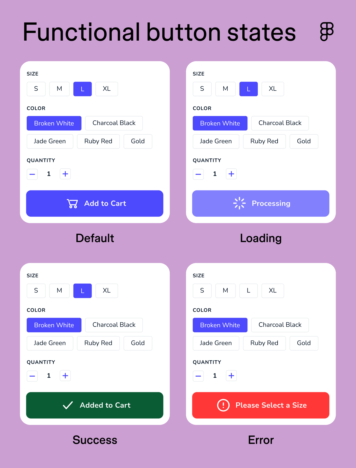
The five core states cover the basics, but real user flows are rarely that clean. A checkout process or a form submission can have multiple possible outcomes, each with a corresponding button state. Functional states handle those in-between moments and edge cases, communicating system status where it matters most.
| Functional state | When it appears | Visual treatment | CSS selector | Figma variants |
|---|---|---|---|---|
| Loading | After click, awaiting response | Spinner or progress bar, reduced opacity | .is-loading | State=Loading |
| Success | Action completed successfully | Green fill, checkmark icon, brief animation | .is-success | State=Success |
| Error | Action failed | Red fill or border, warning icon | .is-error | State=Error |
| Selected | Toggle or filter turned on | Filled or inverted style, persists until deselected | [aria-pressed="true"] | State=Selected |
The loading state activates after a user clicks a button, and the system needs time to respond. Without it, users can’t tell whether their action was registered or whether they should click again.
Choosing between a spinner and a progress bar depends on the wait time. Spinners work well for short, indeterminate processes, like authenticating a login or submitting a form. Progress bars are better for longer operations where you can measure progress, like a file upload or a bulk data export. In both cases, the button should be disabled during loading to prevent duplicate submissions.
The success state confirms that an action was completed as expected. It’s a moment of closure, and it should feel immediate and unambiguous.
A green fill paired with a checkmark icon is the most universally understood signal for a positive outcome. Keep the animation brief and the messaging clear. “Saved,” “Sent,” or “Done” lands better than a generic “Success.”
The error state signals that something went wrong. Like the success state, it uses color and iconography to communicate the outcome. A red fill or border paired with a warning icon draws on widely recognized color symbolism.
Recovery UX is where most error states fall short. The button should reset to a clickable state so users can try again, paired with a clear inline message explaining what went wrong and what to do next. “Payment failed. Check your card details and try again” is far more useful than a red button with no context.
The selected state indicates that a button is actively toggled on. Unlike the other states, it stays on until the user turns it off, making it the right pattern for toggle buttons, filters, and segmented controls.
A filled or inverted style works well here to distinguish it clearly from the default state. If the meaning of a toggle isn’t immediately obvious from the label or icon alone, a tooltip on state change helps. Consider adding one when:
Most design work starts with the happy path, the ideal sequence of steps a user takes to complete an action. But users don’t always follow the happy path. App screen mapping is the practice of visualizing every possible route through an interface, including detours, dead ends, and edge cases.
UX state diagrams are a type of flowchart that makes the logic explicit. Mapping out every button state and the screen outcome it triggers helps designers and developers align on the answers to questions like: what happens if a payment fails? Does the button reset? Does an error message appear? Getting those answers documented before development starts prevents a lot of rework.
The process involves “exploding” a screen into multiple variations, one for each possible button state combination. It’s one of the most effective ways to surface edge cases early and make sure every user has a clear path forward, even when something goes wrong.

Build a button component set using variants, then configure prototyping connections to add interactivity.
CSS buttons are controlled through a combination of native pseudo-classes and custom classes, each mapping to a specific button state. Together, they keep your UI and your code in sync.
Here’s a starter snippet covering the essentials:
.btn {
background-color: #4F46E5;
color: #ffffff;
border: 2px solid transparent;
padding: 10px 20px;
border-radius: 6px;
cursor: pointer;
transition: background-color 150ms ease, outline 150ms ease;
}
.btn:hover { background-color: #4338CA; }
.btn:active { background-color: #3730A3; transform: scale(0.98); }
.btn:focus-visible { outline: 3px solid #6366F1; outline-offset: 3px; }
.btn:disabled, .btn[aria-disabled="true"] { background-color: #E5E7EB; color: #9CA3AF; cursor: not-allowed; pointer-events: none; }
.btn.is-loading { opacity: 0.75; cursor: wait; pointer-events: none; }
.btn[aria-pressed="true"] { background-color: #3730A3; outline: 2px solid #6366F1; }
Each pseudo-class maps to a specific interaction trigger, and knowing when each one fires is key to implementing button states correctly in CSS. Some behave differently across devices, and a couple have important accessibility implications worth calling out:
| Pseudo-class | When it fires | Notes |
|---|---|---|
| :hover | Cursor over button | Not available on touchscreens |
| :active | During click or tap | Fires on both desktop and mobile |
| :focus-visible | Keyboard navigation only | Skips mouse clicks; prefer over :focus |
| :disabled | Native HTML disabled attribute | Use aria-disabled for non-native elements |
| .is-loading / .is-error | Custom classes | For functional states the browser doesn't track natively |
WCAG 2.2 sets the baseline for accessibility in design, and button states are one of the most important places to get it right. Following these standards also tends to produce better usability for everyone, regardless of ability or device.
Here’s what to keep in mind:
Even well-intentioned button designs can create friction if a few key details get overlooked. These are the most common pitfalls to audit in any design system.
Keep reading for answers to frequently asked questions about button states.
Yes, though the set of relevant states looks a bit different on mobile. Hover states don’t exist on touchscreens, so active and loading states carry more weight in communicating feedback. When designing an app, audit your button states for touch interactions to make sure users always know what’s happening after a tap.
Unmoderated usability testing is a good starting point. Heatmaps and click tracking can also surface patterns like rage clicks, which often indicate a button state problem. If users are repeatedly clicking the same element, the loading or disabled state probably isn’t working.
CSS pseudo-classes like :hover, :active, :focus-visible, and :disabled cover the core button states natively. Functional states like loading and error require custom classes since the browser doesn’t track them automatically. See our full CSS button states breakdown above for a complete code example.
A button’s style defines its visual hierarchy, whether it’s a primary, secondary, or ghost button. A button’s state describes its interactive condition at any given moment, like hover, active, or disabled. The same primary button can move through multiple states without its style ever changing.
Figma Design makes it easy to build a button component that contains every state in one place. Using variants, you can define each state as a separate variant property within the same component set, keeping everything organized and easy to update across the file.
Interactive components take it a step further. You configure the interaction once on the component itself, and it carries through everywhere the button gets used. Boolean properties let you toggle icon or label visibility on and off, while instance swap properties help manage different icon variations without duplicating components.
Once you’re ready to build, here’s how to get started:
Visit the Figma Help Center for a more detailed step-by-step walkthrough.
Well-designed button states are the difference between an interface that feels polished and one that leaves users guessing. Before your next build, take time to map out full state diagrams to catch logic gaps early, and audit your existing design system for state consistency and accessibility compliance. When you’re ready to put it into practice, we’d love for you to try Figma.
Here’s how to get started:
Explore ideas and gather feedback, build realistic prototypes, and streamline product development with design systems.
Explore the five dimensions of interaction design and start building intuitive and enjoyable digital experiences with tools from Figma.

Master responsive Web design with examples of how to build websites that adapt across desktops, tablets, and smartphones for a superior user experience.