29 AI website examples for SaaS, e-commerce, and more
Share 29 AI website examples for SaaS, e-commerce, and more
Explore more from
Design basics
From wireframe to website, faster
Design, prototype, and refine every page.

When you’re on a deadline, the hardest part is getting that first version on the page. AI website examples give you a shortcut by showing you dozens of different directions you could take.
But while these sites are great for visual inspiration, they aren’t always easy to build on. If you can’t see the layout structure, you’re stuck rebuilding everything from scratch.
That’s why we rounded up 29 Figma Make website examples for you to experiment with. You can duplicate them, pull the layers apart, and see how the AI designed it. Use these files as a head start to skip manual setup and get you right into making it yours.
Read on to learn:
- 29 AI website design examples to kickstart your next project
- Breakdowns of how these layouts are built
- Time-saving ways to make each example yours
SaaS and tech landing pages
Most SaaS sites use the same elements: bento grids, dark mode, and feature blocks. These examples show how AI can take those familiar patterns and adapt them to different niches without making the results feel generic.
Example 1: Design system landing page
![Screenshot of the design system landing page, created using Figma Make.]](data:image/jpeg;base64,/9j/2wBDAAYEBQYFBAYGBQYHBwYIChAKCgkJChQODwwQFxQYGBcUFhYaHSUfGhsjHBYWICwgIyYnKSopGR8tMC0oMCUoKSj/2wBDAQcHBwoIChMKChMoGhYaKCgoKCgoKCgoKCgoKCgoKCgoKCgoKCgoKCgoKCgoKCgoKCgoKCgoKCgoKCgoKCgoKCj/wAARCAALABQDASIAAhEBAxEB/8QAGAAAAwEBAAAAAAAAAAAAAAAAAAIEAwj/xAAfEAACAgMAAgMAAAAAAAAAAAABAgADBBESEzEhIkH/xAAUAQEAAAAAAAAAAAAAAAAAAAAA/8QAFBEBAAAAAAAAAAAAAAAAAAAAAP/aAAwDAQACEQMRAD8A6ktQBGK6DkfB1JMA3uWOTYpB2vMpyyVqXR19hFxqKqe/EgXp+jr9MDVa0rUJWoVR6AhHb3CB/9k=)
![Screenshot of the design system landing page, created using Figma Make.]](https://cdn.sanity.io/images/599r6htc/regionalized/0924af1585c629a48079b07d493704a641b4cb7a-1440x775.jpg?w=1440&h=775&q=75&fit=max&auto=format)
This design system landing page uses a minimalist aesthetic with a plain white background and black text. The hero uses floating user interface (UI) elements for visual interest, while grids below organize the technical details.
AI website design works well for pages like this that rely on standard patterns. In this example, Figma Make mapped out the initial hierarchy and spacing so the creator could get straight to the specific documentation and component visuals.
Make it your own: Play with the color variables to see how the layout adapts to a new brand palette, or tweak the auto layout settings to test different responsive stacking behaviors.
Example 2: AI call analytics SaaS landing page

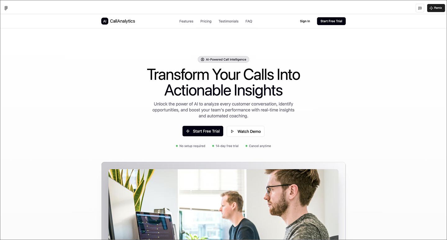
This AI call analytics landing page leads with conversion. The high-contrast CTA buttons are designed to get users into a demo or trial quickly. A single floating stock photo adds just enough visual interest without distracting from the text. At the bottom, the FAQ section uses accordions to maintain a clean UI design.
Make it your own: Swap the stock photo for a high-fidelity product mockup to see the UI in action.
Example 3: AI digital consulting website

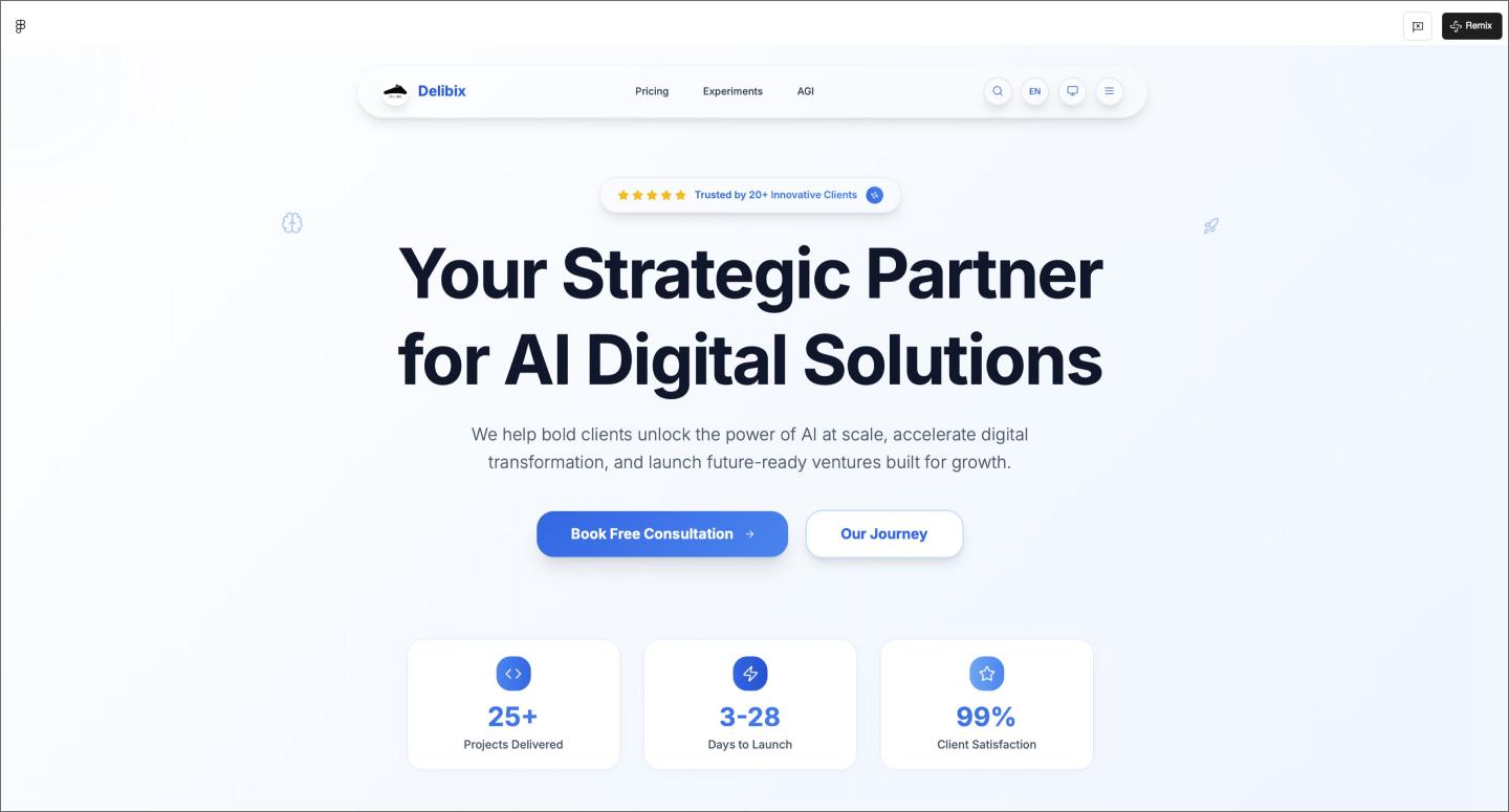
Most AI-generated websites stick to a single landing page, but this digital consulting website builds out a full 100-page architecture with multilingual support. A glass-effect hero and bold typography give it the high-end look needed for executive strategy.
Using AI for a project of this size is a significant time-saver during the information architecture phase. It helps you keep the navigation and layout logic consistent throughout a sitemap, from the homepage to the deepest subpages.
Make it your own: Toggle between the light and dark modes to see how the glass effects adapt, or test the consultation flow with different form lengths.
Example 4: AI agency website

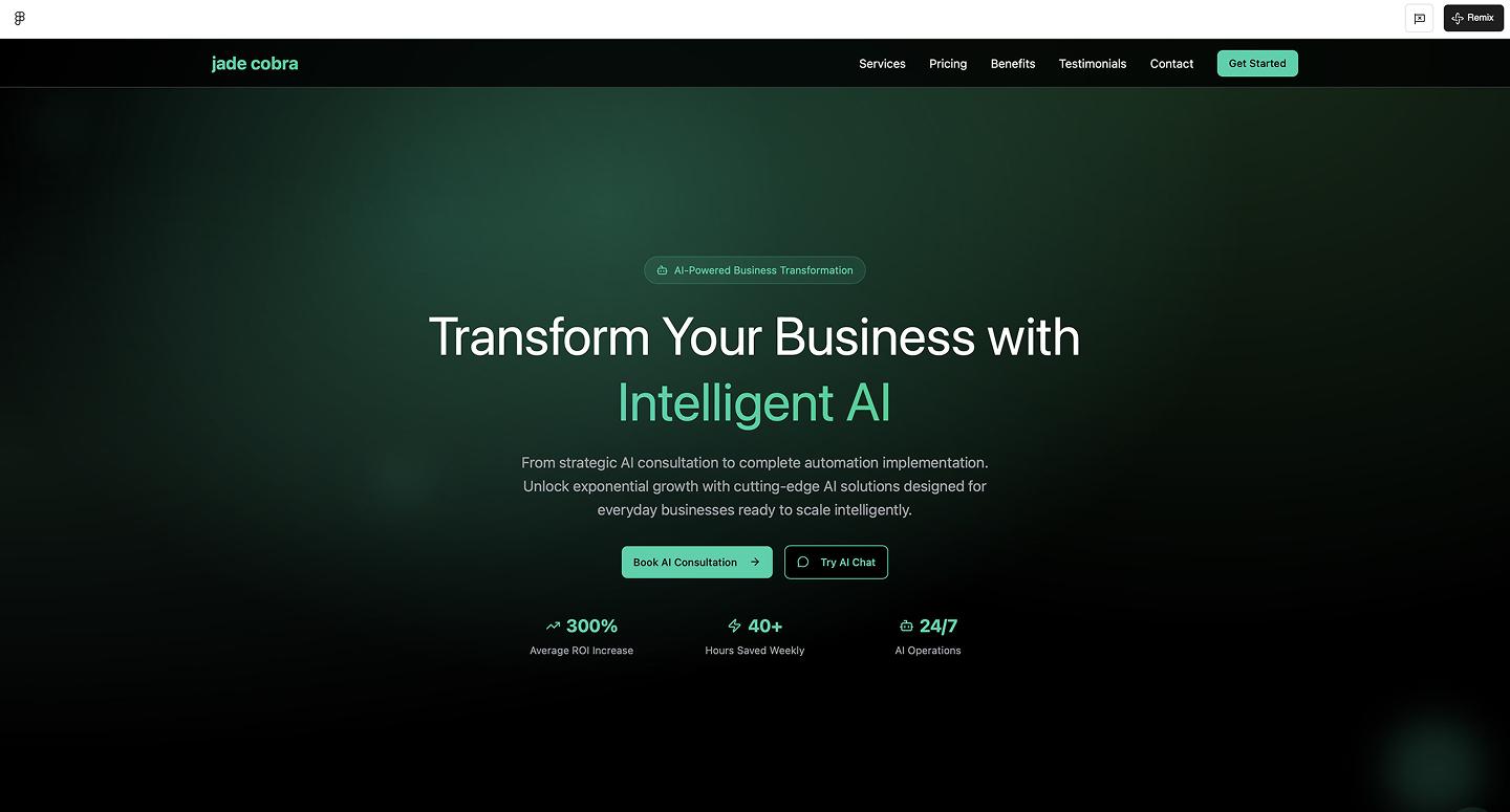
Bento grids and glassmorphism give this AI agency website a technical and scannable edge. It pairs a dark charcoal background with high-impact headings and layered glass icons. AI handles the backdrop blurs and 8px grid math automatically, so the modular panels are perfectly aligned from the start.
Make it your own: Play around with the corner radius on the layout blocks. Sharp edges feel more technical, while softer corners can make a corporate agency feel more welcoming.
Example 5: FarmerAI agricultural application

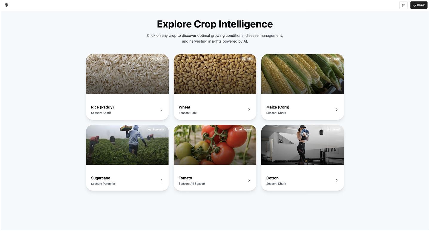
FarmerAI uses a card-based dashboard to track crop health at a glance. The website structure prioritizes quick-entry tools like soil tests and growth calendars, while the dashboard acts as a gateway to a much deeper database of crop-specific guidelines and best practices.
Make it your own: Adjust the layout density by increasing the size of the dashboard cards to see how larger tap targets improve usability.
Turn prompts into a live website
Use our AI website builder to spin up a custom layout with real copy and images from a single prompt.
Dashboards and management systems
Dashboards are notoriously difficult to design because they handle so much data. This group of examples shows how AI landing pages maintain clean interfaces even when the data gets heavy.
Example 6: Coffee shop admin dashboard

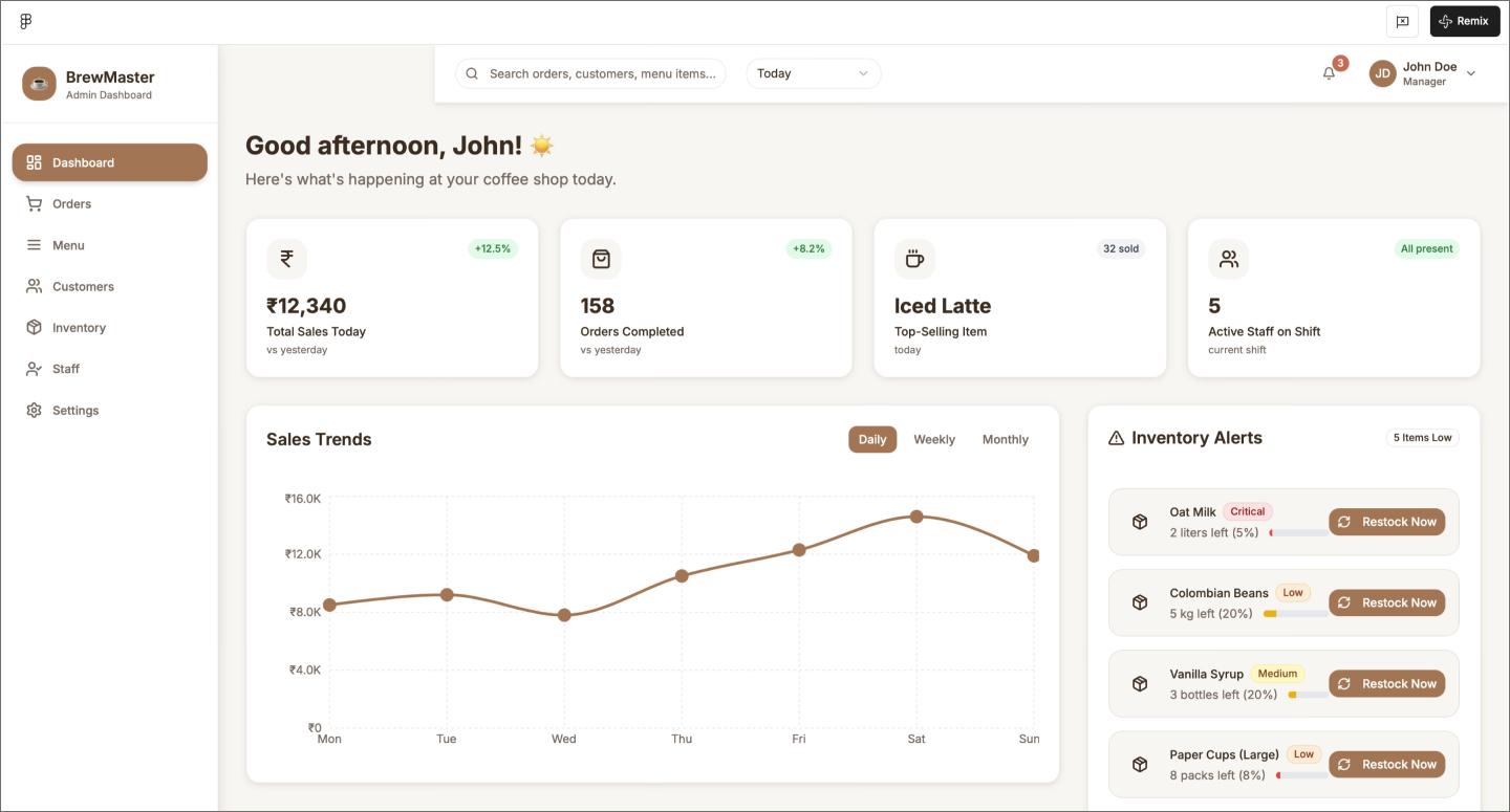
Warm, earthy tones give this coffee shop admin dashboard a brand personality that stands out from typical data-heavy layouts. It balances high-level sales trends with granular details like inventory alerts and recent orders. The AI insights panel adds a proactive layer, categorizing business recommendations by impact level.
Seeing the layout with sales graphs and status tags helps you immediately judge the visual balance. AI populates those mock orders and impact levels, so you can get straight to refining the user experience (UX) design.
Make it your own: Add a time-based heatmap to the sales section to help the manager visualize when the morning rush peaks.
Example 7: Jewelry business management dashboard

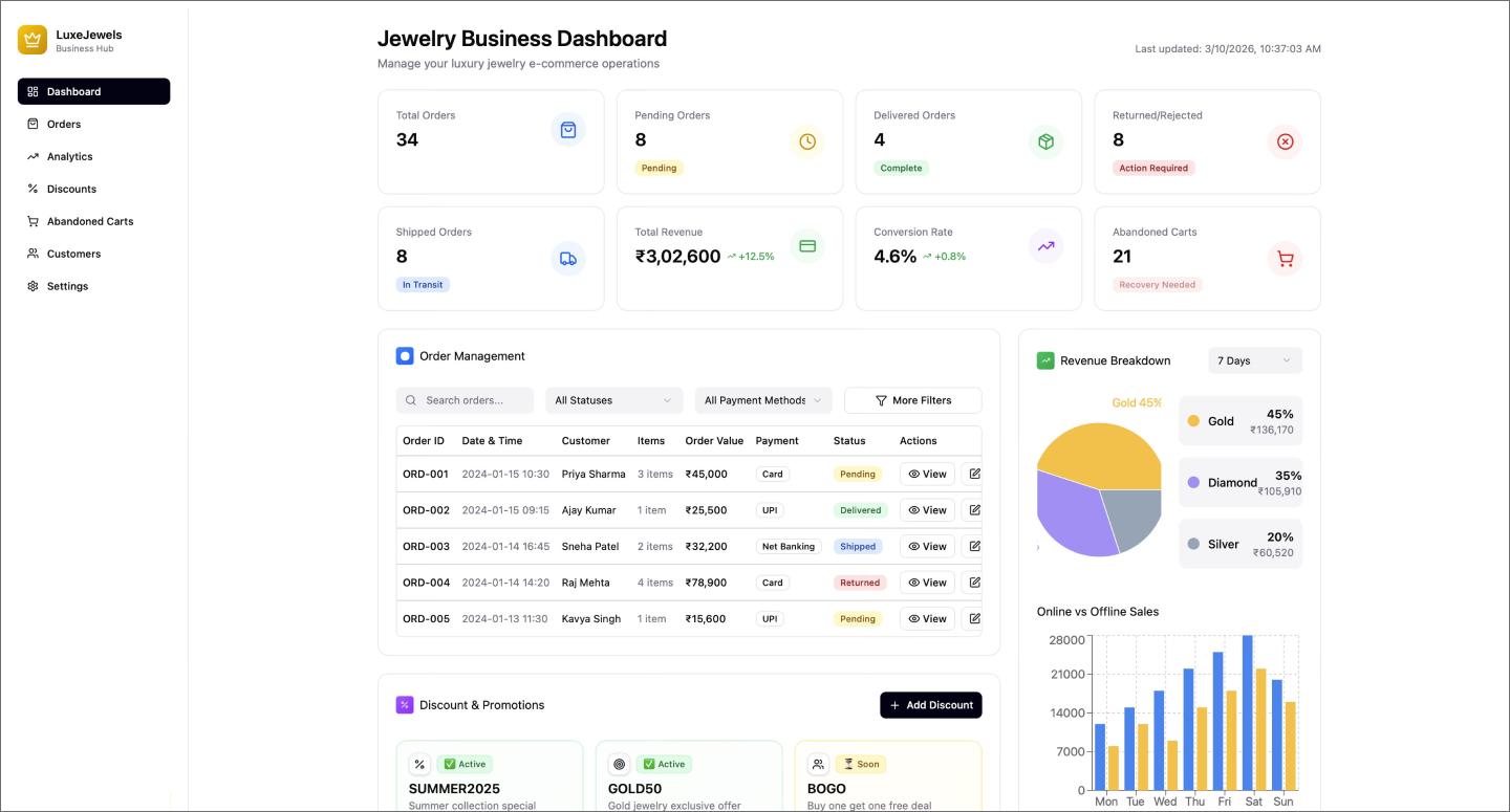
This jewelry management dashboard maps out everything from revenue breakdowns to discount trackers and a sidebar activity feed. It uses a consistent system of color-coded tags to signal status—whether that’s tracking a promotion’s usage levels or flagging an urgent order update. Use it as a reference to organize modules such as tables, feeds, and graphs into a cohesive view.
Make it your own: Use a serif font to lean into a more high-end, luxury aesthetic.
Example 8: Hospital management system

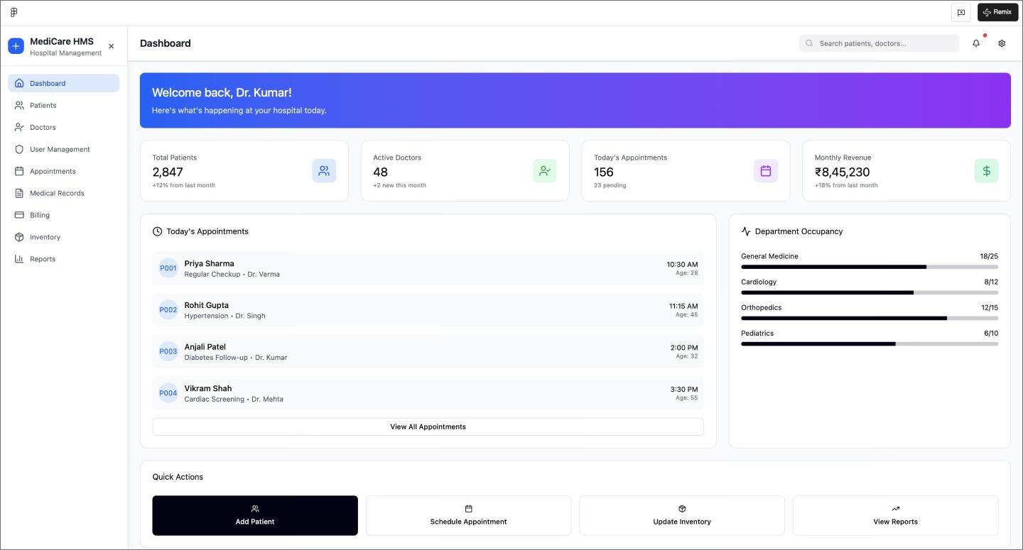
The layout in this hospital management system leads with big-picture stats before diving into an appointment table and a sidebar that visualizes department occupancy at a glance.
Populating these lists and progress bars with AI gives you a realistic look at how the dashboard functions with a full patient load. You can pressure-test your hierarchy and see whether those high-contrast buttons remain the focal point with a packed screen.
Make it your own: Apply color-coded logic to the occupancy bars (like using red for at-capacity departments) to help staff spot bottlenecks even faster.
Example 9: Energy management system dashboard

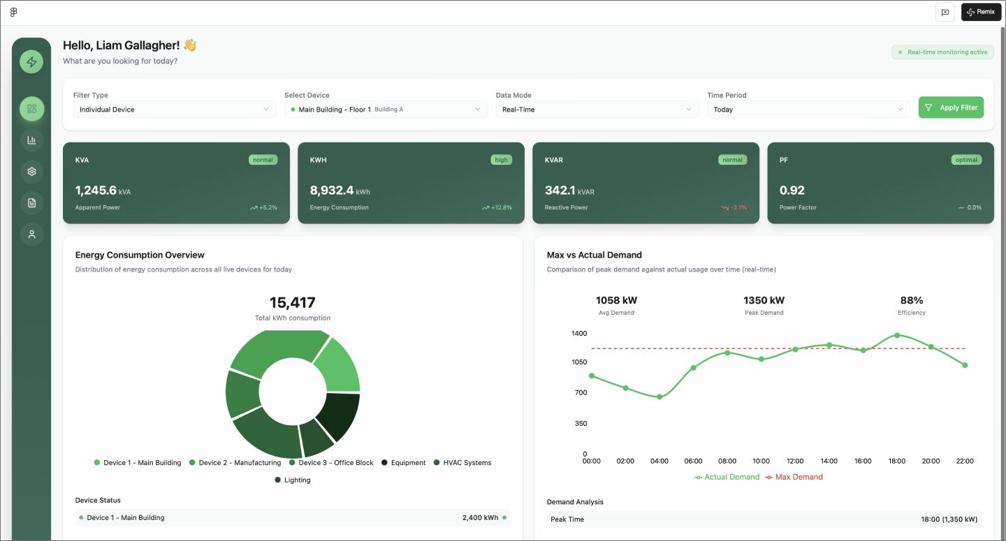
A monochromatic color scheme makes this energy management dashboard feel more cohesive than your average dashboard. It puts user control first with a row of dropdown filters at the top, letting you sort through the data before digging into the two-column grid of pie charts and line graphs.
The green sidebar stays in place as you scroll, making it easy to hop between the main overview and deeper analytics pages. This layout is a useful starting point if you’re trying to organize many data streams into a single branded space.
Make it your own: Try flipping this to a high-contrast dark mode to see how the green lines pop against a black background.
Example 10: HR dashboard mobile and Web app

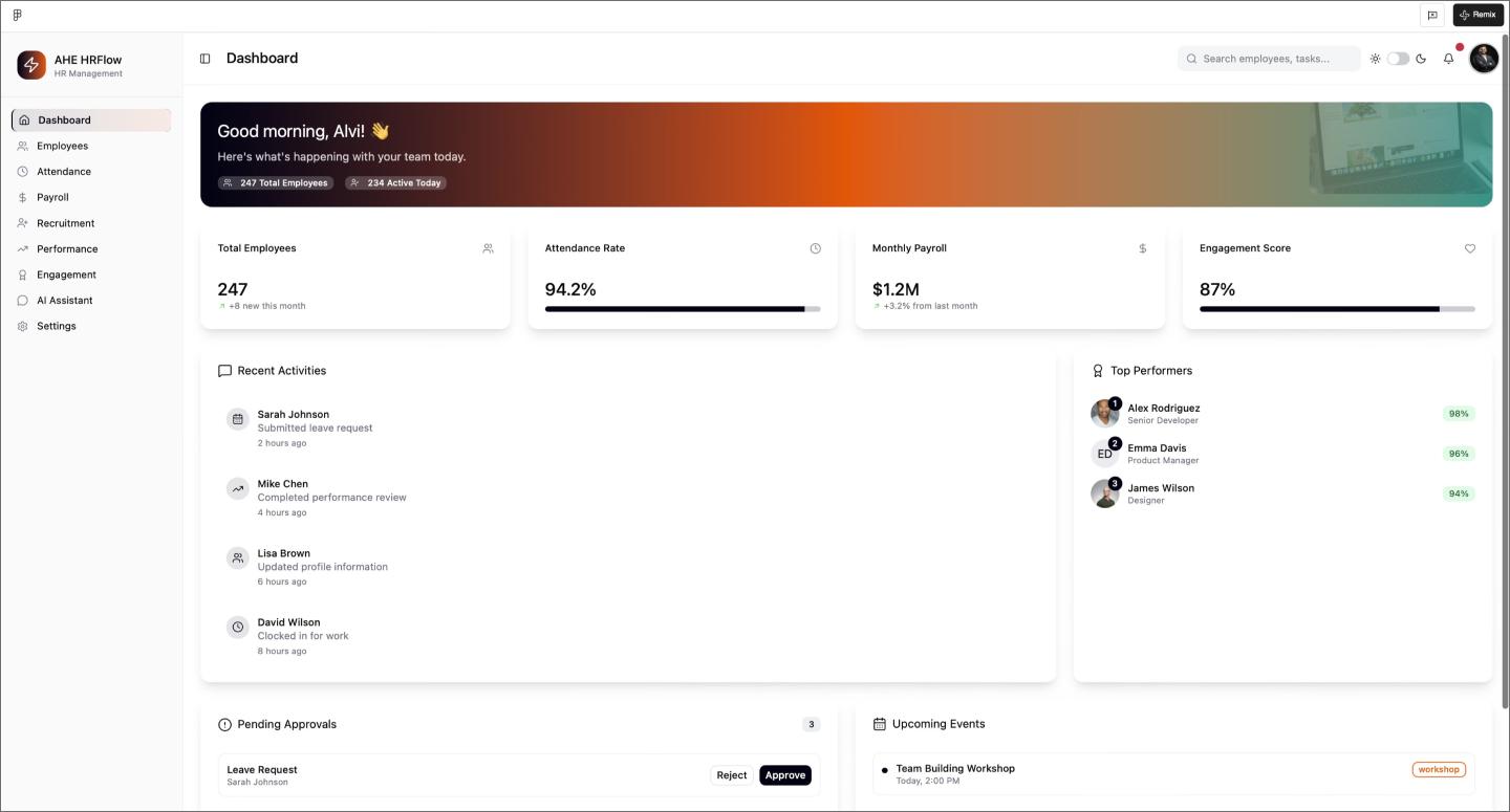
The bright gradient header gives this HR dashboard a modern energy, while modular cards keep tasks organized. The AI even stress-tested the design by generating both light and dark modes. Plus, having dedicated pages for recruitment and attendance already built out means you can test the full user journey and navigation across the whole app.
Make it your own: Try making the header color dynamic, so it changes based on the department you’re looking at—like a calm blue for payroll and a warm orange for recruitment.
E-commerce websites
Great online shops prove that brand storytelling and functional UX don’t have to compete. These layouts lean on organized grids and clear comparisons without crowding out the brand.
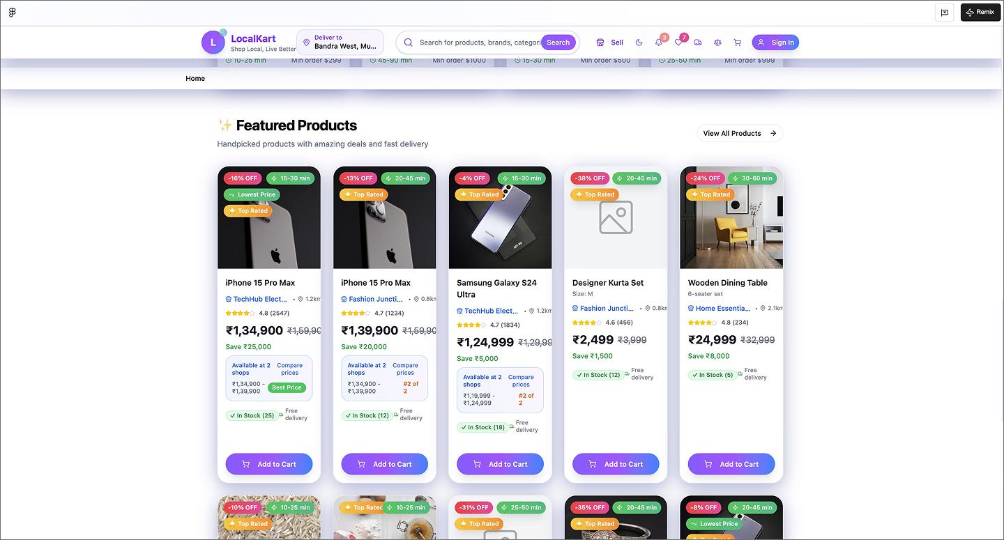
Example 11: E-commerce product listing application

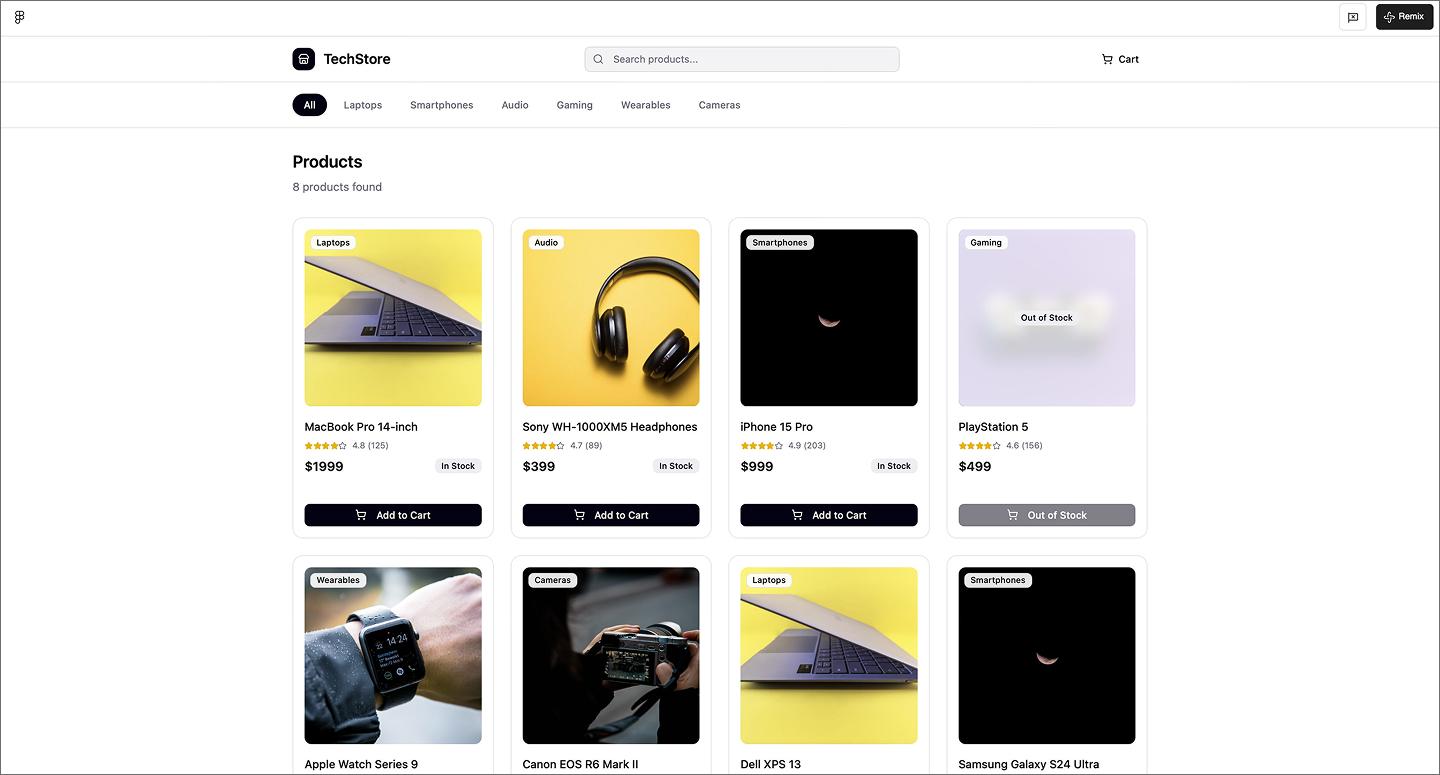
This e-commerce page keeps things simple with an organized product grid. It hits all the e-commerce must-haves—clear photos, pricing, and star ratings—without crowding the screen. Having the category pages mapped out helps, as it shows how a user flows from a broad list to specific hardware like laptops or phones.
Make it your own: Change tech gadgets for something with a totally different aesthetic, like a plant shop or vintage clothing, to see how the grid handles different image styles.
Example 12: Gift shop e-commerce application

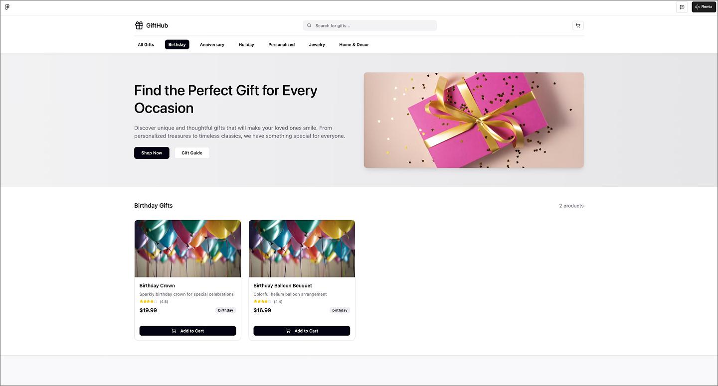
Leading with a big hero section sets the vibe for this gift shop before getting to an orderly product grid. It hits all the essentials, but uses that top spot to make the store feel like a real brand. It strikes a good balance between a strong brand opener and an easy-to-browse store.
Make it your own: Try turning the hero section into a seasonal promotion, like a Mother’s Day or holiday theme.
Example 13: E-commerce website with product comparison

A bright purple hero section makes this e-commerce website feel bold and modern from the first frame. The layout breaks up the shopping experience with icon-based categories and trending links, keeping the navigation easy to follow. Product cards list all the essentials, including a price comparison tool that shows how many other shops carry the item, so shoppers can find the best deal without leaving the page.
Example 14: 3D headphones website

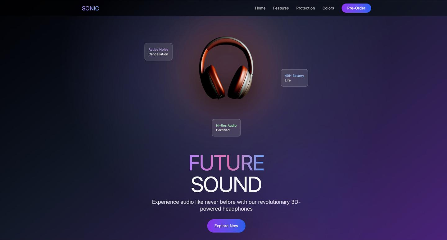
3D elements and a moody dark theme turn this headphone website into a high-end experience. The hero section opens with glowing rings and floating animations, leading into callouts that explain how the hardware is built. Between the interactive color picker and the carrying case animation, the layout uses motion to make a single-product page feel like a guided tour.
Make it your own: Try adding an X-ray toggle that strips away the outer casing as the user scrolls, letting people see the internal tech and drivers.
Example 15: Car dealership ecommerce website

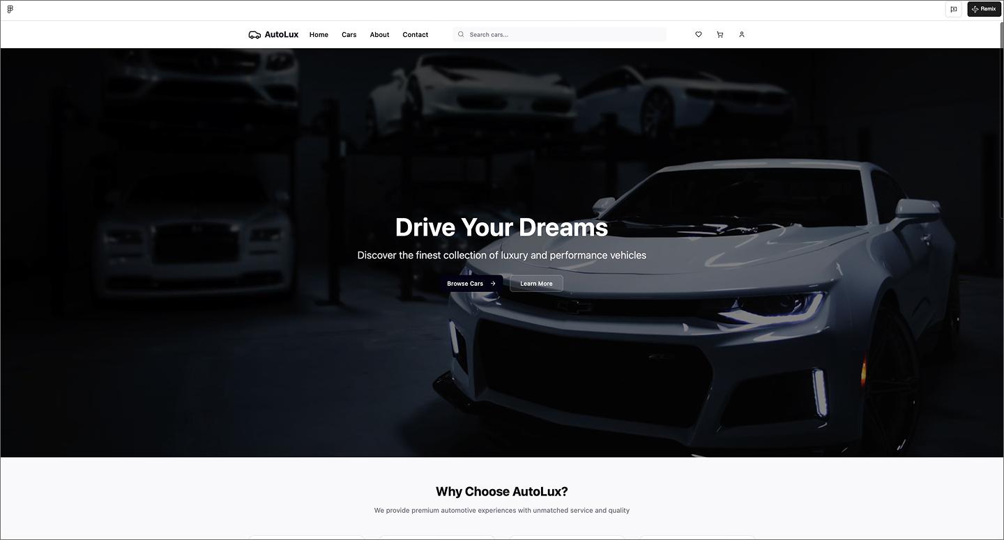
High-quality photography and luxury-focused copy drive the experience with this car dealership website. Using tags for new or featured models helps shoppers filter through the inventory, while the generous spacing gives each vehicle space to stand out. It’s a great example of how to make a high-ticket purchase feel approachable by letting the imagery sell the lifestyle.
Make it your own: Add a monthly payment calculator to each car card so users can see an estimated price based on their down payment without leaving the results page.
Portfolio websites
Portfolios are all about finding that sweet spot between showing off your personality and keeping things professional. AI design tools let you test different layouts and styles until you find what works. Here are a few of our favorite examples made with Figma Make.
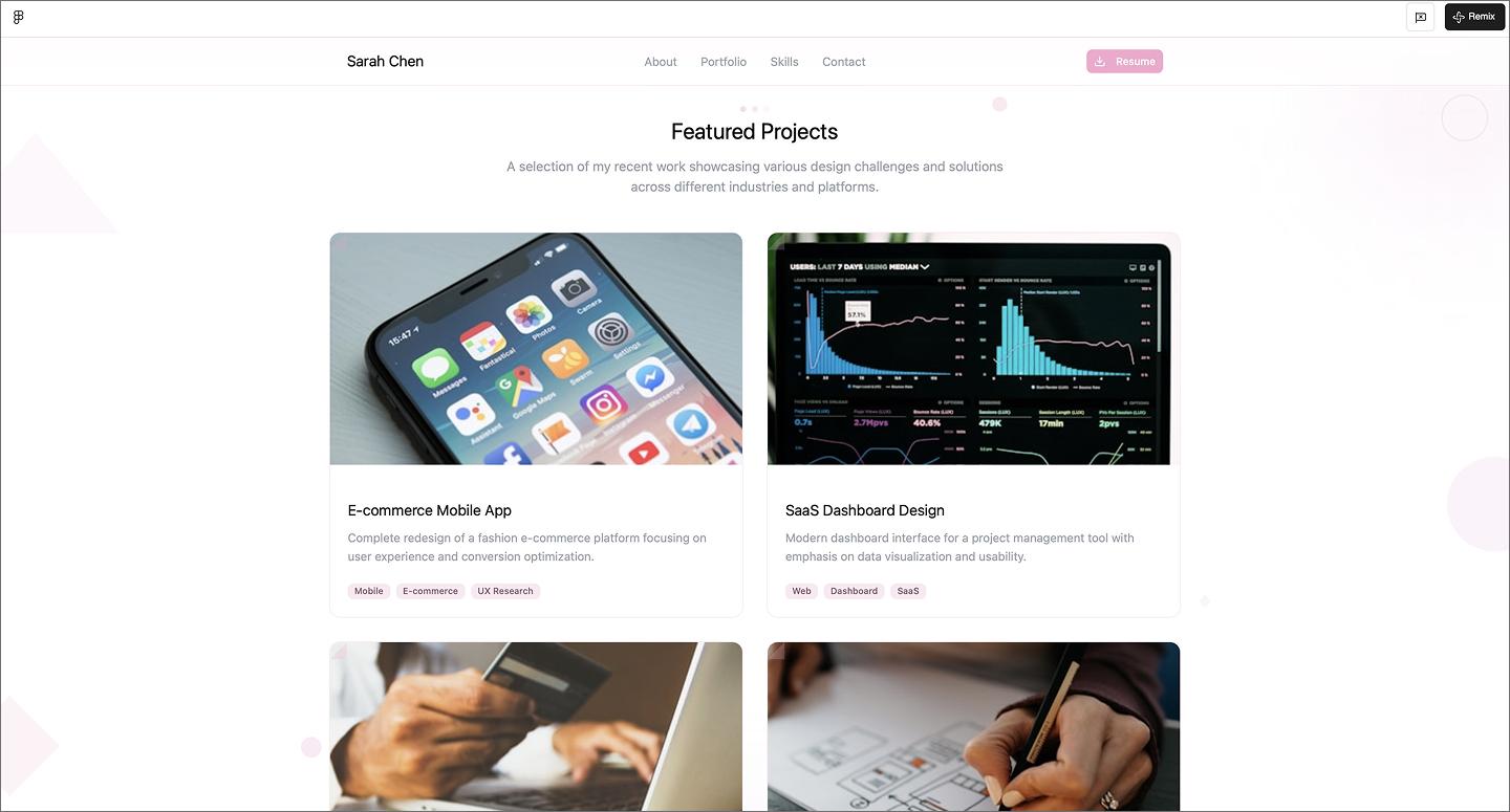
Example 16: Senior software engineer portfolio website

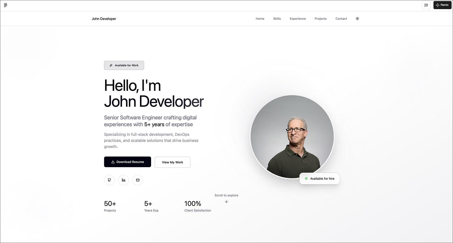
Leading with a straightforward hero section, this senior software engineer portfolio puts resume links and contact buttons front and center. Card-based sections for skills and professional history help break down a long career into bite-sized pieces that are easy to scan. It also includes an embedded contact form at the bottom, so recruiters can reach out the moment they’re done scrolling.
Organizing years of experience into a logical flow is usually a headache, but using AI is a huge help for grouping content. It lays out a long career history into a modular layout, keeping everything readable and balanced.
Make it your own: Turn the skill tags into interactive filters so visitors can click a specific language, like Python or React, to see every project where you used that tech stack.
Example 17: AI engineer portfolio website

Neon gradients and a moving plexus background set the tone for this AI engineer portfolio. The layout moves from a centered hero section into a vertical timeline and glassmorphism cards that keep your work history organized. Color-coded tech tags and visual progress bars add a clear hierarchy without sacrificing scannability.
Make it your own: Drop a terminal-style search bar in the footer to let visitors query your project archive for an extra layer of dev-focused authenticity.
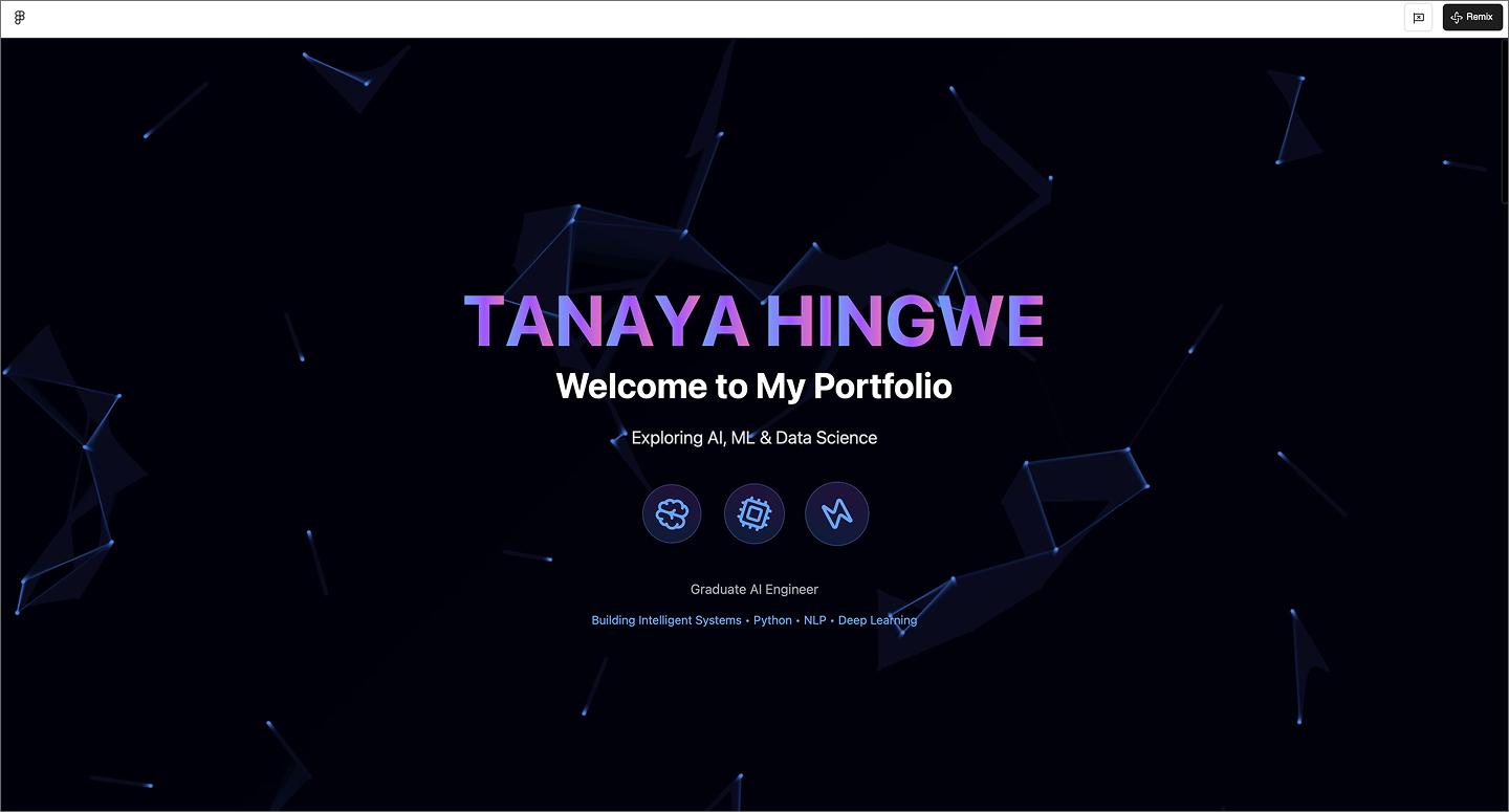
Example 18: Gaming-themed developer portfolio

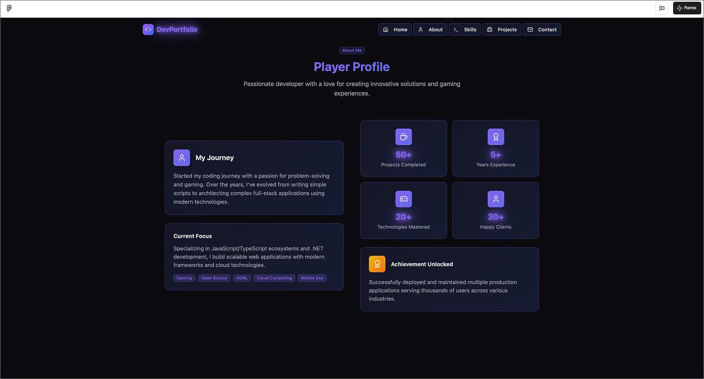
This gaming-themed developer portfolio is full of playful touches like the typewriter effect in the hero and coding symbols scattered throughout. It shows off plenty of technical skill without losing the fun, using quest-style progress bars and badges to track experience. Branding the site as a player profile creates a narrative that’s much more memorable than a dry list of jobs.
Make it your own: Add a photo to the profile section, opting for a stylized 8-bit avatar to double down on the retro gaming aesthetic.
Example 19: UI/UX designer portfolio website

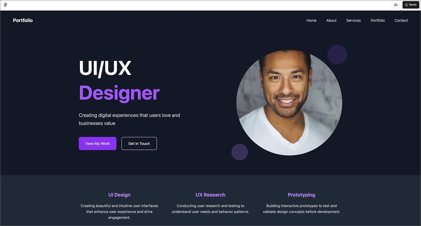
This UI/UX designer portfolio nails the modern tech look with a sleek dark mode and punchy neon accents. The split-layout hero keeps things personal by placing a professional headshot next to a bold headline, while the modular cards and sticky nav make browsing easy. It’s a great example of using high contrast and plenty of space to let technical skills and project work stand out.
Make it your own: Add a light/dark mode toggle in the nav to show off your range with accessibility and color contrast.
Example 20: Architectural portfolio site

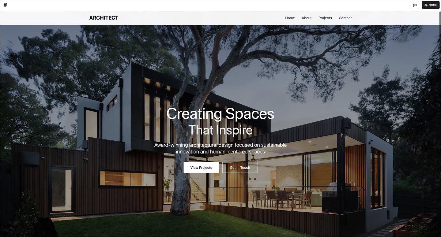
Leaning into an editorial vibe, this architectural portfolio feels more like a design magazine than a typical website. It uses a cinema-scale hero image and a centered overlay to grab your attention. The layout uses wide margins to make every project render feel considered and intentional.
Make it your own: Swap the vertical project grid for a horizontal filmstrip scroll to mimic the feel of flipping through a physical architecture portfolio or coffee table book.
Example 21: Videographer portfolio website

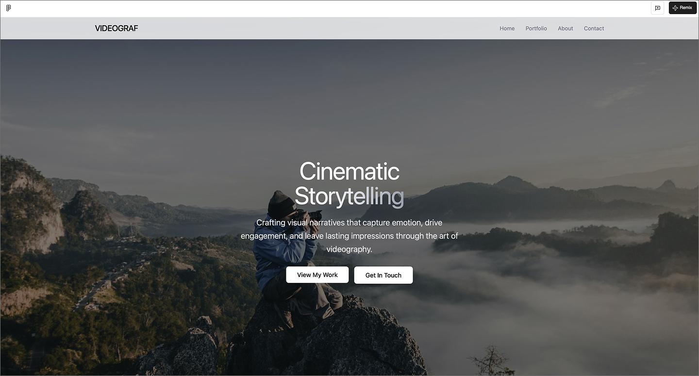
The moody, wide-angle hero image sets a high-end cinematic tone for this videographer portfolio. With a thin nav and subtle buttons, the interface stays out of the way, letting the footage do the work. The gallery section uses high-contrast tags to help people find what they need.
Make it your own: Add a looping video reel to the hero to give people a preview of your filming style.
Example 22: UI designer portfolio

Pale pink gradients and floating accents make this UI designer portfolio feel warm and approachable. The rounded hero layout and bright CTA trade technical intensity for a friendly personal brand.
Using a two-column gallery gives case studies plenty of space for larger images and deeper descriptions. It also uses simple pill tags for skills, so you can highlight skills like Figma and React.
Make it your own: Try color-coding the skill pills—like using different shades for design tools versus development languages—to make the list even easier to scan.
Service and public sector
AI also works well for service businesses or public sector organizations that need reliable and accessible websites. These layouts prioritize quick access to important details, helping people find answers.
Example 23: HVAC company

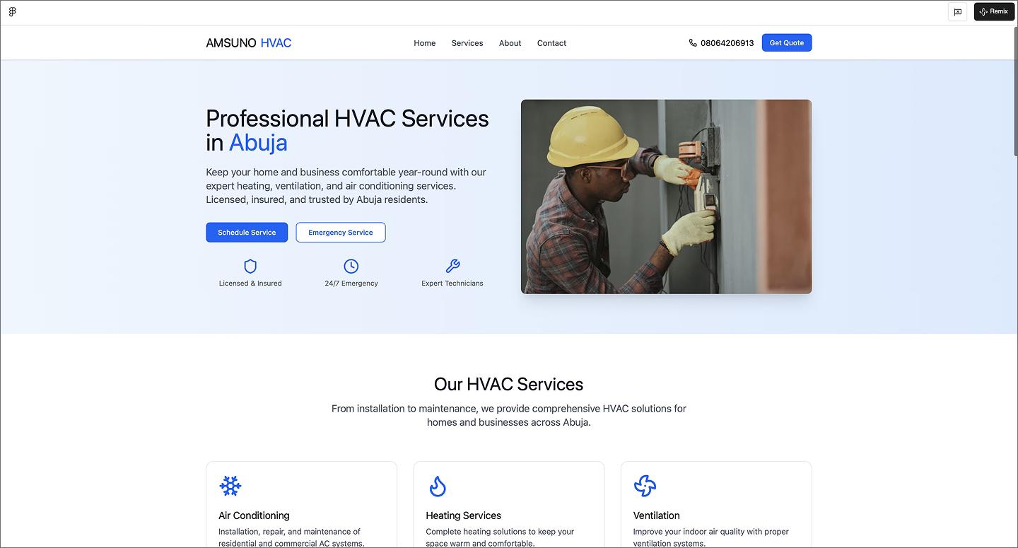
The royal blue and white palette makes this HVAC site feel dependable immediately. The hero section gets straight to business with CTA buttons to get started. The service grid uses checklists and icons to break down technical work into simple, scannable blocks.
Figma Make speeds up the process of building these information-heavy sections, like the service lists and testimonial grids. It generates a conversion-focused structure, so you can focus on the website copy and social proof that builds trust with customers.
Make it your own: Add a “Meet the Tech” section with photos of the team members to give the business a human face before they show up for a service call.
Example 24: Medan city government official portal

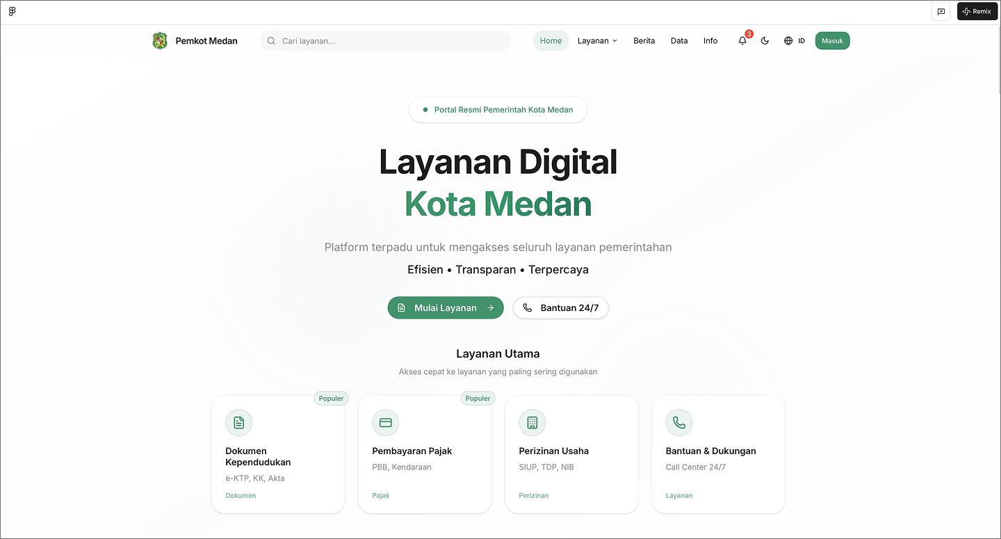
Government websites can be difficult to navigate, but this city portal stays organized with a prominent search bar and logical navigation. It manages hundreds of public services without burying them, using a well-mapped footer and nested menus to make sure every service is reachable.
As you scroll, the layout uses persona-based cards to help specific groups like students or business owners find what they need. Live widgets for city agendas and news feeds also help, turning a government portal into a useful everyday resource.
Make it your own: Add a “quick links” section to the footer for the most-requested tasks, like paying a bill or renewing a permit.
Example 25: Event agency website

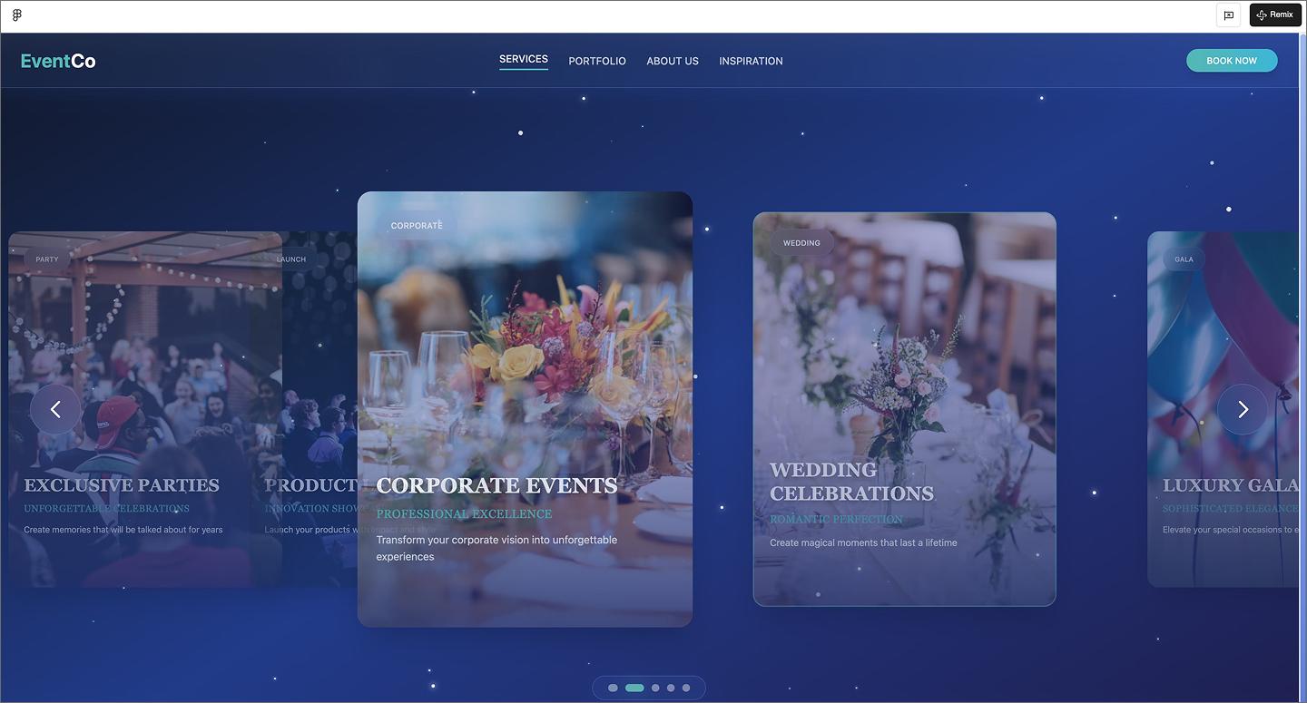
This event agency website uses a navy background and subtle sparkles to look high-end without going overboard. On the home page, users can click through an interactive carousel to explore the different event types. Atmospheric photos and a high-contrast “Book Now” button drive bookings.
Make it your own: Add a “Reveal the process” toggle to your project cards so people can see the venue transform into the final setup.
Example 26: Real estate website

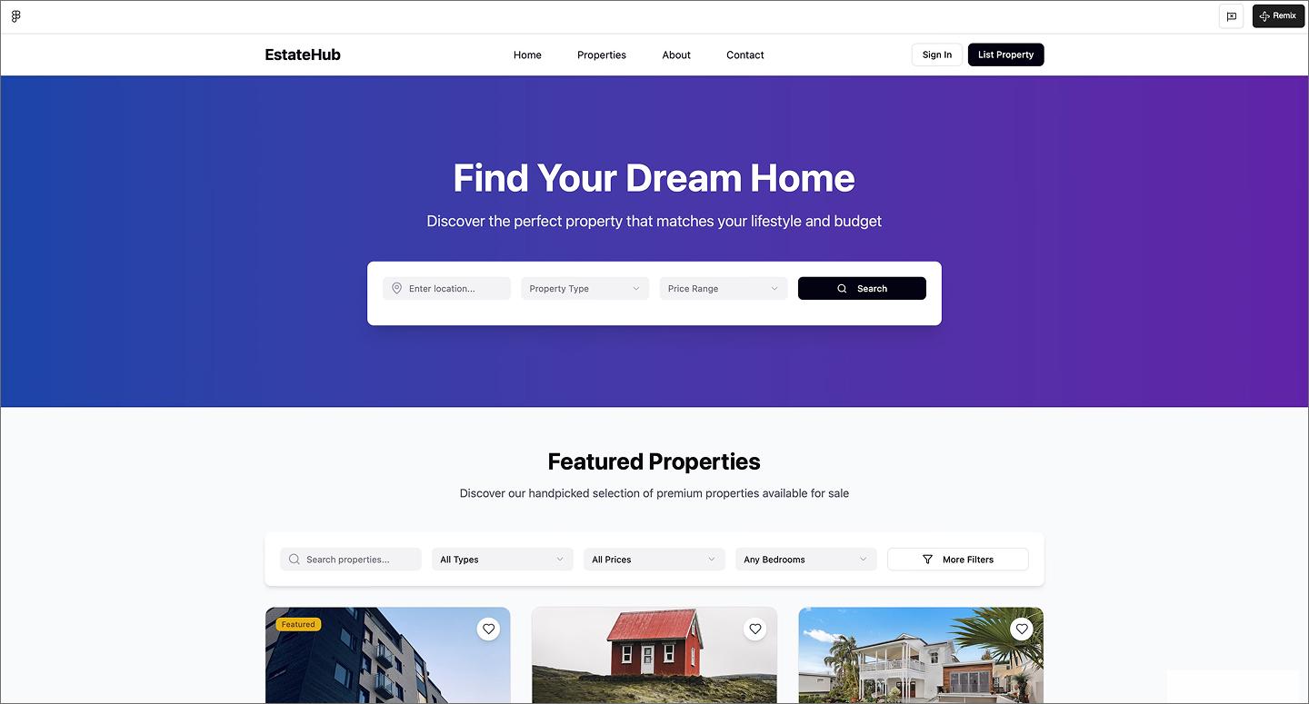
Buying or selling a home is stressful enough, so this real estate website leads with a detailed search bar and filters right at the top. The property cards put the price, address, and specs like bed counts right on the thumbnail. It shows how AI can manage the rigid structure of a marketplace, keeping property data organized without feeling like a spreadsheet.
Make it your own: Try a price history sparkline on the cards to show how the listing price has changed over the last few months at a glance.
Example 27: DrRoads roadside assistance homepage

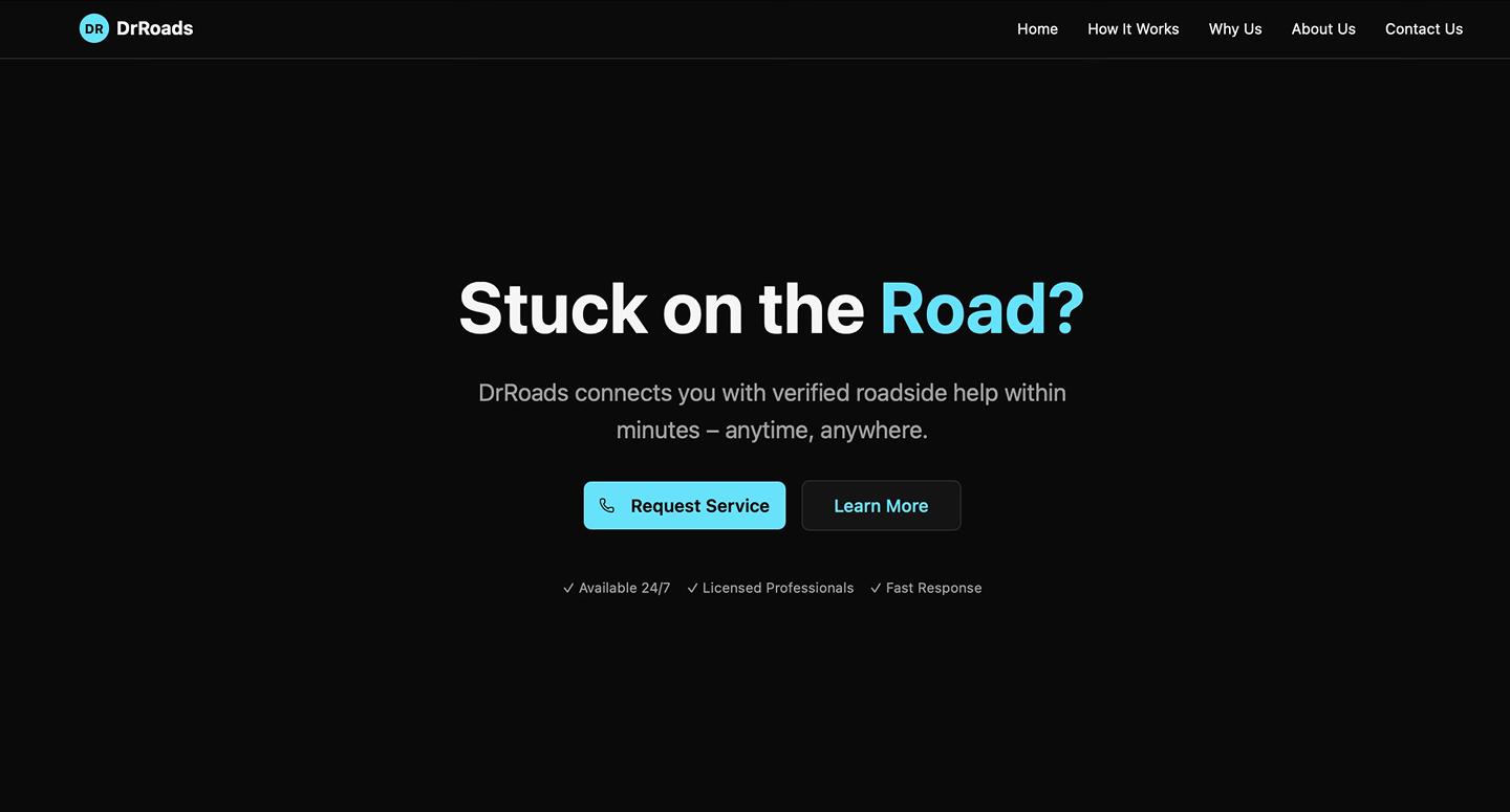
Roadside assistance is usually an emergency, so this DrRoads website uses a simple layout and high-contrast colors to make the most important actions easy to find. The black background makes the bright blue icons and buttons stand out, guiding you toward the help you need without any distractions.
This example covers all the essentials for a service business, including pages for your team story and capabilities, while keeping the overall navigation quick and simple. It also embeds a contact form at the bottom of every page, so customers can easily reach out for help when needed.
Make it your own: Add a live status tracker to the hero section so customers can see how many service trucks are currently on the road and ready to help.
Example 28: Van Isle electrical website

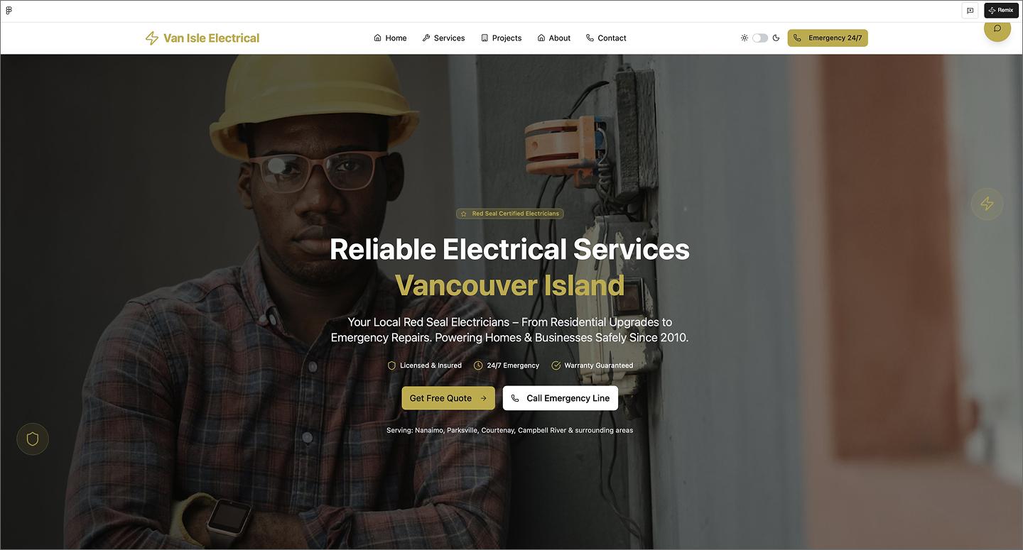
Van Isle Electrical avoids the typical sterile trade look by leading with a big, human-centered photo in the hero section. The gold accents and white background set a friendly tone, and the dark mode toggle shows the design holds up in both modes. The way it organizes different service tiers—like residential, commercial, and specialty work—makes it easy to find exactly what you’re looking for.
Anything high-priority, like emergency services, is highlighted in red to stand out. Plus, there’s a section for an interactive map to show where the team operates, helping establish local trust right away.
Make it your own: Add a “Check your zip code” search bar to the map section so people can quickly check for coverage before picking up the phone.
Example 29: Crisis communications agency website

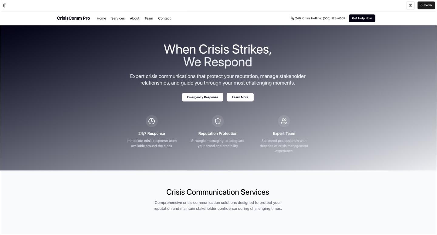
Crisis management requires a serious look, which this agency website achieves with a dark gradient and white typography. It prioritizes authority by making room for credentials and expertise, alongside a team section that puts faces to the names. The emergency hotline stands out in the footer contact form, making it the most important thing a user sees before reaching out.
Make it your own: Add a secure file upload field to the contact form so clients can send over sensitive documents or draft statements for immediate review.
Build your next website with Figma Make
Looking through these AI website examples shows how quickly the baseline for good Web design is moving. The next step is turning that inspiration into something that works for your users. Figma gives you the tools to refine those foundations into something unique.
Here’s how to get started:
- Use Figma Make to generate different layout styles and UI components from a text prompt.
- Use the AI website builder to generate a full-page starting point with relevant copy and images already in place.
- Move to Figma Sites when you’re ready to publish, turning your designs into live, responsive websites.
- Toggle on Dev Mode to grab CSS and assets, making the handoff to your development team easy and predictable.
Ready to build your next website?
Use Figma Make to turn your ideas into high-fidelity layouts in seconds.
Keep reading

23 inspiring portfolio website examples + tips
Looking to create a portfolio website? Explore inspiring portfolio website examples, tips for creating your own, and how Figma can help in this guide.


How to use AI to create a website
Learn how to use AI to create a website from start to finish. Discover tools, tips, and strategies to design, build, and launch your site faster than ever.