Simplicity in design

Share Simplicity in design
Explore more from
Design basics
Create, collaborate, and ship in Figma
All your design work, in one place.

One of the key elements to consider when designing is simplicity. As you are addressing a problem, simplifying the customer’s experience is essential. Simplicity in design can reduce the level fear, uncertainty, and doubt (sometimes referred to as FUD) your user experience with your product. This is especially the case with technology products or services that handle health, money, or long-term decision making, where your customers may already be experiencing stress.
Communicating a message clearly and quickly to your audience will help you better serve them. With a clear message your product will seem, and hopefully be, more meaningful to your customers.
Often, creating something simple is more difficult than creating something complex. However, simplicity in design is not necessarily the opposite of complexity, but the revealing of the complex information in a measured and easy to digest way.
Consider a presentation or a movie. Elements are revealed over time, continuing to build on each other to create a more complex idea. Taking a lot of information and breaking it into pieces for your customers to digest, can convey large amounts of data.
As we’ve covered in the research lesson, one of the first steps to designing is defining what your customers’ goals and problems are. From there, designing an interface with those considerations in mind, you can help your customers accomplish their goals with the most straightforward means.
By doing the research to understand your customers, you can use that data to design a product that lacks elements that are inconsequential. Focusing instead on crucial information with limited distractions. If all unnecessary information is stripped away, it leaves your customer with the essentials required to solve their problems.
For example, this Photos application by Google is trying to solve several problems, but hides the non-crucial information behind a menu, or displays that information in a contextual situation. The customer is presented with just their photos and search bar.

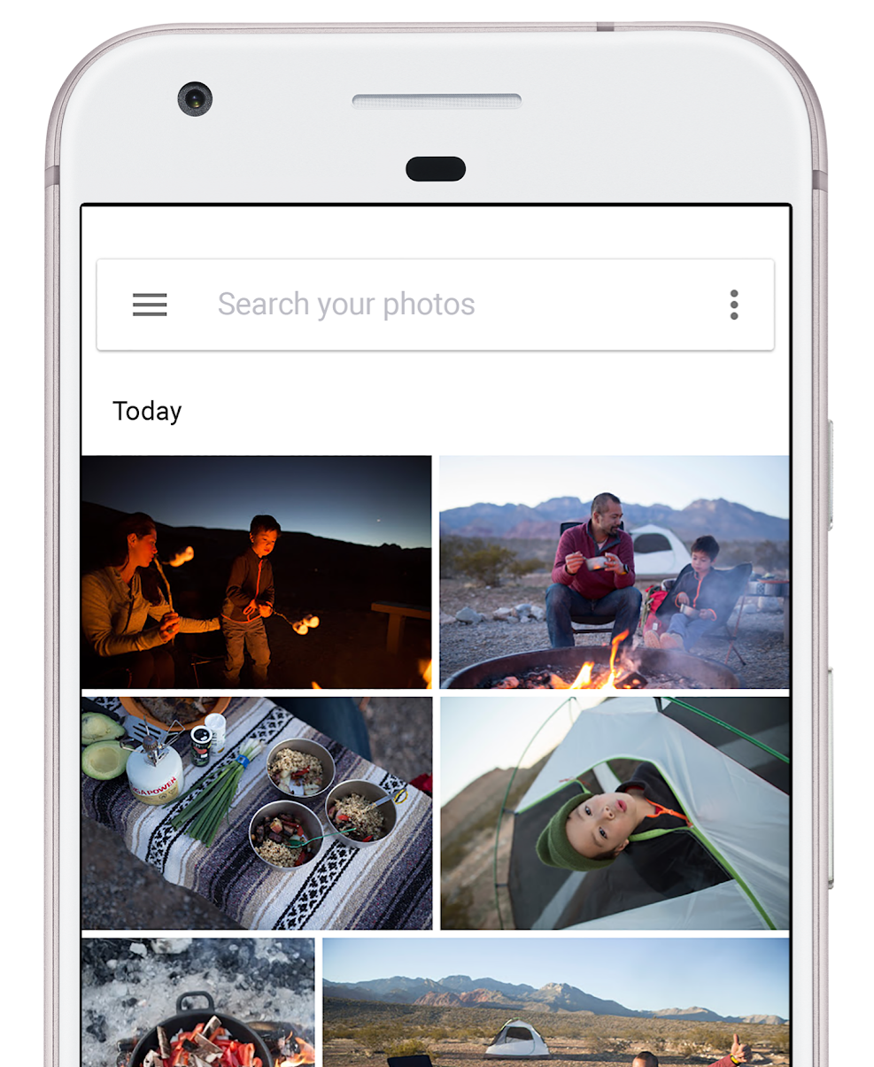
Likely the two things Google’s customers are looking to solve when they open this app: 1) I want to see my photos, and 2) I want to look for a specific moment.
The app goes much further, trying to solve a variety of problems, like sharing, sorting, and even automatic organization; the app also offers some machine learning-aided options for surfacing specific images, such as pictures of animals when you search “pets.”
Familiar paradigms
Another way to maintain simplicity is to use the benefit of existing paradigms and visual languages that your customers may already be used to. As you may have noticed, there are a lot of landing pages or pricing pages across many companies websites that look similar. That can be caused by many things, but it’s likely a result of 1) trends, 2) design systems, and 3) that it is often successful.
Design patterns can become popular across multiple products and companies. Individuals don’t always create original designs in a vacuum. As we’ll experiment with, in this exercise, creating a mood board or vision board for inspiration is common practice, and the research of similar problem and solution sets is used to understand how other designers have tackled these challenges.
Start creating mood boards for free
Figma's free template makes it easy to start creating mood boards for your next big project. Try it today.
A lot of what is created can be dictated by the language of design systems, like Material Design by Google and Apple’s Human Interface Guidelines, and patterns created through popular usage. A design system is a series of components and elements intended to be reused in different combinations to maintain consistency across products and teams. A design system can help manage the designing and building of products and interfaces at scale.
Facebook popularized the hamburger menu. A visual metaphor for the rows of options seen in application menus, it’s an icon of three horizontal lines.


It doesn’t necessarily occur to every customer of Facebook’s what the lines represent, but it has been used on their platform for a long enough period of time that their customers have become accustomed to tapping that icon to see options. Facebook has such a large customer base, that other applications began adopting the hamburger menu, knowing that their customers may recognize it too.
Facebook didn’t invent the hamburger menu, but they most likely are responsible for popularizing it. The meaning of icons can be lost in translation too. Iconography is developed from common understanding, thus the success—and sometimes failure—of emoji. Not every culture represents objects or experiences the same way.
There’s no need to reinvent the wheel. One way to maintain simplicity is by maintaining conventions. A significant amount of mobile device customers learned the hamburger menu through Facebook and other apps that use it so you can use it in your app without redefining what a menu icon looks like.
Another way to heighten simplicity is to increase white space. This is the space between elements. It allows customers to focus on individual objects, without the distractions of what’s surrounding it. In a later section, we’ll dive deep into Gestalt principles, or how the eye moves around a design. One of the elements of guiding your customers around is the open space around objects. Keeping lots of space around a button makes that button easier to find and tap.
Simplicity is a balance between reducing noise and obfuscating unnecessary information. But there is a risk of oversimplification. A good rule of thumb for app design: can a customer perform a standard action (the action they often come to your product in the first place to do) within three to five taps.
Further reading and viewing
- Watch John Maeda's TED Talk on Designing for Simplicity.
Keep reading

Consistency
Learn how consistency in design creates a cohesive brand experience and lets your users know what to expect.
Learn more

What is visual hierarchy
If everything looks the same, then you see nothing. Visual hierarchy can change that.
Learn more

Typography
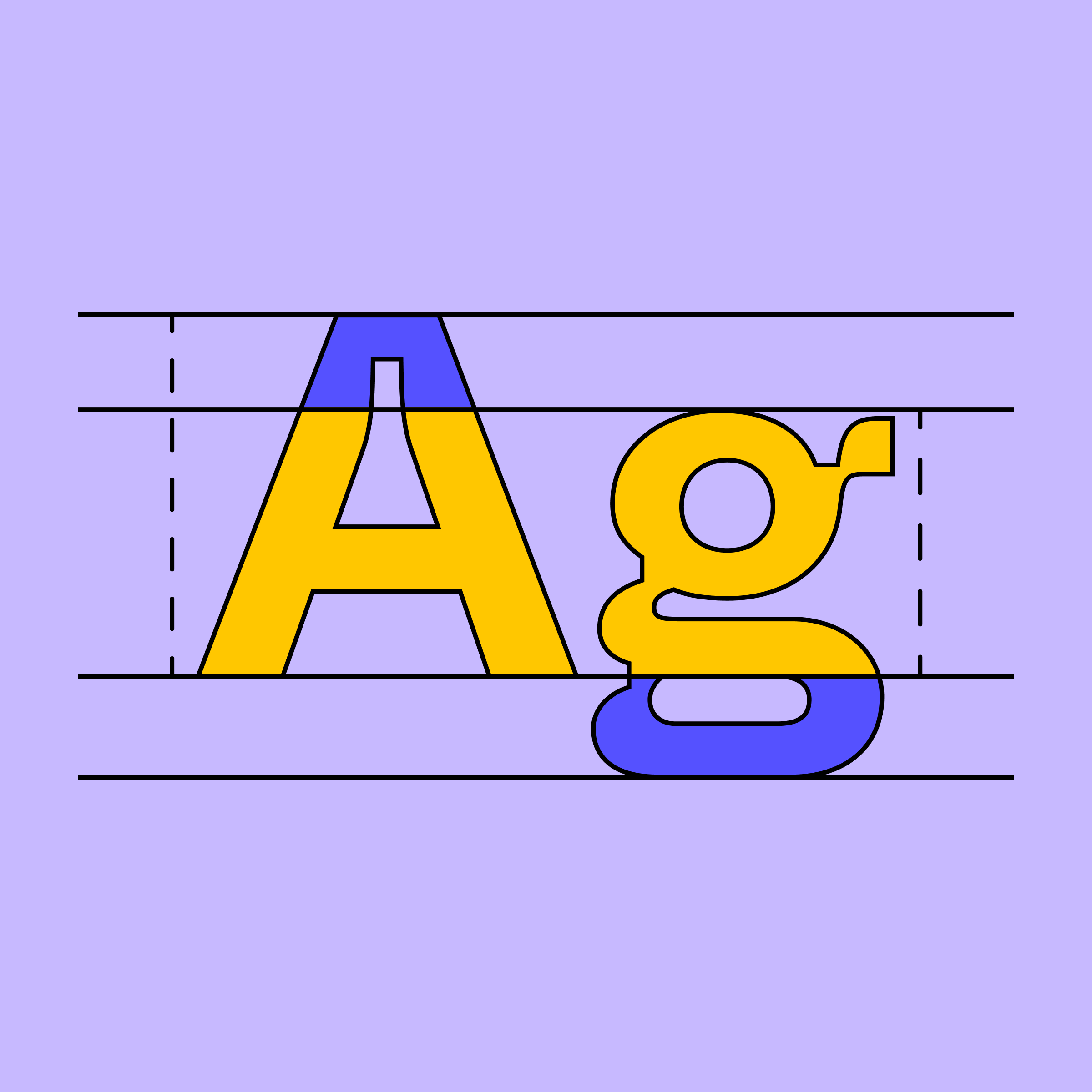
Get an introduction to typeface selection, color contrast, alignment, readability, text hierarchy, and more.
Learn more