
How to use AI to create a website
Learn how to use AI to create a website from start to finish. Discover tools, tips, and strategies to design, build, and launch your site faster than ever.
Skip to main content
Design basics
Design, prototype, and refine every page.

Design decisions help determine whether a product or pricing page struggles or succeeds. In a recent survey, 95% of AI builders said that design is as important for AI-powered products as for traditional ones. Following some pricing page best practices helps convert curious visitors into paying customers.
In this guide, we’ll walk through practical, repeatable design decisions that set high-converting pricing pages apart from those that end up forgotten behind a closed tab.
Read on to learn:
A pricing page is a dedicated webpage that shows visitors service tiers, feature breakdowns, and costs. Its goal is to clarify pricing options for prospective customers so visitors don’t leave out of confusion. For any service, software, or product business with tiered pricing, a well-designed pricing page can mean fewer abandoned carts.
How you build your page also depends on your business model. For instance, B2C (business-to-consumer) pages might highlight emotional triggers and rely on upfront pricing. Meanwhile, B2B (business-to-business) may not share pricing information upfront, instead offering packages that break down costs by business scale.
Here’s what a pricing page can do for you:
Figma Sites is your all-in-one tool for designing and building responsive websites, including pricing pages.
While these benefits are a good start, they aren’t enough to capture everything that goes into well-designed pricing pages. Below, we’ll dig into some best practices.
A well-designed pricing page isn’t just about looks—it’s all about user experience (UX).

The most effective pricing pages use a simple and clear layout and design, telling customers what they get, what it costs, and why it’s worth it. In other words, simple design isn’t just a preference; it’s a conversion strategy.
Use plain language that mirrors how your customers actually talk about their problems. Address their pain points and how your product or service resolves them. Then pair that with a clear, consistent tone and a design that reflects your brand across everything you publish. As customers start to trust you, they’ll recognize and interact with your blog posts, pricing pages, and advertisements. It also improves your pricing page UX while they’re browsing your site, as sudden changes can feel jarring and unpleasant.
A few more things to keep in mind:
Examples of benefit-driven language over features
Avoid talking about features and talk about benefits instead:

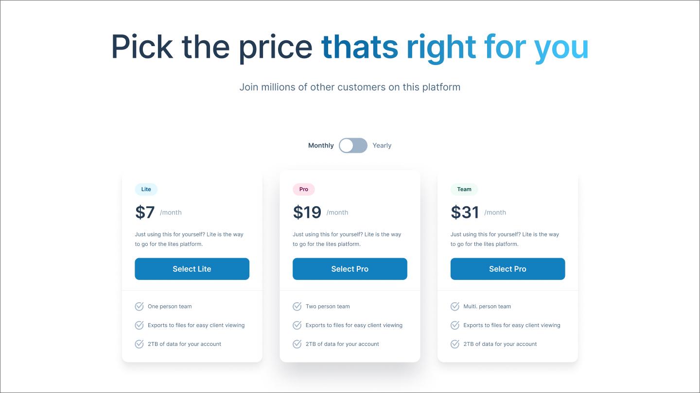
When customers visit your page and see 17 different plans, they’re more likely to weigh tradeoffs than actually buy anything. Stick to around three to four tiers to avoid analysis paralysis, giving people just enough choice.
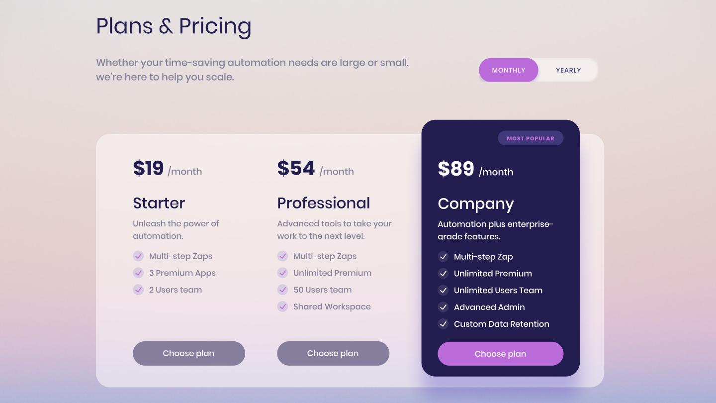
Arrange your tiers from the lowest to highest commitment and name them the same way, such as essentials, advanced, pro, and max. You can also name your tiers based on different buyer personas, like a B2B company offering “freelancer” and “enterprise” plans. List four to six features per plan, tied to use cases that matter to buyers.
A few more things to keep in mind:
Using the decoy effect
The decoy effect makes the middle pricing tier seem like the most rational choice when surrounded by a basic and premium option, making option one feel cheap, and option three feel too expensive.

A pricing page should state costs clearly—no hidden fees or surprise add-ons. Transparent pricing signals confidence in your product and respects for your customer’s time. If a charge isn’t expected, a loyal customer can turn into a one-star review.
To keep things simple, pricing pages should use whole numbers and state whether the cost is per month, per user, or per unit, near the price. If you offer a monthly discount, use a monthly/annual toggle with annual savings clearly shown on the annual side of the toggle and clearly displayed on the pricing page.
Usage-based pricing can rely on simple calculators with sliders that adjust the number of users or credits and how that affects plan costs. For instance, more complex SaaS pricing pages often use multiple sliders for credits, users, and projects to explain how these changes affect cost. This can make more intricate products feel simpler, reducing your customers’ uncertainty when purchasing.

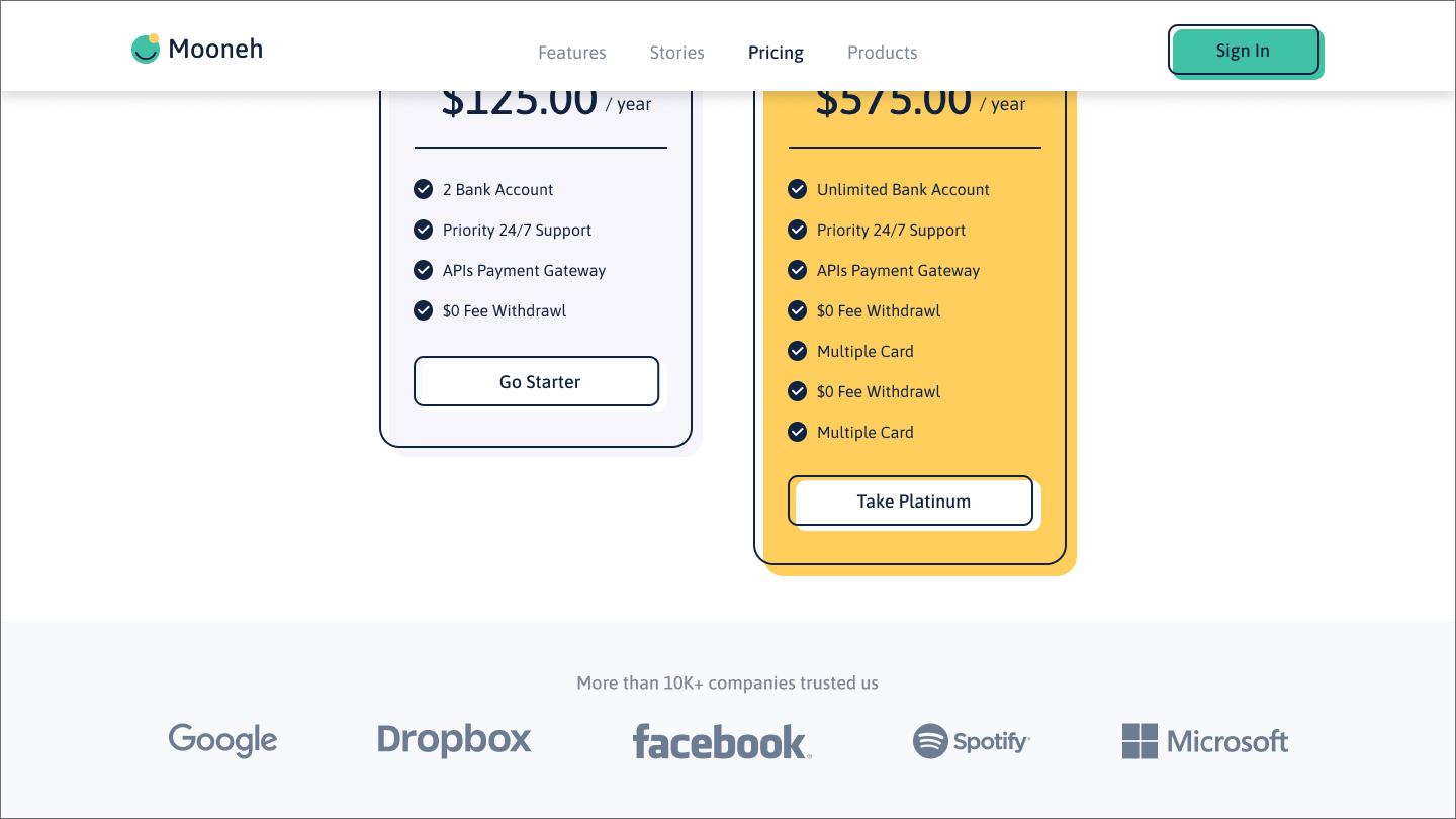
Customers who reach your pricing page are ready to make a decision, but may not be ready to purchase. Social proof tells customers that others have bought this and it worked. User testimonials, star ratings, and case studies can add an extra layer of credibility that your copy can’t provide on its own.
If you’ve worked with some well-known companies, simply adding their logo may be enough. Our example above features companies like Google, Dropbox, and Facebook. You could also include these logos if your product integrates with these platforms, borrowing the trust those brands already built.
Placement matters just as much as the proof itself. Try to place your strongest social proof near your CTA, as that’s where a potential customer’s doubt is likely to creep in. If these are testimonials, make sure they’re short and focused on real outcomes like saving time, money, or effort.

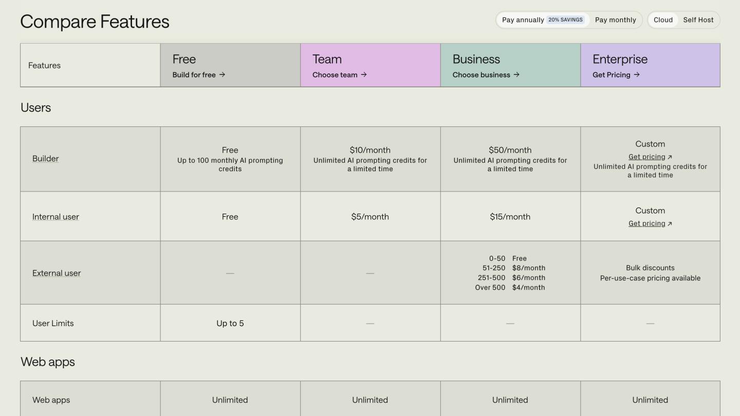
Comparison tables answer the lingering questions someone might have after looking at your pricing page. Where a pricing page lists five or six features, a table breaks down exactly what each plan includes. This saves customers from having to compare plans in their head, as shown in our Retool example above.
When making comparison tables, start with the features that actually drive purchasing decisions for your target personas. Group related features into labeled sections, such as the “user” label found in our example above. Also, use checkmarks, tooltips, and icons to communicate quickly, avoiding long blocks of text that may slow buyers down.
For long tables, consider sticky labels that remind customers about the category they’re browsing. You may also consider accordion tables that expand when the user clicks them, allowing them to focus on areas they prioritize.

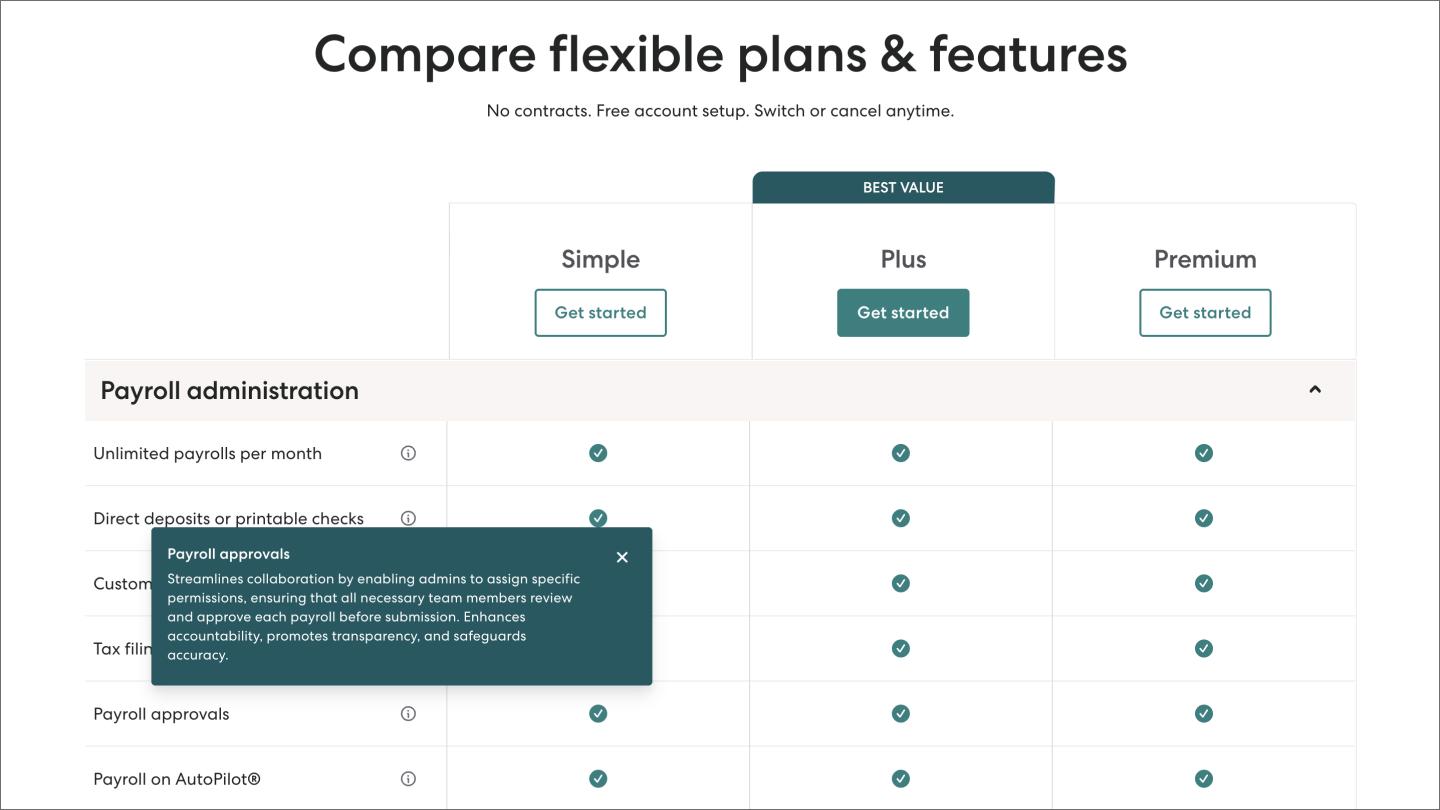
Tooltips cut the explanatory copy that makes comparison tables feel bloated and overwhelming. A small icon, like a checkbox, confirms a feature is included without breaking the customer’s scan.
Hover-based tooltips, like in our Gusto example above, can be handy for desktop pages, but they don’t work on mobile because there’s no hover state on touchscreens.
Instead, consider tap- or click-triggered tooltips that work on mobile or desktop devices so everyone can see your copy. Use a small info icon, such as an “i” or question mark, to indicate that more information is available for a product feature.
Feature previews are similar to tooltips, but use a screenshot or short animation to show how they work. These can be handy when explaining advanced features that are easier to understand when seen in action.

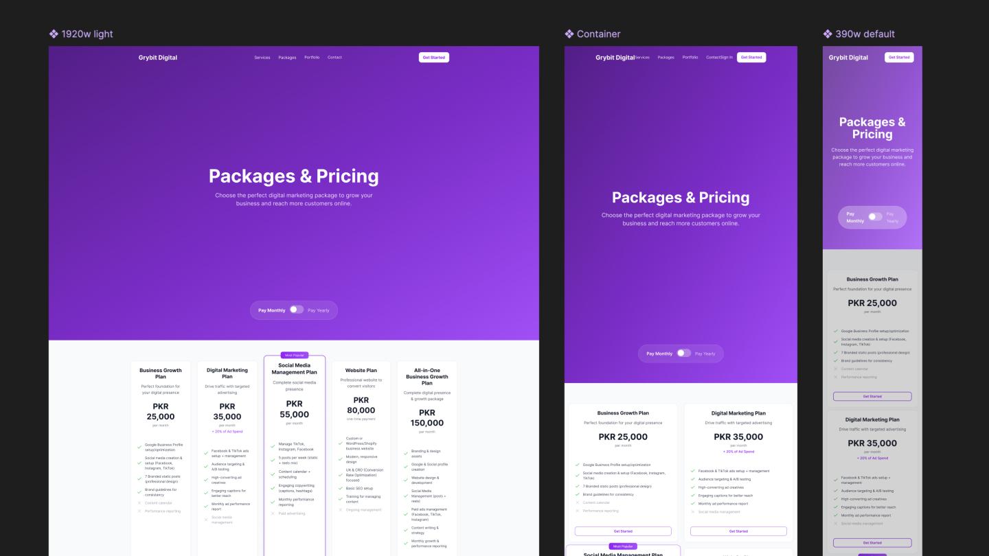
As of July 2025, about 64% of global Web traffic comes from mobile devices, making mobile-first design non-negotiable. When creating mobile pricing pages, start by stacking your plan cards vertically, like in our example above. These cards should have enough space to avoid feeling cramped, yet be large enough so mobile users don’t have to zoom in.
You can also replace comparison tables with accordions that let customers expand feature lists on demand. Alongside sticky headers, this ensures that customers can focus on the features that matter to them without being overwhelmed.
CTAs should also be sticky, keeping the path to conversion in sight without cluttering the experience. These buy buttons should stay at the bottom of your screen, reducing the likelihood that customers will scroll too fast to see them.
A few more tips worth testing:

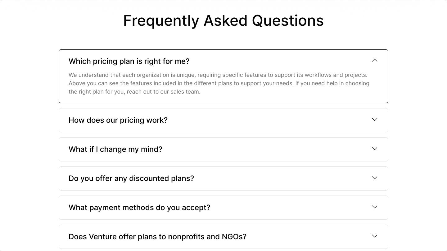
An FAQ section helps overcome the last few objections buyers have about a product. They sit at the bottom of your page and should be about five questions long, focusing on buying decisions, not SEO filler. Answers should be direct, clear, and around one to three sentences.
Questions should address the anxieties people have during sales calls. Ask your salespeople and support representatives which questions come up most. Addressing difficult questions—contract terms, cancellation policies—builds trust before it’s tested.
Here are some example FAQs:

CTA buttons need to be impossible to miss. To start, use high-contrast color palettes and large, easy-to-tap buttons on mobile and desktop devices. Button copy should tell customers exactly what happens next, such as “start for free” or “talk to sales.”
Place CTAs so visitors can see them as soon as the pricing page loads. They should be alongside each pricing tier and further down as users scroll to testimonials or comparison tables. Sticky CTAs stay visible as customers scroll, so the button’s there when they’re ready to click.
Button copy should vary based on how customers use what you offer. For self-service products, “start for free” is better for free trials, while “get started” is better for paid subscriptions. Higher-value tiers may use “book a demo” to receive a guided product presentation or “talk to sales” to discuss how it works in more detail.
Pro tip: Use a consistent website design
A design system with text styles, color palettes, buttons, and badges keeps your pricing page consistent with the rest of your site.

The best pricing pages follow a sequence that moves visitors from curiosity to conversion. Most include these elements:
The brands below have put these best practices into action. With differing designs, they’re a great reminder that pricing pages aren’t a one-size-fits-all template. Instead, they’re geared towards different audiences based on their priorities.
![The pricing page on the Ahrefs website.]](data:image/jpeg;base64,/9j/2wBDAAYEBQYFBAYGBQYHBwYIChAKCgkJChQODwwQFxQYGBcUFhYaHSUfGhsjHBYWICwgIyYnKSopGR8tMC0oMCUoKSj/2wBDAQcHBwoIChMKChMoGhYaKCgoKCgoKCgoKCgoKCgoKCgoKCgoKCgoKCgoKCgoKCgoKCgoKCgoKCgoKCgoKCgoKCj/wAARCAALABQDASIAAhEBAxEB/8QAGAAAAgMAAAAAAAAAAAAAAAAAAAYEBwj/xAAlEAABAwMDAwUAAAAAAAAAAAABAAIEAwUhBgcREhYxIjRhcXP/xAAVAQEBAAAAAAAAAAAAAAAAAAAEBv/EABwRAAICAwEBAAAAAAAAAAAAAAECAAMEETEFYf/aAAwDAQACEQMRAD8AYtObfXK8WehMjSIoY9vUGv8AI+1Iq7T3aoG1TMiAPPA4Vk7XAdowBwM0cpjPsm4Hpfj4VBke5l1XOqkaBI59h1oQgbmX9TWCRp+7VIEmox9RgBJb4yhM27+dbSfzYhWGJc1tCWN0gGDdQGIE/9k=)
![The pricing page on the Ahrefs website.]](https://cdn.sanity.io/images/599r6htc/regionalized/f4cd9f451aa6c05f7e04ff91e51c7ee05090cf75-1440x810.jpg?w=1440&h=810&q=75&fit=max&auto=format)
Ahrefs has a SaaS pricing page that offers three basic tiers, each with a brief plan description that explains how they differ by business size. The annual-to-monthly toggle is prominently displayed in the upper-left corner, with the discount highlighted in orange (like their CTA buttons), tying the discount visually to the page's primary action.

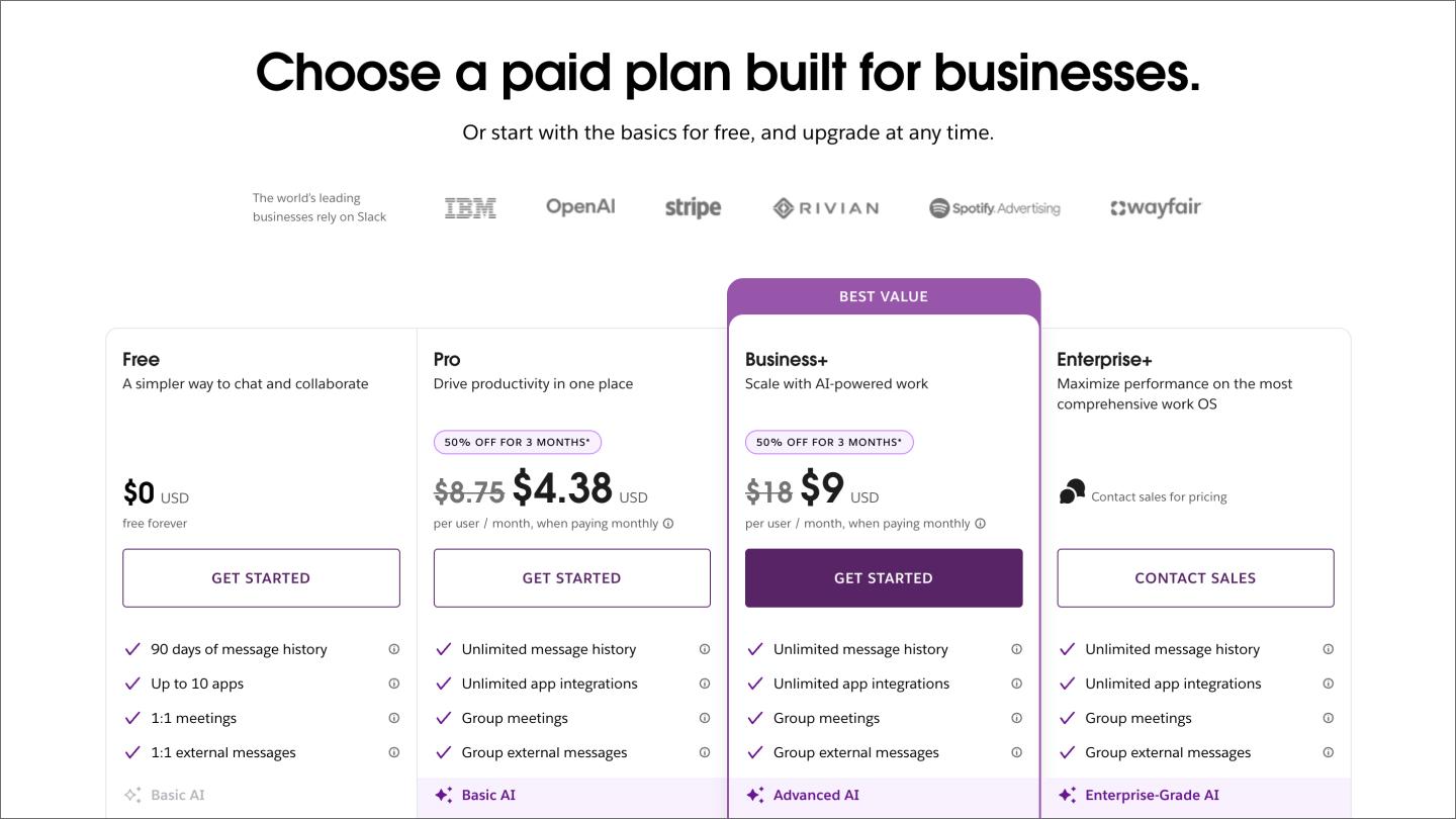
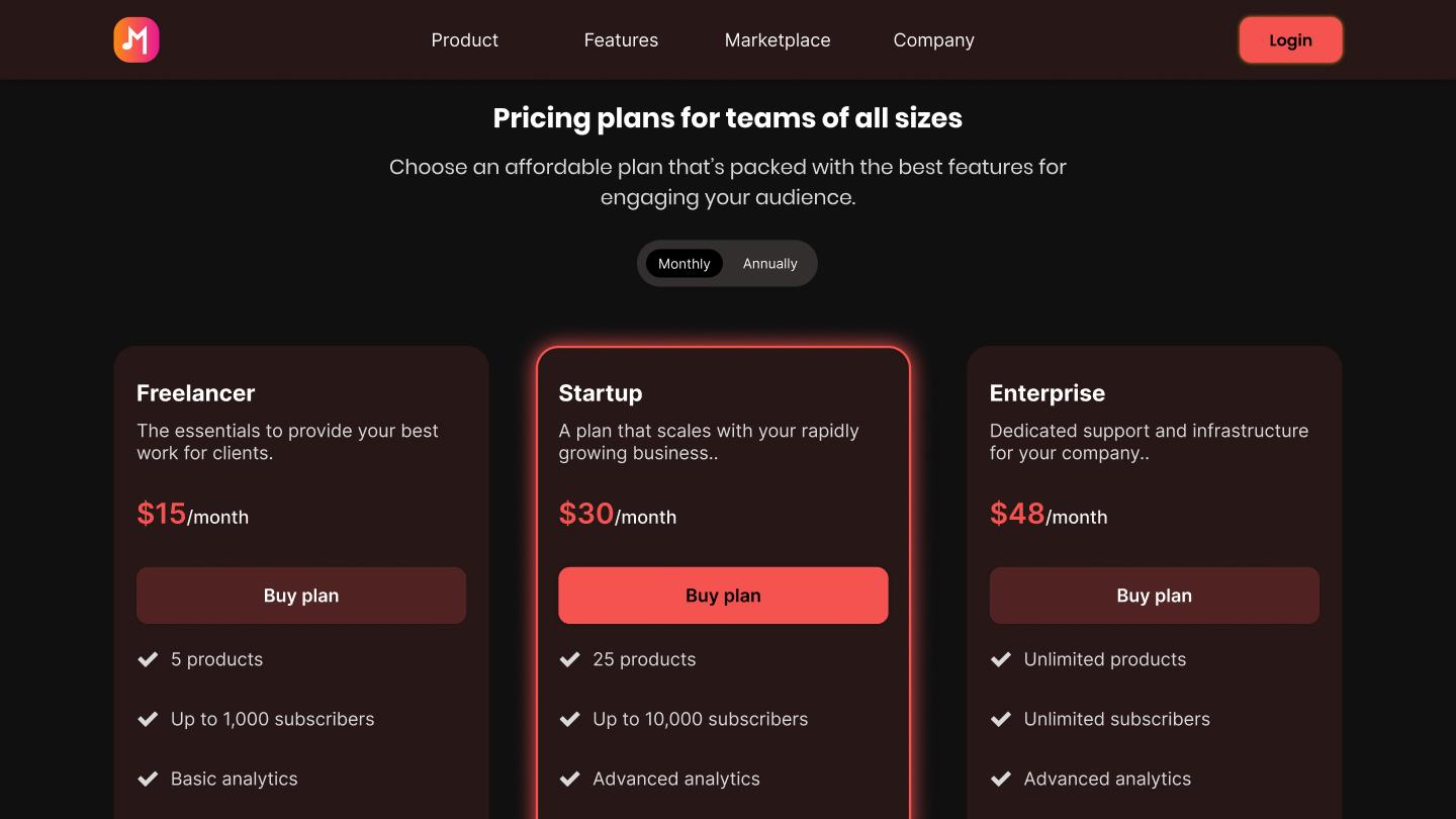
Slack’s pricing page offers four tiers, starting with a free entry point and highlighting the “best value” plan to reduce decision paralysis. Well-known companies like OpenAI and IBM connect Slack to prominent businesses to establish strong credibility. Meanwhile, the fourth CTA button uses “contact sales,” signaling that enterprise sign-ups go through sales.

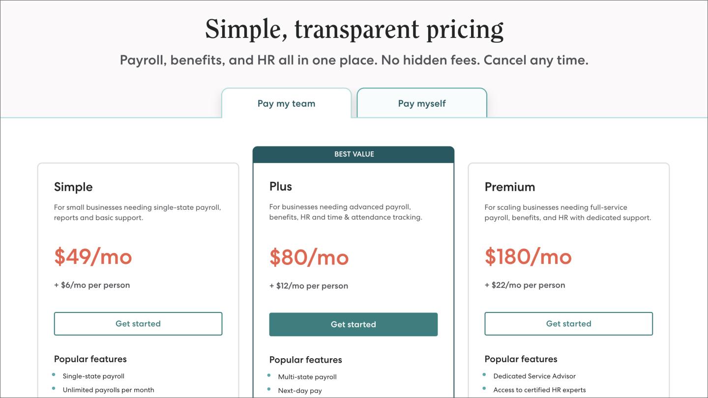
Gusto starts with “simple, transparent pricing,” a not-so-subtle call-out to fellow HR platforms that hide this info. It affirms this further by emphasizing “no hidden fees” and “cancel any time,” addressing two of the most common buyer fears upfront.
Gusto then segments its audience by presenting plans for paying your team and yourself. These prevent cognitive overload by consolidating all plans onto one page, using clear, whole-number pricing with per-person clarifications nearby.

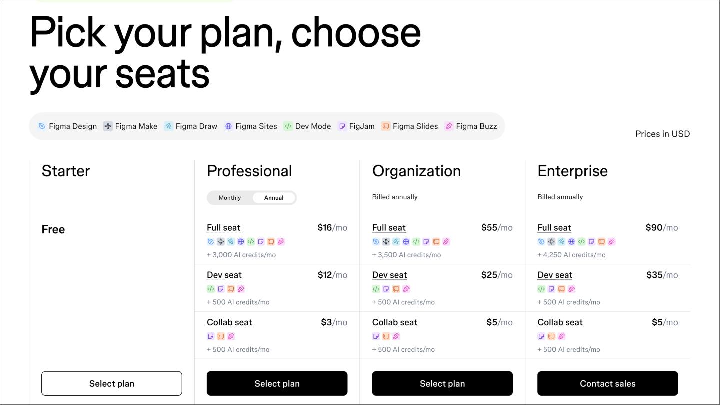
Figma, otherwise known as “us,” starts with a “pick your plan” and “choose your seats” approach to give visitors a sense of control. The icon strip connects products to icons, breaking down what you get with each plan to avoid repetition and save space. It’s an approach that works when your product has a lot to show.
The four-tier structure focuses on personas ranging from small, professional teams to large enterprises. The collab, dev, and full seats break those seats into different types to specify the range of roles that apply to each. Also, the monthly/annual toggle is close to the professional subheading, clarifying that it only applies to the professional plan.

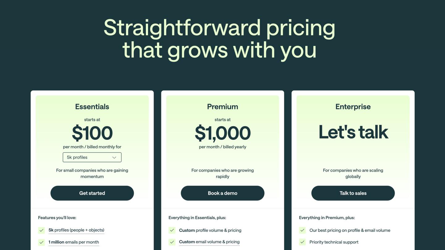
Customer.io starts with a title that emphasizes how its product scales with its customers, immediately addressing a common concern for growing businesses. Its three-tier approach follows this growth plan, adding short descriptions like “for small companies who are gaining momentum” to help make decisions easier.
The essentials plan includes an interactive volume selector to see how a higher need can impact their cost. The “starts at” clarifies that the plan could be more expensive in certain circumstances, swapping the price entirely with a “let’s talk” icon under the enterprise tier.

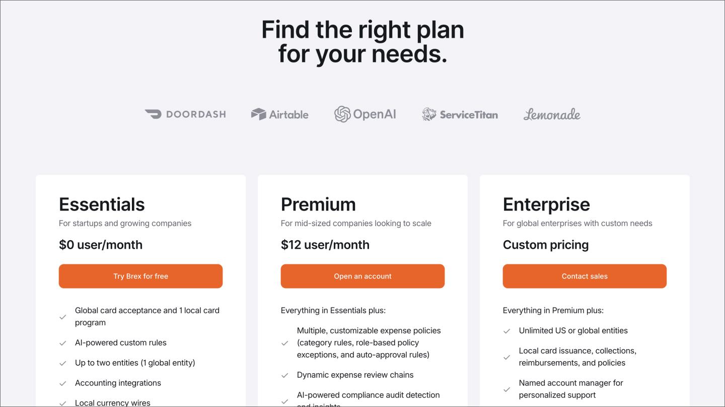
Brex starts with an immediate promise to help customers find the right plan for them, anchoring credibility with recognizable names like DoorDash and Lemonade. The three-tier approach clarifies that pricing under the premium tier is per user per month, while the “everything in Essentials, plus” text avoids needless feature repetition.

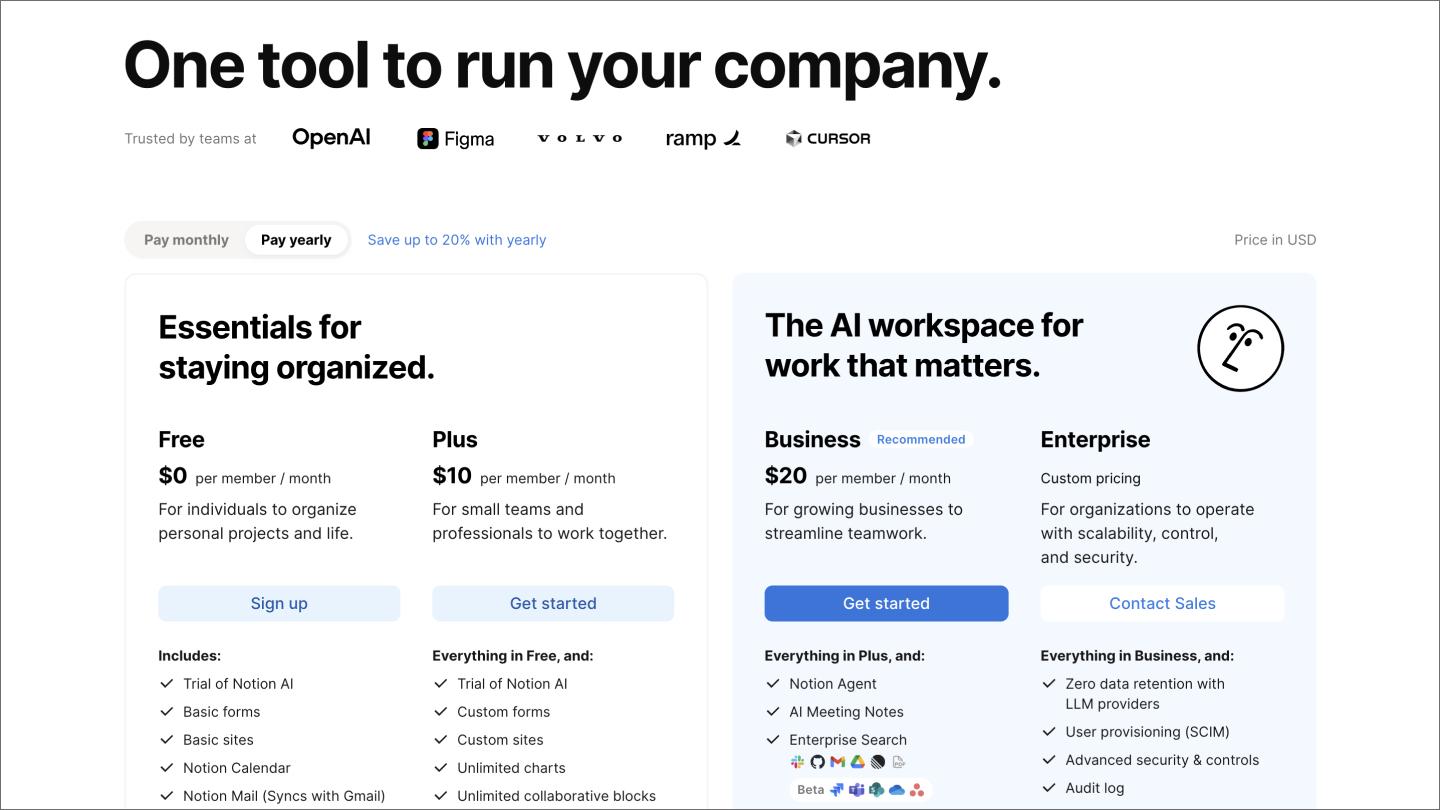
Notion’s headline takes an outcome-based approach, promising to run your company from one tool. The icon strip mentions names like OpenAI and Figma to establish credibility.
Its pricing tiers are divided into two broad categories to clarify which help you stay organized or create an AI workspace. Plans are broken down by per-member-per-month (or year), while a recommended badge next to the Business plan highlights what’s most useful for most visitors.

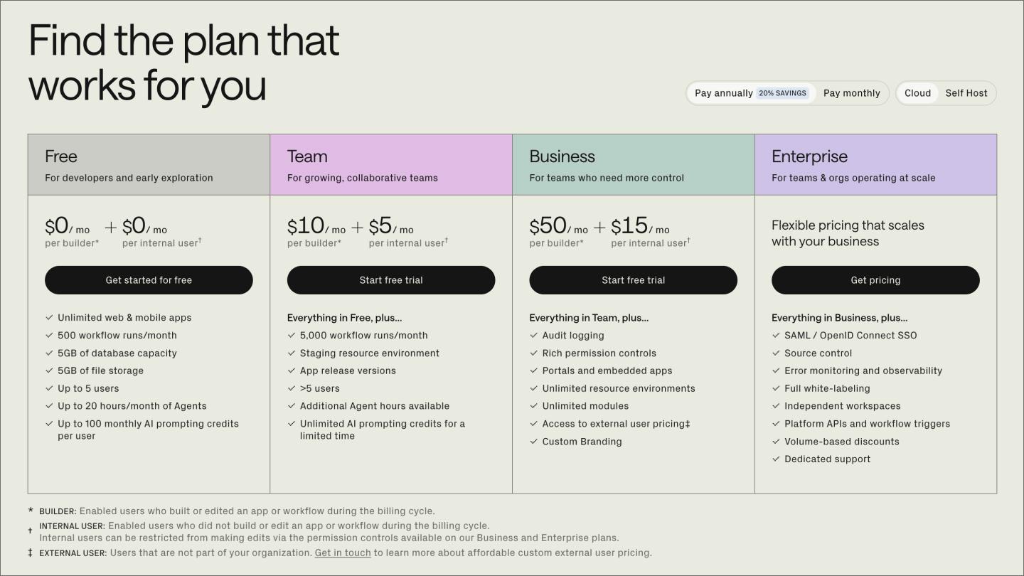
Retool offers to find the plan that works for you, providing this immediately with a three-option toggle for monthly, yearly, and self-hosted options for different company types and infrastructure needs. The self-hosted option might not make sense for everyone, but it does for Retool’s developer audience.
Retool’s four-tier structure uses color-coded column headers that are visually distinct. The dual pricing model breaks down costs by builder and internal users, specifying different needs that again speak to its technical audience. They also use the “everything in…” text to avoid repeating features.
Unlike brochure designs, the best-performing pricing pages aren’t set-and-forget. They are ongoing experiments. They get tested, measured, and refined based on how real visitors use them. They measure effectiveness using tools like Google Analytics 4 (GA4) and these metrics:
Keep reading for answers to frequently asked questions about best practices for B2B, B2C, and SaaS pricing page design.
Most high-converting pricing pages stick to three or four tiers. Fewer than that, and you risk failing to serve distinct buyer segments. Any more, and buyers may get frustrated trying to analyze which option is best for them.
B2C products and self-service SaaS tools should display prices publicly to reduce friction and build trust. In contrast, more customizable options and B2B products may benefit more from a “contact sales” button since no single price point fits every situation.
You can optimize your pricing page for conversions with benefit-based copy, high-contrast CTAs, and a simple design. From there, optimization is an ongoing process that uses A/B tests on specific page elements like headlines or CTA copy. Heatmaps and session recordings help you see what’s actually working.
Yes, an FAQ page at the bottom of your pricing page reduces last-minute drop-offs by addressing lingering buyer doubts and common questions. Sending visitors to an off-page help center may take them out of the decision-making process, reducing the chances they’ll come back and buy.
High-converting pricing pages treat simplicity and transparency as non-negotiable, and refine them based on how real people use them. We hope this guide gives you a strong starting point. When you're ready to build, we'd love for you to try Figma.
Here's how to get started:
Get everything you need to design, prototype, and publish a pricing page, all in one place.
Learn how to use AI to create a website from start to finish. Discover tools, tips, and strategies to design, build, and launch your site faster than ever.


Learning how to make a business website isn't as challenging as you might expect. Discover how to create a website for your business and how Figma can help.